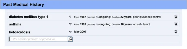
Document Properties Document Title

 Prepared for
NHS Connecting for Health
Version 1.0.0.0 Baseline
Prepared by
Clinical Applications and Patient Safety Project
NHS CUI Programme Team
cuistakeholder.mailbox@hscic.gov.uk
Prepared for
NHS Connecting for Health
Version 1.0.0.0 Baseline
Prepared by
Clinical Applications and Patient Safety Project
NHS CUI Programme Team
cuistakeholder.mailbox@hscic.gov.uk
PREFACE
- PREFACE
- 1 INTRODUCTION
- 2 ADMISSIONS CLERKING GUIDANCE OVERVIEW
- 3 ENTERING A LIST OF NOTE ENTRIES
- 4 REVEALING AND HIDING SECTIONS OF A SET OF DATA
- 5 REQUIRED FIELDS
- 6 DISPLAYING PREVIOUS VALUES
- 7 AUTOMATIC CALCULATIONS DATA
- 8 ADDING FREE TEXT
- 9 GENERAL FORM DESIGNS
- 10 DOCUMENT INFORMATION
- APPENDIX A USABILITY PRINCIPLES
- APPENDIX B STUDY ID 34: EXECUTIVE SUMMARY
- REVISION AND SIGNOFF SHEET
Source PDF: clinicalnoting.pdf
Documents replaced by this document None Documents to be read in conjunction with this document Display of Adverse Drug Reaction Risks – User Interface Design Guidance 1.0.0.0 Design Guide Entry – Terminology – Matching 1.0.0.0 Design Guide Entry – Terminology – Elaboration 2.0.0.0 Design Guide Entry – Terminology – Display Standards for Coded Information 2.0.0.0 Design Guide Entry – Date Display 3.0.0.0 Design Guide Entry – Date and Time Input 2.0.0.0 This document was prepared for NHS Connecting for Health which ceased to exist on 31 March 2013. It may contain references to organisations, projects and other initiatives which also no longer exist. If you have any questions relating to any such references, or to any other aspect of the content, please contact cuistakeholder.mailbox@hscic.gov.uk Patient Safety Process The development lifecycle for this design guide includes an integrated patient / clinical safety risk assessment and management process. Known patient safety incidents relevant to this design guidance area have been researched and reviewed as part of ongoing development. The resulting guidance points aim to support mitigation of these known patient safety risks. In addition, the developers of this design guide have undertaken a patient safety risk assessment to identify new risks that could potentially be introduced by the guidance points in this document. Any potential risks identified have been assessed and managed to support the ongoing clinical safety case for this design guide. The Hazard Log records all the risks that have been identified during development and describes mitigatory actions that, in some cases, will need to be taken by users of this design guide. The Hazard Log is a live document that is updated as the design guide is developed and maintained. Until this design guide has received full Clinical Authority to Release (CATR) from the NHS Connecting for Health (CFH) Clinical Safety Group (CSG) – based on an approved Clinical Safety Case – there may be outstanding patient safety risks yet to be identified and mitigated. Additionally, users implementing applications that follow this design guide’s guidelines (for example, healthcare system suppliers) are expected to undertake further clinical safety risk assessments of their specific systems within their specific context of use. Refer to NHS Common User Interface for further information on the patient safety process and for the safety status and any relevant accompanying safety documentation for this design guide.
1 INTRODUCTION
This document provides guidance for the design of User Interface (UI) controls that enable clinical noting, specifically in the area of acute admissions clerking. It describes the area of focus, lists mandatory and recommended guidance points with usage examples and explains the rationale behind the guidance.
In recent years, admissions clerking pro-forma standards have been the focus of the Royal College of Physicians’ (RCP) Health Informatics Unit (HIU), culminating in the 2008 release of record-keeping standards on the topic (see A Clinician’s Guide to Record Standards – Part 2 {R1} ). Typically, in acute care, the admissions clerking form has been the starting point for documenting the patient’s stay in hospital. In some hospitals, this clerking form will become the cover-sheet for the patient’s progress notes. During the patient’s hospital stay, the admissions clerking documentation is often used as the first point of reference for clinicians unfamiliar with the patient, with sections such as the ‘presenting complaint’ and ‘Past Medical History’ sections providing an important overview of the patient.
From an electronic UI design perspective, the admissions clerking pro-forma standards raise a number of interesting challenges. There are some categories of data implied under the RCP standard headings that may be best handled as a small set of fixed choices from which the clinician may choose one or more; whereas other data entry items require the flexibility of free text or a combination of choices and free text. Some of the data entry items imply lists of summarised clinical situations, observations or opinions, such as the patient’s ‘Past Medical History’. These may require the input of some structured data, including dates, durations and encoded clinical concepts, which may help future data queries, but may also need some flexible noting, such as free text entry.
Therefore, the admissions clerking form serves as a good exemplar for a set of wider clinical noting user interface issues. The aim of the current guidance is to highlight some of the more general issues and solutions involved in electronic clinical noting and form completion, but specifically within the context of admissions clerking. To this end, the structure of the current guidance document does not mirror the structure of the RCP admissions clerking pro-forma (see Hospital Admission Pro-forma Headings and Definitions {R2} ), nor do the illustrations featured within the guidance show a complete admissions clerking form. Designers and developers who wish to develop an electronic admissions clerking interface should use the current guidance when addressing some of the individual UI elements that may comprise the form, but the overall structure of and navigation through the form is outside of the current scope. Conversely, there are some aspects of the current guidance that can apply to other areas of clinical noting, for example, to a discharge form or an interface for recording examination notes.
Page 1
Copyright ©2013 Health and Social Care Information Centre
HSCIC Controlled Document
To indicate their relative importance, each guideline in this document is ranked by Conformance and by Evidence Rating . Table 1 defines those terms:
Conformance Indicates the extent to which you should follow the guideline when defining your UI implementation. There are two levels:
Mandatory - An implementation should follow the guideline
Recommended - An implementation is advised to follow the guideline
Evidence Rating Summarises the strength of the research defining the guideline and the extent to which it mitigates patient safety hazards. There are three ratings (with example factors used to determine the appropriate rating):
Low:
Does not mitigate specific patient safety hazards
User research findings unclear and with few participants
Unreferenced usability principles indicate the design is not significantly better than alternatives
Medium:
Mitigates specific patient safety hazards
User research findings clear but with few participants
References old authoritative guidance (for example, from National Patient Safety Agency (NPSA),
Institute for Safe Medication Practices (ISMP) or World Health Organization (WHO)) that is potentially soon to be superseded
Referenced usability principles indicate the design is significantly better than alternatives
High:
Mitigates specific patient safety hazards
User research findings clear and with a significant number of participants
References recent authoritative guidance (for example, from NPSA, ISMP or WHO)
Referenced usability principles indicate the design is significantly better than alternatives
Table 1: Conformance and Evidence Rating Definitions
Note
Refer to section 10.2 for definitions of the specific terminology used in this document.
1.1 Customer Need
The delivery of safe and efficient patient care requires accurate and complete clinical noting that does not compromise other aspects of clinical welfare.
Clinical noting data should be partly or completely structured using an accepted clinical coding method so that data may be retrieved and re-used quickly and safely. It is generally true that an item of clinical data, having being entered once, will then be retrieved many times over. Therefore, effort must be made to ensure that on a range of levels the data supports browsing and searching, and the assembly of subsets of data into sensible context-specific views. The ability of the UI to ‘slice and dice’ data is very important, given the fact that an electronic screen often offers less space than its paper equivalent, and because navigation through the data is often less convenient and intuitive than physically flipping through a stack of paper notes. In the absence of true machine intelligence, this can only be achieved effectively if some of the data is encoded and that sufficient structure is captured during noting. This requirement for structured data encoding may increase the time and effort needed to initially record notes, but it should lead to larger efficiencies during the retrieval and update of these notes. Capturing encoded data, while simultaneously capturing, but separating out details of its associated context, means that a single data item can be safely retrieved in a range of different ways.
Page 2
Copyright ©2013 Health and Social Care Information Centre
HSCIC Controlled Document
For example, the following data recorded as a block of narrative text may be accurate and complete, but can only be viewed in one way, namely as a block of text:
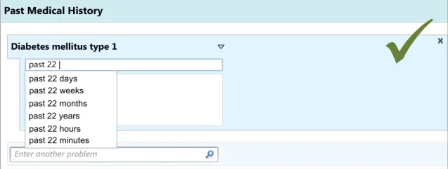
‘Previously had gangrene (toes on left foot) and ketoacidosis (both last year), diabetes type 1 for past 22 years – poor glycaemic control, poor insulin compliance.
However, by recording it as follows, as separate encoded statements, the clinician may be able to run a query to find out, for example, whether the patient has suffered from gangrene in the past or find out when the patient was first diagnosed with asthma:
-
Gangrene – toes left foot, occurred March-2008
-
Ketoacidosis, occurred March-2008
-
Diabetes type 1 – from 1987 (approx) – poor glycaemic control, poor insulin compliance
It is important to note that the context in which each of these statements has been recorded is very important to interpreting them in a safe manner. For example, if readers of a note that a patient had gangrene did not know the date of the gangrene and/or the context in which it was written (namely ‘Past Medical History’), they could wrongly think that the patient had gangrene at the time of writing the note, which could obviously affect any subsequent thinking about their care.
Against this requirement for structured encoded noting, however, we must consider the context and environment in which the clinicians have to complete the form. Training grade doctors, in particular, face great time pressures and at certain points the clinical noting is of secondary importance to actually providing care to the patient. Often they will only have time to write very brief notes, often incorporating shorthand and, if presented with an electronic system, they will follow ‘the path of least resistance’, in that they will choose those options which allow them to do the noting in the shortest time possible, while still accurately documenting the clinical situation.
1.2 Scope
In the context of the data that needs to be captured as part of Admissions Clerking (as defined in the RCP Admissions Clerking Standard, Hospital Admission Pro-forma Headings and Definitions {R2} ), the guidance produced in this document will address the following Clinical Noting areas:
-
Entering a list of note entries
-
Revealing and hiding sections of a set of data fields
-
Indicating required fields
-
Displaying previous values
-
Automatic calculations
-
Adding free text
-
General form designs
It is recognised that there are a number of potential approaches to entering clinical data into an electronic system. For example, the style of entry could range from one that is highly rigid and structured, through to one that is fluid and flexible, such as allowing the clinician to type in or hand write free text. Which style is appropriate may depend in part upon the situation in which the clinician is making the notes or upon the data requirements (for example, should the data be highly structured and encoded).
The current guidance focuses upon a style that is semi-structured, allowing some of the flexibility of free-text entry, but also imposing some structure in the form of fixed-choice data selection controls. This is deemed the most appropriate approach given the usage requirements and the level of technological sophistication that is currently available.
Page 3
Copyright ©2013 Health and Social Care Information Centre
HSCIC Controlled Document
However, this does not aim to prohibit future development of data entry controls that feature a more flexible or, indeed, more constrained style, as long as the usage requirements are satisfied and mandatory guidelines are followed.
1.2.1 In Scope
Table 2 lists the functional areas covered in this guidance:
Entering a list of note entries How to enable the clinician to enter lists of information quickly and safely
Revealing or hiding sections of a set of data
How to show that further fields for capturing related data are available for a particular type of data
Required fields How you indicate that data must be entered into a particular section or field on the form
Displaying previous values For example, how to show previously taken Blood Pressure reading(s) when recording a current reading for the same patient
Automatic calculations How to distinguish between data which has been entered by the user from data that has been automatically calculated by the system. Also how to indicate the source of the data used in an automatically calculated field, such as Body Mass Index (BMI)
Adding free text How to enable the clinician to add free text notes to any item on the form
General form designs How to employ standard controls in a form
Table 2: In Scope Requirements
Also considered was the notion of how to communicate certain default contextual information to the clinician as they are recording notes. For example, such ‘soft defaults’ could include that a clinical statement applies to the patient as opposed to another family member, unless stated otherwise. Another default could be that a problem represents a new rather than an ongoing clinical episode. However, following early design analysis, the conclusion was that such ‘soft defaults’ could be captured and communicated through the use of section headings and choice of clinical terms entered by the clinician.
For example, if the clinician were to record the phrase ‘Family history of asthma’, it is clear that the clinical statement applies to other family members, rather than necessarily to the patient. Likewise, if the clinician enters ‘asthma’ under the heading ‘Family history’, the clinical statement does not necessarily apply to the patient, but instead applies to members in their family.
1.2.2 Out of Scope
This section defines areas that are not covered in this guidance. Although there may be specific risks associated with these areas that are not addressed in this guidance, it is likely that the principles in this guidance will extend to admissions clerking in many of the areas listed below.
Table 3 lists the subject areas that are not covered in this guidance:
Entering frequencies Entering the frequency with which clinical events occur, such as ‘weekly’ or ‘three times a day’.
Summarising multiple occurrences of a clinical situation
Instead of entering multiple occurrences of a clinical situation multiple times into the form, the clinician can just enter the term once and record next to it how many times it occurred. For example, instead of recording ‘myocardial infarction, 1994’, ‘myocardial infarction 1998’, record ‘myocardial infarction x 2, 1994, 1998’.
Entering tabular data Entering data into cells in a table.
Copyright ©2013 Health and Social Care Information Centre
Page 4
HSCIC Controlled Document
Displaying edit history For each item of data, display:
If it has been edited (after having been saved to record)
The previous versions of the edits
The relevant context of the edits, such as the date and author of the edit
Browsing terminology hierarchy Allowing the clinician to browse for SNOMED CT terms by navigating through its hierarchical structure. For example, the clinician could select ‘fracture of forearm’, and then browse down to a more specific instance of the term, such as ‘fracture of radius’.
Manipulating subsets (R4 guidance update) Allowing the clinician to choose which subsets the system searches when they enter clinical phrases to be matched against SNOMED CT terms.
Linking between concepts Allowing the clinician to indicate links between concepts. For example, linking a patient’s diabetes with their ketoacidosis.
‘Free text parsing’ Allowing the clinician to enter text from which the system matches SNOMED CT expressions.
Table 3: Out of Scope Requirements
Note
Listing an item as out of scope does not classify it as unimportant. Project time and resource constraints inevitably restrict what can be in scope for a particular release. It is possible that items out of scope for this release may be considered for a future release.
1.3 Assumptions
A1 The structured terminology used for this guidance will be SNOMED CT.
A2 Appropriate subsets within SNOMED CT will be available.
A3 This guidance applies to computer-screen-based applications that allow dynamically changing screen views, linked into a database. It does not apply to mobile devices, electronic paper or voice-recognition software although some of the principles that apply in the current guidance could also apply to applications delivered by those types of mechanism.
A4 The RCP standards addressing record keeping in acute admissions will be applied to the creation of a pro-forma ( A Clinician’s Guide to Record Standards – Part 2 {R1} and Hospital Admission Pro-forma Headings and Definitions {R2} ).
A5 The data fields and options populating the form will be provided by an appropriate clinical authority.
A6 The clinician records the data in front of the patient or soon afterwards at a workstation.
A7 Suppliers who implement this guidance in their designs should also follow relevant national or international accessibility standards and guidelines. For further details see Design Guide Entry - Accessibility Principles {R4}.
Table 4: Assumptions
Page 5
Copyright ©2013 Health and Social Care Information Centre
HSCIC Controlled Document
1.4 Dependencies
D1 The availability of appropriate data sets, for example, SNOMED CT subsets and clinical content service archetypes.
D2 The following design guidance documents (changes in these documents may affect the current guidance):
Design Guide Entry – Terminology – Matching
Design Guide Entry – Terminology – Elaboration
Design Guide Entry – Terminology – Display Standards for Coded Information
Design Guide Entry – Date and Time Input
Design Guide Entry – Date Display
Display of Adverse Drug Reaction Risks – User Interface Design Guidance
Recording Adverse Drug Reaction Risks – User Interface Design Guidance
Table 5: Dependencies
Copyright ©2013 Health and Social Care Information Centre
Page 6
HSCIC Controlled Document
2 ADMISSIONS CLERKING GUIDANCE OVERVIEW
As outlined in section 1, the current guidance addresses a set of data entry UI mechanisms that can be employed in the context of completing an admissions clerking form. In doing so, it will show not only how to feature standard UI fields, but also how to employ some specialised data entry field structures. In this way, the admissions clerking form is used simply as an exemplar that illuminates a set of wider clinical noting user interface challenges.
The guidance covers a range of data entry situations relevant to admissions clerking, starting with how to record a list of clinical note entries quickly and easily, such as is needed when writing a ‘Past Medical History’ (see section 3). The sections that follow section 3 then address a number of other issues associated with form entry.
The use of standard fields is covered in section 9 and is largely drawn from well established UI style guidance, and therefore was not the subject of any design analysis.
Note
The guidance in that section does not prohibit the use of non-standard controls; instead, it demonstrates how standard controls should be used, if the designer chooses to use them.
Throughout the various sections, the current document will indicate to which of the RCP admissions clerking headings the specific guidance can apply, because data items with the various RCP headings will demand different entry mechanisms. For example, the guidance that addresses the entry of a list of note entries can be applied to the RCP ‘Past Medical History’ and ‘Problem list’ headings. For a more thorough discussion of the use of RCP headings, see A Clinician’s Guide to Record Standards – Part 2 {R1} .
Important
The visual representations used within this document to display the guidance are illustrative only. They are simplified in order to support understanding of the guidance points. Stylistic choices, such as colours, fonts or icons are not part of the guidance and unless otherwise specified are not mandatory requirements for compliance with the guidance in this document.
2.1 Rationale Summary
The rationale for the current guidance draws on several pieces of evidence.
Research:
- Secondary research:
Existing guidelines and standards
UI best practice
Clinical noting practice
- Primary research:
Interviews with health care professionals, including doctors
A series of usability tests where we iteratively updated our designs (implemented in a
set of prototypes) and tested them, a process often labelled Rapid Iterative Test Evaluation (RITE). Each design underwent up to five iterations, with a range of clinicians participating in each set of tests
- Regular consultation with experts:
A panel of clinical experts
Page 7
Copyright ©2013 Health and Social Care Information Centre
HSCIC Controlled Document
A technical audience (developers)
Usability Principles (see APPENDIX A for details on these principles):
-
Nielsen’s usability heuristics
-
Shneiderman’s eight golden rules of interface design
-
ISO 9241: Characteristics of presented information (taken from ISO 9241-10: 1996
Ergonomic requirements for office work with visual display terminals (VDTs) — Part 10: Dialogues principles {R9} )
Existing Standards:
- BS ISO 9241-14:1997 Ergonomic requirements for office work with visual display terminals
(VDTs) — Part 14: Menu dialogues {R6}
- BS ISO 9241-17:1998 Ergonomic requirements for office work with visual display terminals
(VDTs) — Part 17: Form-filling dialogues {R7}
- BS ISO 9241-12:1999 Ergonomic requirements for office work with visual display terminals
(VDTs) — Part 12: Presentation of information {R8}
- BS ISO 9241-10:1996 Ergonomic requirements for office work with visual display terminals
(VDTs) — Part 10: Dialogues principles {R9}
Evolving Standards:
-
Design Guide Entry – Date Display {R12}
-
Design Guide Entry – Date and Time Input {R13}
-
Design Guide Entry – Terminology – Matching {R14}
-
Design Guide Entry – Terminology – Elaboration {R15}
-
Design Guide Entry – Terminology – Display Standards for Coded Information {R16}
-
Recording Adverse Drug Reaction Risks – User Interface Design Guidance {R17}
-
Display of Adverse Drug Reaction Risks – User Interface Design Guidance {R18}
Page 8
Copyright ©2013 Health and Social Care Information Centre
HSCIC Controlled Document
2.2 Summary of Guidance
Table 6 summarises the content of this document by outlining each area of guidance (along with a cross reference to the relevant section) and providing a visual example to illustrate how it might be implemented.
Notes
- Table 6 lists possible clerking data to which the guidelines may apply. These are not intended to be
exhaustive. The guidance may apply to other data which is not outlined in the table.
- Design illustrations are best viewed on a screen in colour.
Section 3 – Entering a list of note entries
Possible clerking data:
Past Medical History
Problem list
Section 4 – Revealing and Hiding Sections of a Set of Data
Possible clerking data:
Observations/ findings
Cardiovascular system
Respiratory system
Abdomen
Genitourinary
Nervous system
Musculoskeletal system
Skin
Page 9
Copyright ©2013 Health and Social Care Information Centre
 HSCIC Controlled Document
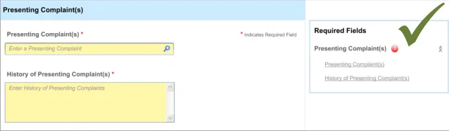
Section 5 – Required Fields
Possible clerking data:
Presenting complaint
History of presenting complaint
Section 6 – Displaying Previous Values
Possible clerking data:
Vital signs
Section 7 – Automatic Calculations Data
Possible clerking data:
Glasgow Coma Scale
BMI
Vital signs
Duration/date
Section 8 – Adding Free Text
Possible clerking data:
Observations/ findings
Cardiovascular system
Respiratory system
Abdomen
Genitourinary
Nervous system
Musculoskeletal system
Skin
Section 9 – General Form Designs
Possible clerking data:
Any of the data areas
Table 6: Summary of Guidance
Copyright ©2013 Health and Social Care Information Centre
Page 10
 HSCIC Controlled Document
3 ENTERING A LIST OF NOTE ENTRIES
3.1 Introduction
These design guidelines address the creation of any list that comprises brief notes about a set of clinical situations, where efficiency and accuracy are prioritised over capturing detail.
This guidance applies to situations where the clinician is making a list of clinical items, such as problems or procedures, where each clinical note entry is summarised in a concise, but accurate format.
The designs shown in this guidance aim to allow a clinician to quickly and safely make a list of entries.
The basic guidelines can apply to the following, amongst other areas:
-
Past medical history
-
Problem list
-
Summary of procedures
-
Action list
In some of the cases, further customisation may be required, but the basic guidelines will apply to all of them.
The following list outlines the main user requirements for the feature addressed by the guidance in this section. These user requirements were elicited following discussions with a panel of expert clinicians and a series of interviews with training grade doctors:
- User must be able to enter text and match an appropriate SNOMED CT concept in the
context of the admissions clerking form
- User must be able to match multiple SNOMED CT concepts sequentially under a single
heading or subheading within the admissions clerking form
- User must be able to elaborate a single concept (or post-coordinated expression ) with
free text
- User must be able to delete matched concepts within the form before it is committed to
the record
- Users must be aware of the fixed choice attribute options available to them when they are
entering free text, for example for selecting laterality of a body site
-
User must be encouraged to select or enter encoded options, where possible
-
If appropriate, allow users to specify duration and dates for a concept
3.2 Principles
The following key principles inform the guidance in this section:
- Improving speed of entry whist maintaining accurate data:
The list could be fairly long and therefore speed, in addition to accuracy, is a key factor.
Unlike other situations, such as during a detailed physical examination, the UI will not require the clinician to enter a lot of detail, structured or otherwise.
Page 11
Copyright ©2013 Health and Social Care Information Centre
HSCIC Controlled Document
Instead, the emphasis is on capturing the main clinical details and moving on to the next entry as quickly as possible.
- Encourage structured (encoded) data entry:
Given the potential reuse of the data (for example, during the patient’s hospital stay), capturing the accurate meaning of the clinical entries plus any relevant context is essential to avoid its later misinterpretation, which could compromise the care delivered to the patient.
Therefore, the designs also encourage structured (encoded) data entry in order to ensure accurate, unambiguous data entry.
- Arrange entries so that they are easy to scan visually. As clinicians are building up a list,
which could be ordered chronologically or otherwise, it will be necessary for them to scan this as they are entering it, in order to:
Maintain an ordered ‘picture’ in their mind
Ensure that they have not missed or duplicated anything
- Screen design heuristics:
Flexibility and efficiency of use
Aesthetic and minimalist design
Error prevention
3.3 Guidelines
The guidelines in this section are based around the following actions:
-
Entering the clinical concept
-
Entering additional details
-
Editing the main clinical concept or the additional details
-
Deleting an entry
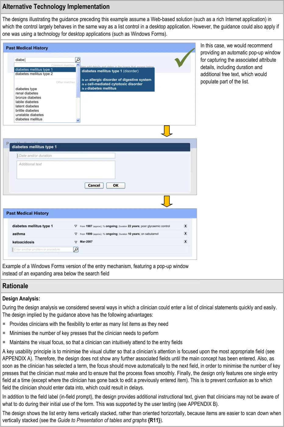
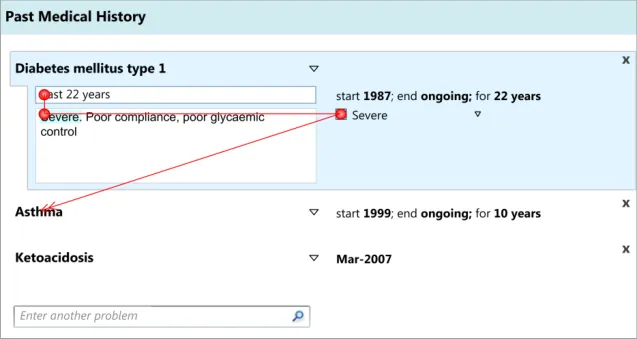
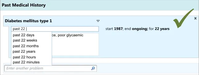
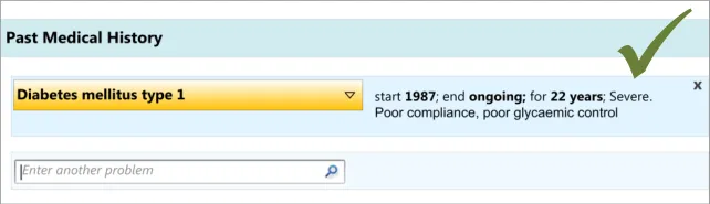
This assumes a distinction between the main clinical concept and its additional details. Our research (see APPENDIX B) has shown that clinicians understand this distinction, in the specific context of entering a ‘Past Medical History’ list, and find it intuitive to enter one or two words which describe the clinical situation and then add some further details associated with that situation.
Also, our analyses showed that it would be more efficient and intuitive for clinicians to enter the additional details for a concept immediately after entering it, rather than entering all the main concepts followed by all their associated details. This ordering was shown to be intuitive in the user testing (see APPENDIX B) we later conducted.
In the context of the current guidance, editing the concept and/or its additional details would only be done before the data was committed to record and shared with other clinicians. This editing could be done, for example, if the patient told the clinician some additional facts or corrected details during the course of the noting, or if the clinician decided immediately after writing an entry that it would be better expressed in a different manner. Therefore, this guidance is not covering the action of updating data.
Likewise, guidance relating to deleting entries in the list would only apply to data that had not yet been committed to record.
Editing and deletion of data after it has been committed to record, and thus potentially seen by other clinicians, may also require a tight system of audit which itself could require warnings and other relevant interface controls. However, these situations are not covered in the current guidance.
Page 12
Copyright ©2013 Health and Social Care Information Centre
HSCIC Controlled Document
It is assumed in this guidance that the clinician will be recording multiple entries sequentially.
Finally, this guidance only addresses the action of entering data and the display of data during its entry. It does not cover how the data should be displayed at a later time.
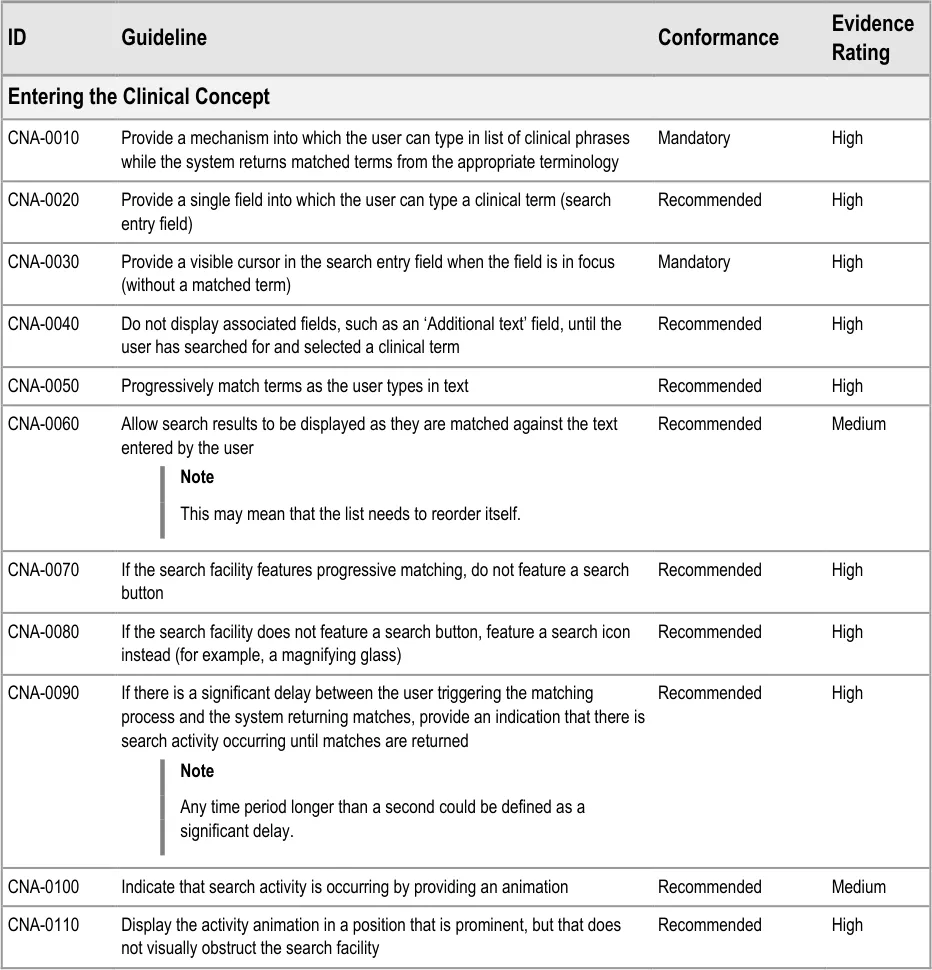
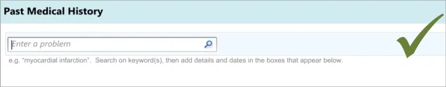
3.3.1 Entering the Clinical Concept
The first action that the clinician will perform will be to enter a clinical concept into the list, prior to entering associated details.
This guidance includes:
-
Entering and encoding the clinical concept
-
Entering and encoding the next clinical concept
-
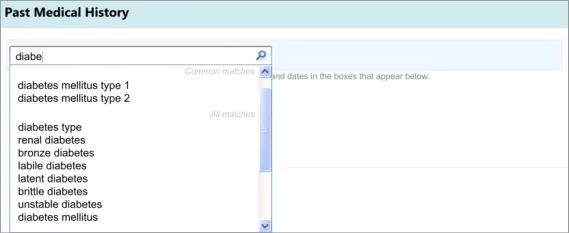
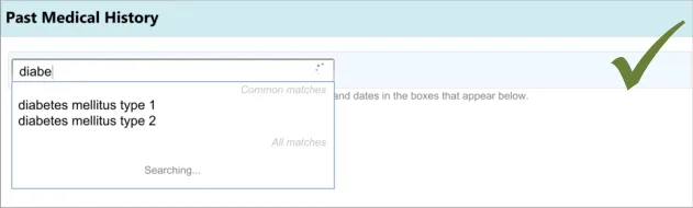
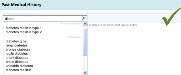
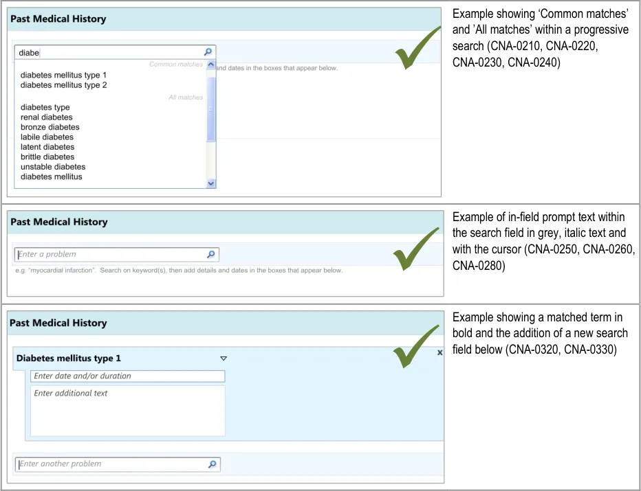
Displaying common matches (where appropriate)
-
Handling ‘match not found’
Page 13
Copyright ©2013 Health and Social Care Information Centre
HSCIC Controlled Document
Page 14
Copyright ©2013 Health and Social Care Information Centre
HSCIC Controlled Document
Page 15
Copyright ©2013 Health and Social Care Information Centre
HSCIC Controlled Document
Page 16
Copyright ©2013 Health and Social Care Information Centre
HSCIC Controlled Document
Page 17
Copyright ©2013 Health and Social Care Information Centre
HSCIC Controlled Document
Desk Research:
The mechanism for SNOMED CT matching, including the entry field size and the visual display used for distinguishing common matches with other matches are based upon previous CUI guidance. For example, the width of the search entry field (32 characters) was determined in Design Guide Entry – Terminology – Matching {R14}, based upon analysis of the lengths of SNOMED CT terms. Additionally, the display of the encoded term is also drawn from previous CUI guidance (see Design Guide Entry – Terminology – Display Standards for Coded Information {R16} ).
The use of ‘common’ items is sometimes used in existing paper forms in order to provide quicker entry and prompting (for example, in Hospital Admission Pro-forma Headings and Definitions {R2} ). This feature is also supported by an international standard, which states that if the “frequency of option use is known (or can be determined) and option groups are small (eight or less), the most frequently used options should be placed first” in a menu (see Menu dialogues {R6} ).
In a recent paper outlining principles for effective clinical decision support, the authors referenced research that suggested clinicians’ satisfaction with a clinical system markedly declines if the time taken to provide system feedback exceeds one second. The authors therefore suggested ‘subsecond screen flips’ (see Ten Commandments for Effective Clinical Decision Support: Making the Practice of Evidence-based Medicine a Reality {R5} ). This supports the need for an animation to appear if the screen change exceeds one second {R5} . The need for “timely and perceptible feedback” associated with “normal task performance” which is “non-intrusive” and does not “distract the user from the task” is also supported by international standards (see User guidance {R10} ). Another standard indicates that “if the system response to option execution” is delayed, “an indication should be provided to the user that the system is processing the request” {R6} . This standard defines a delay as being “more than 3 s[econds] after initiation” {R6}, although the current guidance authors argue that the need to reduce frustration on the part of the clinician would point to providing the indication quicker than 3 seconds.
International standards also recommend that prompts (“user guidance information”) should be “readily distinguishable from other displayed information” and that such messages “should provide the user with specific information relative to the task context rather than generic messages” {R10} . It also states that such text “should not disrupt the user’s task and the continuation of the dialogue” {R10} .
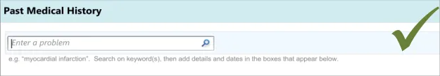
The need for a visible cursor is also underlined by a relevant standard, which states that “cursor position should always be clearly visible if it is within the currently displayed portion of the form” (see Form-filling dialogues {R7} ).
User Research:
A series of iterative usability tests (see APPENDIX B) showed that:
Failure to provide a visible cursor encourages unnecessary mouse clicks and causes confusion
Some clinicians would try to (incorrectly) type in a full sentence into the search entry field, prior to the introduction of progressive
matching and prompting text
Where progressive matching had been implemented, providing a search button confuses clinicians
Failure to provide an indication of search activity leads to unnecessary mouse clicks and user frustration
Initially, clinicians can find it difficult to find the search entry field if it is not sufficiently prominent in relation to other fields
Clinicians expected a list of common ‘Past Medical History’ matches and found it difficult to find a common match when there was
no separate list of common matches
Speed is a priority factor when completing an admissions clerking form. The UI should be geared towards reducing the time that it takes to return matched results
Hazard Risk Analysis Summary :
Potential Hazards:
Clinician tries to enter text that does not match the encoding
terminology
Mechanism is so time consuming that the clinician does not
have sufficient time to complete the form
Mitigations:
Provide progressive matching and instructional text
Minimise number of user actions, such as number of
keystrokes
Page 18
Copyright ©2013 Health and Social Care Information Centre
HSCIC Controlled Document
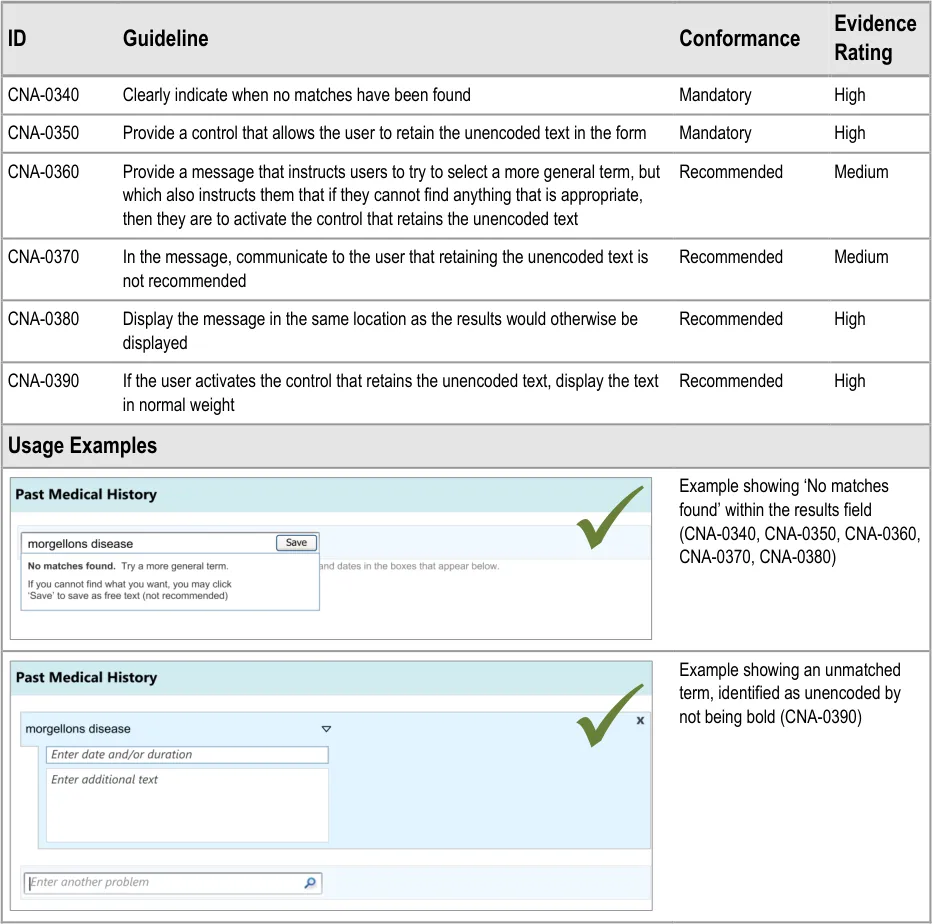
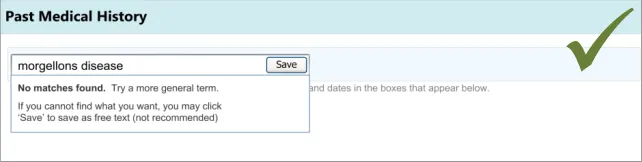
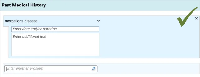
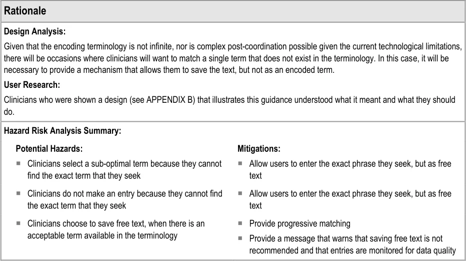
3.3.2 Dealing with ‘Match Not Found’
This section addresses how the UI should behave, and what options it should offer, if clinicians cannot find the term for which they are searching. This guidance has implications beyond the scope of entering a list, and could apply to any matching of encoded terminology.
Page 19
Copyright ©2013 Health and Social Care Information Centre
HSCIC Controlled Document
Page 20
Copyright ©2013 Health and Social Care Information Centre
HSCIC Controlled Document
3.3.3 Entering Additional Details
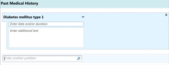
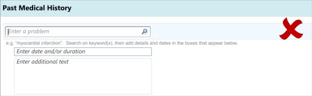
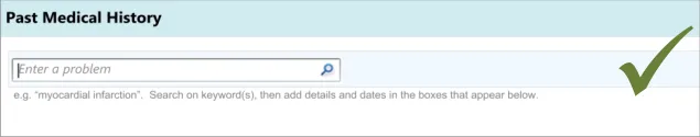
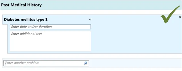
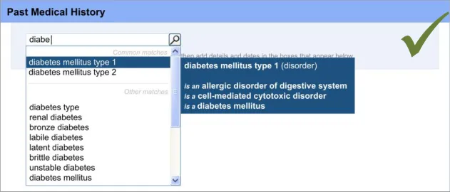
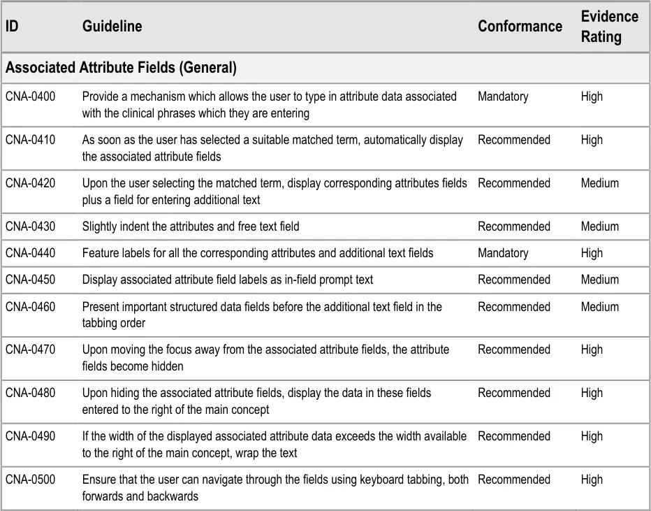
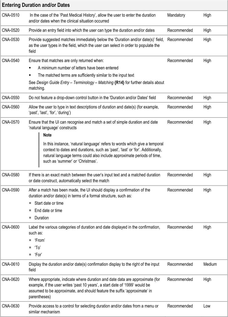
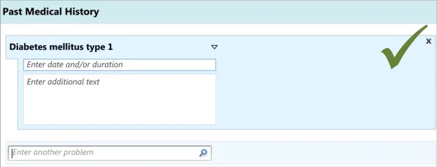
In addition to entering an encoded concept, it is often necessary to record some additional details, for example dates, durations and free text to elaborate the description of the situation. In the context of admissions clerking, this guidance focuses upon entering the duration and dates of the clinical situation that is being summarised, in addition to entering free text which elaborates the main concept. However, this guidance could also apply to other attribute fields, depending upon the clinical noting need.
Note
In this context, the term ‘attribute’ refers to a concept which in some way further describes, characterises or contextualises another concept. For example, ‘severe’ could be an attribute of ‘gastroenteritis’, as could the date on which it occurred.
This guidance includes:
-
Entering duration and/or date(s)
-
Entering free text elaboration
-
Entering other structured attributes (including additional fields for capturing context specific or concept-specific attribute data)
-
Matching SNOMED CT qualifiers
Page 21
Copyright ©2013 Health and Social Care Information Centre
HSCIC Controlled Document
Page 22
Copyright ©2013 Health and Social Care Information Centre
HSCIC Controlled Document
Page 23
Copyright ©2013 Health and Social Care Information Centre
HSCIC Controlled Document
Copyright ©2013 Health and Social Care Information Centre
Page 24
HSCIC Controlled Document
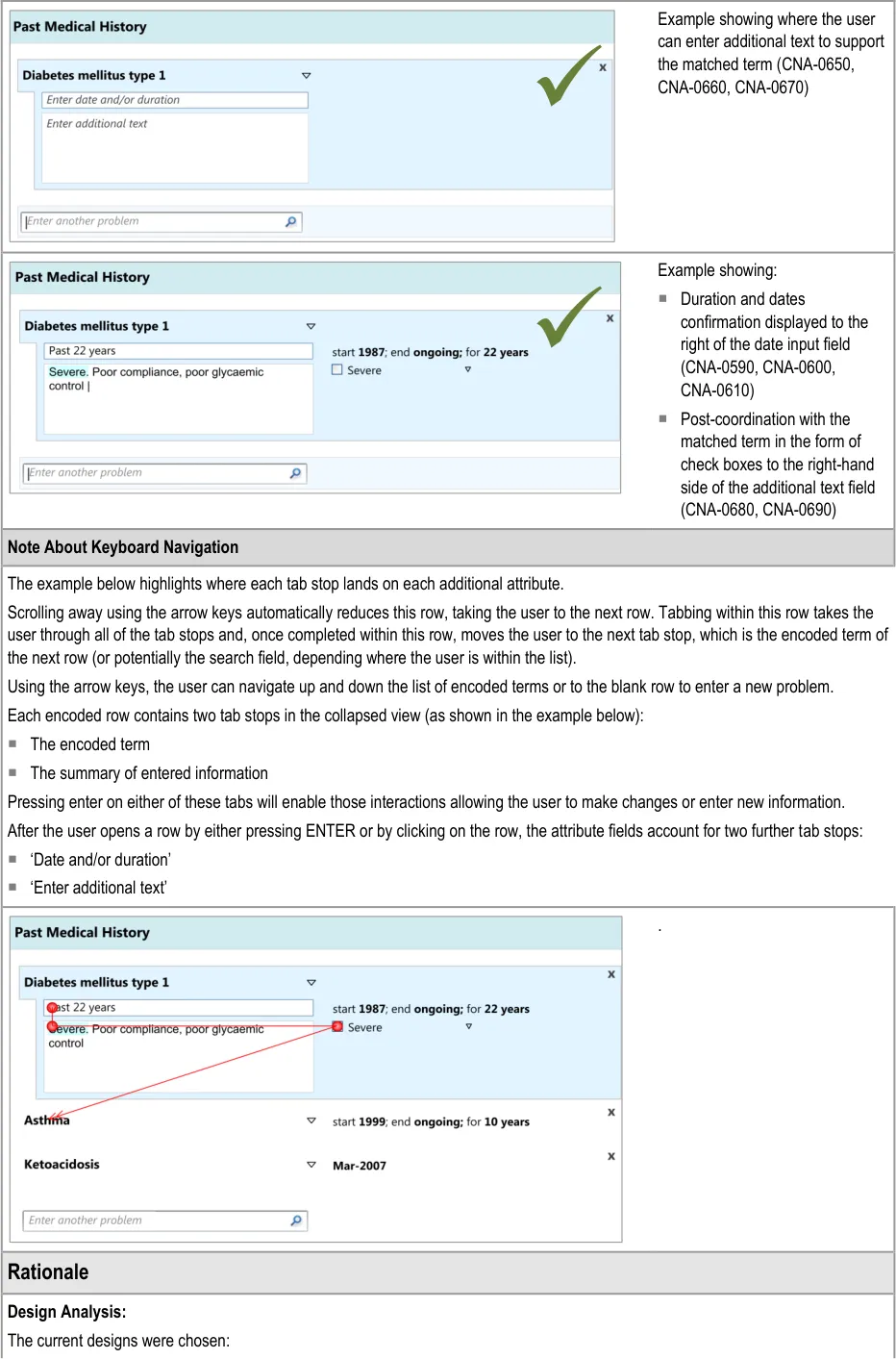
For speed of use: the number of tab and click actions have been minimised
Because the current arrangement draws the clinician’s attention to the fields: they are located immediately below the previous one,
which is an intuitive location to look for the next field
Visually communicating a visual hierarchy between the fields, for example by indenting those lower in the hierarchy, can indicate that the associated attribute fields ‘belong’ to the main concept.
Locating the duration and/or date field before the additional text field is suggested in order to encourage clinicians not to enter duration and/or date information as free text.
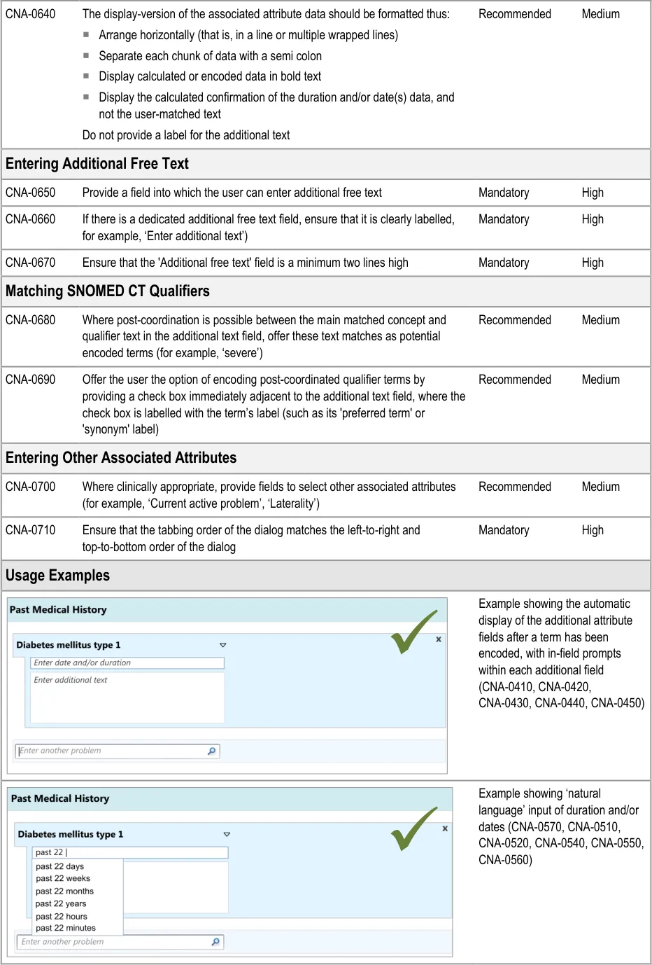
Analysis of SNOMED CT indicates that single concepts are often not sufficient on their own to express realistic clinical statements. Therefore, a field for recording additional free text is required in addition to the main concept field.
The design should be ‘expandable’ to be able to feature fields for other attributes, depending upon the concept matched, such as ‘laterality’ (that is, whether the relevant body site is on the left, right, both or neither), as some attributes may be very important for the safe communication of the clinical concept.
Desk Research:
Relevant ISO guidance states that ‘all fields should be clearly and unambiguously labelled to describe what kind of content should be entered’ (see Form-filling dialogues {R7} ) and that these labels must be ‘distinctive’ in relation to data or instructions, for example, using visual cues such as position, font or colour, and that these visual cues should be applied consistently throughout the form. Therefore, provide sufficient labelling of the fields. These labels can be in-field ‘prompts’, as defined in the Microsoft Windows User Experience Interaction Guidelines {R22} .
Previous CUI guidance on terminology matching and elaboration demonstrates the need for an additional text field to complement the single concept matching field. It also demonstrates how qualifier concepts, such as severity, can be matched within the additional text field (See Design Guide Entry – Date and Time Input {R13} and Design Guide Entry – Terminology – Matching {R14} ).
Style guidance for established UIs indicates that the free text field must be a minimum of two lines high and that a vertical scroll bar appears after the clinician’s typed entry exceeds the visible space (see Essential guide to user interface design {R21} ).
The need to allow the clinician to complete the entry fields just using the keyboard is supported by relevant international standards indicate that “the need for users to switch between different input devices when filling in a form should be minimized” {R7} . Another standard also states that “if a keyboard is available, a keyboard method for selecting and executing options should be provided in addition to the pointing device method” {R6 }.
User Research:
Previous CUI user research, addressing the input of adverse drug reaction risks, has shown that clinicians did not understand a control whereby the clinician can select a matched term and then type in additional text within the same field. In that set of test, the clinicians also tended to want to click into the next input field below, rather than the one adjacent (see Design Guide Entry – Terminology – Display Standards for Coded Information {R16} ).
In the current CUI research (see APPENDIX B), clinicians indicated that they felt that the designs lacked order and felt too time consuming, even though they were using them quickly and without errors. Therefore, the current designs feature the associated attribute fields close together, well-aligned and slightly indented from the main concept in order to imply that they hierarchically ‘belong’ to the main concept.
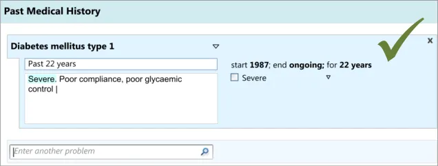
As part of the CUI research (see APPENDIX B), interviews with clinicians indicated that, while writing the ‘Past Medical History’ they often record dates and durations, where known and where relevant. However, these interviews and the subsequent usability testing showed that these date and durations are often recorded in a more colloquial and approximate manner than the more formal way often required for the electronic input of dates and durations. For example, they may write ‘past 10 years’ or simply ’during childhood’. Therefore, the design allows for this type of input. During the user testing, a more formal method of date and duration capture was evaluated that used calendar boxes, which was understandable and usable, but that some clinicians indicated would be too complicated and ‘fussy’ for noting as part of the ‘Past Medical History’.
User testing (see APPENDIX B) showed that the ‘suggested matches’ design of the date entry field was understood and easily used by clinicians, although it did suggest the need to ensure that if there is a perfect match between the input text and the matched date or duration item, then the item should be selected automatically. This was because the clinicians did not always scroll down and select from the list. Clinicians tended to appreciate the ‘confirmation display of their ‘natural language’ input in terms of the more formal ‘Start’, ‘End’ and ‘Duration’.
User testing (see APPENDIX B) also revealed that providing a button which initiates a ‘drop-down’ list on the ‘duration and/or date(s)’ field encourages clinicians to click on the button without typing anything in.
Hazard Risk Analysis Summary:
Page 25
Copyright ©2013 Health and Social Care Information Centre
HSCIC Controlled Document
Potential Hazards:
Start-date automatically calculated from an
entered duration falsely implies a precision that is not correct
If the system encodes free-text durations entered
by the clinician, and the system sorts data by date, records with encoded free-text duration dates may not show correctly in the sorted list
Mitigations:
Indicate that a date is approximate if it has been derived from words
such as ‘past 22 years’ or ‘10 years ago’. Feature the date at an appropriate level of detail, depending upon the user’s input
Convert durations provided in free-text format into standard format
where at least two of the following values are recorded:
Start date
End date
Duration
Page 26
Copyright ©2013 Health and Social Care Information Centre
HSCIC Controlled Document
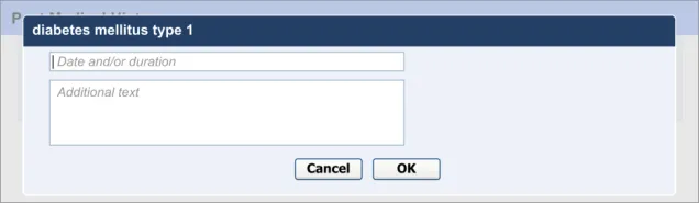
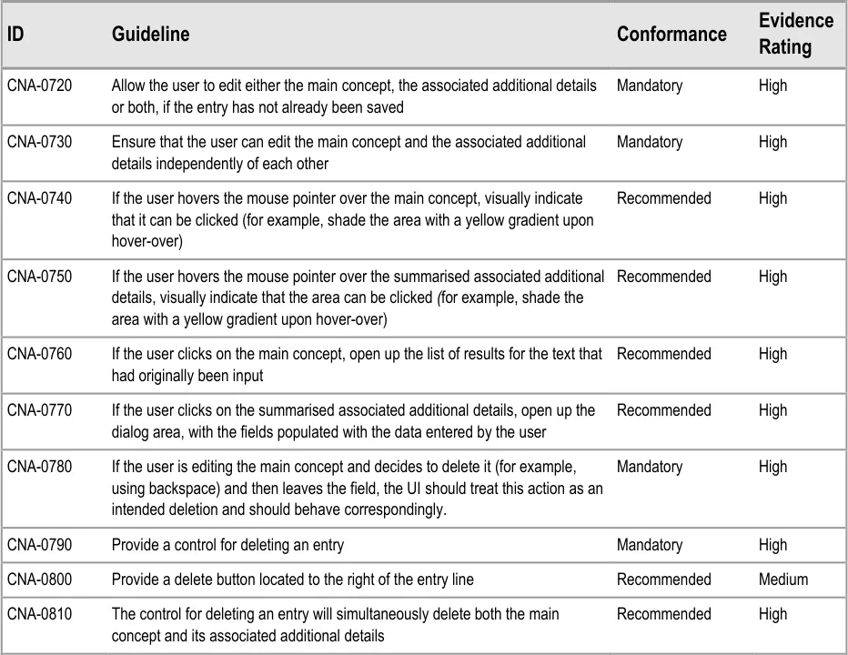
3.3.4 Editing and Deleting Entries
This section focuses upon the actions of editing and deleting entries in a list. These are obviously important, given the fact that clinicians may need to go back and change the document during the process of writing it: they may remember relevant details later in the process of writing, or maybe, if they are noting at the same time as clerking the patient, the patient may correct themselves or remember further details after a clinical situation has been noted. Anecdotal evidence suggests that patients often forget diseases or conditions that only become apparent when their drug history is taken.
Note
The guidance below does not account for situations where the notes have been saved to the patient’s record and the information has been effectively shared with the wider health team. In those cases, any edits or deletions must be accompanied by a rigorous auditing mechanism, given the dangers and legal implications involved in changing aspects of a patient record.
This guidance addresses:
-
Editing the main concept
-
Editing additional details
-
Deleting entries
Page 27
Copyright ©2013 Health and Social Care Information Centre
HSCIC Controlled Document
Page 28
Copyright ©2013 Health and Social Care Information Centre
HSCIC Controlled Document
User Research:
This mechanism was tested and clinicians used it correctly (see APPENDIX B). They found it natural to click on the associated attribute details in order to edit them.
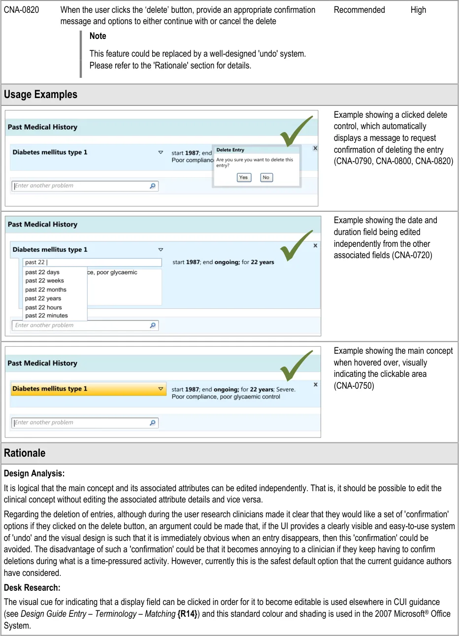
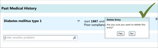
During the early design iterations, participants were provided with a control for deleting an entry. Although they could clearly see how to delete an entry, participants indicated that there should be a ‘confirmation’ message which contained a set of options to either go ahead with the deletion or to cancel it, as they were worried they could delete an entry by accident. Indeed, one participant had deleted an entry by accident in a previous task without initially realising he had done, and he indicated that a confirmation message would have been useful.
It is worth noting that the researchers did not test an ‘undo’ function, nor did they explore other ways of ensuring that the visual design made it very clear if something had been deleted. In further discussions with clinicians following the testing, the issue was raised that the confirmation dialog box could be annoying to frequent users, but no alternative designs have been tested.
Page 29
Copyright ©2013 Health and Social Care Information Centre
HSCIC Controlled Document
4 REVEALING AND HIDING SECTIONS OF A SET OF DATA
4.1 Introduction
In this section, the guidance explores how to hide and reveal sections of a form. This will be an important feature in clinical noting, given the vast array of potential data entry fields in contrast to the limited number of fields that any given clinician will require in the case of a specific patient. Simply presenting all the possible fields and allowing the clinician to pick and choose which ones to complete would be prohibitive in terms of the clinician’s time and effort, not to mention the negative impact on the clinician’s satisfaction with the system: imagine having to scroll through twenty fields to get to the field that one wants. It would be overwhelming and fields could be missed or not found. Therefore, some fields should be hidden when the clinician first views the form.
The current guidance is limited to traditional form designs and does not explore in detail complex navigational structures. Instead, it seeks to show how a form can be expanded and contracted to reveal sections of data-entry fields.
This guidance demonstrates how a form can be expanded and contracted in a basic manner. It does not prohibit other more complex navigational structures in forms. The research showed that clinicians understood and could use this basic mechanism for revealing and hiding data fields. But, it also showed that, where there were a lot of data fields, clinicians felt that this basic form design could be laborious and time consuming to use (see APPENDIX B). Therefore, this guidance should be used only in situations where a traditional form design is deemed appropriate.
The user requirements for this section of the guidance are:
- Ensure that in a given view, the UI can filter out optional data fields in a set of data, until
the point at which the user requests them or they are triggered by the UI (contingent upon data entered or selected)
-
Provide a control for revealing optional data fields
-
Ensure that users are aware of the type of data fields that they are able to access (prior to
them accessing them)
-
Allow users to hide optional data fields that have not been completed
-
Do not allow users to hide data fields that have been completed, unless the data is
summarised elsewhere. The default view will be that the data that has been recorded by the user is always visible.
4.2 Principles
The following key principles inform the guidance in this section:
- Screen design heuristics:
User control and freedom
Visibility of system status
Consistency and standards
- A clinician dealing with an individual patient in a given clinical situation is likely to only need
to complete a proportion of the possible fields available
-
Do not present all possible data entry fields to a clinician at any one time
-
Help clinicians to quickly find the fields that they need to complete
Page 30
Copyright ©2013 Health and Social Care Information Centre
HSCIC Controlled Document
- Reduce visual distractions to the clinician’s current task
4.3 Guidelines
This guidance comprises four main areas:
-
Communicating that there are more hidden fields
-
Accessing hidden fields
-
Hiding fields
-
Displaying hierarchically nested sets of fields
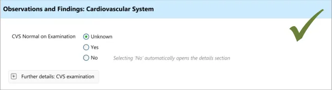
4.3.1 Accessing Hidden Fields
The UI must allow the clinician to quickly and easily access hidden fields.
Page 31
Copyright ©2013 Health and Social Care Information Centre
HSCIC Controlled Document
Desk Research:
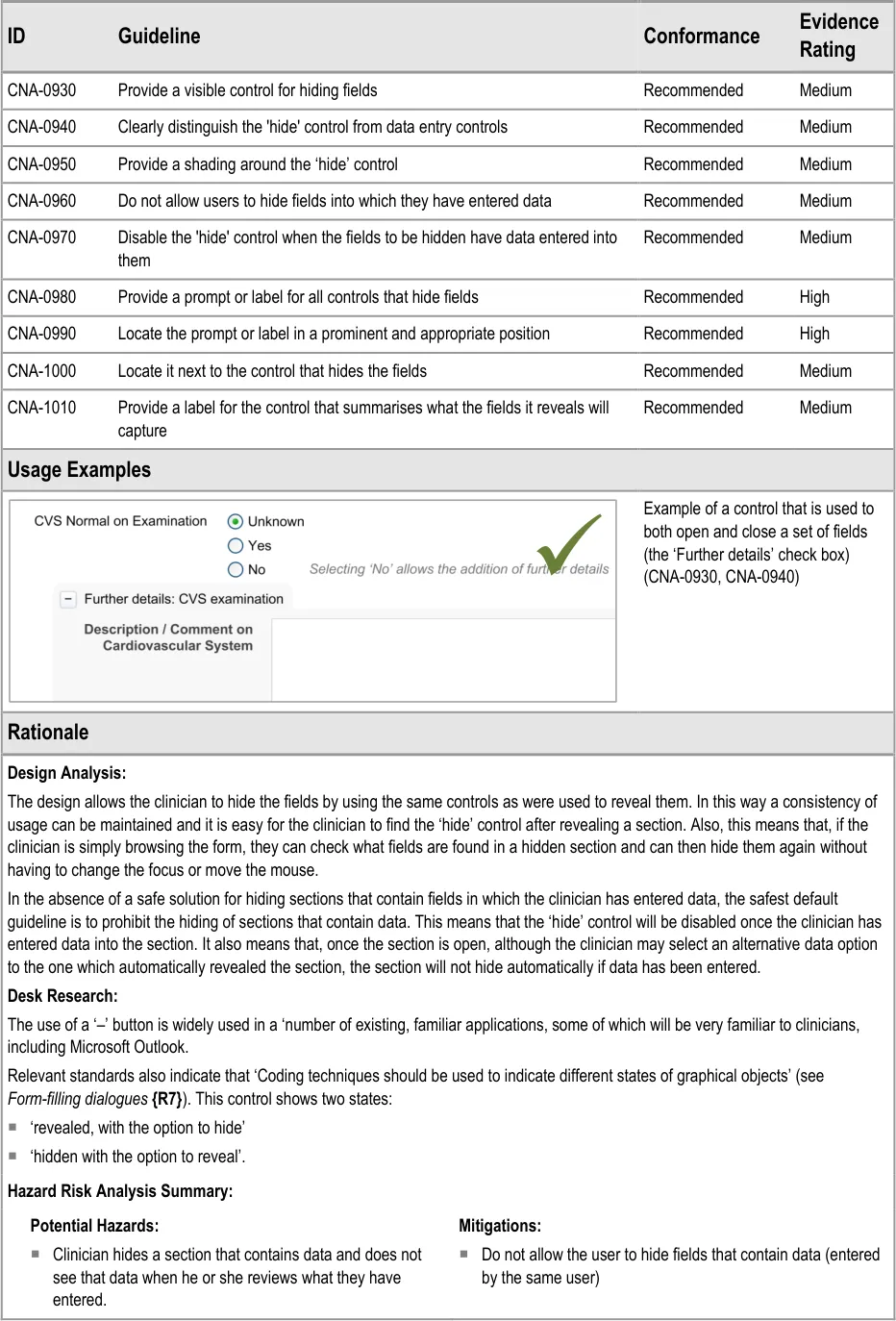
The mechanism for revealing the hidden fields has precedence in a number of existing applications, some of which will be very familiar to clinicians. A good example is the ‘+’ button in Microsoft Outlook, a popular desktop email application through which NHSmail can be accessed.
Additionally, the automatic revealing of fields through a data selection is a common feature on many desktop and Web applications, many of which will be familiar to clinicians.
Indeed this feature is recommended by relevant international standards which state that ““if/then” interdependency rules among entry fields” should either be avoided or should ”automatically be handled by the system by constraining user choices and visible fields”. In this way the form hides fields until a data selection logically implies that these fields should be completed and the UI automatically reveals the fields {R7} . A further standard also supports the notion of hiding options that are not relevant to the user at a given point in time, which states that if “information concerning unavailable options is not required for the task”, then “only options available to the user should be presented” {R6} .
User Research:
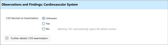
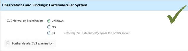
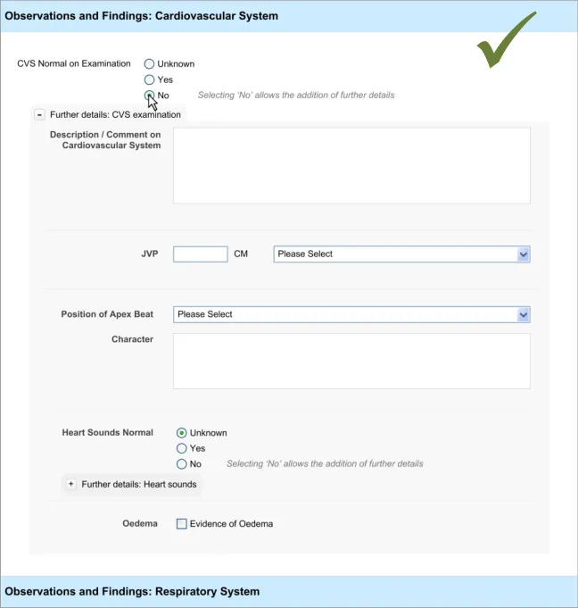
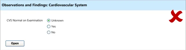
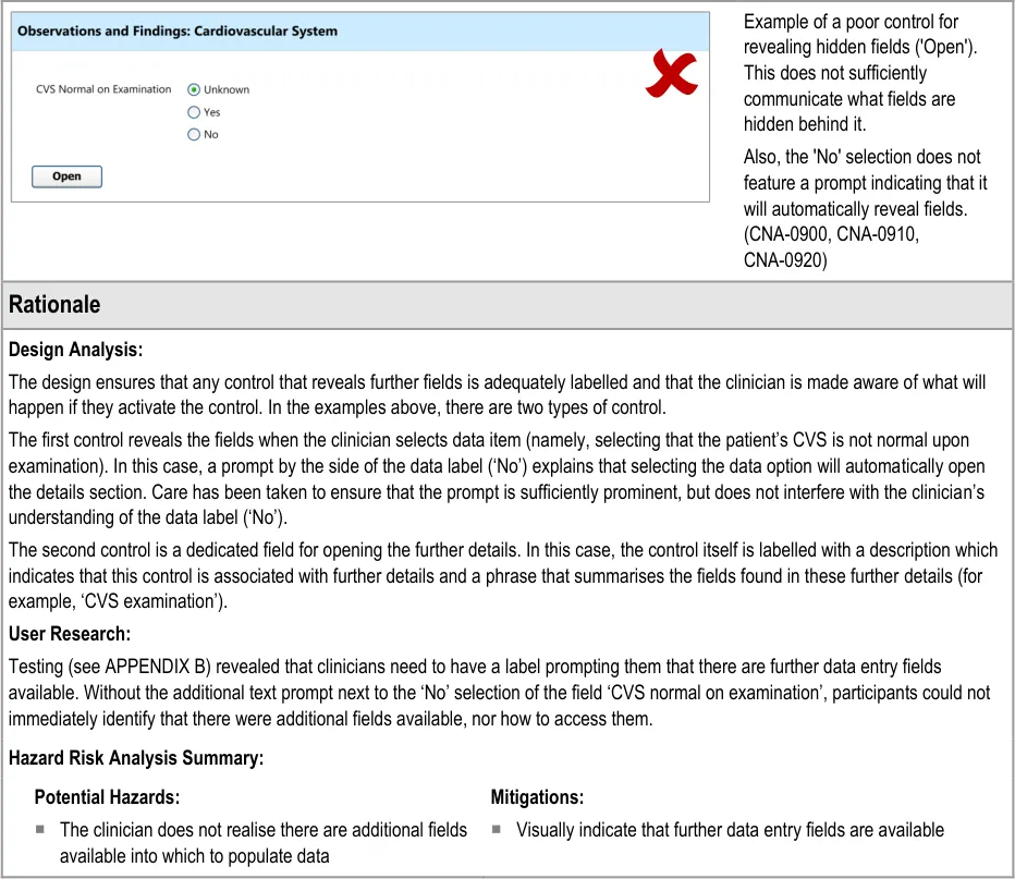
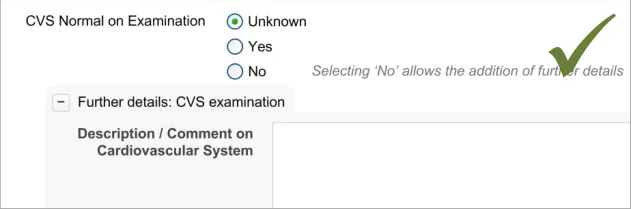
Testing (see APPENDIX B) revealed that just making a data selection was not sufficient and that the dual route to revealing fields was necessary in order to be usable. Participants indicate that they did not want to be forced to make a data selection in order to see what fields could be made available to them. However, they did understand how to open fields automatically by selecting ‘No’ (for the field ‘CVS normal on examination’)
4.3.2 Communicating That There Are Hidden Fields
The first requirement for revealing hidden fields is to communicate to the clinician that there are hidden fields which may be revealed. If the UI does not communicate that there are hidden fields, then the clinician may not be aware that such fields exist and may not find them. The existence of the fields should be communicated along with a brief description of what the topic the fields cover.
This section addresses how this should be done in a basic manner, which conforms to traditional electronic form design (for details of traditional electronic form designs, see Essential guide to user interface design {R21} ).
Page 32
Copyright ©2013 Health and Social Care Information Centre
 HSCIC Controlled Document
Page 33
Copyright ©2013 Health and Social Care Information Centre
 HSCIC Controlled Document
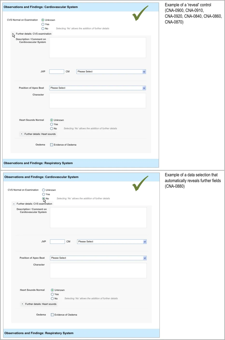
4.3.3 Hiding Fields
Upon opening a section of fields, the clinician may decide not to enter any details into that section, and then hide those fields again, in order to focus on other fields.
This will be an important action as, if the clinician cannot hide fields after opening them, the form could become overwhelming and unwieldy.
This section of the guidance addresses how sections of fields can be hidden. It is worth noting that the solutions explored in this section are limited in that they do not explore how a section of fields can be hidden even if data has been entered into one or more of its fields. The designs shown in the current guidance assume the safest default position; namely that if a section contains any data entered by the clinician, it cannot be hidden. Also, the current design guidance does not explore the automatic hiding of data fields, which could, if a safe solution is found, improve the clinician’s experience by reducing the numbers of actions required.
Future design research could identify a safe solution that allows fields to be hidden, manually or automatically, even if data has been entered into them, but this is not covered in the current design guidance.
Page 34
Copyright ©2013 Health and Social Care Information Centre
HSCIC Controlled Document
Page 35
Copyright ©2013 Health and Social Care Information Centre
HSCIC Controlled Document
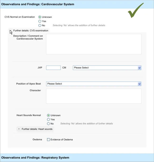
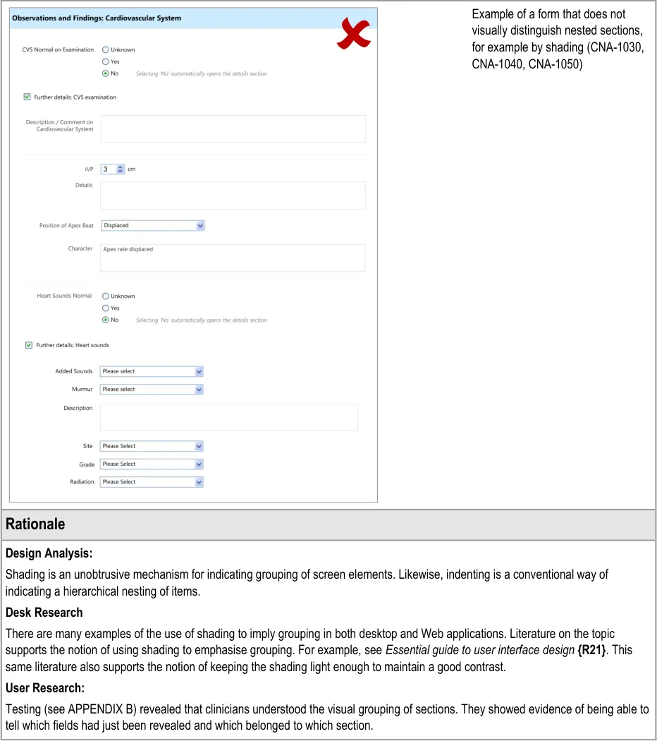
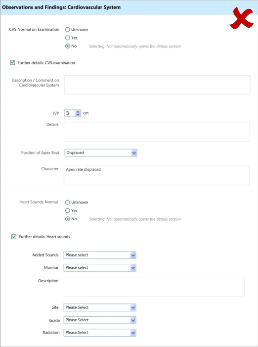
4.3.4 Displaying Hierarchically Nested Fields
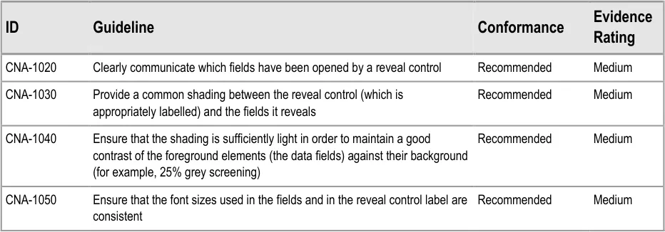
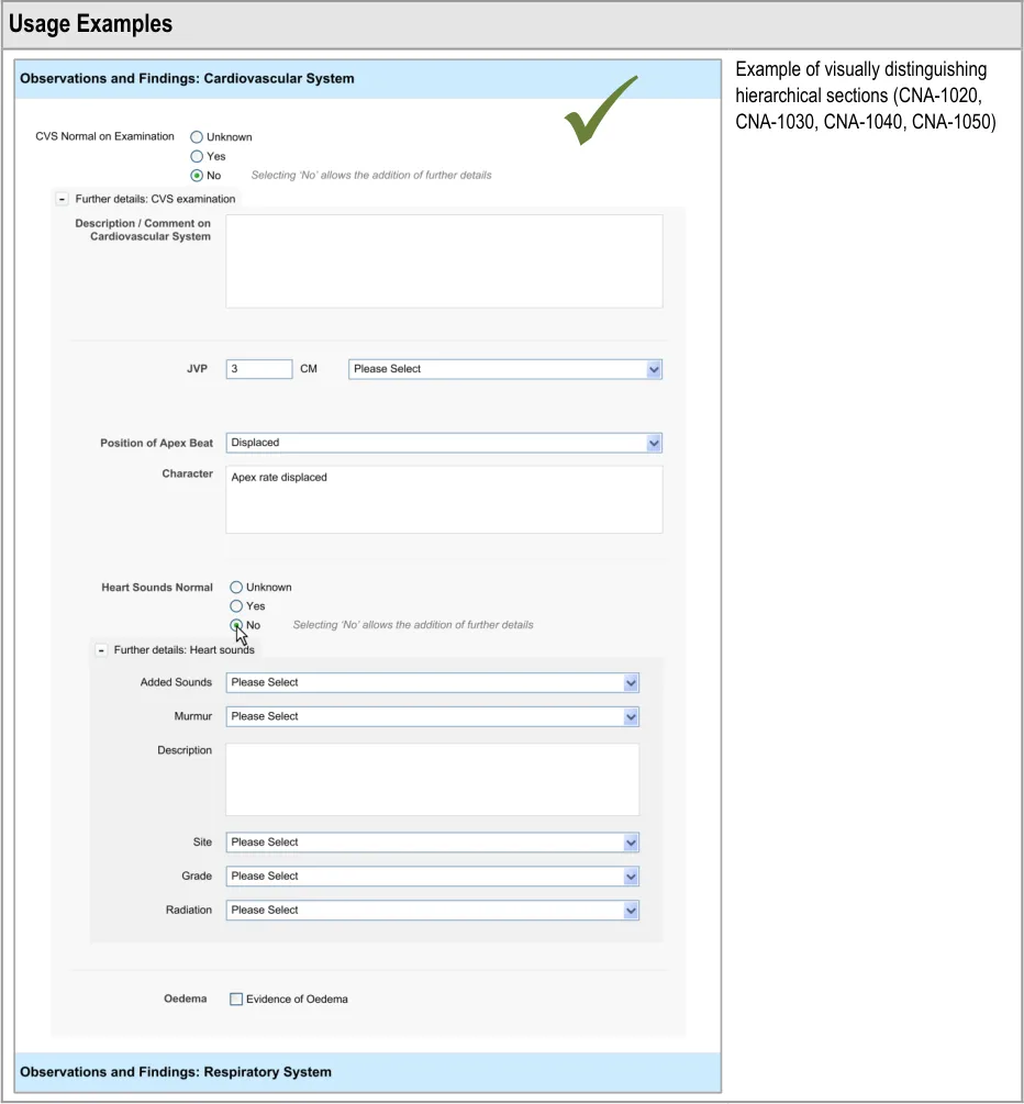
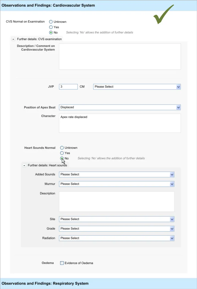
Where there is a section of fields that is located within another section, it may be important to communicate the hierarchical structure so that clinicians can easily orientate where they are in the form and to understand which fields will be hidden if they activate a given ‘Hide’ control. Failure to adequately communicate which fields will be hidden by activating a ‘hide’ control could result in confusion on the part of the clinician and accidental hiding of relevant fields.
This section of the guidance addresses how to communicate that one set of fields is ‘nested’ within another.
Page 36
Copyright ©2013 Health and Social Care Information Centre
HSCIC Controlled Document
Page 37
Copyright ©2013 Health and Social Care Information Centre
 HSCIC Controlled Document
Page 38
Copyright ©2013 Health and Social Care Information Centre
HSCIC Controlled Document
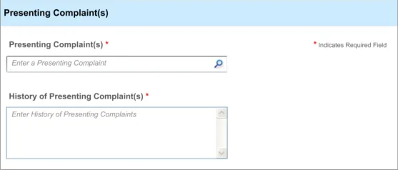
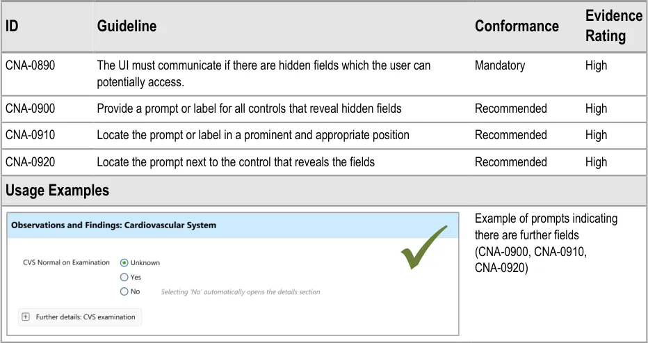
5 REQUIRED FIELDS
5.1 Introduction
In clinical noting, as in most data entry tasks, there will be data fields that the relevant authority will deem to be necessary for the data author to address; that is, they must provide a selection or enter text for that field. These fields are often referred to as ‘required’ fields and must be completed in order for the data to be successfully saved to the record.
The current guidance is limited to situations where:
-
Only a proportion of the total available fields are ‘required’
-
There is a linear sequence of fields (and an accompanying tabbing order)
-
Logically, the clinician can complete fields further in the sequence without having
completed a required field
- Clinicians need some degree of flexibility when completing the form
Where these conditions do not apply, other solutions may be applied that do not feature the designs outlined in this section.
The user requirements for this section of the guidance are:
-
The UI must be able to indicate to the user that one or more data fields are required
-
Ensure that users are aware if they have ‘missed’ one or more required fields
Note
‘Missed’ is defined in terms of the user addressing other fields that are positioned later in the tabbing order.
5.2 Principles
The following key principles inform the guidance in this section:
- Screen design heuristics:
Visibility of system status
Flexibility and efficiency of use
User control and freedom
Match between system and the real world
Recognition rather than recall
-
Do not overly restrict clinicians’ freedom to complete the form in the way they want
-
Do not obstruct the clinician’s primary tasks
-
Ensure that the clinician is aware of which fields are required and which are not
-
Do not rely upon clinicians to remember which field(s) they have missed
Page 39
Copyright ©2013 Health and Social Care Information Centre
HSCIC Controlled Document
5.3 Guidelines
This guidance comprises two main areas:
-
Proactively indicating required fields
-
Reactively indicating required fields that have been missed
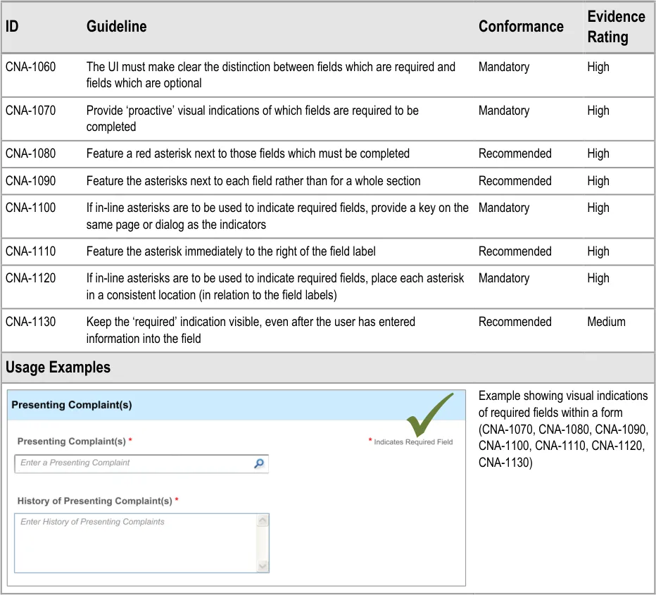
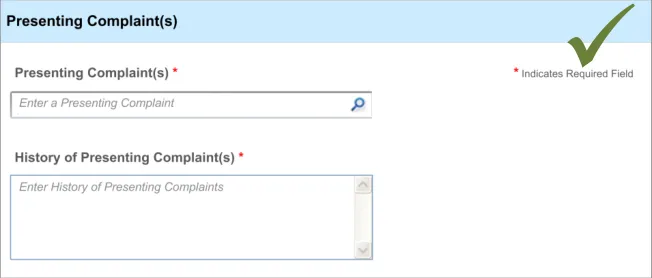
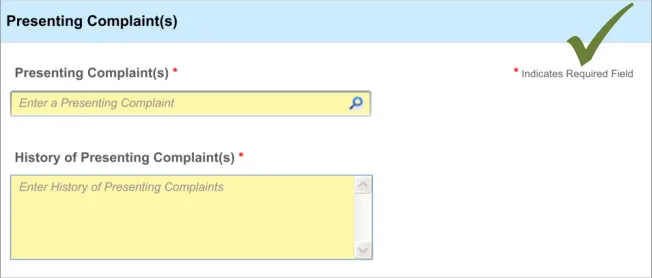
5.3.1 Proactively Indicating Required Fields
When clinicians are faced with a set of fields, some of which are required, the UI must distinguish ‘up front’ which ones are required and which are not.
This ‘proactive’ indication of required fields contrasts with a ‘reactive’ indication of required fields that have been missed. ‘Reactive’ is when the UI indicates an uncompleted required field only when the clinician attempts to move on. Reactive indication of required fields is discussed in the next guidance section.
Page 40
Copyright ©2013 Health and Social Care Information Centre
 HSCIC Controlled Document
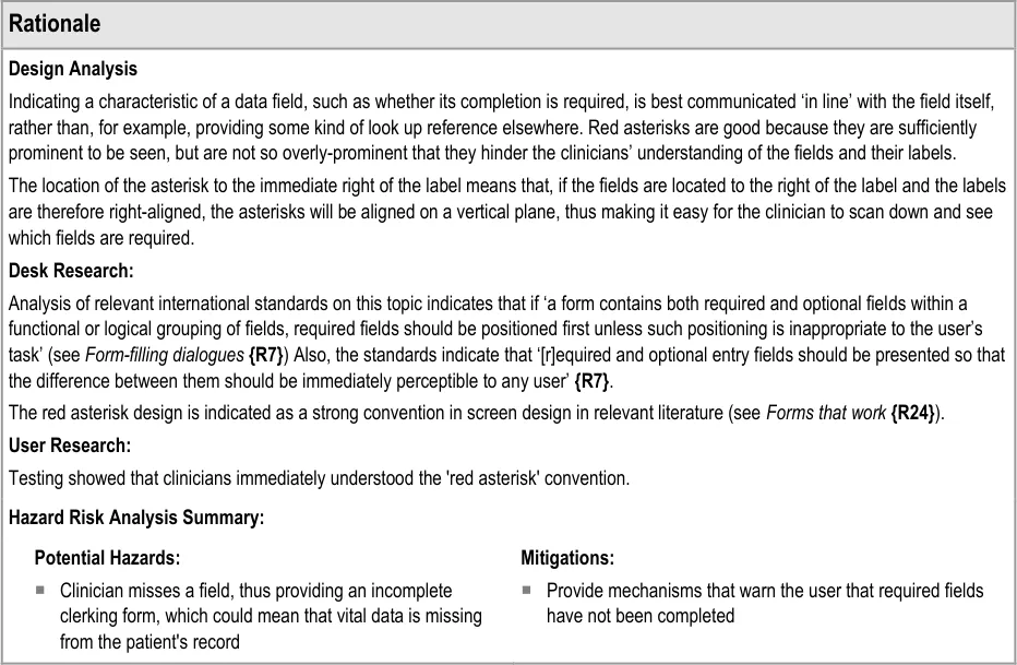
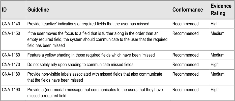
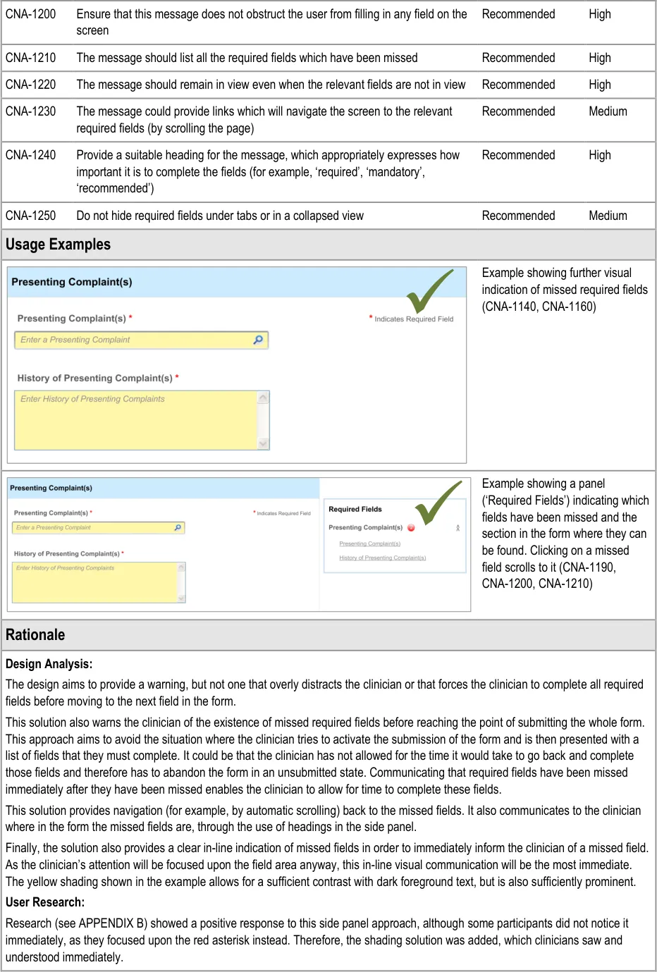
5.3.2 Reactively Indicating Required Fields That Have Been Missed
In addition to ‘proactively’ indicating required fields, and if the clinician is to be allowed some flexibility in the order in which they complete the form, the UI must also warn the clinician where they have missed out any required fields.
In this case, the term ‘missed’ refers to a situation where the clinician has not completed a required field and has moved the focus to a point beyond the field in the tabbing order.
This guidance has been written with the assumption that, at any specific point in the completion of the form, the required fields may not be visible. For example, in a form comprising ten pages, the clinician might be viewing page 8, although there is a required field that they have missed on page 2. Therefore, a mechanism may be required to indicate the fields that are required, which is not in-line with these required fields.
Page 41
Copyright ©2013 Health and Social Care Information Centre
HSCIC Controlled Document
Page 42
Copyright ©2013 Health and Social Care Information Centre
HSCIC Controlled Document
Hazard Risk Analysis Summary:
Potential Hazards:
If clinicians are forced to complete required fields at the end of
the admissions clerking process, rather than as they go along. Risk that clinicians are forced to close the form without saving it because they do not have time to go back and search for the fields which are missing data
If clinicians are unable to skip past required fields whilst
populating the form with data
Mitigations:
Encourage users to complete required fields as they
progress through the form, although without forcing them to do so
Indicate to users that a missed field is required whilst
allowing them to progress and navigate through the form
Page 43
Copyright ©2013 Health and Social Care Information Centre
HSCIC Controlled Document
6 DISPLAYING PREVIOUS VALUES
6.1 Introduction
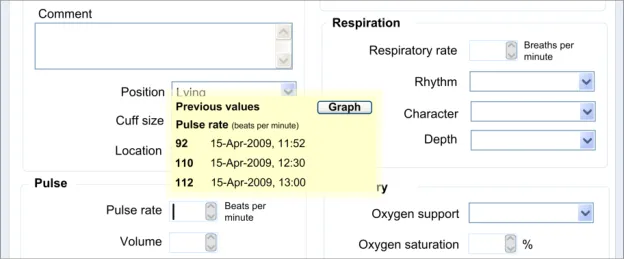
At the point of entering new data about a patient, it may be useful for the clinician to be able to see any previous instances of the same type of data. For example, if the clinician is about to enter the patient’s pulse rate, it could be useful to see the previous pulse rate entries for that patient.
This contextual information may influence the clinician’s actions:
- They may change line of questioning or examination that they perform with the patient.
Obviously this is only applicable if the clinician is entering the notes at the same time as the examination.
- They may search for other data from the patient’s record in order to help their interpretation
of the data. For example, they may access the patient’s vital signs chart in order to see the full trend of the data.
Therefore, it will be useful to display the last few values of a type of data as the clinician is about to enter a new value.
Note
This feature is not intended to replace the graphical display of a full set of values; instead it is only aiming to provide a limited window onto the most recent values.
Moreover, this guidance focuses upon the display of numerical values. Potentially this guidance could apply to other types of data, such as descriptions of illnesses, but this has not been explored in the designs nor in the research, and therefore any application of this guidance to non-numerical data must be accompanied by further design and testing in order to ensure patient safety.
The user requirements for this section of the guidance are:
- Ensure that the user can access a sequence of recent values when entering the current
value into a field (for example, the last three values)
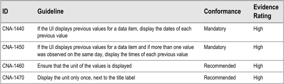
- Ensure that the dates and/or times of the previous values are clearly indicated when they
are being displayed
- Ensure that the order in which the previous values have been recorded is clearly evident
to the user
-
Indicate that the data displayed may only be a proportion of the total data available
-
Link to historical data or a graphical representation
6.2 Principles
The following key principles inform the guidance in this section:
- Screen design heuristics:
Recognition rather than recall
Aesthetic and minimalist design
-
Do not obstruct the clinician’s primary tasks
-
Values must be displayed with sufficient context to be meaningful and unambiguous
-
Provide the clinician with sufficient context which may influence what questions they ask
Page 44
Copyright ©2013 Health and Social Care Information Centre
HSCIC Controlled Document
6.3 Guidelines
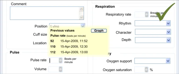
This section addresses how to display the previous values at the point at which the clinician is about to enter a new value. In the current designs, this point is defined as the point at which the focus moves into the relevant field.
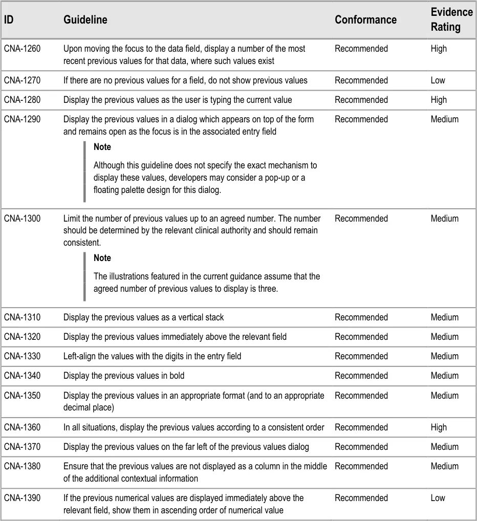
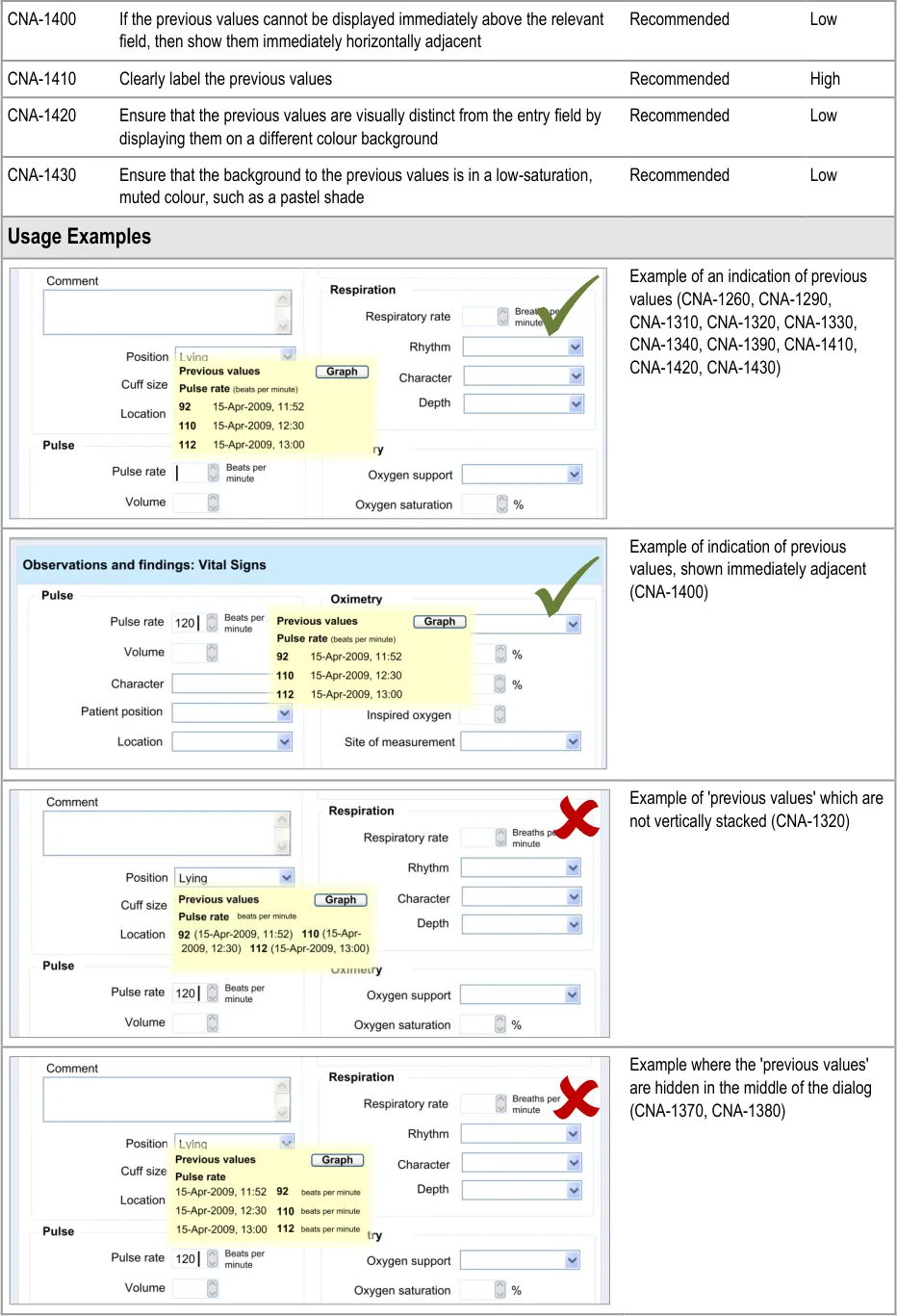
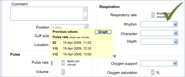
In the examples shown below, the number of previous values shown has been set at three. However, this is an arbitrary number, and the guidance urges that the number of previous values shown be determined by an appropriate clinical authority, which accounts for the specific clinical contexts.
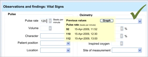
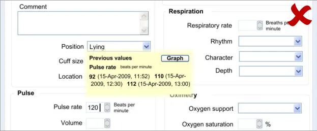
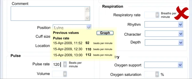
6.3.1 Displaying Previous Values
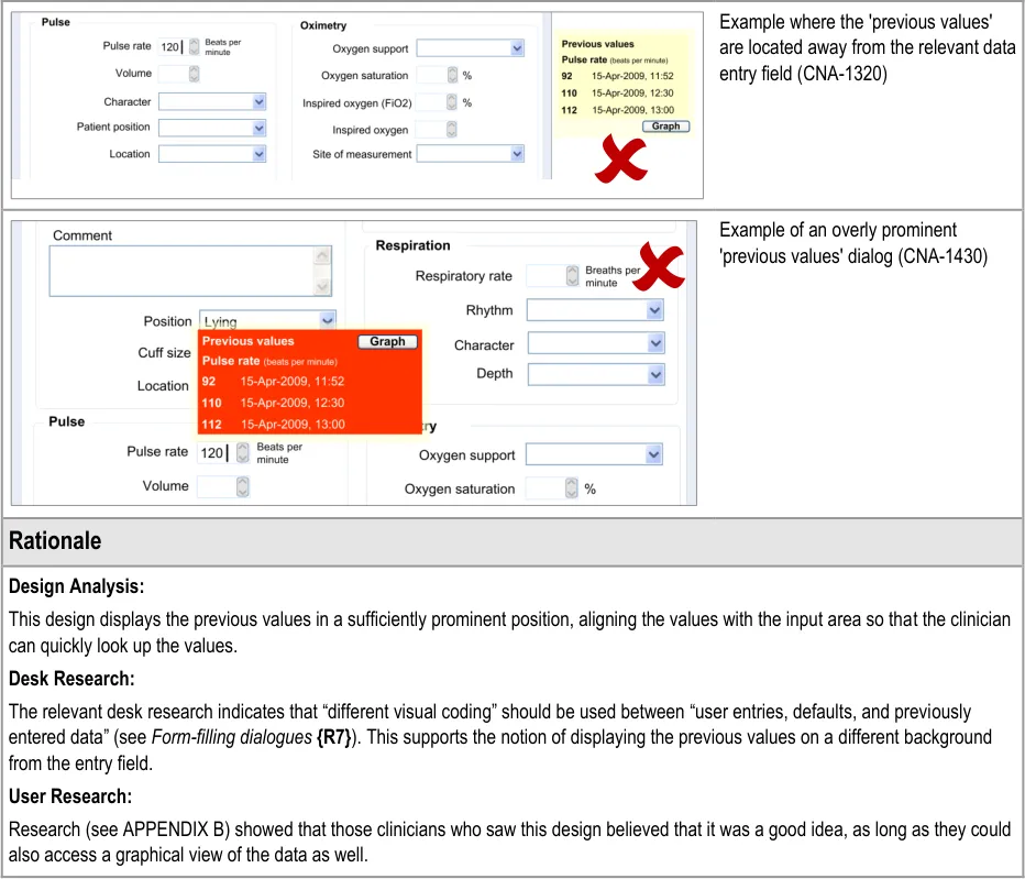
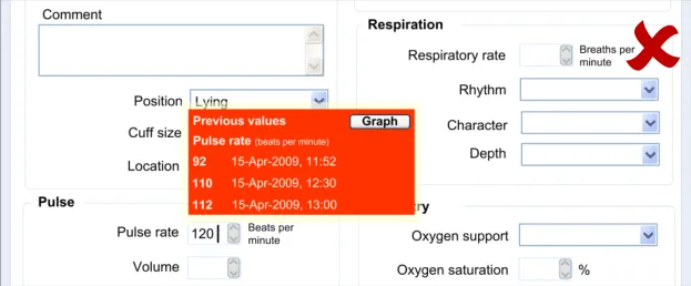
This guidance area is focused on how to make previous values known to the clinician in a way that aids the clinician without detracting from the process of recording the new data values.
Page 45
Copyright ©2013 Health and Social Care Information Centre
HSCIC Controlled Document
Page 46
Copyright ©2013 Health and Social Care Information Centre
HSCIC Controlled Document
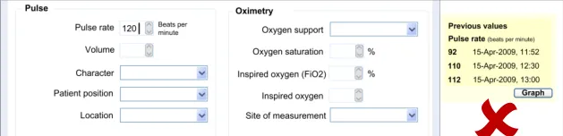
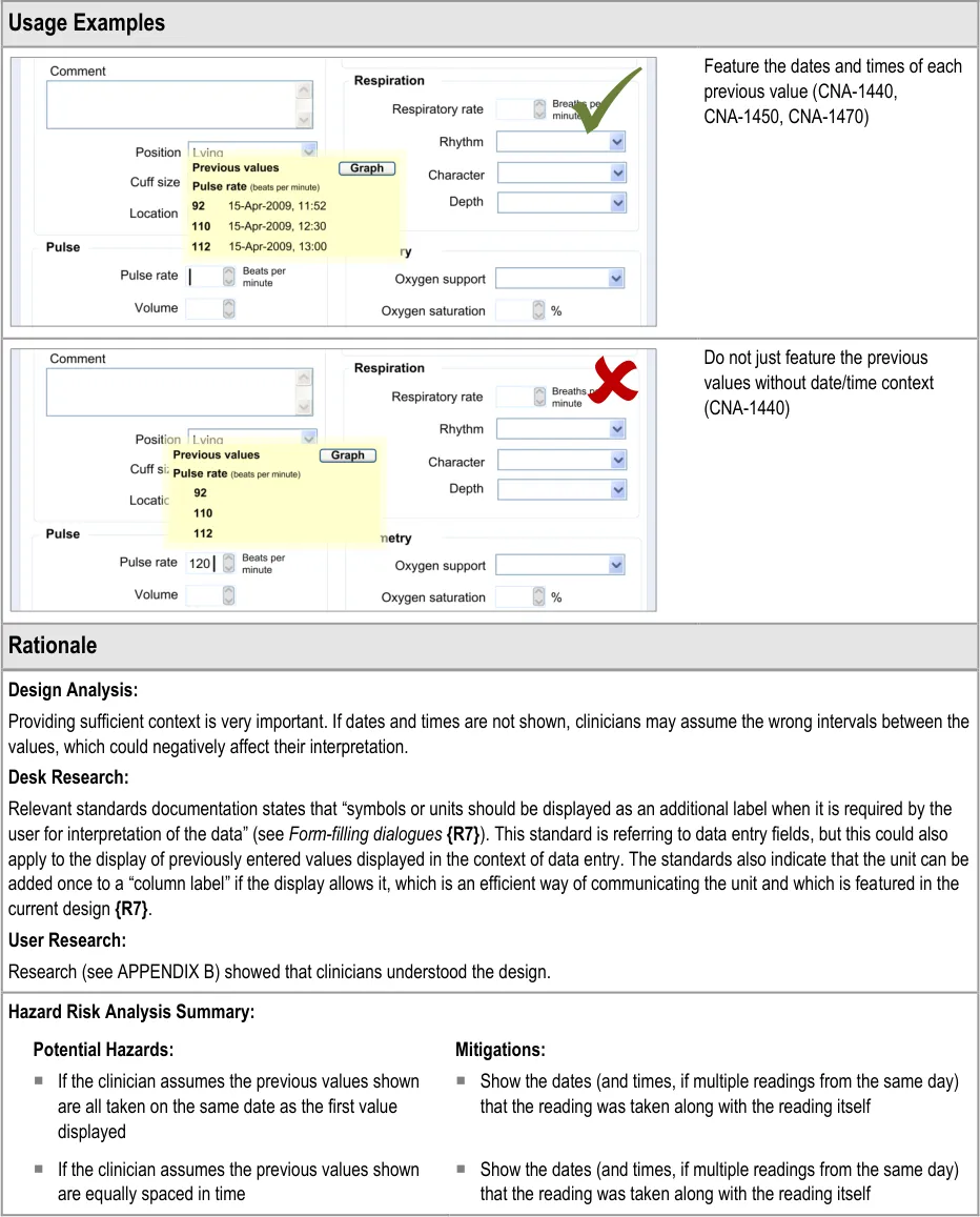
6.3.2 Contextual Attributes to Display for Previous Values
In addition to displaying the previous values, there is a requirement to display information about the context in which the previous values were recorded. This provides valuable meaning about the values, and reduces the likelihood that they are misinterpreted; a value without a date or time is fairly meaningless.
Copyright ©2013 Health and Social Care Information Centre
Page 47
HSCIC Controlled Document
Page 48
Copyright ©2013 Health and Social Care Information Centre
HSCIC Controlled Document
7 AUTOMATIC CALCULATIONS DATA
7.1 Introduction
Within clinical noting, there will be many occasions where values, such as scores, can be automatically calculated by the system in order to reduce the clinician’s workload. For example, a Body Mass Index (BMI) score could be instantly calculated by the system, thus saving the clinician the vital seconds it would take them to manually calculate the score.
This feature becomes more important where the scoring system is more complex and there is more room for errors to be made. Calculating an early warning score is an example where the calculations are more complex and where the implications of miscalculation could be quite dangerous.
Other situations where values could be automatically calculated include the calculation of an end date, if the start date and duration have been entered by the clinician. This would prevent the entry of inconsistent data, which could happen if the clinician were to enter all three data.
The guidance outlined in this section applies only to use in traditional form design. It does not preclude different displays in other more innovative clinical noting interfaces. Also, the features relating to displaying details of a score only apply where a score has been calculated. Such a feature may not be necessary. For example, where an end date has been calculated from a start date and duration, this calculation would be fairly obvious and would not require further explanation.
The second half of this guidance addresses another important feature: communicating to the clinician that a score has been calculated, but owing to missing data, the system has had to make assumptions about the value of the missing data. This can be useful in that it could encourage the clinician to enter this missing data. It is also useful in those situations where a ‘partial’ score is more informative to the clinician than no score.
The user requirements for this section of the guidance are:
- Ensure that the user is aware when a value has been calculated by the system rather than
having been entered by the user
- Communicate to the user the data that has been used to calculate the automatically
calculated value
- Communicate both the field labels and the values of the data which contribute to the
calculated value
- Provide sufficient information to communicate the location of data items used in the
calculation (for example, in the form, in the record)
- Provide a mechanism that allows the user to easily access the data that has been used to
calculate the automatically calculated value
- Allow the user to identify where there are missing values that affect the calculation of a
derived value
- Ensure that the UI can cope with both simple and complex calculations
Page 49
Copyright ©2013 Health and Social Care Information Centre
HSCIC Controlled Document
7.2 Principles
The following key principles inform the guidance in this section:
- Screen design heuristics:
Visibility of system status
Consistency and standards
Help and documentation
- Clinicians must be aware of the relationship between values that they have entered and
values that have been calculated
- Clinicians must be able to easily find out more information about a value, if appropriate and
available
7.3 Guidelines
This guidance comprises two main areas:
-
Displaying calculated values
-
Displaying scores where values are missing
7.3.1 Displaying Calculated Values
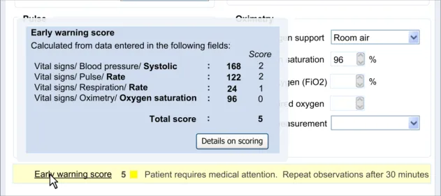
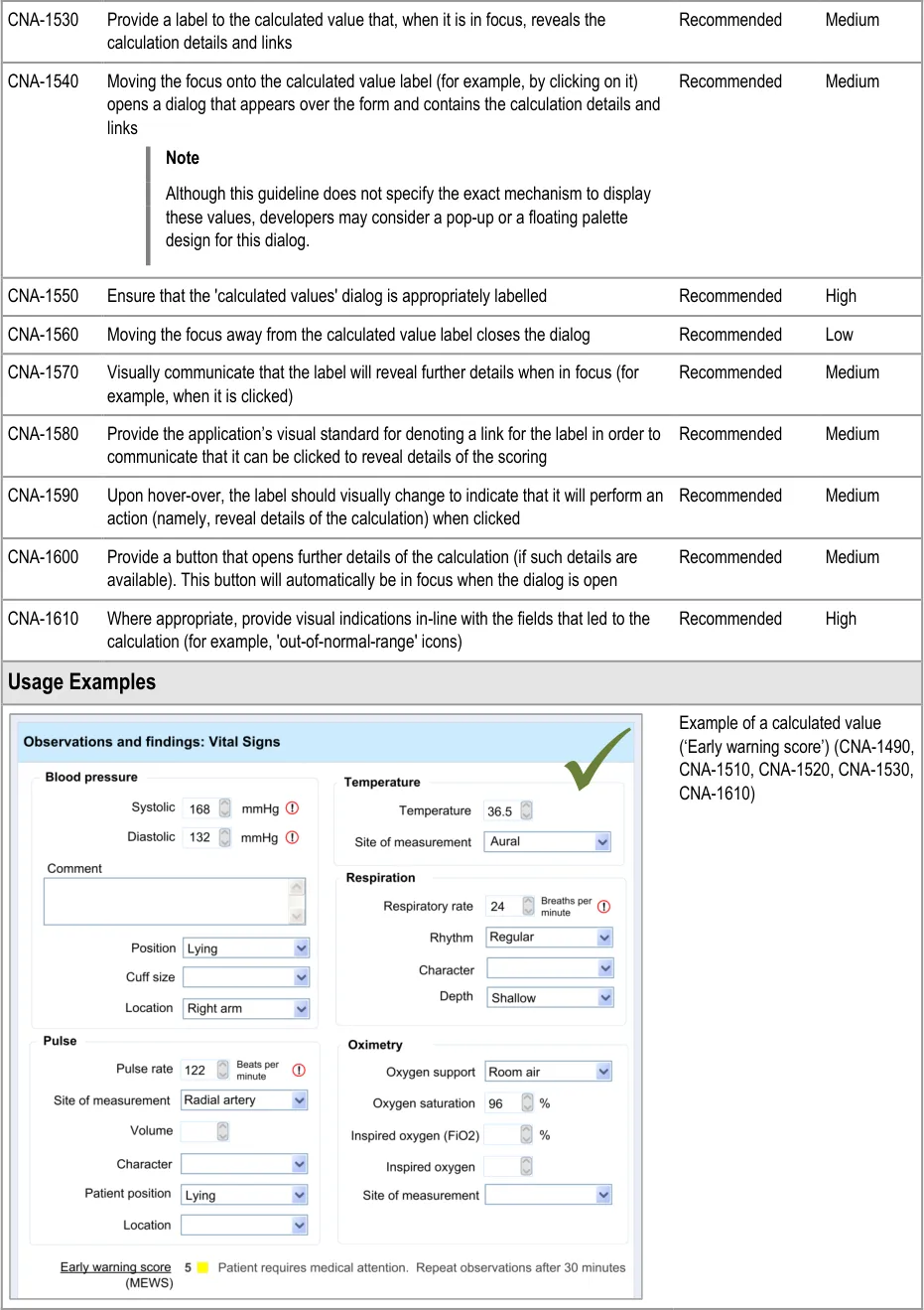
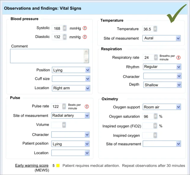
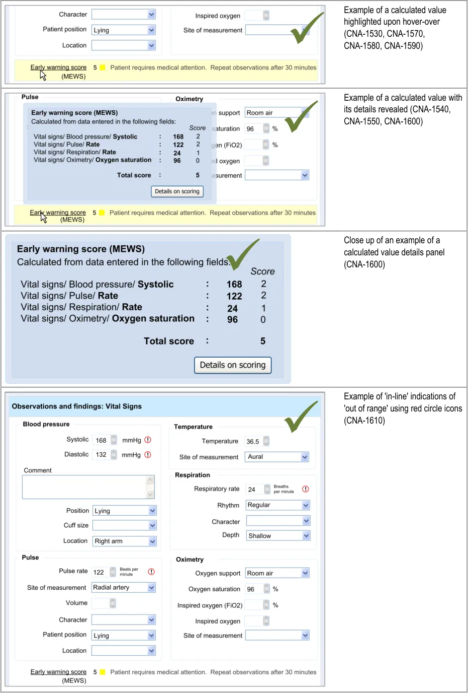
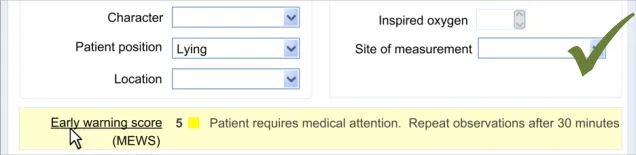
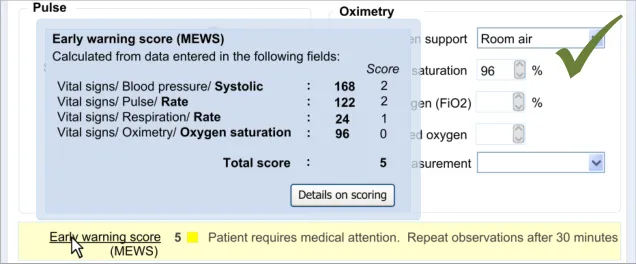
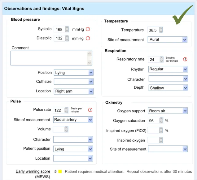
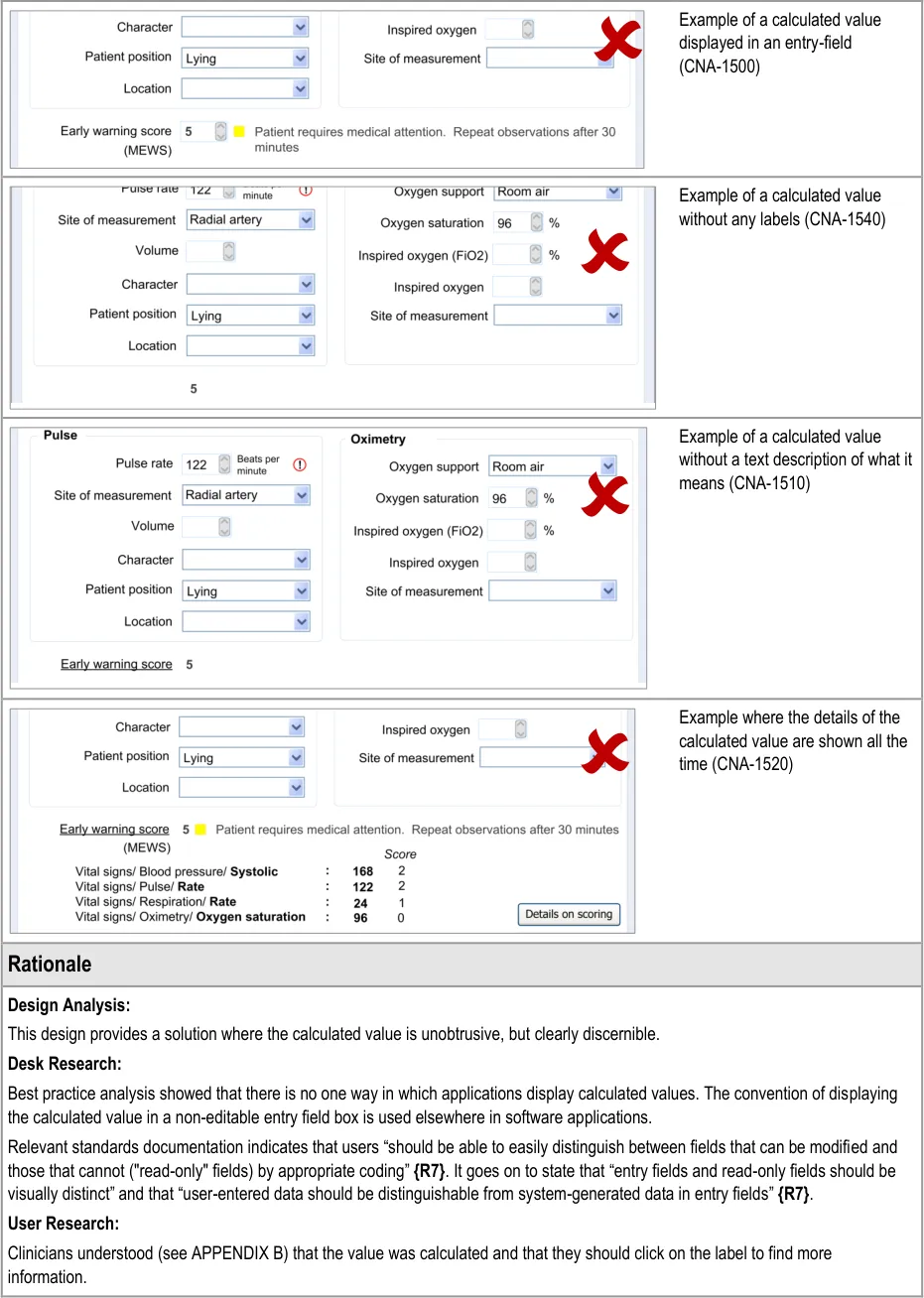
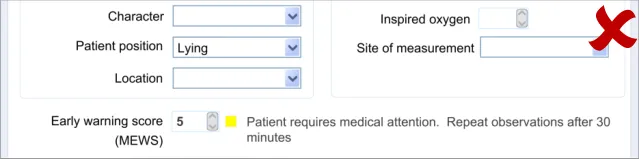
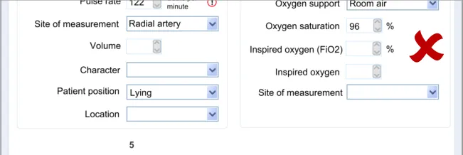
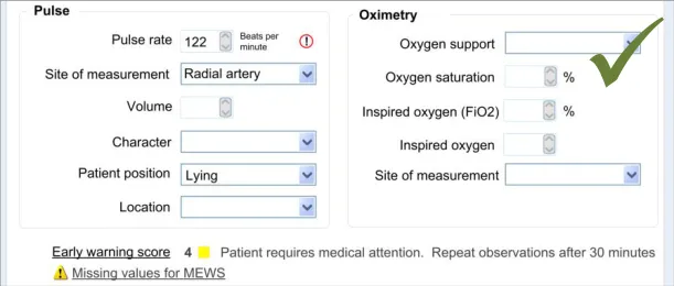
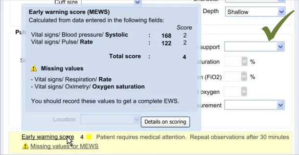
In this section, the guidance addresses the mechanisms required to distinguish calculated values from user-entered values. It also addresses how the UI can communicate how the value was calculated and, importantly, which input values contributed to the calculated value (including an indication of where these entry fields are located).
This is particularly important as it not only provides meaning to the calculated value, but it also teaches the clinician which values must be entered in order for the system to calculate the value. It also helps clinicians to go back and check the input values if they want to question the calculated value.
Further details about the calculated value, which could typically be a score, could also be displayed. For example, in the case of displaying an early warning score or a Glasgow Coma Scale score, the UI could also show the normal value ranges and any other ranges available.
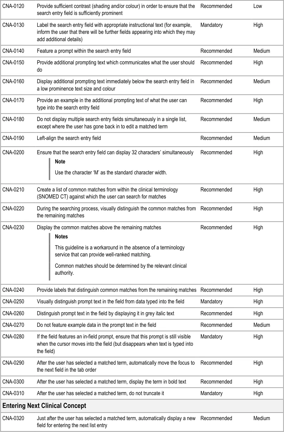
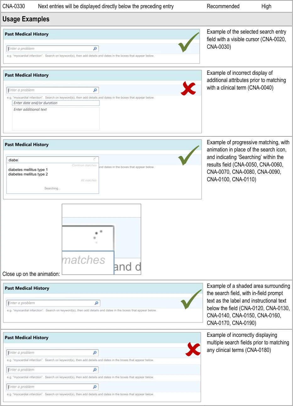
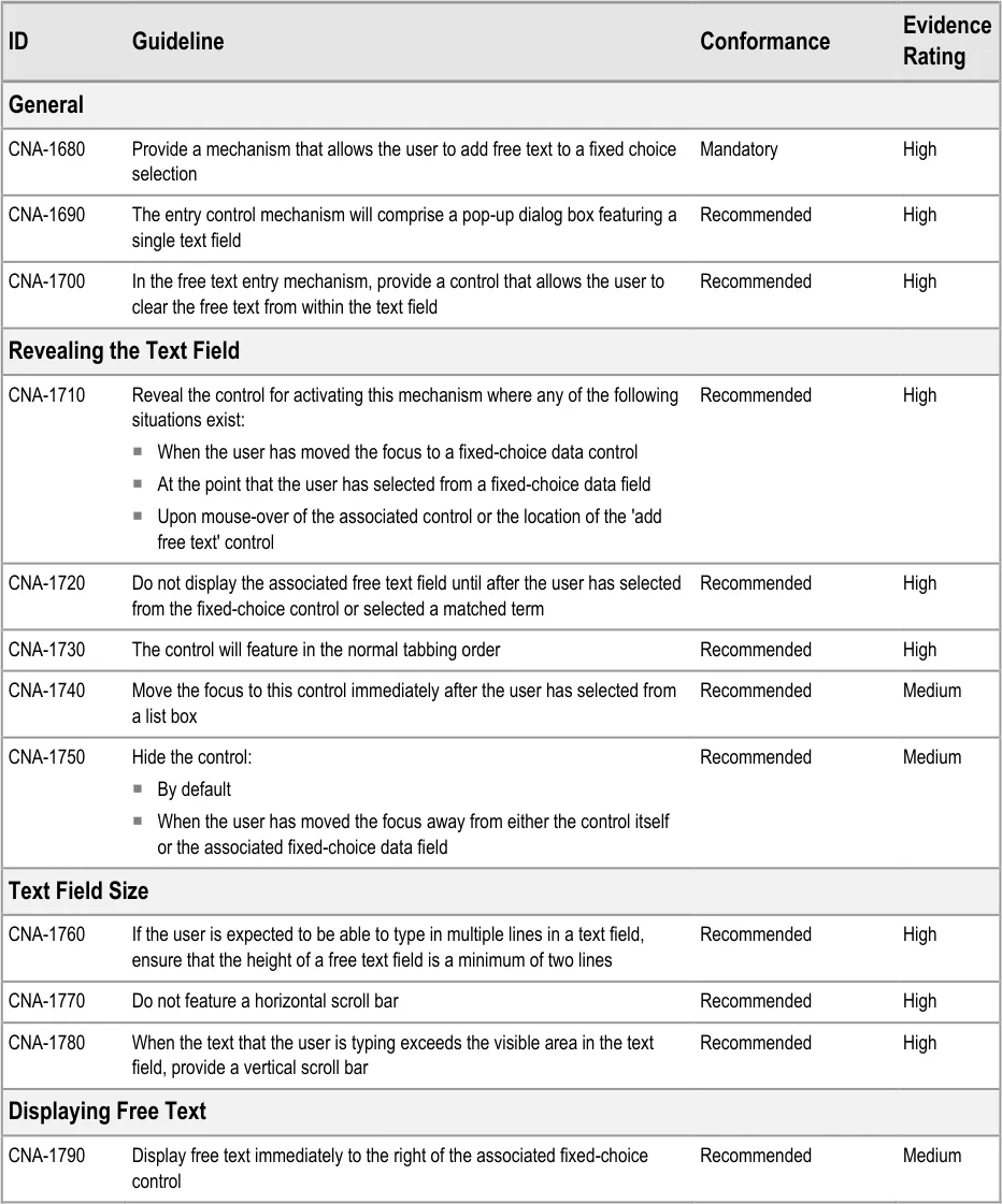
| Col1 | Evidence ID Guideline Conformance Rating |
|---|---|
| CNA-1480 The UI must make clear the distinction between values which have been directly entered by the user and values which have been calculated by the system Mandatory High | |
| CNA-1490 Display calculated values in bold Recommended Medium | |
| CNA-1500 Do not display calculated values in an editable field Recommended Medium | |
| CNA-1510 Where appropriate, provide text that briefly explains the meaning of the calculated value (for example, if the value is a score, indicate the clinical meaning of the score) Recommended High | |
| CNA-1520 Where appropriate, provide access to details of: Which values entered by the user have contributed to the calculation Which other values have contributed to the calculation In which fields and under which headings were the values entered The scoring system applied (if appropriate) Link(s) to further details about the calculation (if appropriate) Recommended High |
Page 50
Copyright ©2013 Health and Social Care Information Centre
HSCIC Controlled Document
Page 51
Copyright ©2013 Health and Social Care Information Centre
 HSCIC Controlled Document
Page 52
Copyright ©2013 Health and Social Care Information Centre
HSCIC Controlled Document
Page 53
Copyright ©2013 Health and Social Care Information Centre
HSCIC Controlled Document
Hazard Risk Analysis Summary:
Potential Hazards:
If the calculation method employed is not obvious (for
example, type of Early Warning Score) clinicians may misinterpret the calculated value
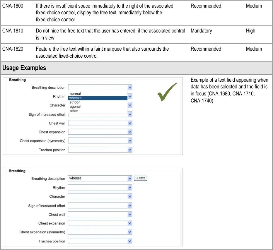
Mitigations:
Where appropriate, provide access to the type of scoring
system applied
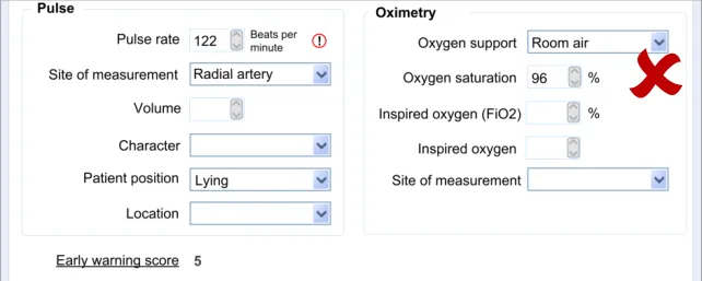
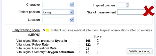
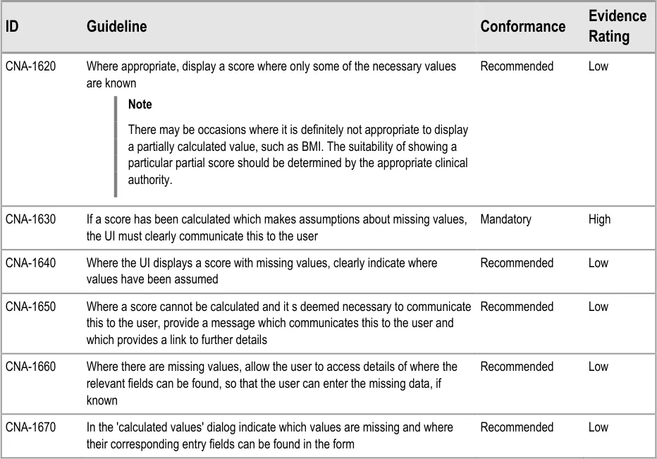
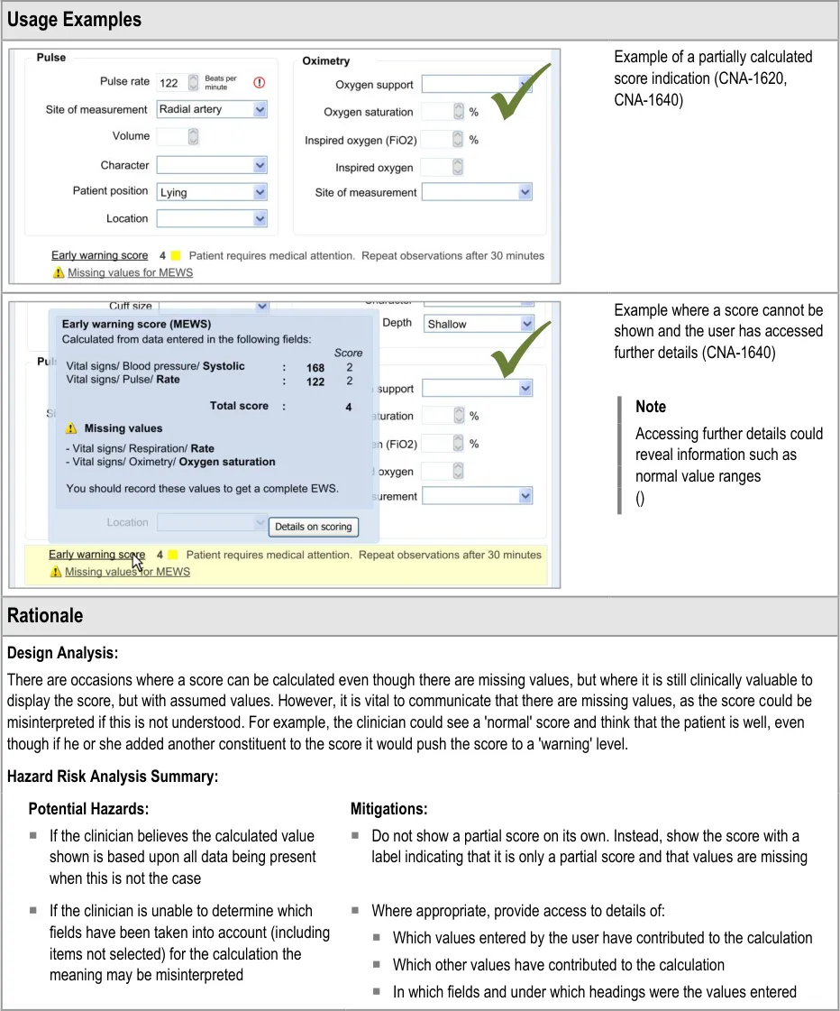
7.3.2 Displaying Scores Where Values Are Missing
In certain situations, an automatic calculation, such as a score, can and should be calculated even if there are values missing that would ideally contribute to the calculated score.
In these situations, one option would be to indicate that the score cannot be calculated owing to missing values. Where it is deemed useful to do so, the UI should indicate that a score could not be calculated and allow the clinician to access a dialog that specifies where the relevant data entry fields can be found.
However, another option will be to calculate the score by substituting the missing values with assumed (default) values, while clearly communicating that values are missing. A default value could be, for example, the value representing ‘normal’ as part of an early warning score.
As often only some values of the potential full set will be known, it is important to be able to display partial scores in some situations.
Page 54
Copyright ©2013 Health and Social Care Information Centre
HSCIC Controlled Document
Page 55
Copyright ©2013 Health and Social Care Information Centre
HSCIC Controlled Document
8 ADDING FREE TEXT
8.1 Introduction
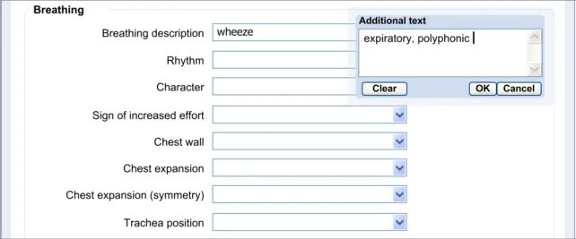
Completing an electronic admissions clerking form will be a relatively, if not completely, new experience for many clinicians, and an argument can be made that, in many circumstances selecting from fixed-choice options cannot match the extent of expression that is afforded by noting on paper. The relevant authorities may regularly increase the range of the fixed-choice options but, in the near future, it is unlikely that these fixed-choice options will be able to express all that the clinician wishes to express. There must be scope for the clinician to supplement the fixed-choice options and encoded matches with free text.
The clinician could wish to add free text to any fixed-choice option, and the interface should allow them to do this. This feature is addressed in the current section of the guidance.
This section of the guidance comprises four main areas:
-
Add free text
-
Display free text
-
Edit free text
-
Required or recommended free text fields
The user requirements for this section of the guidance are:
-
Allow the user to add free text to any fixed-choice or encoded data field in the form
-
Display any associated free text in a location that is visible and clearly associated with its
data item
-
Allow the user to delete the free text, but only before it has been committed to the record
-
Allow the user to edit the free text
-
Delete the free text if the user deletes the associated data item
-
Warn the user before deleting any free text
-
Allow the free text to remain if the user changes the data item
8.2 Principles
The following key principles inform the guidance in this section:
-
Match the flexibility of expression that clinicians currently have on paper
-
Screen design heuristics:
Match between system and the real world
User control and freedom
Flexibility and efficiency of use
Page 56
Copyright ©2013 Health and Social Care Information Centre
HSCIC Controlled Document
8.3 Guidelines
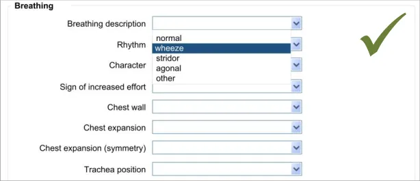
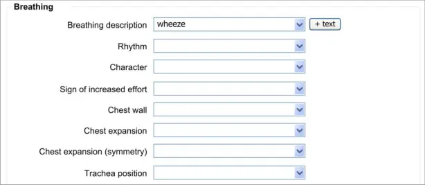
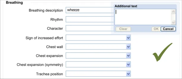
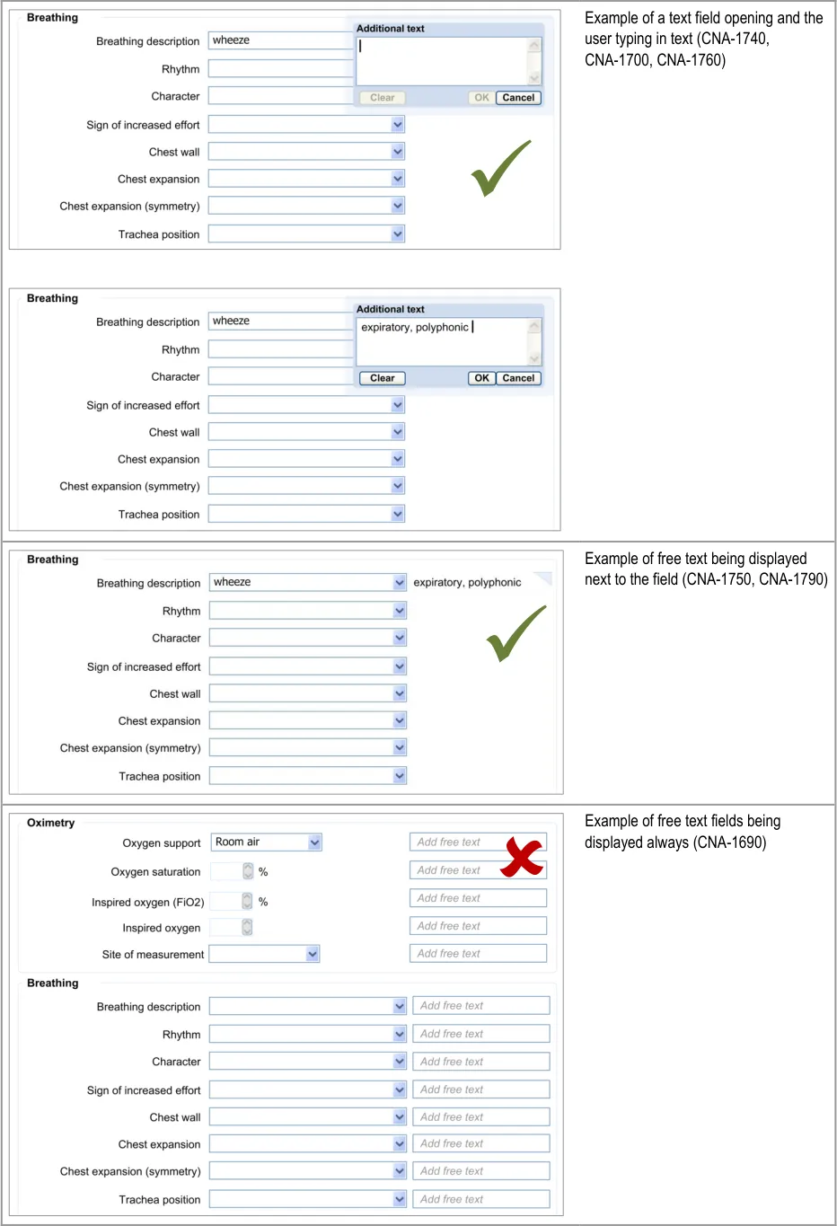
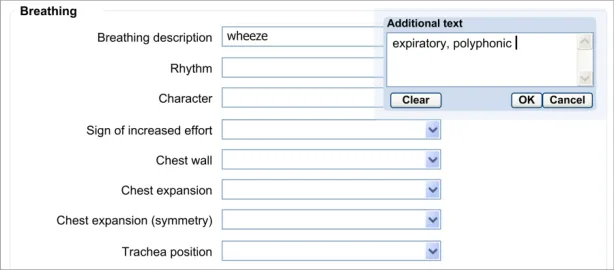
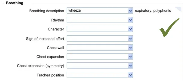
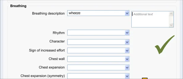
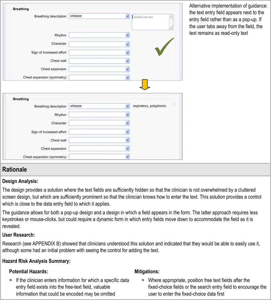
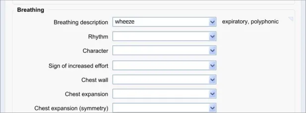
8.3.1 Add New Free Text
The approach taken by this guidance regarding adding new free text is to allow the clinician to enter the free text at the same point (or rather, just after) selecting from a fixed-choice data field or entering and selecting an encoded term. It is intuitive to feature the entry of free text ‘in-line’ with the fixed-choice data field it is elaborating.
Page 57
Copyright ©2013 Health and Social Care Information Centre
HSCIC Controlled Document
Page 58
Copyright ©2013 Health and Social Care Information Centre
 HSCIC Controlled Document
Page 59
Copyright ©2013 Health and Social Care Information Centre
HSCIC Controlled Document
8.3.2 Edit Free Text
After the clinician has added some free text to a fixed-choice data field, they must be allowed to go back and change that text before they save the form to the patient record. It could be that they have made a mistake, or that they have discovered some new information from the patient. It could be that they are new to the form and have typed some free text which is better recorded as a fixedchoice data item later in the form. Whatever the reason, the clinician must be able to quickly and easily edit this data.
The approach adopted by the current guidance combines the control for editing the free text with the field for displaying the free text, in order to make the action of editing intuitive to the clinician.
Page 60
Copyright ©2013 Health and Social Care Information Centre
HSCIC Controlled Document
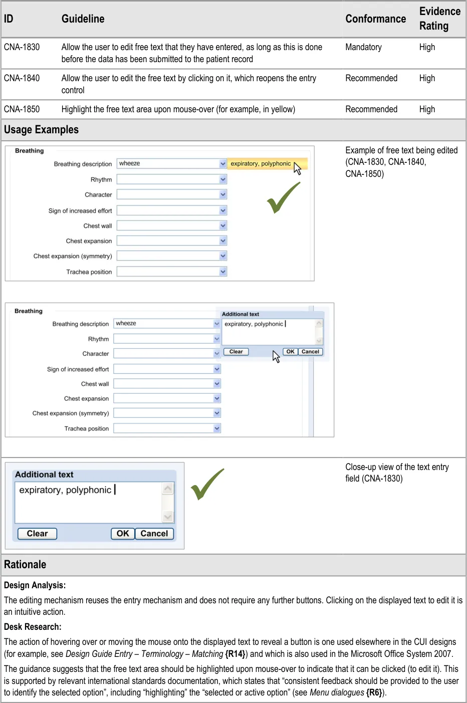
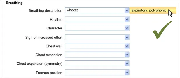
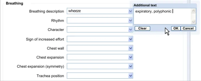
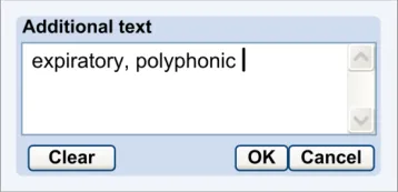
Page 61
Copyright ©2013 Health and Social Care Information Centre
HSCIC Controlled Document
User Research:
User research (see APPENDIX B) showed that clinicians understood that they could edit free text by clicking on it.
8.3.3 Required or Recommended Free Text Field
If the clinician is required to add some free text or, at least, is encouraged to do so, the free text field should be made immediately visible to the clinician. That is to say, in those situations where it is recommended that the clinician should type in some free text, do not require the clinician to perform an action for it to appear.
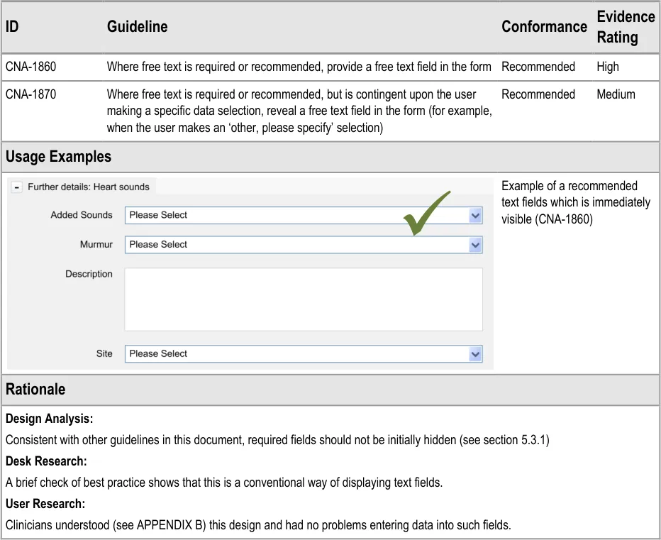
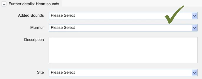
Copyright ©2013 Health and Social Care Information Centre
Page 62
HSCIC Controlled Document
9 GENERAL FORM DESIGNS
9.1 Introduction
In this section, the guidelines presented are based upon standard UI practice and should be followed by developers who are planning to employ standard data entry fields in their application. These guidelines are not exclusive to the healthcare informatics industry but have been chosen because they are applicable to healthcare applications.
9.2 Principles
The following key principles inform the guidance in this section:
-
Consistency
-
Minimal design
9.3 Guidelines
In this section, the guidelines focus upon:
-
How to use standard fields, such as check boxes and radio buttons
-
How to provide labels and prompts
9.3.1 Use of Standard Fields
These guidelines address how standard fields, including radio buttons, check boxes and drop-down list boxes should be implemented in a form.
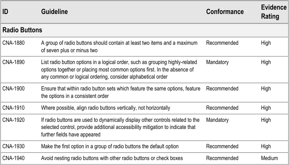
Page 63
Copyright ©2013 Health and Social Care Information Centre
HSCIC Controlled Document
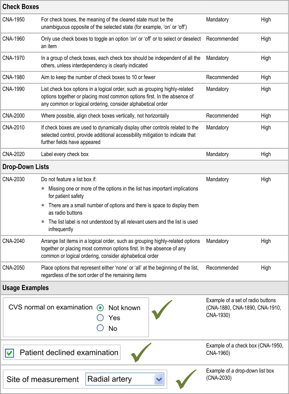
Page 64
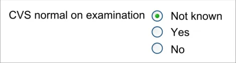
Copyright ©2013 Health and Social Care Information Centre
HSCIC Controlled Document
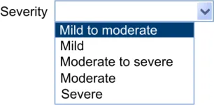
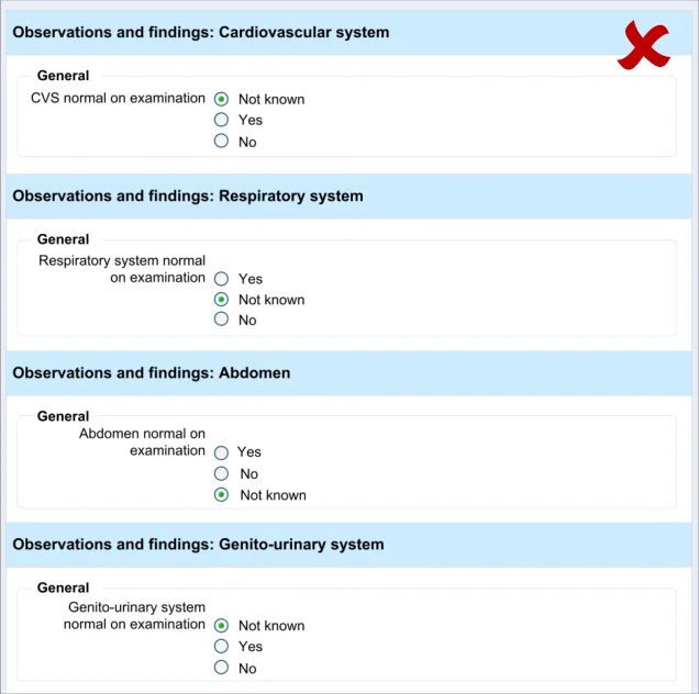
Page 65
Copyright ©2013 Health and Social Care Information Centre
HSCIC Controlled Document
9.3.2 Labels and Prompts
These guidelines address how labels and text prompts should be implemented in a standard form.
| Evidence ID Guideline Conformance Rating | Col2 |
|---|---|
| CNA-2060 Unless there is reason not to do so, use sentence-style capitalisation, that is to begin the sentence with a capital and then use lower case text unless there is cause to do otherwise Recommended Medium | CNA-2060 Unless there is reason not to do so, use sentence-style capitalisation, that is to begin the sentence with a capital and then use lower case text unless there is cause to do otherwise Recommended Medium |
| CNA-2070 For a group of check boxes, aim to keep the label length about the same for all labels Recommended Medium | CNA-2070 For a group of check boxes, aim to keep the label length about the same for all labels Recommended Medium |
| CNA-2080 Use positive phrasing Recommended Medium | CNA-2080 Use positive phrasing Recommended Medium |
| CNA-2090 Where necessary, provide text prompts in order to instruct users as to the type of data they should enter in a field Recommended High | CNA-2090 Where necessary, provide text prompts in order to instruct users as to the type of data they should enter in a field Recommended High |
| CNA-2100 Write the prompt in italic grey text Recommended High | CNA-2100 Write the prompt in italic grey text Recommended High |
| CNA-2110 Prompt text should not be editable Mandatory High | CNA-2110 Prompt text should not be editable Mandatory High |
| CNA-2120 If there is sufficient space, feature the text prompt immediately below or to the right of the field Recommended Medium | CNA-2120 If there is sufficient space, feature the text prompt immediately below or to the right of the field Recommended Medium |
| CNA-2130 If space is limited, feature an in-field text prompt Recommended High | CNA-2130 If space is limited, feature an in-field text prompt Recommended High |
| CNA-2140 Allow the in-field text prompt to remain upon the focus moving to the field Recommended Medium | CNA-2140 Allow the in-field text prompt to remain upon the focus moving to the field Recommended Medium |
| CNA-2150 Remove the in-field text prompt upon data being entered into or selected in the field Recommended High | CNA-2150 Remove the in-field text prompt upon data being entered into or selected in the field Recommended High |
| CNA-2160 Do not feature examples in the in-field prompt text Recommended High | CNA-2160 Do not feature examples in the in-field prompt text Recommended High |
| Usage Examples | Usage Examples |
| If space is limited, feature an in-field text prompt (CNA-2130) | |
| Distinguish the input text from the prompt text (CNA-2100) |
| Do not feature the prompt the same weight as the input text (CNA-2100) | |
| Remove the in-field text prompt upon data being entered into the field (CNA-2150) |
| Do not feature examples in the in- field prompt text (CNA-2160) |
Page 66
Copyright ©2013 Health and Social Care Information Centre
HSCIC Controlled Document
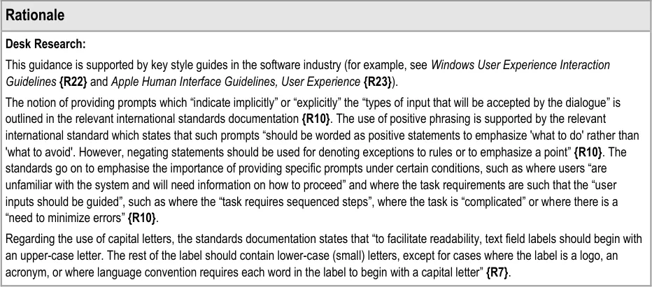
Page 67
Copyright ©2013 Health and Social Care Information Centre
HSCIC Controlled Document
10 DOCUMENT INFORMATION
10.1 Terms and Abbreviations
BMI Body Mass Index
CATR Clinical Authority to Release
CSG Clinical Safety Group
CUI Common User Interface
CVS Cardiovascular System
HIU Health Informatics Unit
ISMP Institute for Safe Medication Practices
NHS National Health Service
NHS CFH NHS Connecting for Health
NPSA National Patient Safety Agency
PMH Past Medical History
RCP Royal College of Physicians
RITE Rapid Iterative Testing Evaluation
SNOMED CT Systematized Nomenclature of Medicine Clinical Terms
UI User Interface
WHO World Health Organization
Table 7: Terms and Abbreviations
10.2 Definitions
The Authority The organisation implementing the NHS National Programme for IT (currently NHS Connecting for Health).
Current best practice Current best practice is used rather than best practice, as over time best practice guidance may change or be
revised due to changes to products, changes in technology, or simply the additional field deployment experience that comes over time.
Entry field Type of field in which data is entered. Entry fields may be optional fields or required fields.
Page 68
Copyright ©2013 Health and Social Care Information Centre
HSCIC Controlled Document
Conformance In the guidance tables, indicates the extent to which you should follow the guideline when defining your UI implementation. There are two levels:
Mandatory - An implementation should follow the guideline
Recommended - An implementation is advised to follow the guideline
Evidence Rating In the guidance tables, summarises the strength of the research defining the guideline and the extent to which it mitigates patient safety hazards. There are three ratings (with example factors used to determine the appropriate rating):
Low:
Does not mitigate specific patient safety hazards
User research findings unclear and with few participants
Unreferenced usability principles indicate the design is not significantly better than alternatives
Medium:
Mitigates specific patient safety hazards
User research findings clear but with few participants
References old authoritative guidance (for example, from National Patient Safety Agency (NPSA),
Institute for Safe Medication Practices (ISMP) or World Health Organization (WHO)) that is potentially soon to be superseded
Referenced usability principles indicate the design is significantly better than alternatives
High:
Mitigates specific patient safety hazards
User research findings clear and with a significant number of participants
References recent authoritative guidance (for example, from NPSA, ISMP or WHO)
Referenced usability principles indicate the design is significantly better than alternatives
Field Area on a screen display in which data is entered or presented.
Form Structured display with labelled fields that the user reads, fills in, selects entries for (for example, through choice buttons or radio buttons) or modifies.
Label Short descriptive title for an entry or read-only field, table, control or object.
Navigation Ability to move from field to field within a form, to proceed forward and backward through a form and move from form to form.
NHS Entity Within this document, defined as a single NHS organisation or group that is operated within a single technical infrastructure environment by a defined group of IT administrators.
Optional field Field that not necessarily needs to be filled in or modified by the user.
Read-only field Field that contains data that cannot be modified by the user.
Required field Field that must be completed by the user if it does not already have a value.
Table 8: Definitions
Page 69
Copyright ©2013 Health and Social Care Information Centre
HSCIC Controlled Document
10.3 Nomenclature
This section shows how to interpret the different styles used in this document to denote various types of information.
10.3.1 Body Text
Code Monospace
Script
Other markup languages
Interface dialog names Bold
Field names
Controls
Folder names Title Case
File names
Table 9: Body Text Styles
10.3.2 Cross References
Current document – sections Section number only
Current document – figures/tables Caption number only
Other project documents Italics and possibly a footnote
Publicly available documents Italics with a footnote
External Web-based content Italics and a hyperlinked footnote
Table 10: Cross Reference Styles
10.4 References
R1. Royal College of Physicians (Health Informatics Unit): A Clinician’s Guide to Record Standards
- Part 2: Standards for the structure and content of medical records and communications whenpatients are admitted to hospital, October 2008
R2. Royal College of Physicians (Health Informatics Unit): Hospital Admission Pro-forma Headings and Definitions, April 2008
R3. NHS Connecting for Health Clinical Content Development: Hospital Admission, September 2008
2008
1.0
1.0
R4. NHS CUI Programme - Design Guide Entry - Accessibility Principles 1.0.0.0
R5. Bates, et al: Ten Commandments for Effective Clinical Decision Support: Making the Practice of Evidence-based Medicine a Reality, Journal of the American Medical Informatics Association, Vol. 10 Number 6 Nov / Dec 2003
R6. British Standards Institute, BS EN ISO 9241-14: 1997 Ergonomic requirements for office work with visual display terminals (VDTs) — Part 14: Menu dialogues
Copyright ©2013 Health and Social Care Information Centre
2003
1997
Page 70
HSCIC Controlled Document
R7. British Standards Institute, BS EN ISO 9241-17: 1998 Ergonomic requirements for office work with visual display terminals (VDTs) — Part 17: Form-filling dialogues
R8. British Standards Institute, BS EN ISO 9241-12: 1999 Ergonomic requirements for office work with visual display terminals (VDTs) — Part 12: Presentation of information
R9. British Standards Institute, BS EN ISO 9241-10: 1996 Ergonomic requirements for office work with visual display terminals (VDTs) — Part 10: Dialogues principles
R10. British Standards Institute, BS EN ISO 9241-13: 1999 Ergonomic requirements for office work with visual display terminals (VDTs) — Part 13: User guidance
1998
1999
1996
1999
R11. British Standards Institute, BS 7581:1992 Guide to Presentation of tables and graphs 1992
R12. NHS CUI Programme – Design Guide Entry – Date Display 3.0.0.0
R13. NHS CUI Programme – Design Guide Entry – Date and Time Input 2.0.0.0
R14. NHS CUI Programme – Design Guide Entry – Terminology – Matching 1.0.0.0
R15. NHS CUI Programme – Design Guide Entry – Terminology – Elaboration 2.0.0.0
R16. NHS CUI Programme – Design Guide Entry – Terminology – Display Standards for Coded Information
R17. NHS CUI Programme – Recording Adverse Drug Reaction Risks – User Interface Design Guidance
R18. NHS CUI Programme – Display of Adverse Drug Reaction Risks – User Interface Design Guidance
2.0.0.0
1.0.0.0
1.0.0.0
R19. Nielsen, J: Usability Engineering, 1993 1993
R20. Shneiderman, B: Designing the User Interface – Strategies for Effective Human-Computer Interaction, 1998
R21. Galitz, W.O: Essential guide to user interface design. An introduction to GUI design principles and techniques, 1997
Third Edition
1997
R22. Windows User Experience Interaction Guidelines 2008
R23. Apple Human Interface Guidelines: User Experience 2008
R24. Jarrett, Caroline: Forms that work 2009
Table 11: References
Copyright ©2013 Health and Social Care Information Centre
Page 71
HSCIC Controlled Document
APPENDIX A USABILITY PRINCIPLES
The following usability principles have been applied through this guidance document. They are well-recognised principles within the user experience domain.
A.1 Nielsen’s Usability Heuristics
See Usability Engineering {R19} for more information on these principles:
Visibility of system status
Match between system and the real world
User control and freedom
Consistency and standards
Error prevention
Recognition rather than recall
Flexibility and efficiency of use
Aesthetic and minimalist design
Help users recognise, diagnose, and recover from errors
Help and documentation
A.2 Shneiderman’s Eight Golden Rules of Interface Design
See Designing the User Interface – Strategies for Effective Human-Computer Interaction {R20} for more information on these principles:
Strive for consistency
Enable frequent users to use shortcuts
Offer informative feedback
Design dialogs to yield closure
Offer error prevention and simple error handling
Permit easy reversal of actions
Support internal locus of control
Reduce short-term memory load
A.3 ISO 9241: Characteristics of Presented Information
See Ergonomic requirements for office work with visual display terminals (VDTs) — Part 10: Dialogues principles {R9} for more information on these principles:
Clarity (the information content is conveyed quickly and accurately)
Discriminability (the displayed information can be distinguished accurately)
Conciseness (users are given only the information necessary to accomplish the task)
Consistency (the same information is presented in the same way throughout the application, according to the user’s expectation)
Detectability (the user’s attention is directed towards information required)
Page 72
Copyright ©2013 Health and Social Care Information Centre
HSCIC Controlled Document
Legibility (information is easy to read)
Comprehensibility (meaning is clearly understandable, unambiguous, interpretable and recognisable)
Page 73
Copyright ©2013 Health and Social Care Information Centre
HSCIC Controlled Document
APPENDIX B STUDY ID 34: EXECUTIVE SUMMARY
B.1 Abstract
The UK National Health Service (NHS) Common User Interface (CUI) Programme is a partnership between Microsoft [®] and NHS Connecting for Health (NHS CFH), which is part the NHS National Programme for Information Technology (NPfIT).
As part of CUI, the Clinical Applications and Patient Safety (CAPS) project has the goal of ensuring that software applications used by the NHS enhance patient safety. To achieve this, CAPS provides software developers with user interface design guidelines derived through a user-centric development process that includes explicit patient-safety evaluations.
This summary describes key findings from user research carried out in April 2009 by the CUI CAPS team on the clinical noting required for hospital admissions clerking.
Purpose:
To hone a set of designs in terms of their usability that would then form the basis for user interface design guidelines for admissions clerking. Over the series of iterations, the Design Team aimed to reduce the number of errors being made by the clinical participants and to improve the designs’ ease of, and suitability for, use in a clinical environment.
Method:
Over a series of five stages of usability testing, the Design Team iteratively tested the prototypes, quickly analysed the data and updated the designs in response to the findings.
Key Results:
Key findings included:
-
The need for progressive matching of clinical concepts
-
The need to capture durations in a colloquial format
-
The need for common matches to be distinguished when searching for clinical concepts
B.2 Research Objectives
The objectives of the research were to test a set of design features based on the following areas:
-
General form design (standard controls)
-
Entering summary lists
-
Required fields
-
Durations
-
Displaying calculated values
-
Displaying previous values
-
Adding free text
The research was intended to result in a final set of designs plus a list of any outstanding issues that could not be resolved during the test period.
Page 74
Copyright ©2013 Health and Social Care Information Centre
HSCIC Controlled Document
B.3 Research Design
Rapid Iterative Testing and Evaluation (RITE) testing: 13 sessions (15 participants), plus pilot testing, with Health Care Professionals (HCPs) working within the UK National Health Service (NHS). Prototypes embodying the potential guidelines were constructed in a range of media:
-
Microsoft [®] Silverlight™
-
Microsoft [®] Expression Blend™
-
Microsoft [®] Office PowerPoint [®] slides featuring static designs created in Microsoft [®] Office
Visio [®] with some animation
The test sessions were grouped into five sequential stages. Largely, participant allocation to each stage was determined by the location of the testing; for example, all the participants tested in Birmingham City Hospital were part of Stage Three. Before each stage in the testing, the prototypes were updated (if necessary), based upon the findings of the previous stage.
Participants were tested individually, with the exception of two sessions where participants doubled up and addressed the component tasks in turn.
In each test session, the participant was given a set of typical clinical noting tasks to perform using the various prototypes, with one prototype per task:
- Where the prototype was interactive, the participant was asked to perform the task by
using the keyboard and/or the mouse.
- Where the prototype was not interactive, the researcher presented it screen-by-screen
and asked the participant what they understood and what they would do next at each stage in the screen flow.
The tasks were presented in the form of brief written scenarios that set the scene and gave the participant goals to achieve with the prototype. After each task, the participant would be asked questions about their experience of the prototype, including how suitable they thought the design would be in a real clinical situation.
Following each stage in the testing, the researcher collaborated with the Design Team in analysing the findings and planning updates to be implemented before the next testing stage. In this way, the prototypes were incrementally improved over the five stages, with these changes being tested at each subsequent stage.
In the case of the ‘entry of summary list’ design, alternative designs were presented to the participant as part of the post-task discussion. However, this was the only exception: in all other cases, alternative designs were not tested or discussed.
If a prototype was deemed sufficiently capable of enabling the participant to perform the task easily and without error, it was dropped from the testing. This was because of time constraints: stopping tests on a successful prototype released time for tests on a previously untested prototype.
B.4 Results
B.4.1 Participant Description
15 participants took part in the user research, although in two cases participants ‘doubled up’, taking it in turns to perform user tasks (marked as 7a/7b and 12a/12b in Table 12). In total, testing took part in six different hospitals throughout London, the South East and the West Midlands. The participants had varying levels of IT experience, although everyone had a basic level of computer proficiency, and all used computers to varying degrees in a clinical context.
Page 75
Copyright ©2013 Health and Social Care Information Centre
HSCIC Controlled Document
Each participant had either volunteered through the NHS CFH Events Management System (EMS) signup or had been recruited by an HCP who had volunteered. None of the respondents had previously taken part in CUI clinical engagement for other work areas
Table 12 shows a summary of the participants’ profiles:
1 Doctor Plastic surgery Y4 Registrar Royal Free Hospital High: HTML, ASP, SQL, developed in-house mini-EPR
2 Health Care Assistant
MAU Band 2 Basingstoke and North Hampshire Hospital
3 Nurse MAU RGN Basingstoke and North Hampshire Hospital
4 Nurse Practitioner
Pain Band 7 Basingstoke and North Hampshire Hospital
5 Doctor Medicine FY2 Basingstoke and North Hampshire Hospital
6 Nurse (Pain Sister)
7a Ward Manager
Pain Band 6 Basingstoke and North Hampshire Hospital
Surgical Assessment Unit Band 7 Birmingham City Hospital Medium: iSoft [®] Lorenzo [®] RCM (transferring patients, scanning notes). Microsoft [®] Office Word, Excel, PowerPoint, Internet
Low: Sage, Email, Internet (four hours a week)
Low: Pathology results, Internet shopping, ECDL
Medium: Email, recording statistics for clinics, booking, National Audit database, Hospital PMS
Unknown
Medium: Hospital intranet, Microsoft [®] Office Outlook [®], blood results, PMS system, Google™, Microsoft [®] Office Excel [®], record data for audits
7b Nurse Surgical Assessment Unit Band 6 Birmingham City Hospital Medium: Lorenzo RCM (transferring patients, scanning notes). Word, Excel, Microsoft [®] Office PowerPoint [®], Internet
8 Nurse Medicine MSSU Band 7 Birmingham City Hospital Medium: ICM – patient finder, results, discharge, the Microsoft [®] Office System
9 Doctor Poisons FY2 Birmingham City Hospital High: In-house ICM, Web client (clinical data archive), x-rays. previous professional IT experience
10 Nurse A&E Band 7 Birmingham City Hospital Low: IPM Lorenzo PAS, x-rays
11 Doctor Rotating: Cardiology, Neurology, Breast Surgery (current)
12a Doctor Rotating:
Diabetes, General Medicine, Elderly, Cardiovascular
12b Doctor Rotating:
General Medicine, Endocrinology
FY1 Whipps Cross Medium: In-house blood system, PACS (Agfa [®] ), PAS, Excel, GraphPad Prism [®], email, Microsoft Office
FY1 Royal London Hospital Medium: CRS, EPR, PACS, Word, PPT, Internet, email
FY1 Royal London Hospital Medium: CRS, EPR, PACS, Word, PPT, Internet, email
13 Doctor ICU FY1 Homerton n/a
Table 12: Testing Participants
Copyright ©2013 Health and Social Care Information Centre
Page 76
HSCIC Controlled Document
B.4.2 Key Findings
- Clinicians understood how to enter observation data into a form using standard controls,
such as drop-downs and radio buttons
-
However, clinicians felt that it would be too time-consuming to enter data in this way
-
Clinicians understood how to reveal hidden fields with the check box control and/or by
selecting a data item, as long as there is sufficient labelling and prompts
- Clinicians may try to enter too much information into a search field (such as for Past
Medical History (PMH)) unless there is progressive matching
-
Clinicians do not want to navigate to a tab in order to enter a duration or date
-
Clinicians quickly learn how to type in data into the ‘natural language’ ‘duration/date(s)’
field
- Clinicians find it unclear and time-consuming to search a long list of search results for a
fairly common clinical concept
- Some clinicians find a ‘Current problem’ field ambiguous and unclear, whereas others find
it easy to understand
- If the ‘Current problem’ field is located immediately below the additional text field, the
clinician may not notice it
-
Clinicians want to be able to reorder a summary list (such as a PMH)
-
Faced with a ‘search’ or ‘drop-down’ button alongside a search entry field (or combo box),
some clinicians may click the button without entering any text.
-
Clinicians understand red asterisks mean that a field is required
-
Clinicians understand the usefulness of providing a right-hand panel that indicates missed
fields, but some clinicians do not notice it: clinicians find it easier to notice in-line indications, such as yellow shading in the missed fields
- Clinicians expected in-line indications for the data that contributed to a calculated value,
where appropriate (in this case, where the values are ‘out-of-range’)
- Clinicians need the label to be visually distinct in order to know that they can click on it to
find further information about the calculation. However, after they realise that further information about the calculation may be available, they indicate that clicking on the label is intuitive
- Clinicians expect the same ‘auto-complete’ mechanism in a date dialog as is employed in
the summary list entry control, which allows the entry of words such as ‘past’
-
Clinicians found the button for adding free text to be insufficiently prominent
-
Clinicians expect to be able to access a graphical representation of previous values
Page 77
Copyright ©2013 Health and Social Care Information Centre
HSCIC Controlled Document
B.4.3 Conclusions
- Although the guidance should clearly show how standard controls should be used in
electronic forms, further work should be done to make the process more intuitive and less time-consuming
- In order to simply reveal fields on a form, provide a check box control in addition to
providing a mechanism that automatically reveals fields when a certain data item is selected
-
Provide progressive matching where technology supports it
-
In the control for entering summary lists, do not hide fields behind a tab
-
Provide a ‘natural language’ entry field which matches duration and date phrases and
numbers as they are entered, and provide a ‘play back’ of what they have entered in a more formal structure
-
Distinguish common matches in the search results
-
If a ‘Current problem’ field is to be featured, locate it next to the ‘duration/date(s)’ field
-
Provide a feature to reorder the summary list
-
Do not feature a search button if the matching is done progressively. Feature a search icon
where appropriate
-
Do not feature a drop-down button in the ‘duration/date(s)’ entry field
-
Feature red asterisks next to the labels of required fields
-
Shade required fields in yellow where they have been missed by the clinician (that is,
where the clinician has moved the focus to a field that is after the required field in the tabbing order)
- Provide a right-hand panel that lists missed fields in addition to in-line indications of
missed fields
- Where appropriate, feature in-line indications of values that contribute to a calculated
score
-
Ensure that the label of the calculated score visually communicates that it can be clicked
-
Ensure that the button for adding free text is sufficiently prominent
-
In a previous values dialog, provide access to a graphical representation of previous values
B.5 Design Iterations: Findings and Design Updates
Table 13 to Table 19 describe the design iterations in each area of testing, including the findings and changes made in each case. The left-hand columns indicate the number of design iterations performed.
Table 13 describes the design iterations for entering summary lists:
Page 78
Copyright ©2013 Health and Social Care Information Centre
HSCIC Controlled Document
1 Too time consuming
Don’t always want to add a date
Wants to write everything in ‘additional text’
Wants to be able to add natural terms that are how he would write them
Clinician does not like systems that require codes or exact text
2 Clinicians tried to enter everything in the first field
Clinicians tried to type all information in the ‘additional text’ field
Too many search results returned
Time consuming/too much detail required/over-complicated
It is strange separating the concept from its details, but it does make sense
More emphasis on date rather than details
‘Current problem’ is ambiguous
Want to be able to sort by date
Depending upon the situation, either the ‘natural language’ or the calculated date would be most appropriate in the final display
3 Need to indicate that dates are approximate
Clinician tries to select from date drop-down without typing
Clinician finds it hard to find the ‘next’ entry field
Clinician cannot find items at the top of the list
Must be able to use familiar nomenclature
Not hard, but long-winded
SNOMED CT limitations – “gangrenous toes”
Did not notice ‘Current problem’ check box
4 Entered ‘ketoacidosis’ as part of the ‘diabetes’ entry
Too many results returned
Would expect a shortlist of common matches
Typed in the duration/date(s), but did not select it
Did not understand the ‘Current problem’ field
5 Clinician confused as to whether to type into the search field or click on the button
Missed the ‘Current problem’ field
Would like to enter a problem and then, below it, list the associated complications
Clinicians claimed that the data entry process seemed ‘time consuming’, although they did complete the tasks quickly and without major problems
Types in date, but does not select it
Colours and alignment are not good
Wants to be able to change the order (for example. by ‘drag and drop’)
Some shorthand not recognised in the SNOMED CT search
Table 13: Entering Summary Lists
Table 14 describes the design iterations for required fields:
Remove ‘attribute’ tabs: feature ‘duration/dates’ and ‘current problem’ fields in the same area as the additional text field
Provide ‘natural’ date input
Improve visual appearance, including removing fields from around the calculated date
Remove date drop-down button
Remove frames
Provide ‘progressive’ matching
Provide a common matches ‘shortlist’
Replace the ‘Search’ button with a nonclickable icon
Remove the ‘Current problem’ field
Improved alignment and slightly indented the attribute fields.
Page 79
Copyright ©2013 Health and Social Care Information Centre
HSCIC Controlled Document
1 Red asterisks are very clear and understandable
Indifferent to the side panel
Expect such validation upon clicking the final ‘Submit’
2 Red asterisks are very clear and understandable
3 Did not notice the right-hand side panel Replace right-hand panel with in-line indication of having missed a field: yellow shading in the field
4 Did not notice the red asterisks Reintroduced the right-hand panel
Table 14: Required Fields
Table 15 describes the design iterations for displaying automatic calculations:
1 Expected visual cues for ‘out-of-range’ values
Label/value do not seem ‘clickable’
2 Expected visual cue for ‘out-of-range’ values
Over-complicated
Alerts are not sufficiently obvious
3 Lots of comments relating to EWS alerts rather than calculated values
Some clinicians needed prompting to click on the label to find more information
Generally participants had no problems with understanding what was calculated and what had been entered, and found it intuitive to click on an item to find further information
4 Clinician would expect a standard action plan to appear if they click on the ‘details of scoring’ button
Table 15: Displaying Automatic Calculations
Table 16 describes the design iterations for entering durations:
Added visual cues for ‘out-of-range’ values
Replaced the ‘calculated’ icon with an underline for the label
1 Limited applicability
Concerns over spurious accuracy
Would like ‘asap’ option
2 Would expect to use shorthand
Would like auto-complete
Concerns over spurious accuracy
Expects to be able to enter ‘past 22 years’
Limited in expression, in that you cannot express frequency
3 Limited applicability: this concept “falls between two stools”
Table 16: Entering Durations
Provide auto-complete
Allow the entry of words such as ‘past’
Table 17 describes the design iterations for general form design (including revealing fields):
Copyright ©2013 Health and Social Care Information Centre
Page 80
HSCIC Controlled Document
1 Would expect to type a single line, for example ‘HS 1+2+0=Clear, Otherwise normal’
Does not think ‘Not examined’ is a good default
Wants progressive disclosure of fields
2 Free text would easier than making selections
Might not know that there are fields for further details
Negative statements are useful
3 Free text would be easier than making selections
Want drawings/annotations
Clinician does not realise they should click ‘No’ for further details
Buttons are too small
Must be able to use familiar nomenclature
4 Need the ability to add free text
Text is too small
Laborious: would prefer tick boxes
Table 17: General Form Design
Table 18 describes the design iteration for adding free text:
Implemented the progressive disclosure
1 Clinician expected to be able to find what they wanted to enter as fixed choice widgets
Button was not sufficiently prominent
Table 18: Adding Free Text
Table 19 describes the design iteration for displaying previous values :
1 Clinicians liked this feature and would find it useful
Seeing a graph would be more useful
Table 19: Displaying Previous Values
Copyright ©2013 Health and Social Care Information Centre
Page 81
HSCIC Controlled Document
REVISION AND SIGNOFF SHEET
Change Record
01-Jun-2009 Ben Luff 0.0.0.1 Initial draft for review/discussion
01-Jun-2009 Andy Payne 0.0.1.0 Raised to Working Baseline
04-Jun-2009 Mick Harney 0.0.1.1 Copyedited Working Baseline
11-Jun-2009 Ben Luff 0.0.1.2 Updates following copyedit and NHS CFH comments
12-Jun-2009 Mick Harney 0.0.1.3 Copyedit on changes
16-Jun-2009 Andy Payne 0.0.1.4 Updates
18-Jun-2009 Graham Hoare 0.0.1.5 Copyedit complete
19-Jun-2009 Ben Luff 0.0.1.6 Updates following copyedit comments
23-Jun-2009 Simon Burnham 0.1.0.0 Updates processed and raised to Baseline Candidate
01-Jul-2009 Andy Payne 0.1.0.1 Further changes to Baseline Candidate version
01-Jul-2009 Mick Harney 0.1.0.2 Copyedit on further changes
01-Jul-2009 Mick Harney 0.2.0.0 Raised to Baseline Candidate #2
09-Jul-2009 Mick Harney 1.0.0.0 Raised to Baseline
Document Status has the following meaning:
- Drafts 0.0.0.X - Draft document reviewed by the Microsoft CUI Project team and the
Authority designate for the appropriate Project. The document is liable to change.
- Working Baseline 0.0.X.0 - The document has reached the end of the review phase and
may only have minor changes. The document will be submitted to the Authority CUI Project team for wider review by stakeholders, ensuring buy-in and to assist in communication.
- Baseline Candidate 0.X.0.0 - The document has reached the end of the review phase and
it is ready to be frozen on formal agreement between the Authority and the Company.
- Baseline X.0.0.0 - The document has been formally agreed between the Authority and the
Company.
Note that minor updates or corrections to a document may lead to multiple versions at a particular status.
Open Issues Summary
None
Page 82
Copyright ©2013 Health and Social Care Information Centre
HSCIC Controlled Document
Audience
The audience for this document includes:
- Authority CUI Manager / Project Sponsor . Overall project manager and sponsor for the
NHS CUI project within the Authority
- Authority Clinical Applications and Patient Safety Project Manager. Responsible for
ongoing management and administration of the Project
- The Authority Project Team . Responsible for jointly agreeing with the Company NHS CUI
Project Team the approach defined in this document and any necessary redefinition of the Clinical Applications and Patient Safety Project strategy that results from the document or approach agreed
- Company NHS CUI Project Team . Responsible for agreeing with the Authority Project
Team the approach defined in this document, including any necessary redefinition of the Clinical Applications and Patient Safety Project strategy that results from the document or approach agreed
Reviewers
Mike Carey Workstream Lead
Tim Chearman UX Architect
Peter Johnson Clinical Architect
Frank Cross Clinical Advisor
Mike Clements Clinical Advisor
Beverley Scott Clinical Safety Officer
Distribution
Mike Carey Workstream Lead
Tim Chearman UX Architect
Peter Johnson Clinical Architect
Frank Cross Clinical Advisor
Mike Clements Clinical Advisor
Beverley Scott Clinical Safety Officer
Page 83
Copyright ©2013 Health and Social Care Information Centre
HSCIC Controlled Document
Document Properties
Document Title User Interface Design Guidance Clinical Noting in Forms: Admissions Clerking
Author Clinical Applications and Patient Safety Project
Restrictions RESTRICTED – COMMERCIAL; MICROSOFT COMMERCIAL; Access restricted to: NHS CUI Project Team, Microsoft NHS Account Team
Creation Date 1 June 2009
Last Updated 23 June 2015
Copyright:
You may re-use this information (excluding logos) free of charge in any format or medium, under the terms of the Open Government Licence. To view this licence, visit nationalarchives.gov.uk/doc/open-government-licence or email psi@nationalarchives.gsi.gov.uk.
Page 84
Copyright ©2013 Health and Social Care Information Centre