Document Properties Document Title Displaying Graphs and Tables
 Prepared for
NHS Connecting for Health
Version 2.0.0.0 Baseline
Prepared by
Clinical Applications and Patient Safety Project
NHS CUI Programme Team
cuistakeholder.mailbox@hscic.gov.uk
Prepared for
NHS Connecting for Health
Version 2.0.0.0 Baseline
Prepared by
Clinical Applications and Patient Safety Project
NHS CUI Programme Team
cuistakeholder.mailbox@hscic.gov.uk

PREFACE
- PREFACE
- 1 INTRODUCTION
- 2 DATA VALUES AND UNITS GUIDANCE DETAILS
- 2.1 Guidelines – Creating Symbols for Data Points in Graphs
- 2.2 Guidelines – Identifying and Labelling Data
- 2.3 Guidelines – Displaying Data Units
- 2.4 Guidelines – Displaying Blood Pressure Composites
- 2.5 Guidelines – Displaying Textual-Numerical Values in Graphs
- 2.6 Guidelines – Focus of Data Points
- 3 SCALING GUIDANCE DETAILS
- 4 AXES GUIDANCE DETAILS
- 5 LAYOUT, DENSITY AND FORMATTING GUIDANCE DETAILS
- 6 MULTIPLE DATA SERIES GUIDANCE DETAILS
- 7 INTERPOLATION GUIDANCE DETAILS
- 8 INDICATIVE RANGES GUIDANCE DETAILS
- 9 TABLES GUIDANCE DETAILS
- 10 CONTEXTUAL INFORMATION GUIDANCE DETAILS
- 11 DOCUMENT INFORMATION
- APPENDIX A HIGH-LEVEL TASK SCENARIOS
- REVISION AND SIGNOFF SHEET
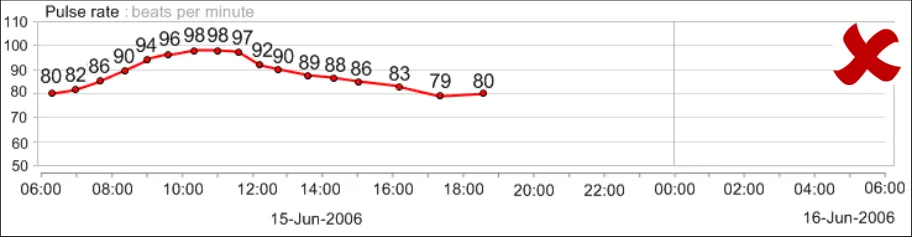
Source PDF: dispgraphs.pdf
Documents replaced by this document Displaying Graphs and Tables – User Interface Design Guidance 1.0.0.0 Documents to be read in conjunction with this document Design Guide Entry – Date Display 3.0.0.0 Design Guide Entry – Time Display 3.0.0.0 This document was prepared for NHS Connecting for Health which ceased to exist on 31 March 2013. It may contain references to organisations, projects and other initiatives which also no longer exist. If you have any questions relating to any such references, or to any other aspect of the content, please contact cuistakeholder.mailbox@hscic.gov.uk
1 INTRODUCTION
Table 1 describes the changes made since the previous version of this document:
1.0.0.0 15-Sep-2008 The following table summarises updates that have been made to this document:
Modified :
GTAB-188 and GTAB-189 have been reworded to further mitigate safety issues
Table 1: Changes Since the Last Baseline Version
1.1 Customer Need
Clinical data represented numerically, such as physiological observations or ‘vital signs’ readings, play a crucial role in clinical decision-making and in communicating with patients, which in turn can influence patient involvement with their treatment regimen. In addition to accurately reading such numerical data, clinicians must also interpret patterns in the data to assess the patient’s status and to determine the best course of action. This often requires them to rapidly assimilate multiple series of data. Often, these patterns are difficult to spot initially, but become more distinct as a pathology develops and it is imperative that clinicians can detect them as early as possible. Pattern detection is a universal human capacity which people tend to do very efficiently and often subconsciously. However, the detection and meaning of a data pattern can be heavily influenced by the way in which the data is presented, and misinterpretation may occur if the data is not presented in a way that clinicians can easily understand.
In a clinical context, this may mean that important patterns could be missed or are detected too late. Although, in acute care, early warning scores are effective for detecting problems, in other clinical contexts, and for subtle data patterns, measurements may need to be displayed graphically for changes to be perceived.
Also, in order that patients can comply with the care intervention, such as changing their lifestyle or taking medication, it is crucial that they can understand their condition, their likely prognosis and the physiological targets they must achieve in order to get better. Health psychology research has shown that patients’ understanding of their condition and likely outcomes are often subject to bias. Whereas people often find it hard to see trends and deficits in numerical data, graphical representations effectively communicate the pattern and direction of physiological signs, along with the changes that patients’ must effect to reach their targets. With this understanding, patients’ get feedback on their behaviour in order to better regulate it.
This guidance aims to define the key factors that influence the interpretation of patterns in clinical data, focusing upon scatter and line graphs and tables.
This guidance draws upon User Interface (UI) current best practice and upon research into the use of graphs and tables in clinical settings.
This guidance is for use by Independent Software Vendors to ensure that good design principles support clinicians’ interpretation of numerical data, reveal critical patterns and assist users in accessing specific data values.
1.2 Potential Patient Safety Risks to be Mitigated
The development of this guidance relied on identifying a set of high level tasks associated with the use of clinical charts (that is, graphs and tables).
Page 1
Copyright ©2013 Health and Social Care Information Centre
HSCIC Controlled Document
We identified risks associated with those tasks by running risk assessment activities, interviewing clinicians in early design analysis and requirements capture exercises (including {R5} ) and consulting a number of sources, including existing studies [1] and papers ( {R11, R15} ).
These tasks were located in a set of typical user scenarios and a set of potential patient safety risks and consequences were noted with these scenarios. A full outline of these tasks, scenarios, and potential safety risks can be found in APPENDIX A.
The high level tasks comprise:
-
Read the current data values
-
Compare the current data values with past readings
-
Check if the current data values exceed, fail to exceed or fall below a threshold
-
Check for significant patterns over time in a series of data values
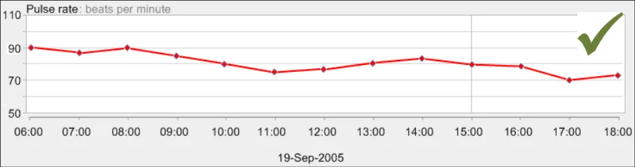
-
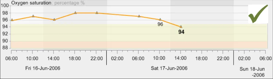
Check for significant interactions between data series
-
Check the provenance of the data values
-
Check if there is a significant change in values from their normal levels
The main potential patient safety risks identified in the context of clinicians interpreting chart information include:
-
Overestimation of a trend, either a rise or fall
-
Not viewing a relevant previous set of data or not recognising when it was taken
-
Not identifying a drop in blood pressure as being significant:
Not seeing how much it has dropped
Not seeing how quickly it has dropped
- Not seeing a drop in blood pressure in the context of the oxygen, pulse and temperature
remaining constant
-
Not seeing that the respiratory rate has increased slightly
-
Not correctly reading the absolute values of a measure
-
Not factoring in that the differences in readings may be partially or wholly accounted for
by the change in settings in which the readings were taken
-
Not seeing the current configuration of the vital signs (for example, high, low, rising)
-
Not recognising that the data is now showing a new trend
-
Not recognising a previous trend
-
Not recognising the differences between the two trends
-
Not recognising that the change in trend is significant
-
Not recognising where the patient’s current blood pressure readings are in relation to the
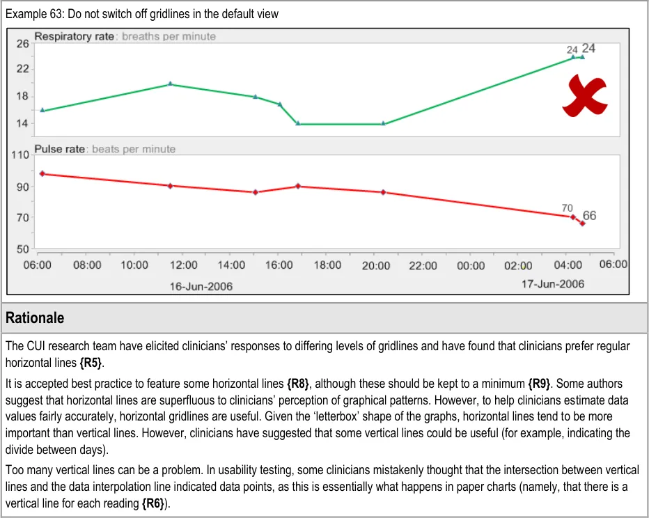
target range
1 Acutely ill patients in hospital: Recognition of and response to acute illness in adults in hospital {R1} : http://www.nice.org.uk/CG50
Page 2
Copyright ©2013 Health and Social Care Information Centre
HSCIC Controlled Document
-
Not accurately reading the patient’s current blood pressure reading
-
Not being able to view the current configuration of the observations data in relation to the
patient’s usual levels
- Not identifying the rise in blood pressure and pulse as significant:
Not seeing by how much they had risen
Not seeing how quickly they had risen
- Not identifying the drop in a measure as significant:
Not seeing by how much they had dropped
Not seeing how quickly they had dropped
- Not being able to view the changes in blood pressure and oxygen saturations in relation to
each other
-
Not recognising that the blood pressure has stabilised
-
Not recognising that the patient’s blood pressure readings are in the target range
The consequences for such risks could be:
-
A delayed diagnosis
-
A delayed treatment
-
An incorrect diagnosis
-
A missed diagnosis
-
An incorrect treatment
-
Failure to comply with treatment regimen
The design guidance points outlined in later sections aim to mitigate these patient risks.
1.3 Scope
The main purpose of this guidance is to allow electronic clinical systems to clearly and effectively communicate levels and patterns of data to the clinician and patient.
In order to provide further focus to this guidance, it is primarily restricted to the key physiological observations that serve as fundamental indicators of patient health, otherwise known as ‘vital signs’ data. Specifically, the guidance addresses these forms of data:
- Blood pressure, comprising systolic and diastolic pressures, measured in millimetres of
mercury (mmHg)
-
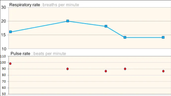
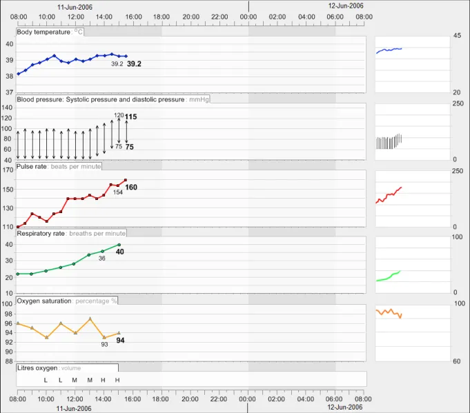
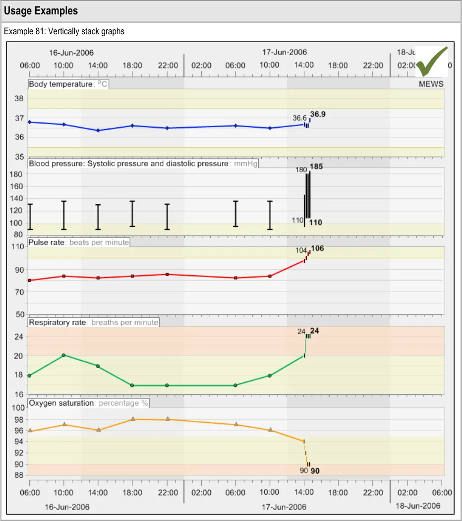
Body temperature, measured in degrees centigrade (˚C)
-
Pulse rate, measured in beats per minute
-
Respiratory rate, measured in breaths per minute
-
Oxygen saturation, expressed as a percentage (%)
These are commonly used, individually or in combination with themselves or other measurements, throughout the healthcare industry. The regular recording of these measurements is also mandated by the recent National Institute for Health and Clinical Excellence (NICE) guidelines for acute care
Page 3
Copyright ©2013 Health and Social Care Information Centre
HSCIC Controlled Document
{R1} . Those guidelines serve as exemplars for this guidance. It is expected that guidance applying to those measurements can also be generalised to other data types, although care must be taken by suppliers when doing so. In some cases, additional design considerations may apply that are out of scope for the current guidance. Parts of this guidance expand this set of exemplars to include some blood test results, such as serum creatinine and serum urea levels, but generally the focus is upon the five ‘vital signs’ data listed above.
Patterns of change through time are formed primarily by combinations of four characteristics (taken from Stephen Few {R8} ):
-
Magnitude of change
-
Shape of change
-
Velocity of change
-
Direction of change
Positioning graphical representations of data in a two dimensional plot area is an effective, efficient and well-recognised way of communicating these factors. Time-based scatter plots with interpolated data points are currently used throughout the healthcare industry, often in paper form. Although more innovative, but unconventional, data visualisations are available, this guidance focuses upon the design of interpolated scatter plots because their understanding is immediate and relatively little learning is required by the clinician to interpret them.
The purpose of the guidance is therefore to ensure that this conventional graphing method is as clear, efficient and safe as possible when presented electronically, rather than trying to push the boundaries of data visualisation techniques. Additionally, there will be occasions where the clinician will also want to view the data solely as numerical data; if, for example, they are more concerned with the absolute values rather than the patterns they form.
To achieve these goals, this guidance will identify the basic components of both conventional graphs and tables and will address these in turn. The primary focus is upon the static views of graphs and tables whilst acknowledging that the interaction between the clinician and the data also has an impact on the interpretation of data and needs careful handling. The emphasis is upon format rather than specific content, although with indication where certain types of content will be required.
Note
Definitions for terms which have a specific meaning in the context of this document are listed in section 11.2.
1.3.1 Data Values and Labels
Creating symbols for data glyphs in graphs This guidance does not specify symbols for specific data types, with the exception of blood pressure. Instead, it outlines the rules that a designer must follow when creating a set of data symbols
Identifying data series This guidance does not specify the exact wording of the data series (for example, we will not mandate ‘Heart rate’ over ‘Pulse rate’). However, it recommends that suppliers use standard terms where possible (for example, from the Systematised Nomenclature of Medicine-Clinical Terms (SNOMED-CT)
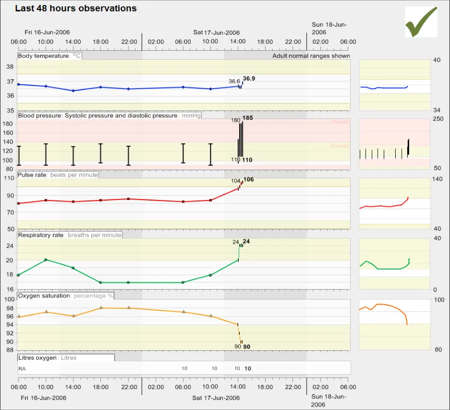
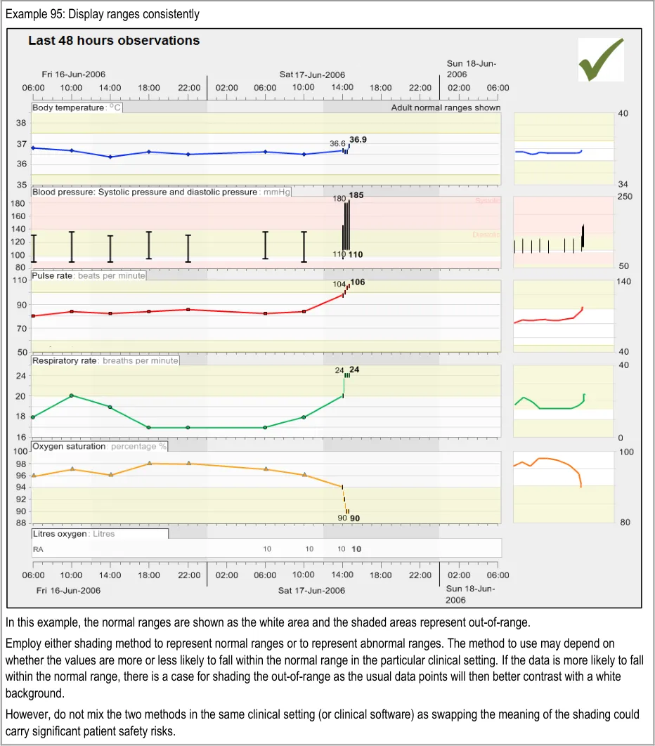
Displaying data units This guidance does not specify a comprehensive list of units
This guidance does not cover translating values from one unit to another
Displaying two data values that are linked together This guidance does not cover any value linkages that are not blood pressure
Page 4
Copyright ©2013 Health and Social Care Information Centre
HSCIC Controlled Document
Displaying paired values, such as systolic and diastolic pressure. Also, displaying pairs of paired values, such as lying and standing blood pressures (which are themselves pairs)
This guidance does not cover paired values that are not blood pressures
Displaying numerical value labels in graphs This guidance does not specify exact positions of labels. Also, the precision of data values will not apply to any data variable other than the vital signs data series
Displaying numerical values in tables
Allowing access to numerical (digital) value labels in graphs
Distinguishing manually input data values from values feeding in directly from a machine.
Note
Manually input readings include those that have been read from a machine, but manually entered
Allowing the user to focus on specific data values
Note
This will include separate guidance for graphs and for tables
Special guidance when overlaying graphs
This guidance does not specify in precise detail the mechanism used to access views to numerical values. For example, although it may recommend a hover-over or a toggle switch, it is not going to detail the precise UI interaction required for a hover-over, nor the exact formatting or position of the toggle switch
This guidance does not provide any special guidance for continuous data input. Its focus is on readings that have been made (and entered) by a clinician. Where readings come directly from a medical device, it recommends that these are distinct from manually input readings
This guidance does not specify exact mechanisms for focusing upon data values, nor hotspot dimensions or rules nor the precise user interaction required for selecting a value (for example, the precise look of a fish-eye or a crosshair)
Displaying data overviews or summaries This guidance does not specify the exact form, formatting or interaction of look-head scrolling nor thumbnails.
This guidance does not specify an exhaustive list of summary data that could be displayed
Allowing the user to switch between graphs and tables This guidance does not specify the exact mechanisms for switching between
graphs and tables
This guidance does not cover the display of mean, peak and low values:
When to display peaks and lows
Labelling of peaks and lows
For what range to display peaks and lows
Where to display peaks and lows data
Table 2: Data Values and Labels Scope
1.3.2 Scaling
Optimum scaling This guidance does not cover any data that is not featured in the list of observations data (that is, the vital signs)
The guidance may not be able to define precisely an optimum scaling; instead it outlines what factors to consider when setting the scaling and ways to ensure that scaling is kept consistent within any given system
Minimum scales This guidance does not specify absolute minimum scales (that is, the shallowest that the y-axis can be in relation to the x-axis)
Page 5
Copyright ©2013 Health and Social Care Information Centre
HSCIC Controlled Document
Dynamic scaling This guidance does not cover any data that is not in the list of vital signs
This guidance does not define any mechanism for changing the scaling (for example, a zoom control or a scale slider).
Dealing with extreme values
Table 3: Scaling Scope
1.3.3 Axes
X-axis and y-axis arrangements This guidance does not recommend default views, but will not go as far as recommending that no other data except for time should appear on the x-axis
Time axis intervals This guidance does not define a mechanism for setting or changing time intervals or scales
Data variable (non-time) axis intervals This guidance does not cover logarithmic data representations
Data variable (non-time) ranges
Gridlines This guidance does not define a mechanism for revealing/hiding gridlines
Axes labels
Special axis considerations in the event of overlaying graphs
Table 4: Axes Scope
This guidance does not define the workings of any interactive mechanisms for viewing overlaid graphs
1.3.4 Layout Density and Formatting
Typefaces
Background colours
Foreground colours
Labelling of graphs and tables This guidance will only be defining label design, not content
This guidance does not define the optimum or minimum width and height of the graphing area
Note
This may need to be defined in the context of an assumed screen resolution or as a function of screen resolution
Table 5: Layout Density and Formatting Scope
1.3.5 Simultaneous Views of Multiple Data Series
Considerations for viewing multiple, non-overlaid graphs
This guidance does not cover mechanisms for adding or removing data series from view. It will not define mechanisms for changing the order of multiple graphs
Considerations for viewing multiple, overlaid graphs This guidance does not define mechanisms for overlaying or semi-overlaying data series
Table 6: Simultaneous Views of Multiple Data Series Scope
Page 6
Copyright ©2013 Health and Social Care Information Centre
HSCIC Controlled Document
1.3.6 Interpolation
When to show interpolation This guidance does not specify what to do when interpolation has to cease for a data series (for example, when data is unknown for a given period)
Formatting of interpolation This guidance does not define any algorithms for smoothing interpolation lines
Special formatting in the event of overlaying or semi-overlaying data series
Table 7: Interpolation Scope
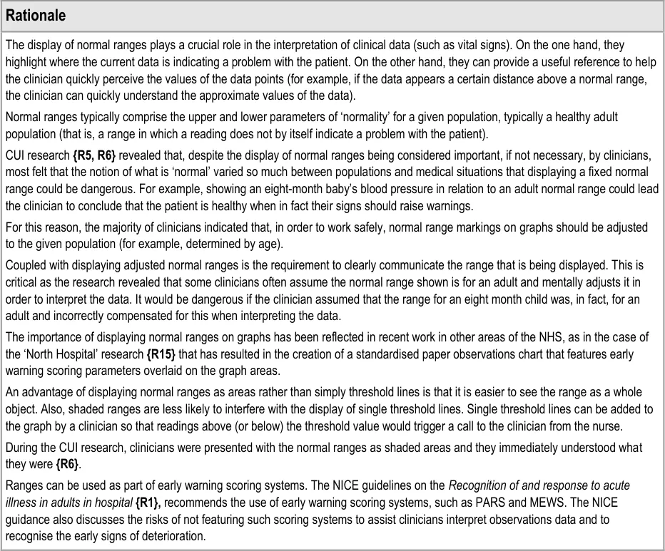
1.3.7 Indicative Ranges
Normal ranges This guidance does not define mechanisms for adjusting normal ranges nor for switching normal ranges on or off
This guidance does not specify the label text for normal ranges.
This guidance does not specify target ranges and critical thresholds:
When to show target ranges, critical ranges or thresholds
Formatting of target ranges, critical ranges or thresholds
Formatting of target ranges, critical ranges or thresholds
Labelling target ranges, critical ranges or thresholds
Changing target ranges, critical ranges or thresholds
It does not define mechanisms for changing target ranges, critical ranges or thresholds, nor does it specify the label text for target ranges, critical ranges or thresholds.
Table 8: Indicative Ranges Scope
1.3.8 Tables
Table orientation and scaling This guidance does not define mechanisms for switching the orientation of tables nor the direction of data
It does not address viewing table data and graph data simultaneously
Table formatting This guidance does not define mechanisms for scrolling, sorting and filtering
Table 9: Tables Scope
1.3.9 Additional Contextual Information
Displaying contextual data This guidance does not list all contextual information to be displayed
Accessing contextual data This guidance does not define the precise mechanisms for accessing contextual data that is not immediately visible
Table 10: Additional Contextual Information Scope
1.3.10 Additional Visualisation Mechanisms
There are many potential data visualisation mechanisms that could be employed to assist the interpretation of clinical observations data, such as zoom views, event timeline overlays and further statistical analysis and calculation methods, such as mean and peak values and trend lines.
Page 7
Copyright ©2013 Health and Social Care Information Centre
HSCIC Controlled Document
However, these are out of scope for the current work. Consideration was given to a mechanism for calculating deviations between a baseline value set by the clinician and more recent values, but this was not deemed essential by the clinical audience who reviewed the scope of this guidance.
1.4 Assumptions
A1 Absolute space (that is, the dimensions of the screen available for displaying a graph or table) will vary between suppliers.
A2 Although this guidance focuses upon vital signs data, where they deem it appropriate, suppliers should apply this guidance to other data series
A3 The interpretation of graphs and tables should be done in the context of early warning scoring systems where applicable (for example, Modified Early Warning Score (MEWS) or Patient At-Risk Scores (PARS))
A4 Where necessary, indicative or ‘normal’ ranges for a given population should be agreed by the supplier with the appropriate professional bodies or appropriate clinical authority.
A5 Measurement labels should be expressed in SNOMED-CT terms
A6 Clinicians may view graphs and tables on a variety of hardware platforms. However, special provision for non-PC platforms is not covered by the current guidance
Table 11: Assumptions
1.5 Dependencies
D1 There exists an accompanying mechanism for entering the observations data (not in scope in the current document)
D2 The display of dates must conform to the guidance for Date Display {R3}
D3 The display of times must conform to the guidance for Time Display {R4}
Table 12: Dependencies
1.6 Summary of Guidance
Table 13 references and provides a brief description of each guideline in this document.
Important
The information in Table 13 is provided only as a high-level orientation aid and indicative summary. To obtain the definitive statement of each guideline, you must refer to the sections and examples indicated.
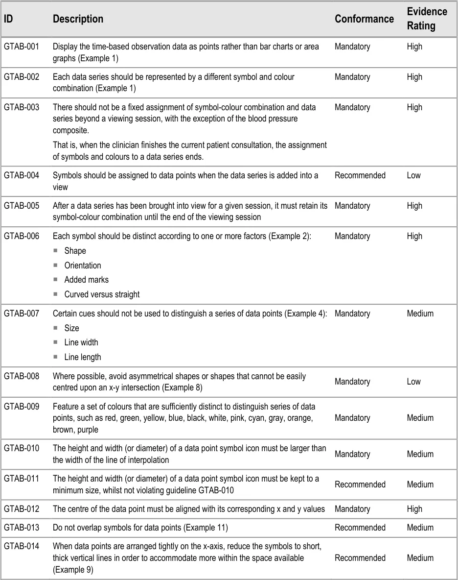
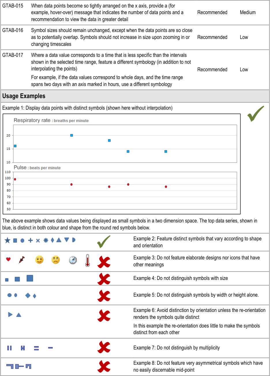
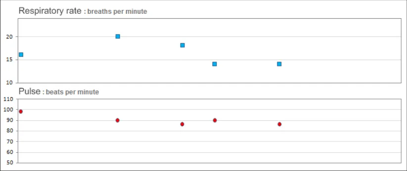
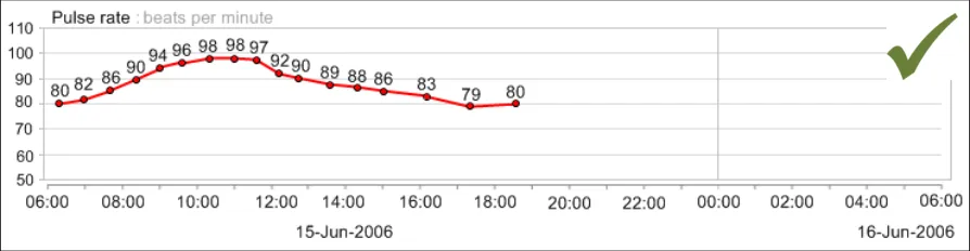
GTAB-001 2.1 Display the time-based observation data as points rather than bar charts or area graphs (Example 1)
GTAB-002 2.1 Each data series should be represented by a different symbol and colour combination (Example 1)
GTAB-003 2.1 There should not be a fixed assignment of symbol-colour combination and data series beyond a viewing session, with the exception of the blood pressure composite.
GTAB-004 2.1 Symbols should be assigned to data points when the data series is added into a view
GTAB-005 2.1 After a data series has been brought into view for a given session, it must retain its symbol-colour combination until the end of the viewing session
GTAB-006 2.1 Each symbol should be distinct according to one or more factors (Example 2)
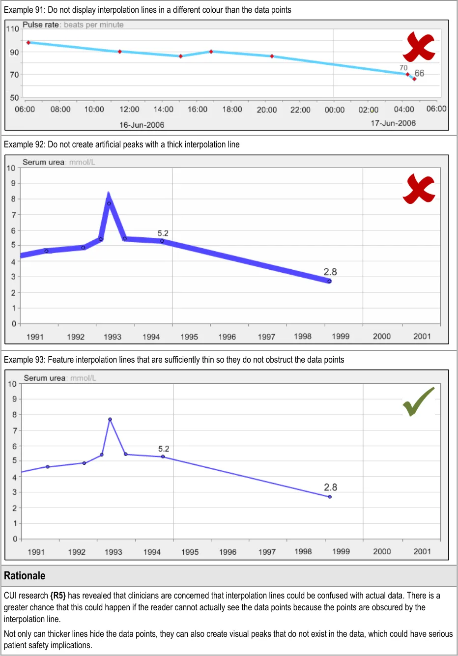
GTAB-007 2.1 Certain cues should not be used to distinguish a series of data points (Example 4)
Page 8
Copyright ©2013 Health and Social Care Information Centre
HSCIC Controlled Document
GTAB-008 2.1 Where possible, avoid asymmetrical shapes or shapes that cannot be easily centred upon an x-y intersection (Example 8)
GTAB-009 2.1 Feature a set of colours that are sufficiently distinct to distinguish series of data points, such as red, green, yellow, blue, black, white, pink, cyan, gray, orange, brown, purple
GTAB-010 2.1 The height and width (or diameter) of a data point symbol icon must be larger than the width of the line of interpolation
GTAB-011 2.1 The height and width (or diameter) of a data point symbol icon must be kept to a minimum size, whilst not violating guideline GTAB-010
GTAB-012 2.1 The centre of the data point must be aligned with its corresponding x and y values
GTAB-013 2.1 Do not overlap symbols for data points (Example 11)
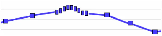
GTAB-014 2.1 When data points are arranged tightly on the x-axis, reduce the symbols to short, thick vertical lines in order to accommodate more within the space available (Example 9)
GTAB-015 2.1 When data points become so tightly arranged on the x axis, provide a (for example, hover-over) message that indicates the number of data points and a recommendation to view the data in greater detail
GTAB-016 2.1 Symbol sizes should remain unchanged, except when the data points are so close as to potentially overlap. Symbols should not increase in size upon zooming in or changing timescales
GTAB-017 2.1 Where a data value corresponds to a time that is less specific than the intervals shown in the selected time range, feature a different symbology (in addition to not interpolating the points)
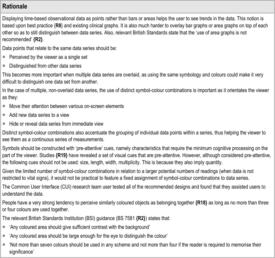
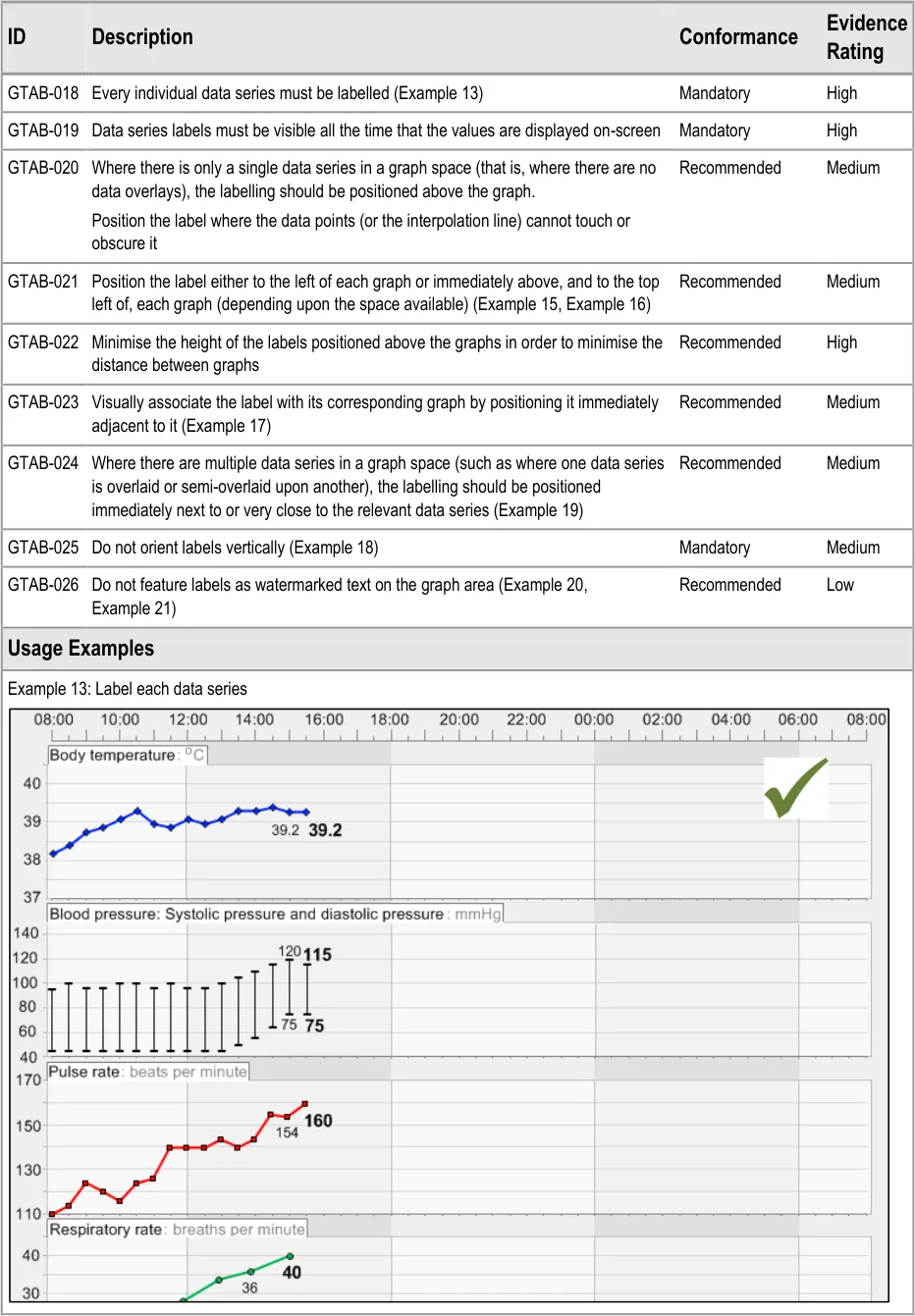
GTAB-018 2.2 Every individual data series must be labelled (Example 13)
GTAB-019 2.2 Data series labels must be visible all the time that the values are displayed on-screen
GTAB-020 2.2 Where there is only a single data series in a graph space (that is, where there are no data overlays), the labelling should be positioned above the graph.
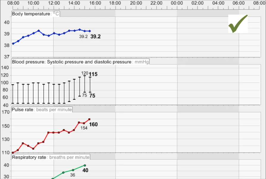
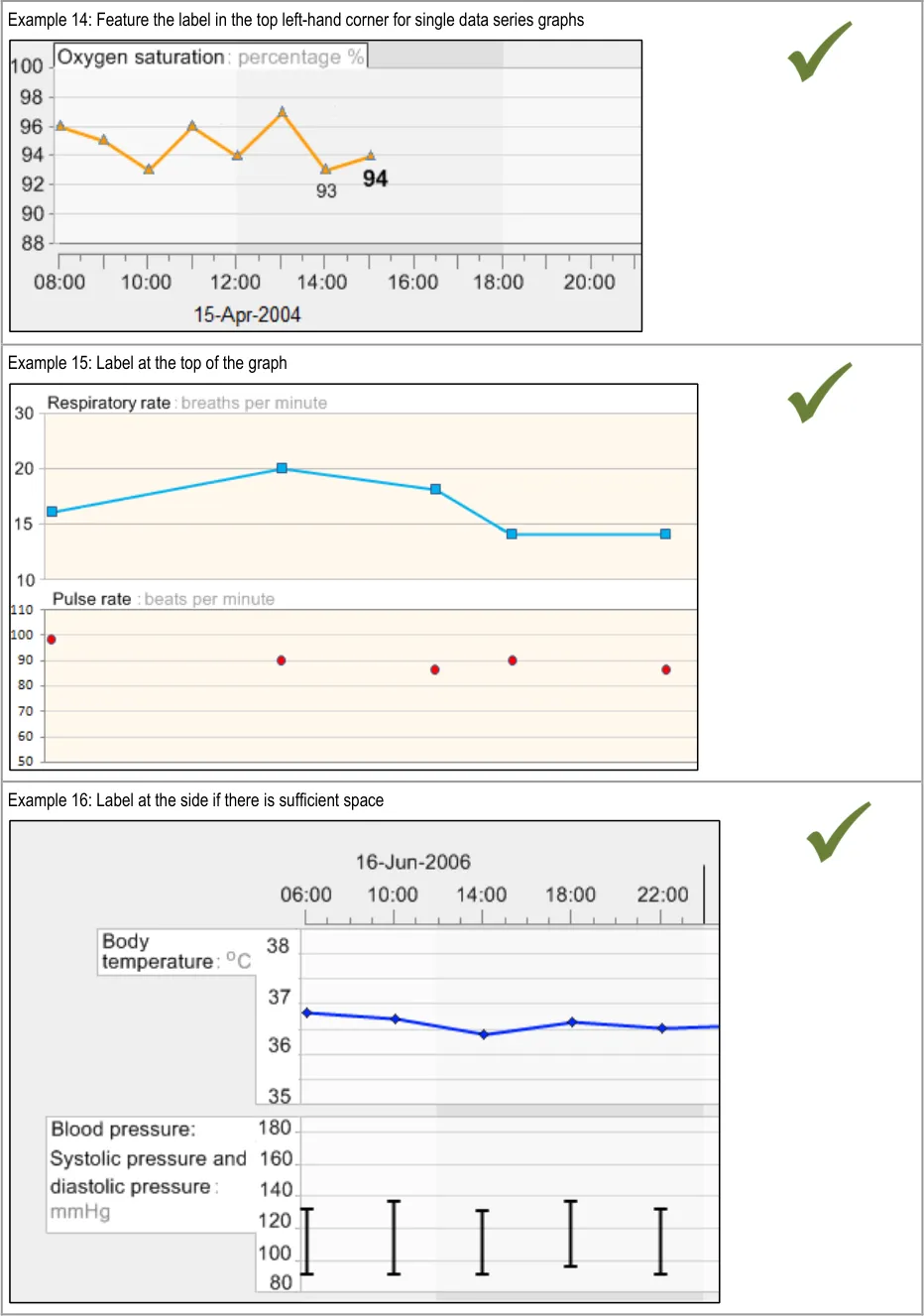
GTAB-021 2.2 Position the label either to the left of each graph or immediately above, and to the top left of, each graph (depending upon the space available) (Example 15, Example 16)
GTAB-022 2.2 Minimise the height of the labels positioned above the graphs in order to minimise the distance between graphs
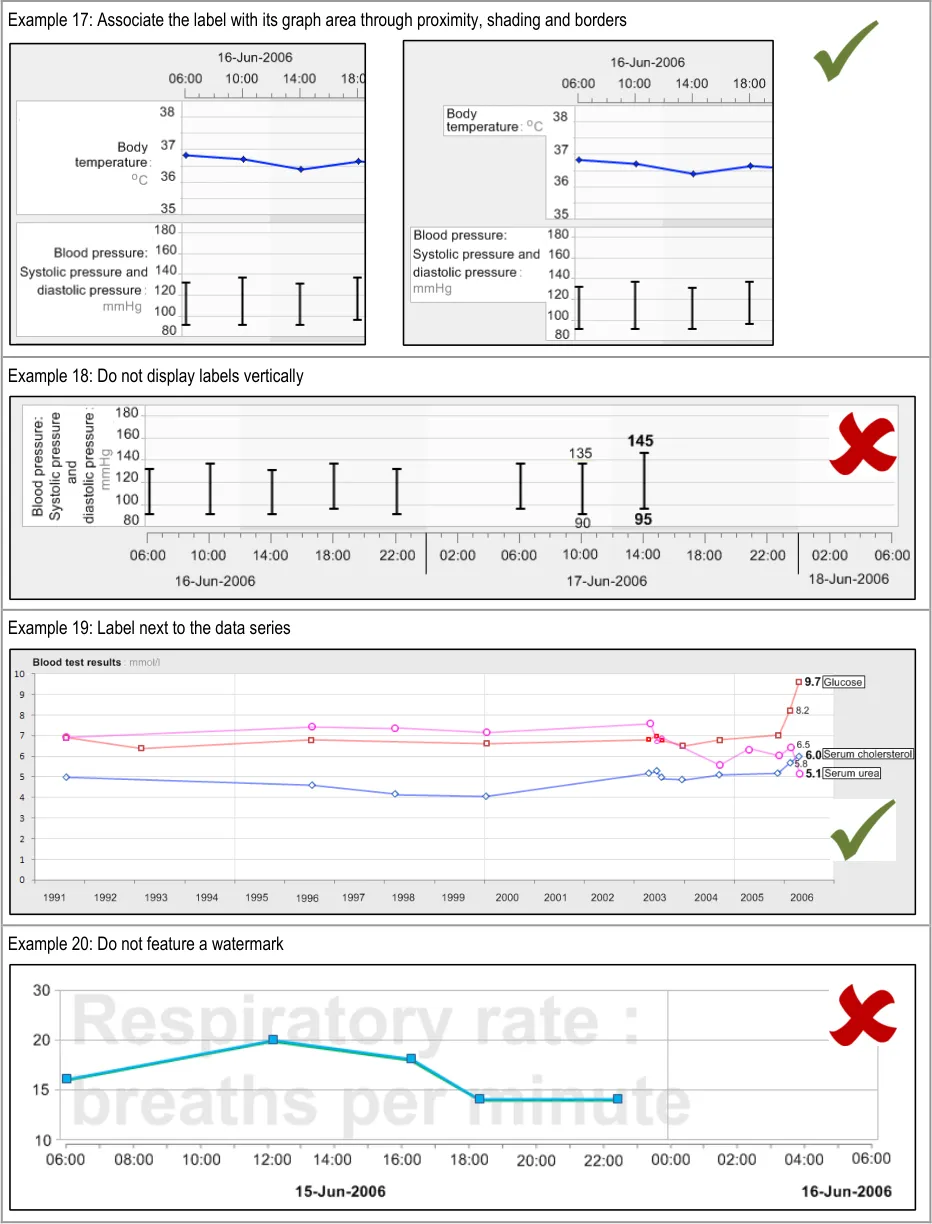
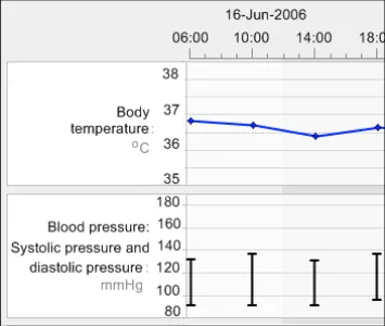
GTAB-023 2.2 Visually associate the label with its corresponding graph by positioning it immediately adjacent to it (Example 17)
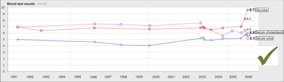
GTAB-024 2.2 Where there are multiple data series in a graph space (such as where one data series is overlaid or semioverlaid upon another), the labelling should be positioned immediately next to or very close to the relevant data series (Example 19)
GTAB-025 2.2 Do not orient labels vertically (Example 18)
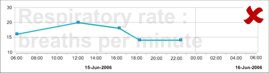
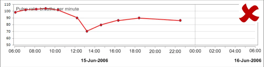
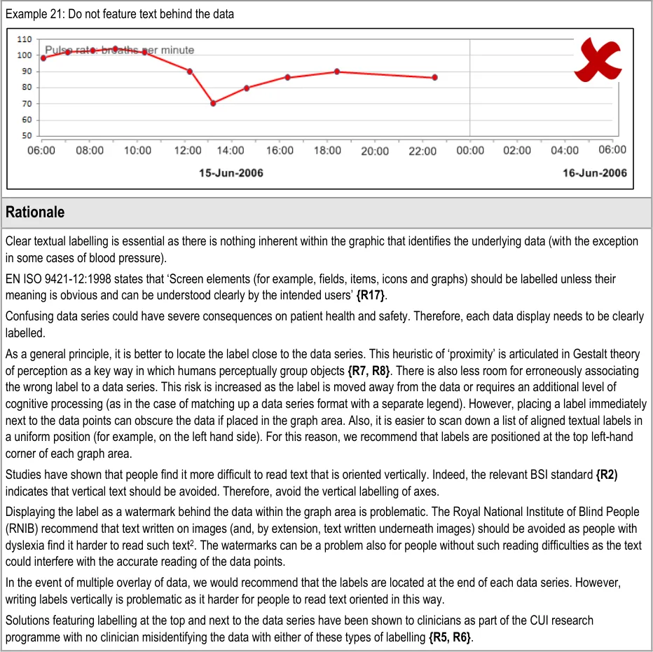
GTAB-026 2.2 Do not feature labels as watermarked text on the graph area (Example 20, Example 21)
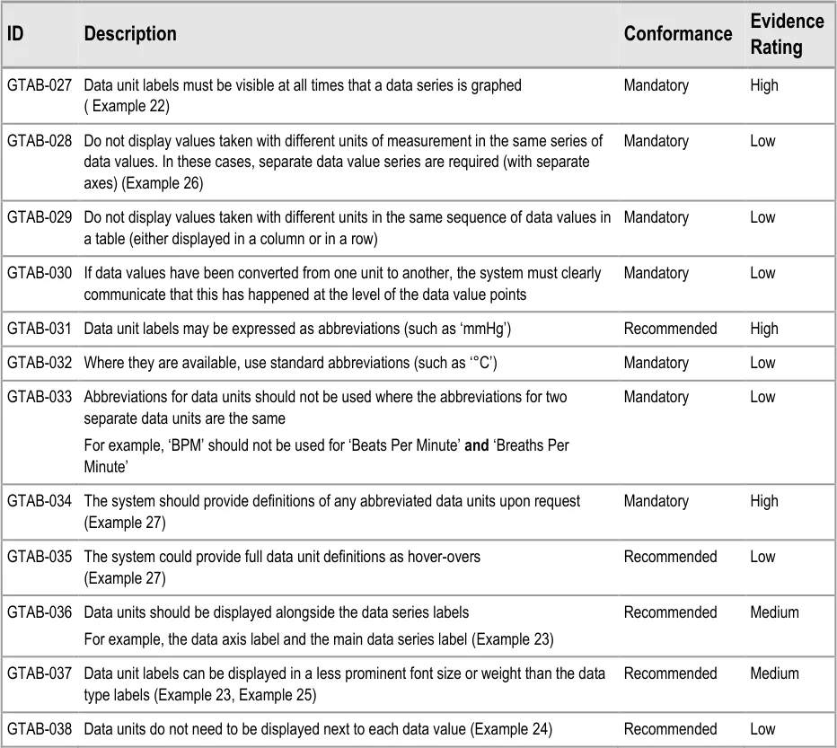
GTAB-027 2.3 Data unit labels must be visible at all times that a data series is graphed ( Example 22)
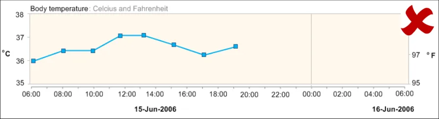
GTAB-028 2.3 Do not display values taken with different units of measurement in the same series of data values. In these cases, separate data value series are required (with separate axes) (Example 26)
GTAB-029 2.3 Do not display values taken with different units in the same sequence of data values in a table (either displayed in a column or in a row)
GTAB-030 2.3 If data values have been converted from one unit to another, the system must clearly communicate that this has happened at the level of the data value points
GTAB-031 2.3 Data unit labels may be expressed as abbreviations (such as ‘mmHg’)
GTAB-032 2.3 Where they are available, use standard abbreviations (such as ‘°C’)
Page 9
Copyright ©2013 Health and Social Care Information Centre
HSCIC Controlled Document
GTAB-033 2.3 Abbreviations for data units should not be used where the abbreviations for two separate data units are the same
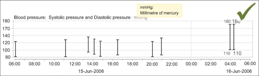
GTAB-034 2.3 The system should provide definitions of any abbreviated data units upon request (Example 27)
GTAB-035 2.3 The system could provide full data unit definitions as hover-overs (Example 27)
GTAB-036 2.3 Data units should be displayed alongside the data series labels (Example 23)
GTAB-037 2.3 Data unit labels can be displayed in a less prominent font size or weight than the data type labels (Example 23, Example 25)
GTAB-038 2.3 Data units do not need to be displayed next to each data value (Example 24)
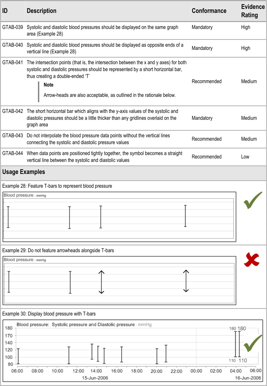
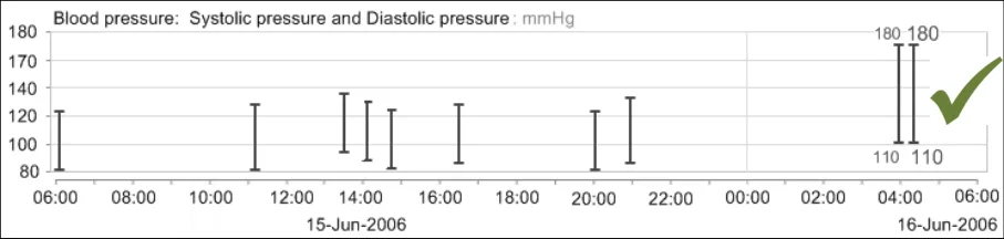
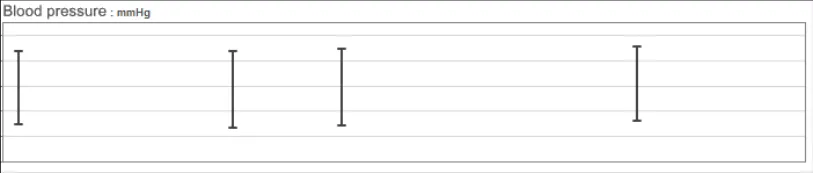
GTAB-039 2.4 Systolic and diastolic blood pressures should be displayed on the same graph area (Example 28)
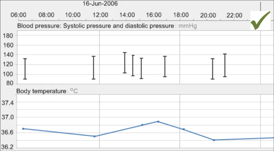
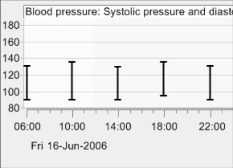
GTAB-040 2.4 Systolic and diastolic blood pressures should be displayed as opposite ends of a vertical line (Example 28)
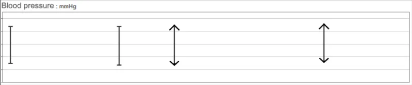
GTAB-041 2.4 The intersection points (that is, the intersection between the x and y axes) for both systolic and diastolic pressures should be represented by a short horizontal bar, thus creating a double-ended ‘T’
GTAB-042 2.4 The short horizontal bar which aligns with the y-axis values of the systolic and diastolic pressures should be a little thicker than any gridlines overlaid on the graph area
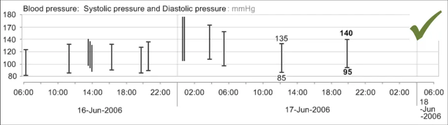
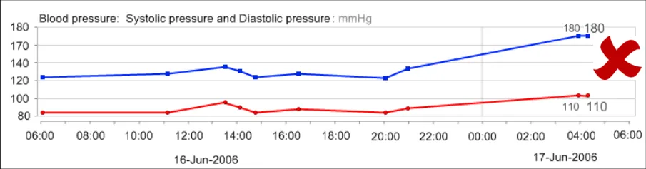
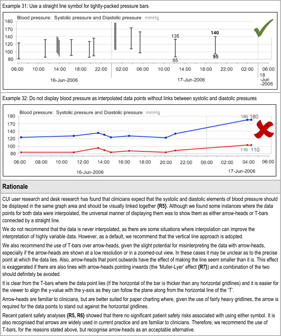
GTAB-043 2.4 Do not interpolate the blood pressure data points without the vertical lines connecting the systolic and diastolic pressure values
GTAB-044 2.4 When data points are positioned tightly together, the symbol becomes a straight vertical line between the systolic and diastolic values
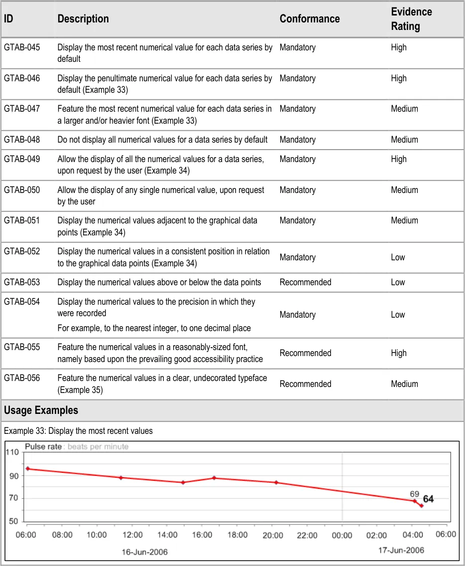
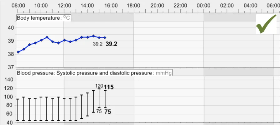
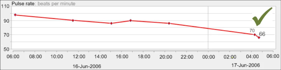
GTAB-045 2.5 Display the most recent numerical value for each data series by default
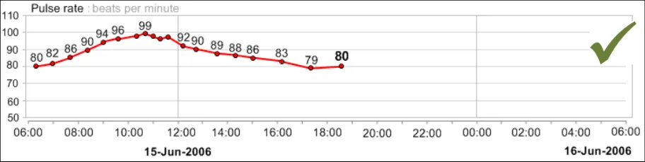
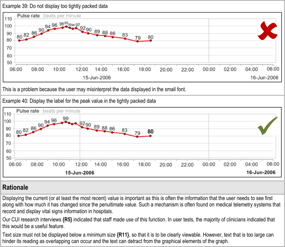
GTAB-046 2.5 Display the penultimate numerical value for each data series by default (Example 33)
GTAB-047 2.5 Feature the most recent numerical value for each data series in a larger and/or heavier font (Example 33)
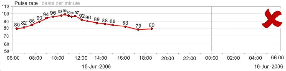
GTAB-048 2.5 Do not display all numerical values for a data series by default
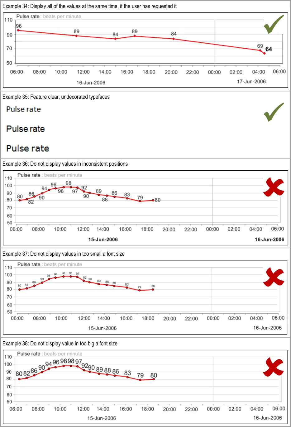
GTAB-049 2.5 Allow the display of all the numerical values for a data series, upon request by the user (Example 34)
GTAB-050 2.5 Allow the display of any single numerical value, upon request by the user
GTAB-051 2.5 Display the numerical values adjacent to the graphical data points (Example 34)
GTAB-052 2.5 Display the numerical values in a consistent position in relation to the graphical data points (Example 34)
GTAB-053 2.5 Display the numerical values above or below the data points
GTAB-054 2.5 Display the numerical values to the precision in which they were recorded
GTAB-055 2.5 Feature the numerical values in a reasonably-sized font, namely based upon the prevailing good accessibility practice
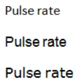
GTAB-056 2.5 Feature the numerical values in a clear, undecorated typeface (Example 35)
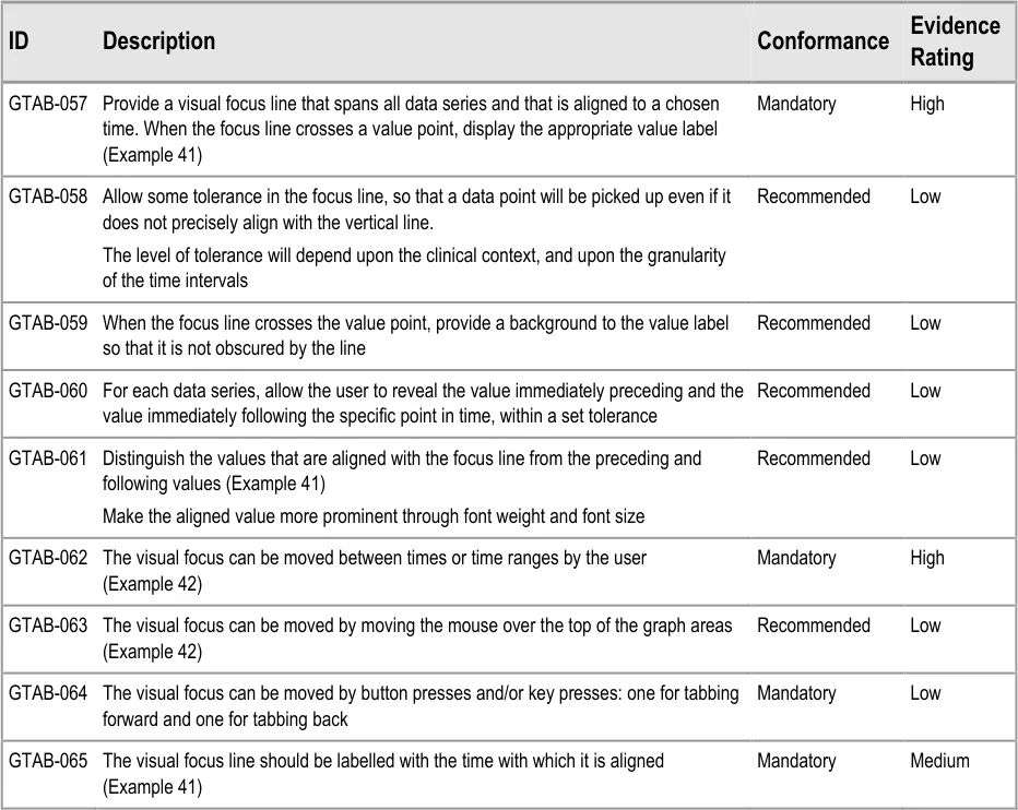
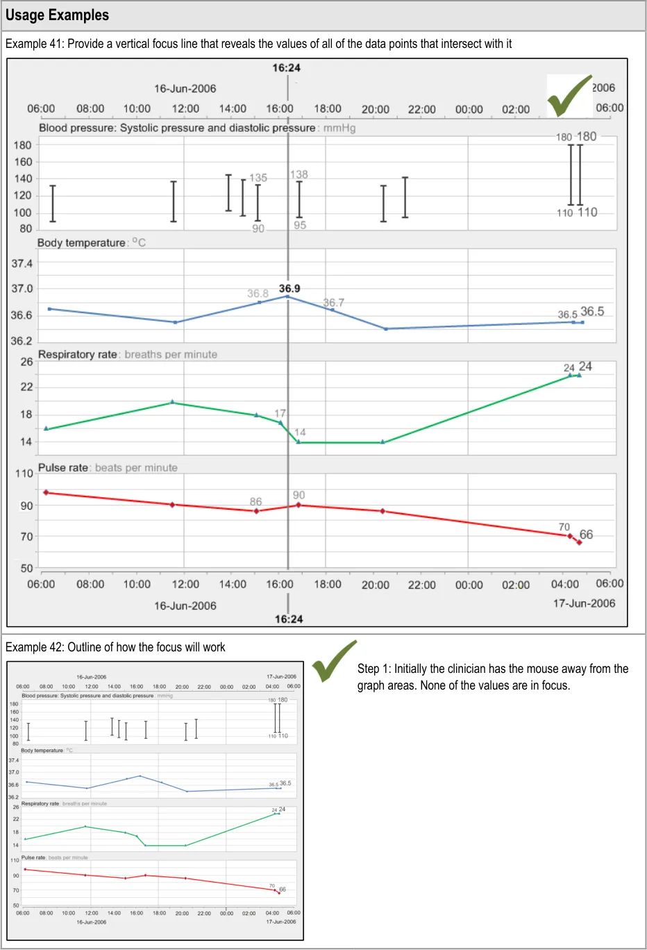
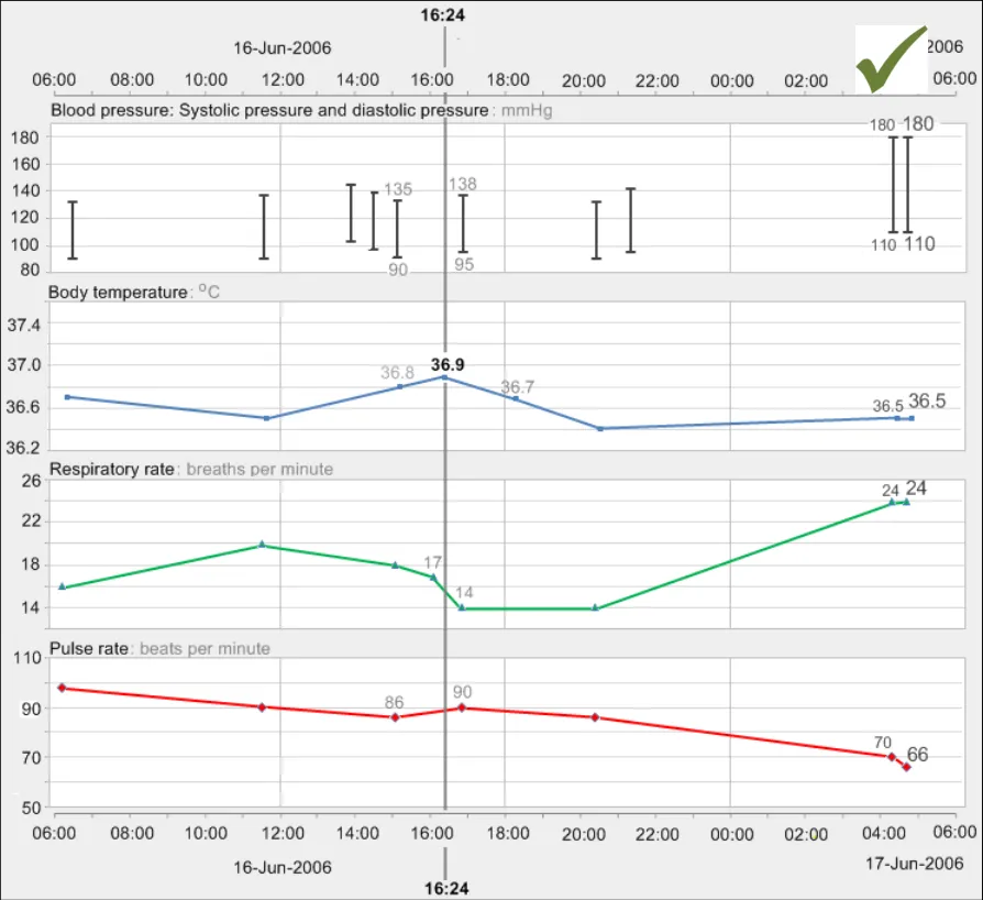
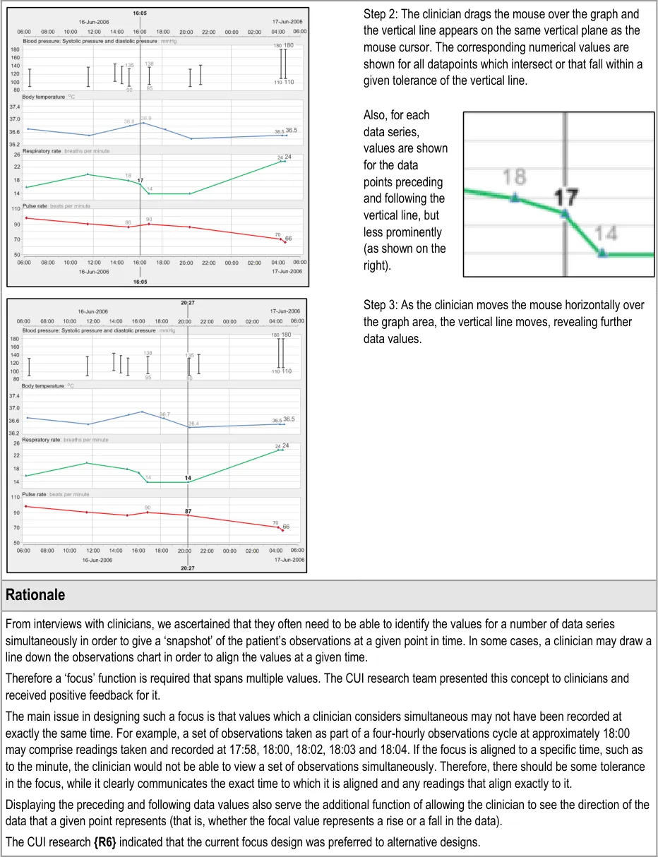
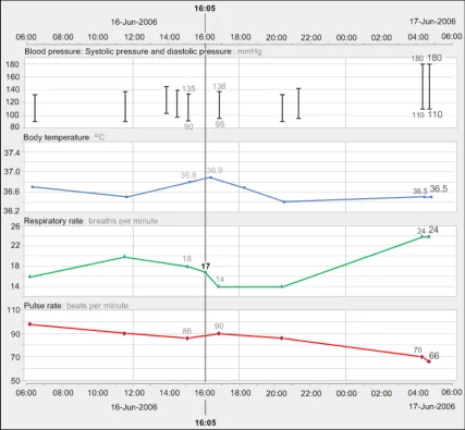
GTAB-057 2.6 Provide a visual focus line that spans all data series and that is aligned to a chosen time. When the focus line crosses a value point, display the appropriate value label (Example 41)
GTAB-058 2.6 Allow some tolerance in the focus line, so that a data point will be picked up even if does not precisely align with the vertical line
GTAB-059 2.6 When the focus line crosses the value point, provide a background to the value label so that it is not obscured by the line
GTAB-060 2.6 For each data series, allow the user to reveal the value immediately preceding and the value immediately following the specific point in time, within a set tolerance
Page 10
Copyright ©2013 Health and Social Care Information Centre
HSCIC Controlled Document
GTAB-061 2.6 Distinguish the values that are aligned with the focus line from the preceding and following values (Example 41)
GTAB-062 2.6 The visual focus can be moved between times or time ranges by the user (Example 42)
GTAB-063 2.6 The visual focus can be moved by moving the mouse over the top of the graph areas (Example 42)
GTAB-064 2.6 The visual focus can be moved by button presses and/or key presses: one for tabbing forward and one for tabbing back
GTAB-065 2.6 The visual focus line should be labelled with the time with which it is aligned (Example 41)
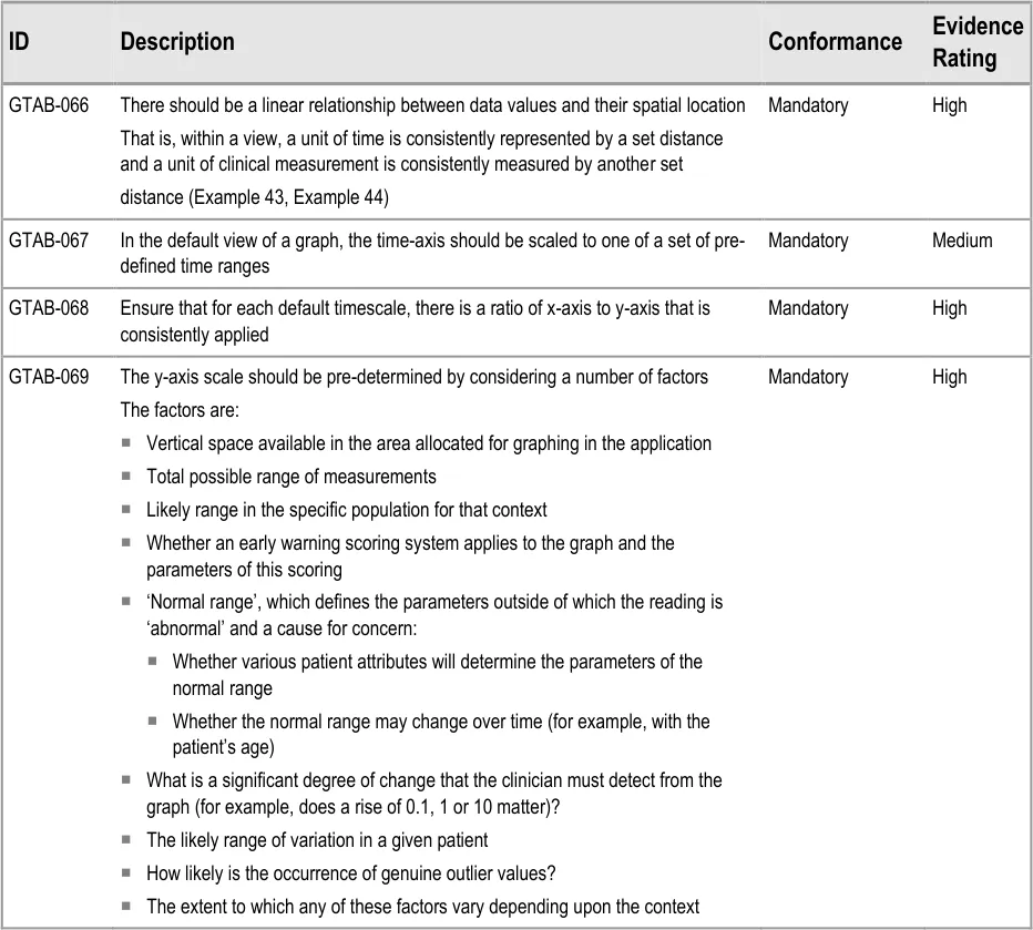
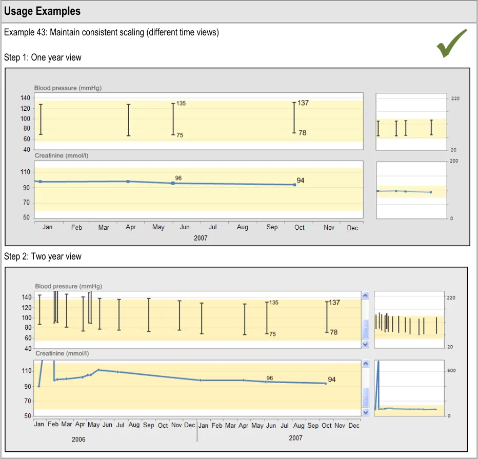
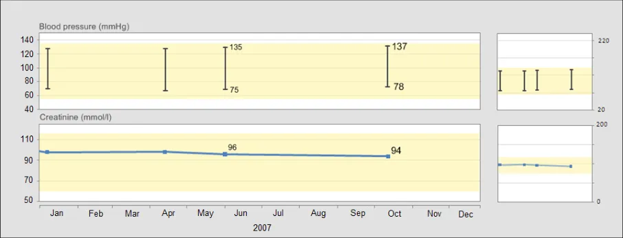
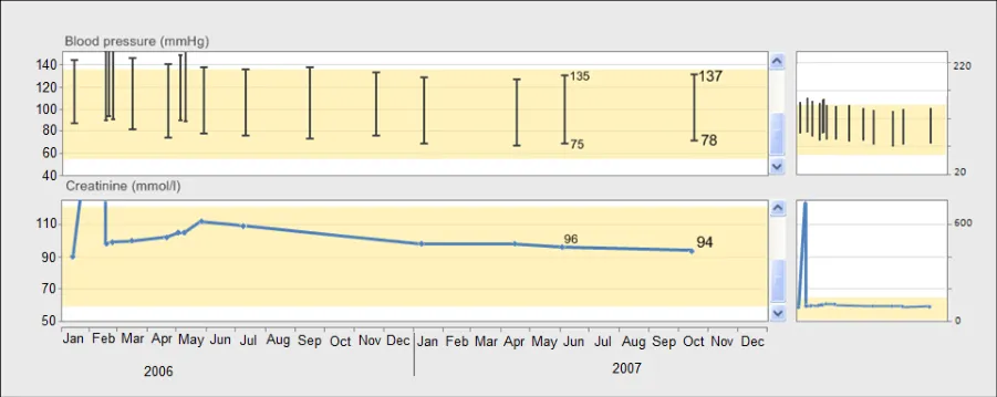
GTAB-066 3.1 There should be a linear relationship between data values and their spatial location (Example 43)
GTAB-067 3.1 In the default view of a graph, the time-axis should be scaled to one of a set of pre-defined time ranges
GTAB-068 3.1 Ensure that for each default timescale, there is a ratio of x-axis to y-axis ratio that is consistently applied
GTAB-069 3.1 The y-axis scale should be pre-determined by considering a number of factors
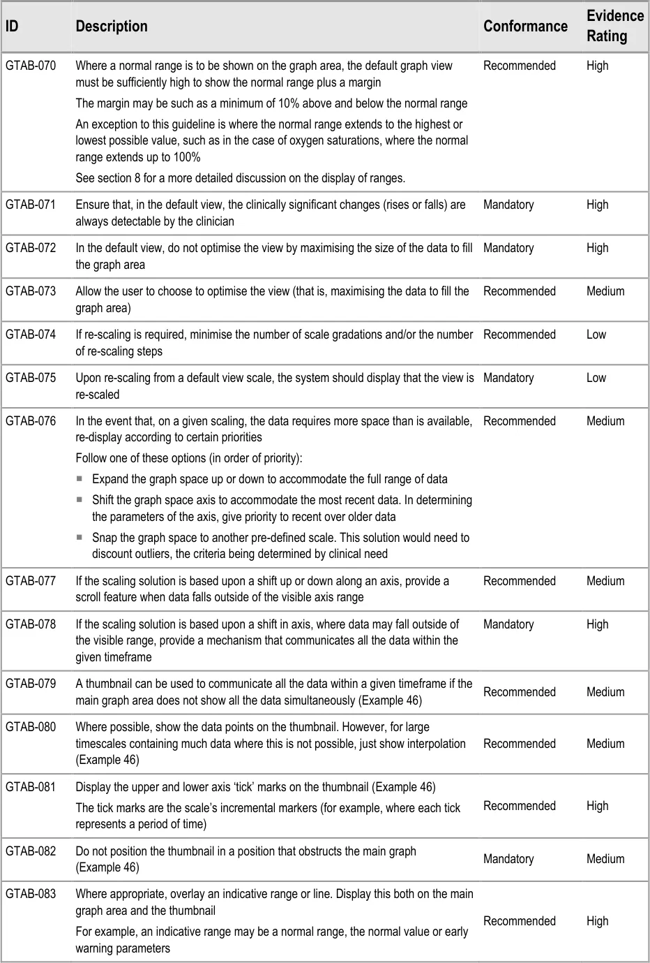
GTAB-070 3.1 Where a normal range is to be shown on the graph area, the default graph view must be sufficiently high to show the normal range plus a margin
GTAB-071 3.1 Ensure that, in the default view, the clinically significant changes (rises or falls) are always detectable by the clinician.
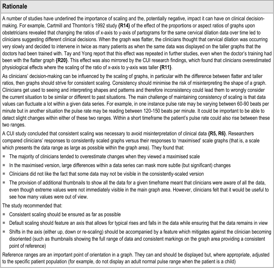
GTAB-072 3.1 In the default view, do not optimise the view by maximising the size of the data to fill the graph area
GTAB-073 3.1 Allow the user to choose to optimise the view (that is, maximising the data to fill the graph area)
GTAB-074 3.1 If re-scaling is required, minimise the number of scale gradations and/or the number of re-scaling steps
GTAB-075 3.1 Upon re-scaling from a default view scale, the system should display that the view is re-scaled
GTAB-076 3.1 In the event that, on a given scaling, the data requires more space than is available, re-display according to certain priorities
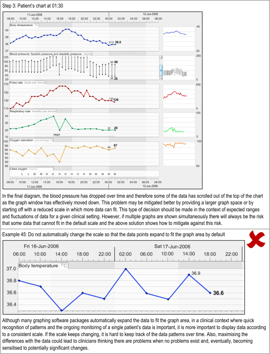
GTAB-077 3.1 If the scaling solution is based upon a shift up or down along an axis, provide a scroll feature when data falls outside of the visible axis range
GTAB-078 3.1 If the scaling solution is based upon a shift in axis, where data may fall outside of the visible range, provide a mechanism that communicates all the data within the given timeframe
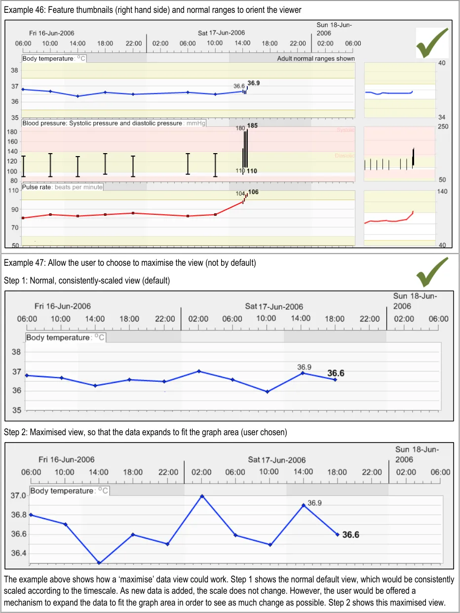
GTAB-079 3.1 A thumbnail can be used to communicate all the data within a given timeframe if the main graph area does not show all the data simultaneously (Example 46)
GTAB-080 3.1 Where possible, show the data points on the thumbnail, although for large timescales containing much data this will not be possible and, in those cases, just show interpolation. (Example 46)
GTAB-081 3.1 Display the upper and lower axis ‘tick’ marks on the thumbnail (Example 46)
GTAB-082 3.1 Do not position the thumbnail in a position that obstructs the main graph (Example 46)
GTAB-083 3.1 Where appropriate, overlay an indicative range or line. Display this both on the main graph area and the thumbnail
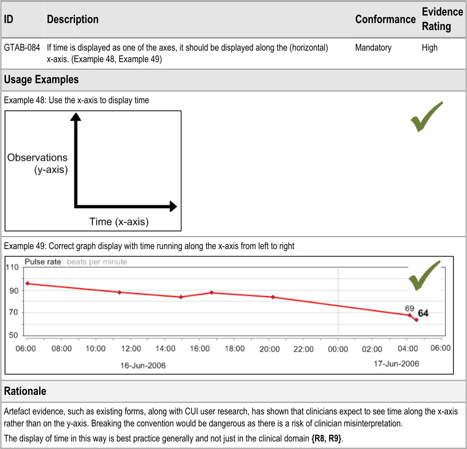
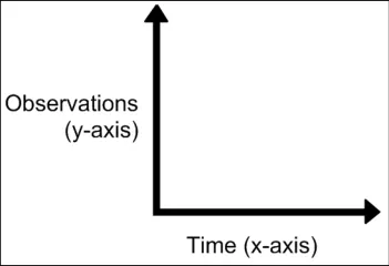
GTAB-084 4.1 If time is displayed as one of the axes, it should be displayed along the (horizontal) x-axis (Example 48, Example 49)
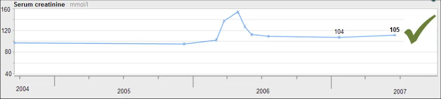
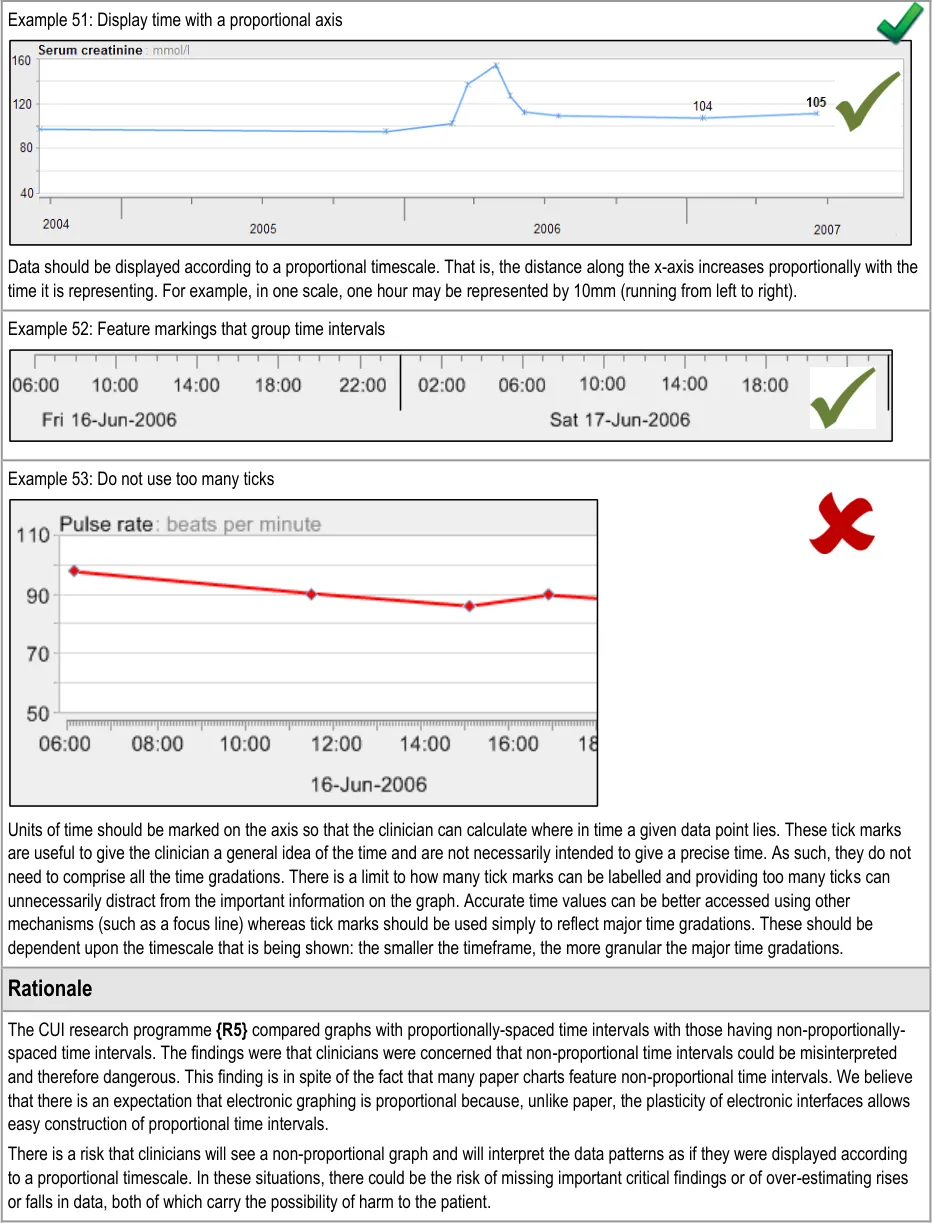
GTAB-085 4.2 As a default, time must be displayed proportionally in observation graphs (Example 51)
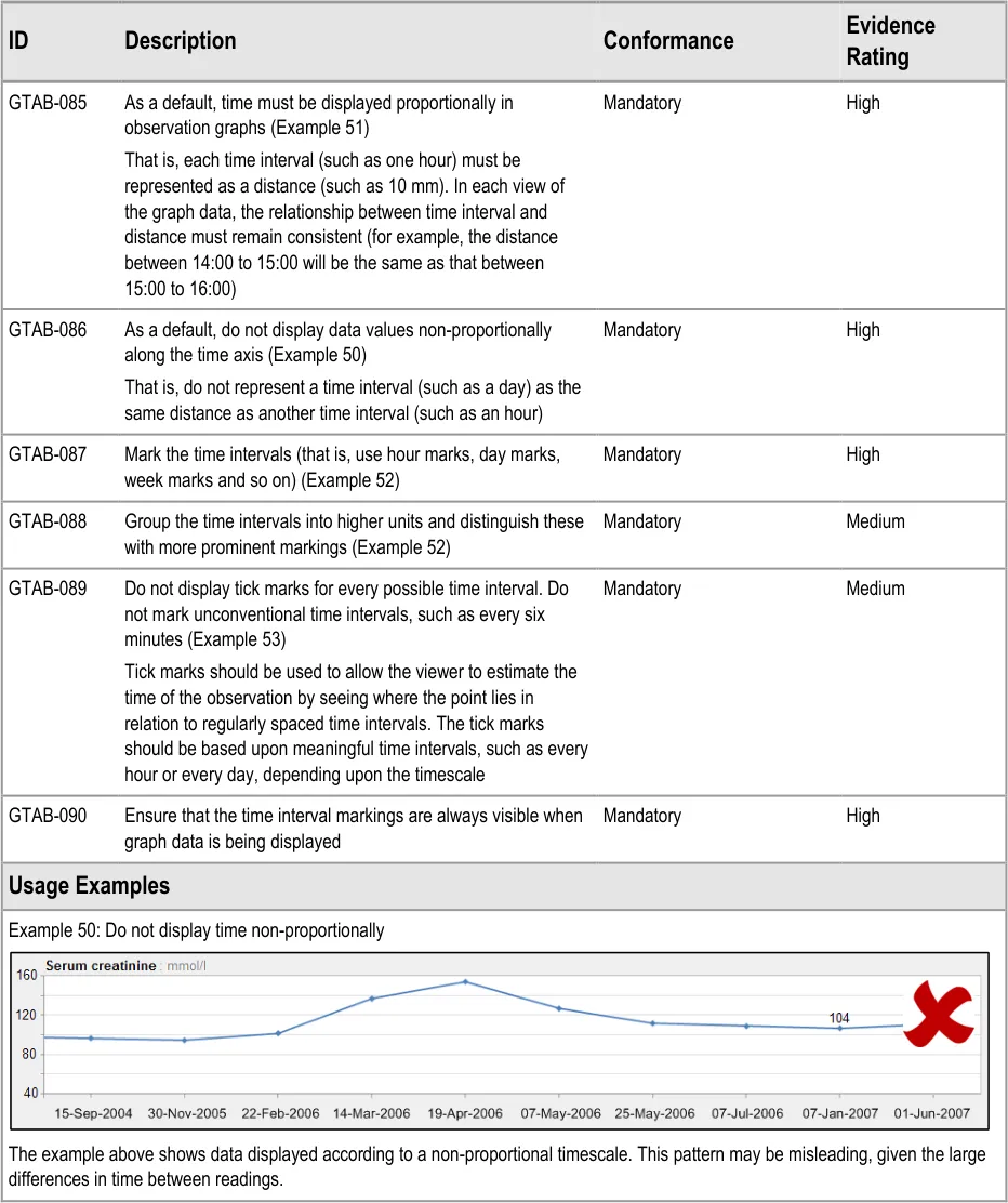
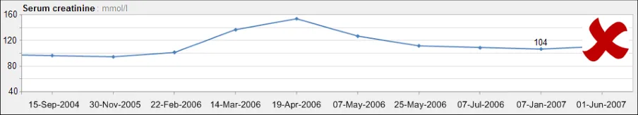
GTAB-086 4.2 As a default, do not display data values non-proportionally along the time axis (Example 50)
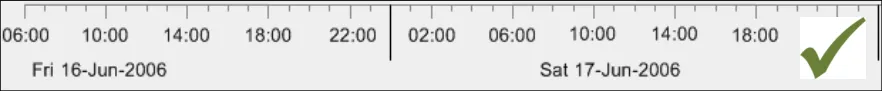
GTAB-087 4.2 Mark the time intervals (that is, use hour marks, day marks, week marks and so on) (Example 52)
GTAB-088 4.2 Group the time intervals into higher units and distinguish these with more prominent markings (Example 52)
Page 11
Copyright ©2013 Health and Social Care Information Centre
HSCIC Controlled Document
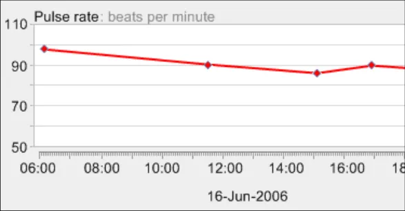
GTAB-089 4.2 Do not display tick marks for every possible time interval. Do not mark unconventional time intervals, such as every six minutes. (Example 53)
GTAB-090 4.2 Ensure that the time interval markings are always visible when graph data is being displayed.
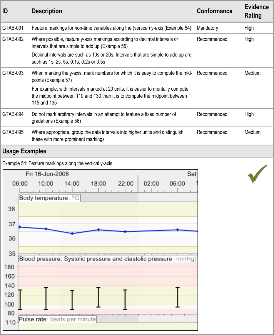
GTAB-091 4.3 Feature markings for non-time variables along the (vertical) y-axis. (Example 54)
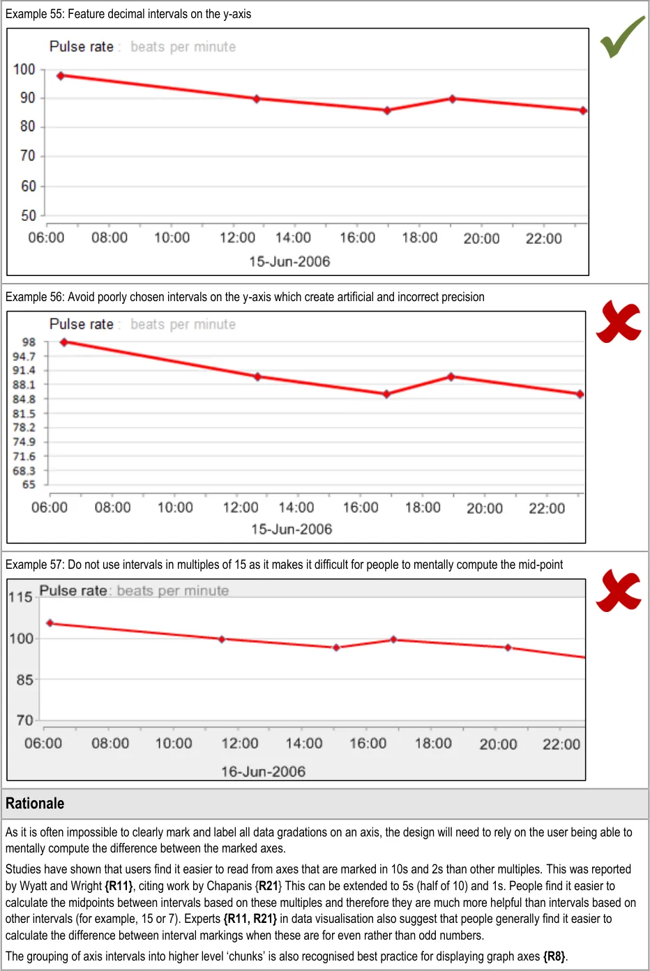
GTAB-092 4.3 Where possible, feature y-axis markings according to decimal intervals or intervals that are simple to add up (Example 55)
GTAB-093 4.3 When marking the y-axis, mark numbers for which it is easy to compute the mid-points (Example 57)
GTAB-094 4.3 Do not mark arbitrary intervals in an attempt to feature a fixed number of gradations (Example 56)
GTAB-095 4.3 Where appropriate, group the data intervals into higher units and distinguish these with more prominent markings
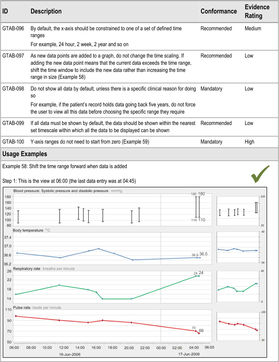
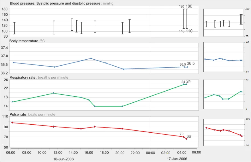
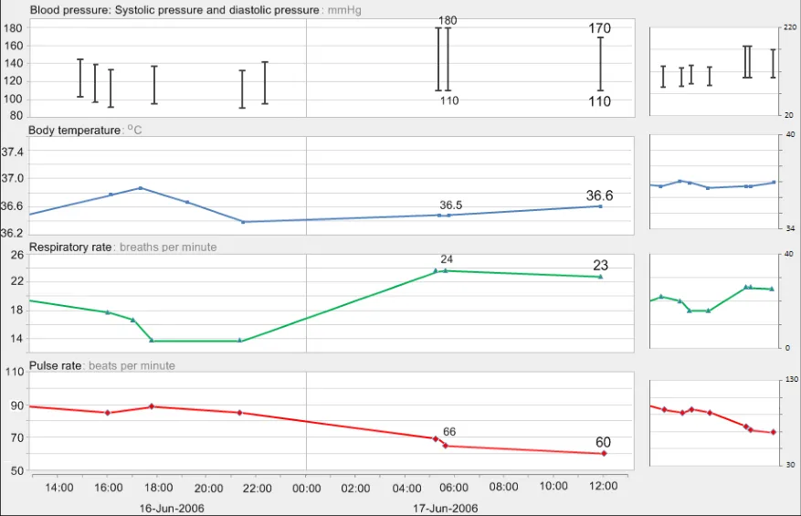
GTAB-096 4.4 By default, the x-axis should be constrained to one of a set of defined time ranges
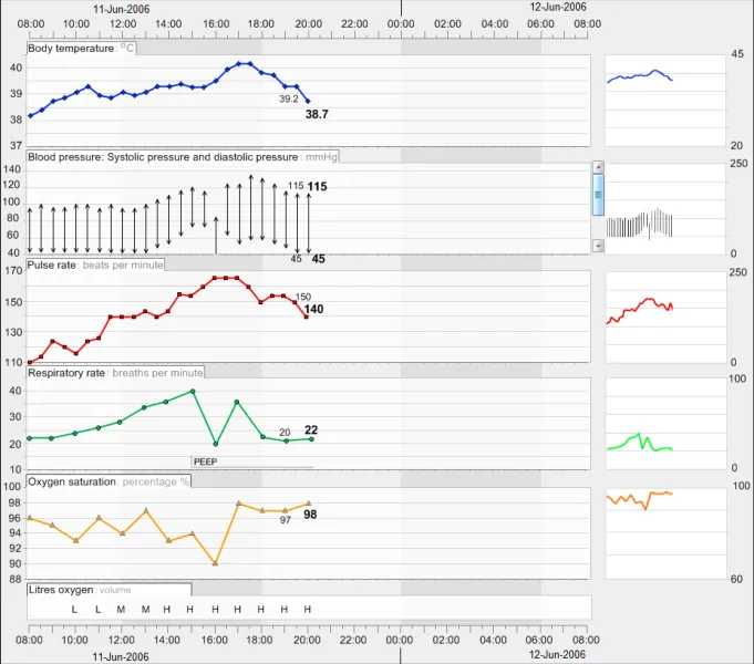
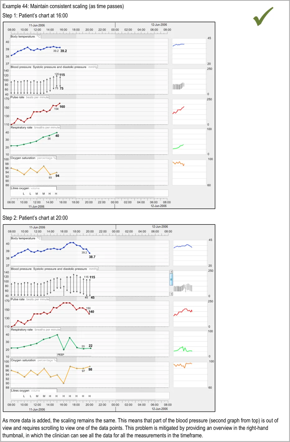
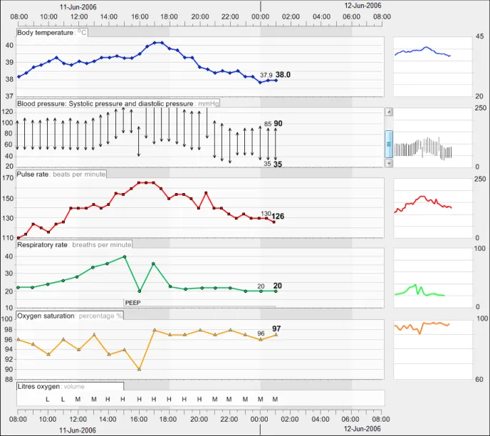
GTAB-097 4.4 As new data points are added to a graph, do not change the time scaling. If adding the new data point means that the current data exceeds the time range, shift the time window to include the new data rather than increasing the time range in size. (Example 58)
GTAB-098 4.4 Do not show all data by default, unless there is a specific clinical reason for doing so
GTAB-099 4.4 If all data must be shown by default, the data should be shown within the nearest set timescale within which all the data to be displayed can be shown
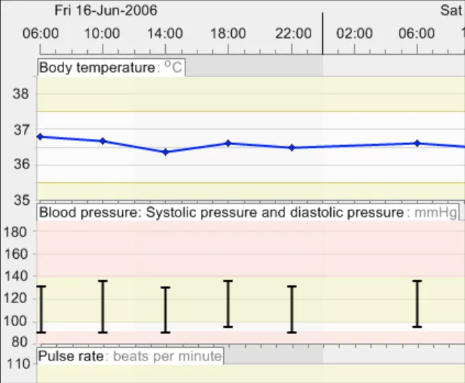
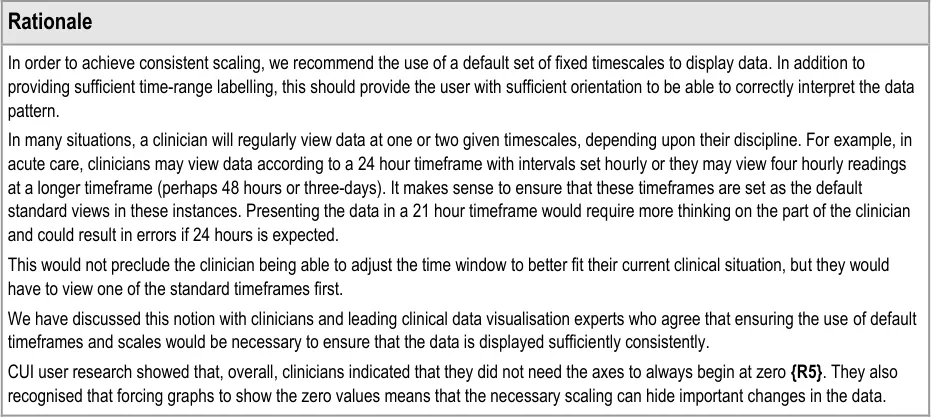
GTAB-100 4.4 Y-axis ranges do not need to start from zero (Example 59)
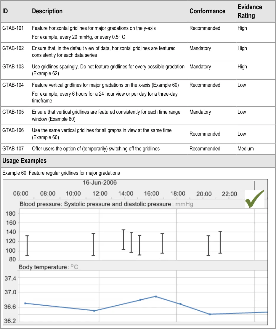
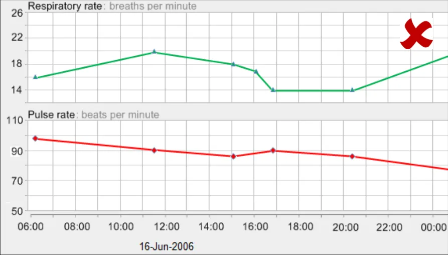
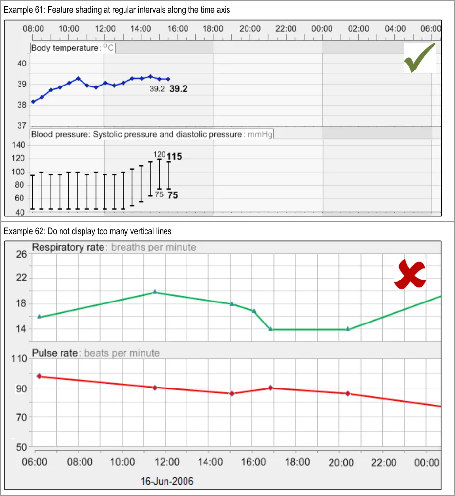
GTAB-101 4.5 Feature horizontal gridlines for major gradations on the y-axis
GTAB-102 4.5 Ensure that, in the default view of data, horizontal gridlines are featured consistently for each data series
GTAB-103 4.5 Use gridlines sparingly. Do not feature gridlines for every possible gradation (Example 62)
GTAB-104 4.5 Feature vertical gridlines for major gradations on the x-axis (Example 60)
GTAB-105 4.5 Ensure that vertical gridlines are featured consistently for each time range window (Example 60)
GTAB-106 4.5 Use the same vertical gridlines for all graphs in view at the same time (Example 60)
GTAB-107 4.5 Offer users the option of (temporarily) switching off the gridlines
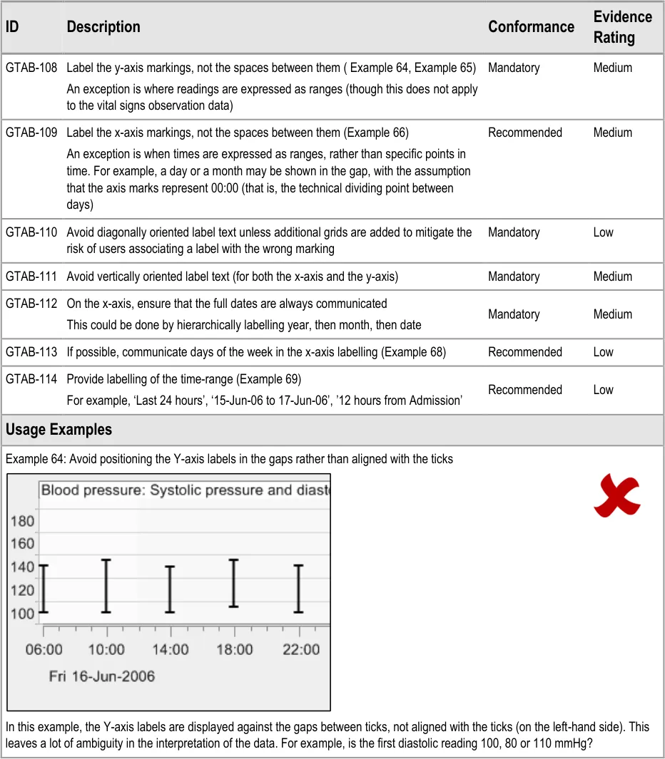
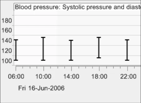
GTAB-108 4.6 Label the y-axis markings, not the spaces between them ( Example 64, Example 65)
GTAB-109 4.6 Label the x-axis markings, not the spaces between them (Example 66)
GTAB-110 4.6 Avoid diagonally oriented label text unless additional grids are added to mitigate the risk of users associating a label with the wrong marking
GTAB-111 4.6 Avoid vertically oriented label text (for both the x-axis and the y-axis)
GTAB-112 4.6 On the x-axis, ensure that the full dates are always communicated
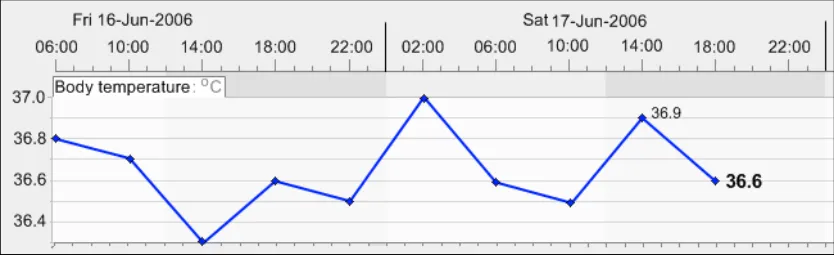
GTAB-113 4.6 If possible, communicate days of the week in the x-axis labelling (Example 68)
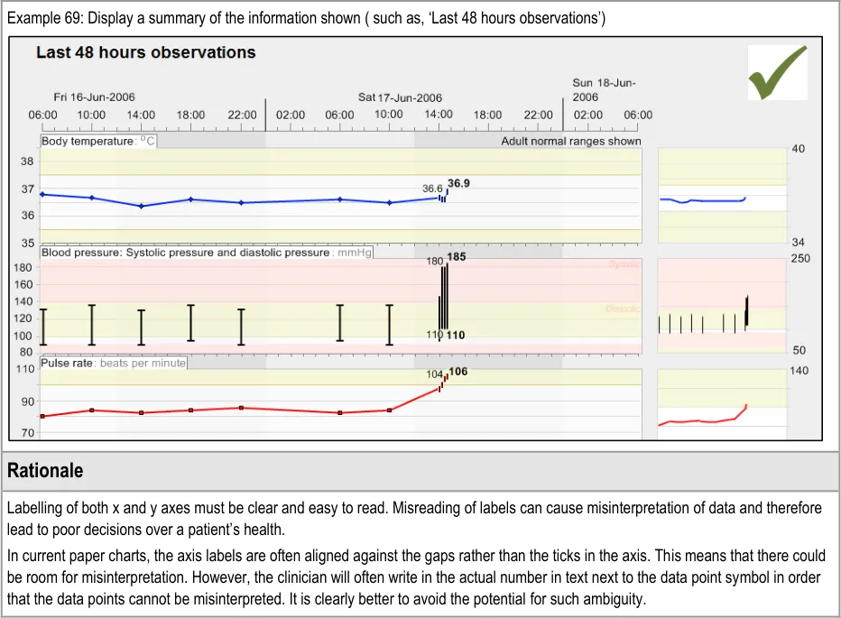
GTAB-114 4.6 Provide labelling of the time-range (Example 69)
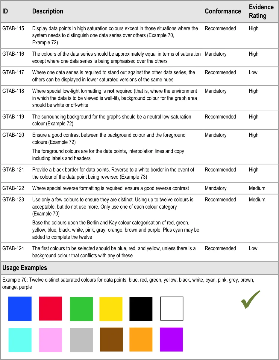
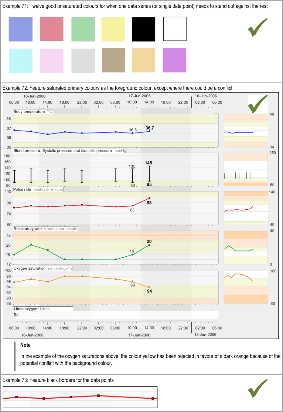
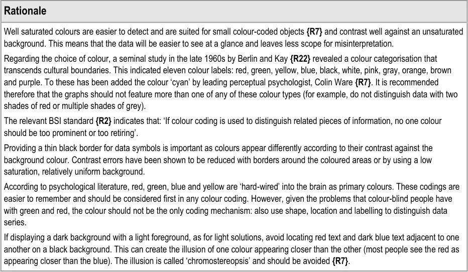
GTAB-115 5.1 Display data points in high saturation colours except in those situations where the system needs to distinguish one data series over others (Example 70, Example 72)
GTAB-116 5.1 The colours of the data series should be approximately equal in terms of saturation except where one data series is being emphasised over the others
GTAB-117 5.1 Where one data series is required to stand out against the other data series, the others can be displayed in lower saturated versions of the same hues
Page 12
Copyright ©2013 Health and Social Care Information Centre
HSCIC Controlled Document
GTAB-118 5.1 Where special low-light formatting is not required (that is, where the environment in which the data is to be viewed is well-lit, background colour for the graph area should be white or off-white
GTAB-119 5.1 The surrounding background for the graphs should be a neutral low-saturation colour (Example 72)
GTAB-120 5.1 Ensure a good contrast between the background colour and the foreground colours (Example 72)
GTAB-121 5.1 Provide a black border for data points. Reverse to a white border in the event of the colour of the data point being reversed (Example 73)
GTAB-122 5.1 Where special reverse formatting is required, ensure a good reverse contrast
GTAB-123 5.1 Use only a few colours if they are to be distinct. Using up to twelve colours is acceptable, but do not use more. Only use one of each colour category (Example 70)
GTAB-124 5.1 The first colours to be selected should be blue, red, and yellow, unless there is a background colour that conflicts with any of these colours
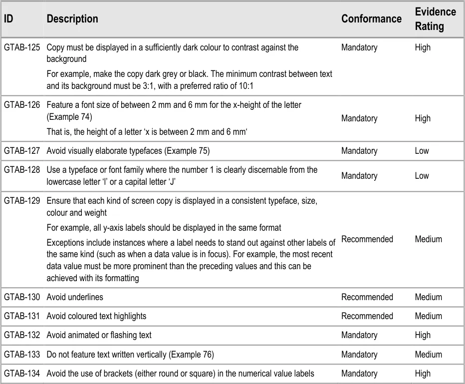
GTAB-125 5.2 Copy must be displayed in a sufficiently dark colour to contrast against the background
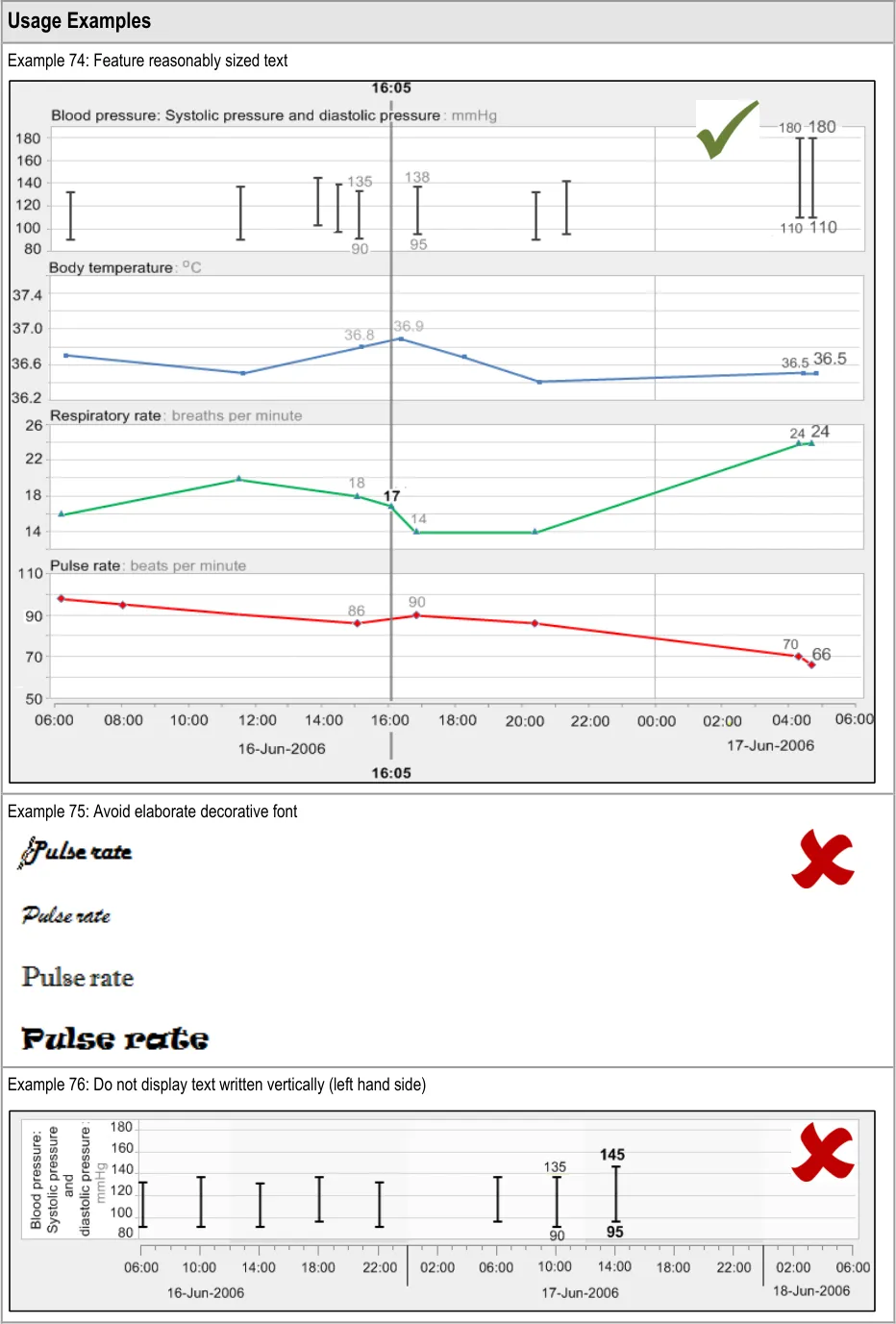
GTAB-126 5.2 Feature a font size of between 2 mm and 6 mm for the x-height of the letter (Example 74)
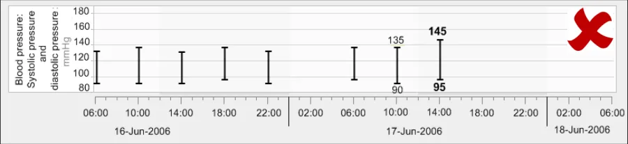
GTAB-127 5.2 Avoid visually elaborate typefaces (Example 75)
GTAB-128 5.2 Use a typeface or font family where the number 1 is clearly discernable from the lowercase letter ‘l’ or a capital letter ‘J’
GTAB-129 5.2 Ensure that each kind of screen copy is displayed in a consistent typeface, size, colour and weight.
GTAB-130 5.2 Avoid underlines
GTAB-131 5.2 Avoid coloured text highlights
GTAB-132 5.2 Avoid animated or flashing text
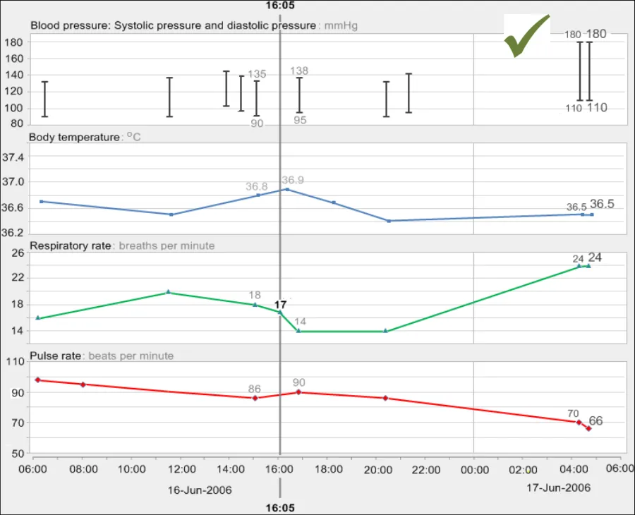
GTAB-133 5.2 Do not feature text written vertically (Example 76)
GTAB-134 5.2 Avoid the use of brackets (either round or square) in the numerical value labels
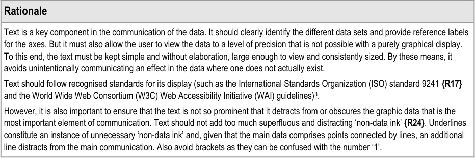
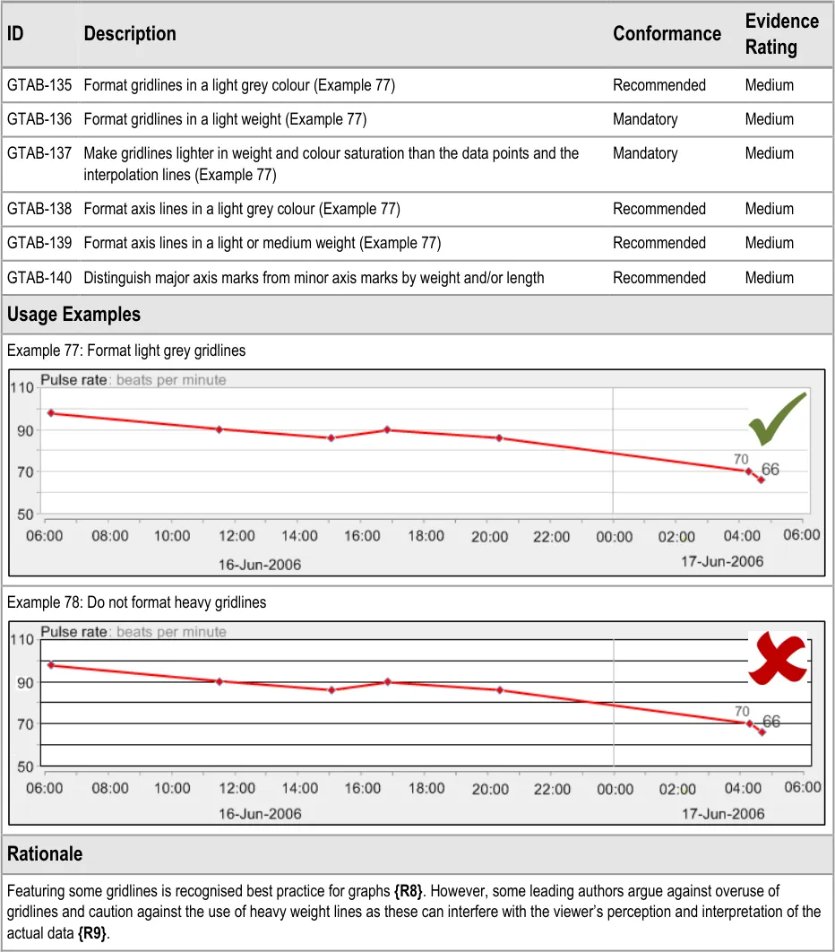
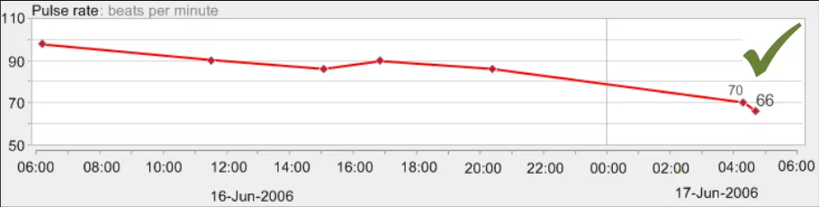
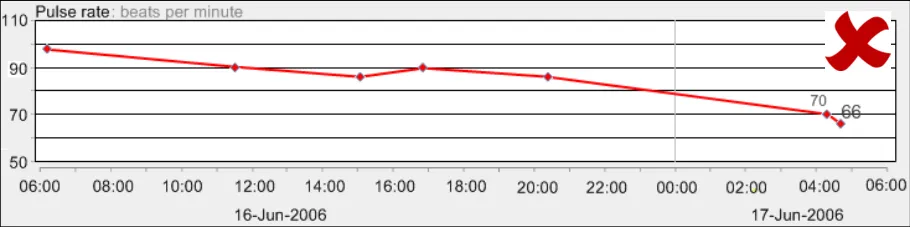
GTAB-135 5.3 Format gridlines in a light grey colour (Example 77)
GTAB-136 5.3 Format gridlines in a light weight (Example 77)
GTAB-137 5.3 Make gridlines lighter in weight and colour saturation than the data points and the interpolation lines (Example 77)
GTAB-138 5.3 Format axis lines in a light grey colour (Example 77)
GTAB-139 5.3 Format axis lines in a light or medium weight (Example 77)
GTAB-140 5.3 Distinguish major axis marks from minor axis marks by weight and/or length
GTAB-141 5.4 Do not feature watermarks or background images on the graph area
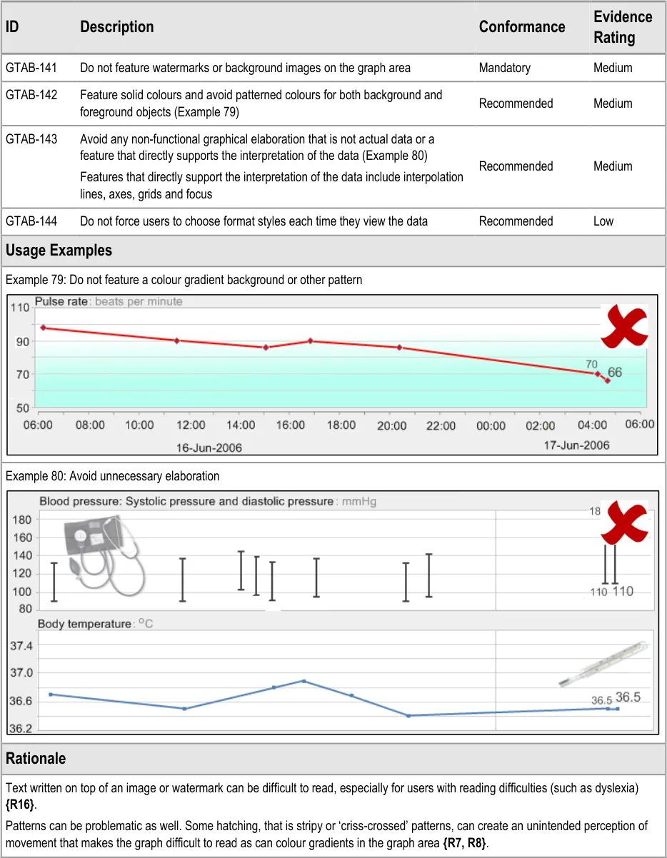
GTAB-142 5.4 Feature solid colours and avoid patterned colours for both background and foreground objects (Example 79)
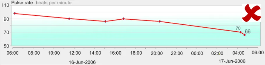
GTAB-143 5.4 Avoid any non-functional graphical elaboration that is not actual data or a feature that directly supports the interpretation of the data (Example 80)
GTAB-144 5.4 Do not force users to choose format styles each time they view the data
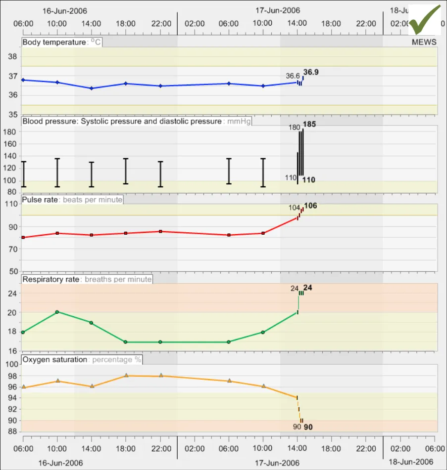
GTAB-145 6.1 Display multiple data series vertically stacked unless there is clinical reason to do otherwise (Example 81)
GTAB-146 6.1 Vertically align the left-hand axes of all the graphs (Example 81)
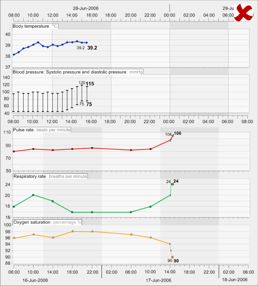
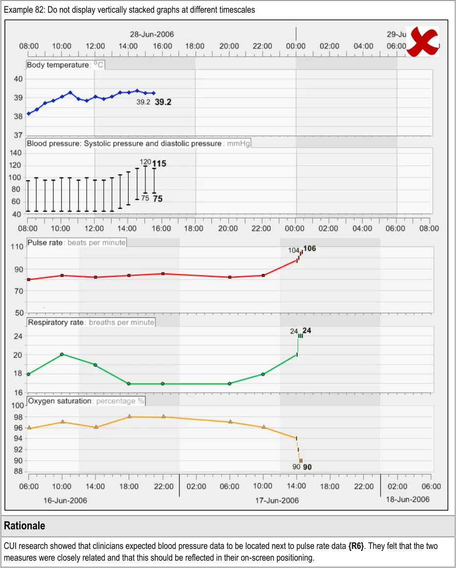
GTAB-147 6.1 Vertically align time intervals between data series that are being viewed simultaneously (Example 81, Example 82)
Page 13
Copyright ©2013 Health and Social Care Information Centre
HSCIC Controlled Document
GTAB-148 6.1 Minimise the space between graphs, though allowing for the inclusion of header labels (Example 81)
GTAB-149 6.1 Where a convention exists, position sets of graphs in the appropriate order (Example 81)
GTAB-150 6.1 Where no convention exists, the position of graphs in the vertical stacking can be determined by the order in which they are added to the view
GTAB-151 6.1 The user should be able to change the order in which the graphs are stacked
GTAB-152 6.1 Where the number of graphs exceeds the vertical space available on screen, provide a suitable mechanism to move the viewing window up and down
GTAB-153 6.1 Where there are graphs that have been chosen for viewing, but are not in view, feature a suitable mechanism to communicate that there are further graphs not in view
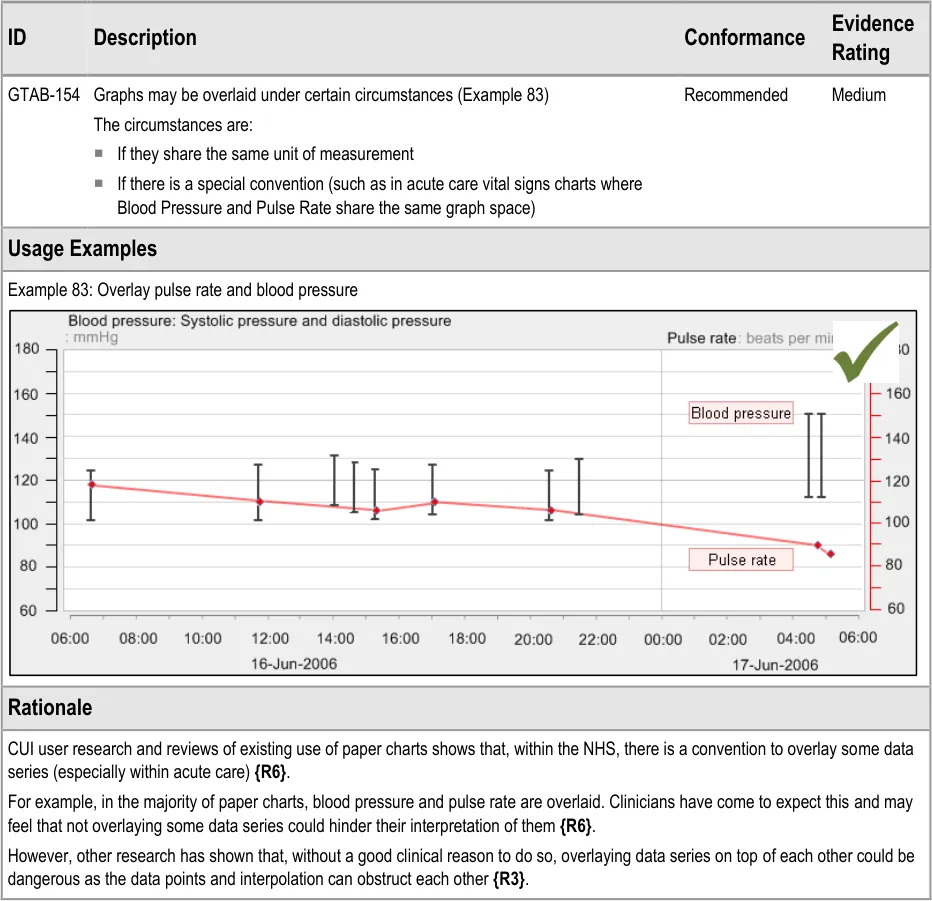
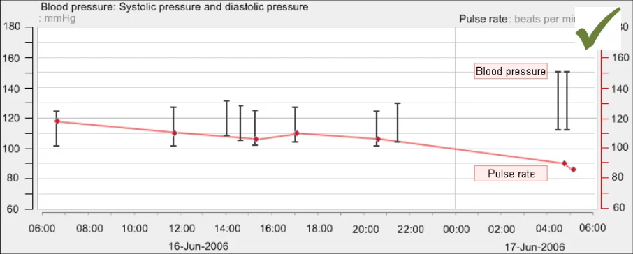
GTAB-154 6.2 Graphs may be overlaid under certain circumstances (Example 83)
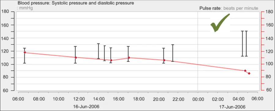
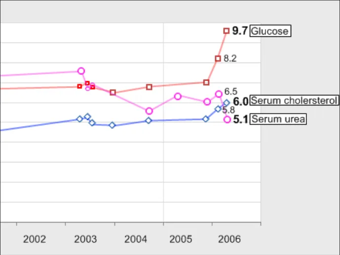
GTAB-155 6.3 If two data series displayed in the same graph area are measured in different units, show both axes (Example 85)
GTAB-156 6.3 If two axes are shown, label each axis (Example 85)
GTAB-157 6.3 If two data series displayed in the same graph area are measured in different units and the axes gradation spacing is different, do not show horizontal gridlines
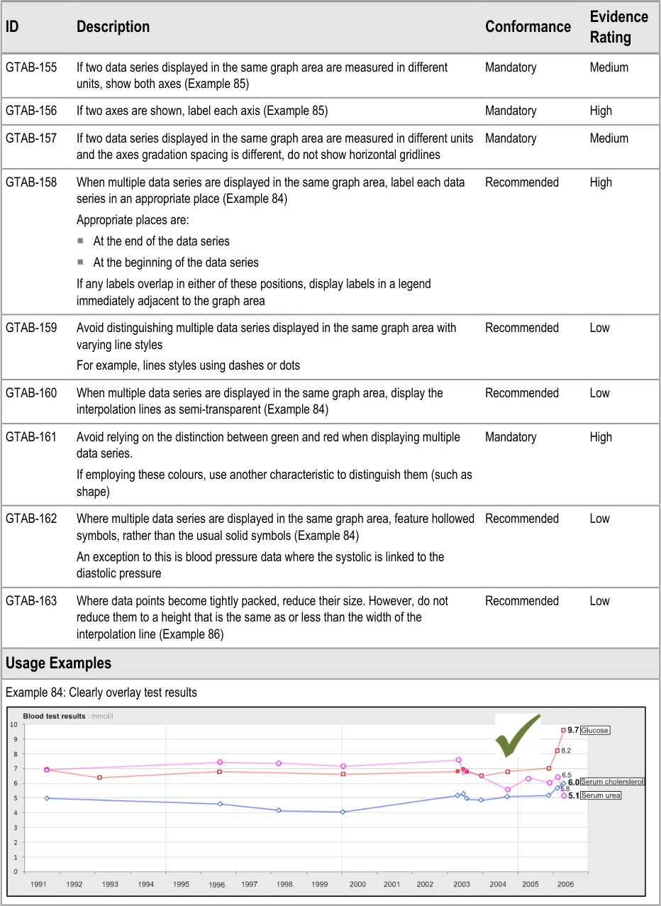
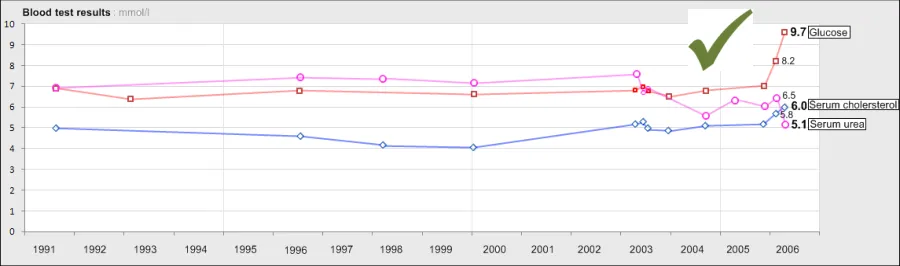
GTAB-158 6.3 When multiple data series are displayed in the same graph area, label each data series in an appropriate place (Example 84)
GTAB-159 6.3 Avoid distinguishing multiple data series displayed in the same graph area with varying line styles
GTAB-160 6.3 When multiple data series are displayed in the same graph area, display the interpolation lines as semi-transparent (Example 84)
GTAB-161 6.3 Avoid relying on the distinction between green and red when displaying multiple data series
GTAB-162 6.3 Where multiple data series are displayed in the same graph area, feature hollowed symbols, rather than the usual solid symbols bound by a black border (Example 84)
GTAB-163 6.3 Where data points become tightly packed, reduce their size. However, do not reduce them to a height that is the same as or less than the width of the interpolation line (Example 86)
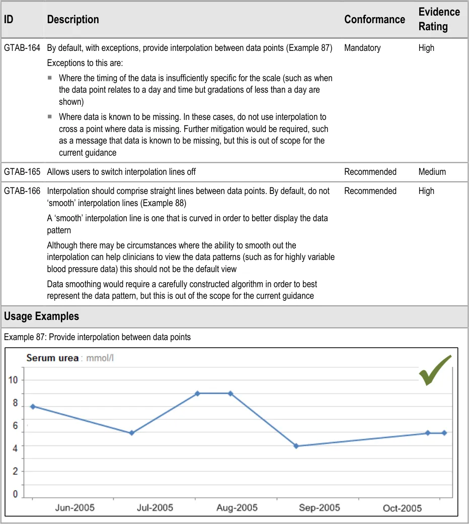
GTAB-164 7.1 By default, with certain exceptions, provide interpolation between data points (Example 87)
GTAB-165 7.1 Allows users to switch interpolation lines off
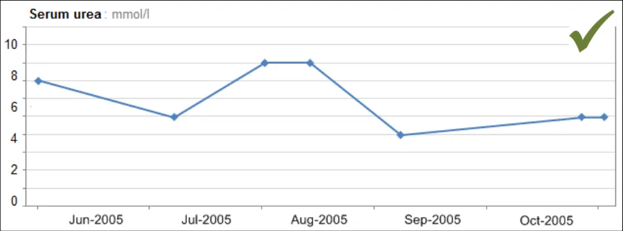
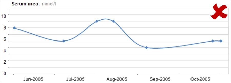
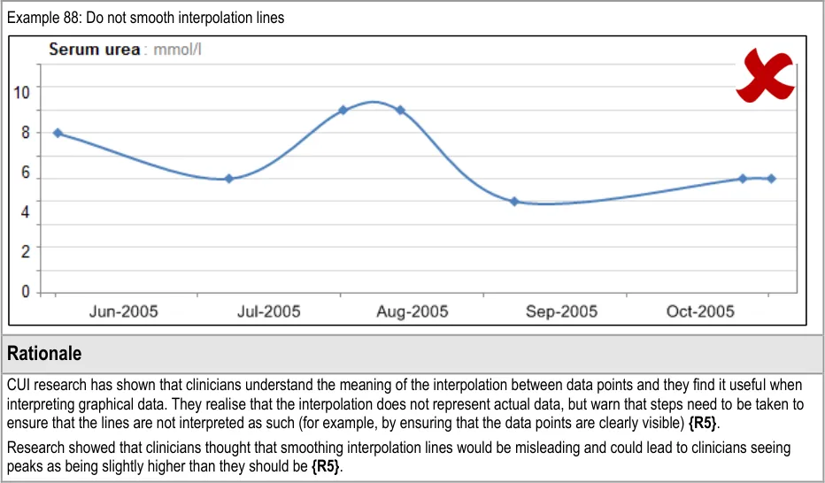
GTAB-166 7.1 Interpolation should comprise straight lines between data points. By default, do not ‘smooth’ interpolation lines (Example 88)
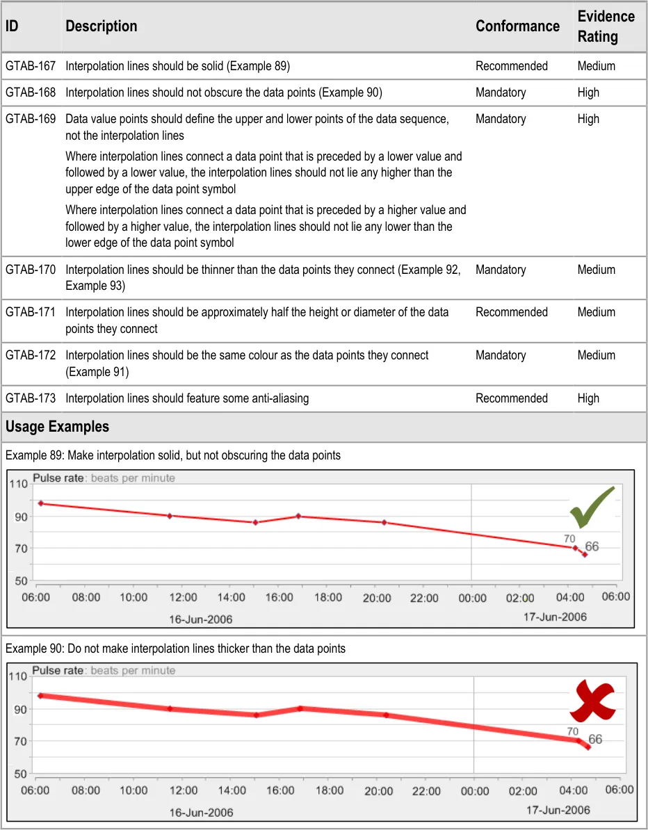
GTAB-167 7.2 Interpolation lines should be solid (Example 89)
GTAB-168 7.2 Interpolation lines should not obscure the data points (Example 90)
GTAB-169 7.2 Data value points should define the upper and lower points of the data sequence, not the interpolation lines
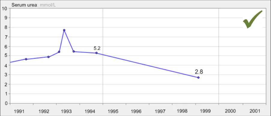
GTAB-170 7.2 Interpolation lines should be thinner than the data points they connect (Example 92, Example 93)
GTAB-171 7.2 Interpolation lines should be approximately half the height or diameter of the data points they connect
GTAB-172 7.2 Interpolation lines should be the same colour as the data points they connect (Example 91)
GTAB-173 7.2 Interpolation lines should feature some anti-aliasing
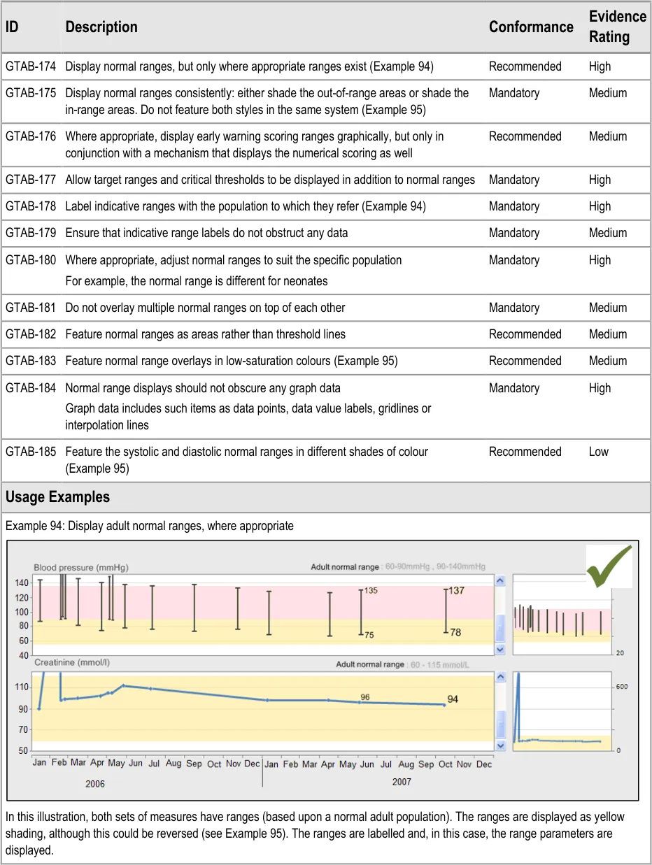
GTAB-174 8.1 Display normal ranges, but only where appropriate ranges exist (Example 94)
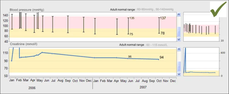
GTAB-175 8.1 Be consistent with how to display normal ranges: either shade the out-of-range areas or shade the inrange areas. Do not feature both styles in the same system (Example 95)
Page 14
Copyright ©2013 Health and Social Care Information Centre
HSCIC Controlled Document
GTAB-176 8.1 Where appropriate, graphically display early warning scoring ranges, but only in conjunction with a mechanism that displays the numerical scoring as well
GTAB-177 8.1 Allow target ranges and critical thresholds to be displayed in addition to normal ranges
GTAB-178 8.1 Label indicative ranges with the population to which they refer (Example 94)
GTAB-179 8.1 Ensure that the indicative labels do not obstruct any data
GTAB-180 8.1 Where appropriate, normal ranges should be adjusted to suit the specific population
GTAB-181 8.1 Do not overlay multiple normal ranges on top of each other
GTAB-182 8.1 Feature normal ranges as areas rather than threshold lines
GTAB-183 8.1 Feature normal range overlays in low-saturation colours (Example 95)
GTAB-184 8.1 Normal range displays should not obscure any graph data
GTAB-185 8.1 Feature the systolic and diastolic normal ranges in different shades of colour (Example 95)
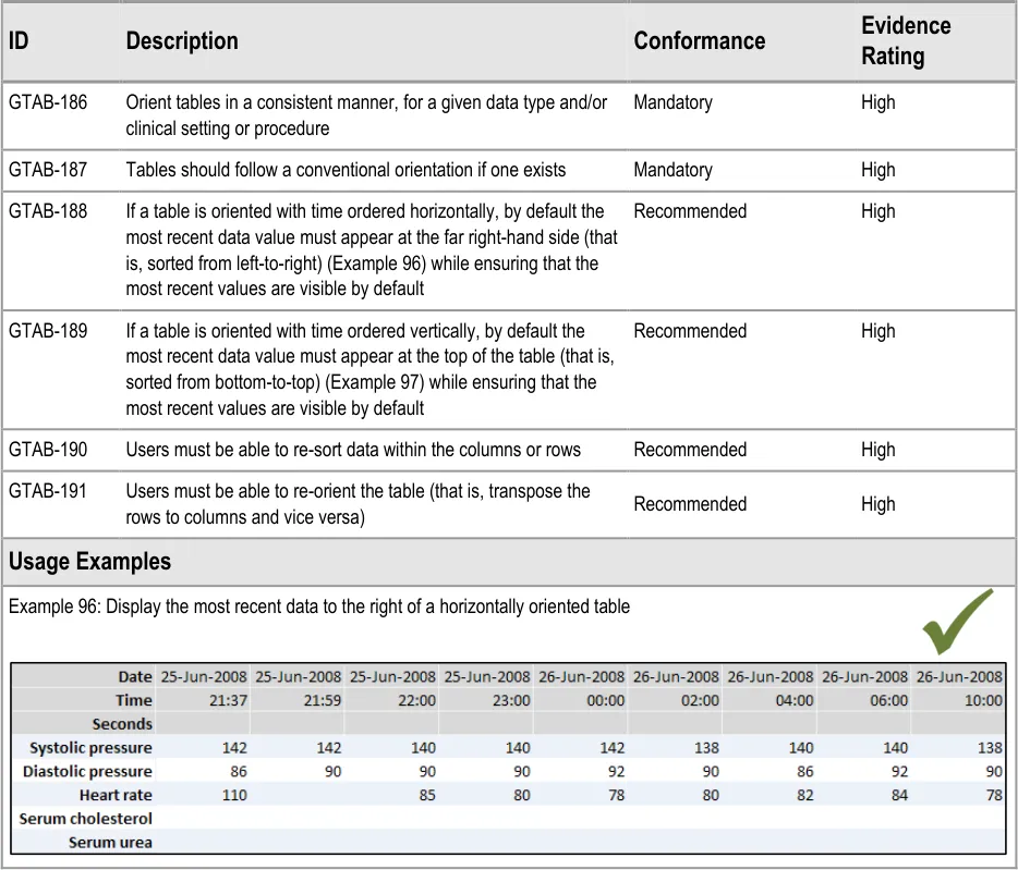
GTAB-186 9.1 Orient tables in a consistent manner, for a given data type and/or clinical setting or procedure
GTAB-187 9.1 Tables should follow a conventional orientation if one exists
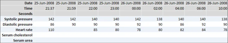
GTAB-188 9.1 If a table is oriented with time ordered horizontally, by default the most recent data value must appear at the far right-hand side (that is, sorted from left-to-right) while ensuring that the most recent values are visible by default (Example 96)
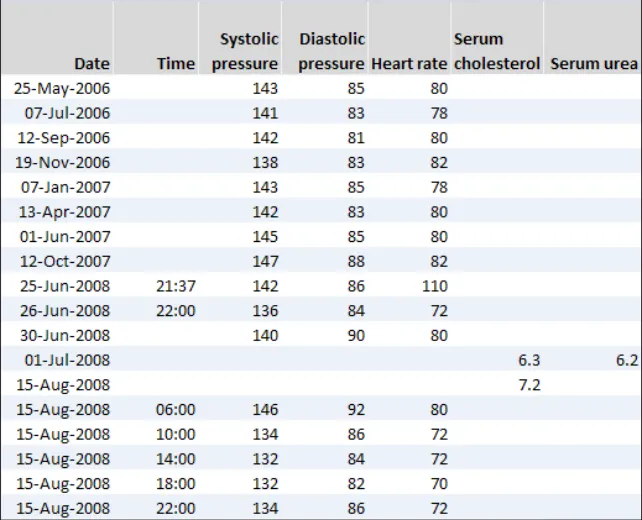
GTAB-189 9.1 If a table is oriented with time ordered vertically, by default the most recent data value must appear at the top of the table (that is, sorted from bottom-to-top) while ensuring that the most recent values are visible by default (Example 97)
GTAB-190 9.1 Users must be able to re-sort data within the columns or rows
GTAB-191 9.1 Users must be able to re-orient the table (that is, transpose the rows to columns and vice versa)
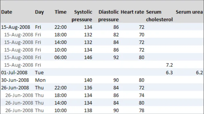
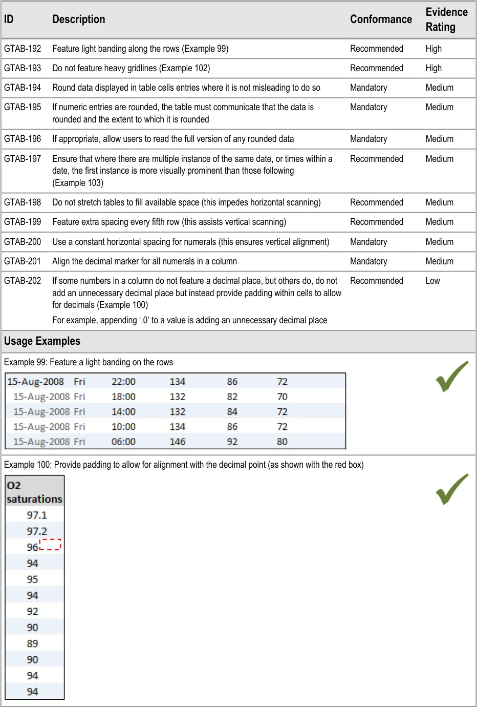
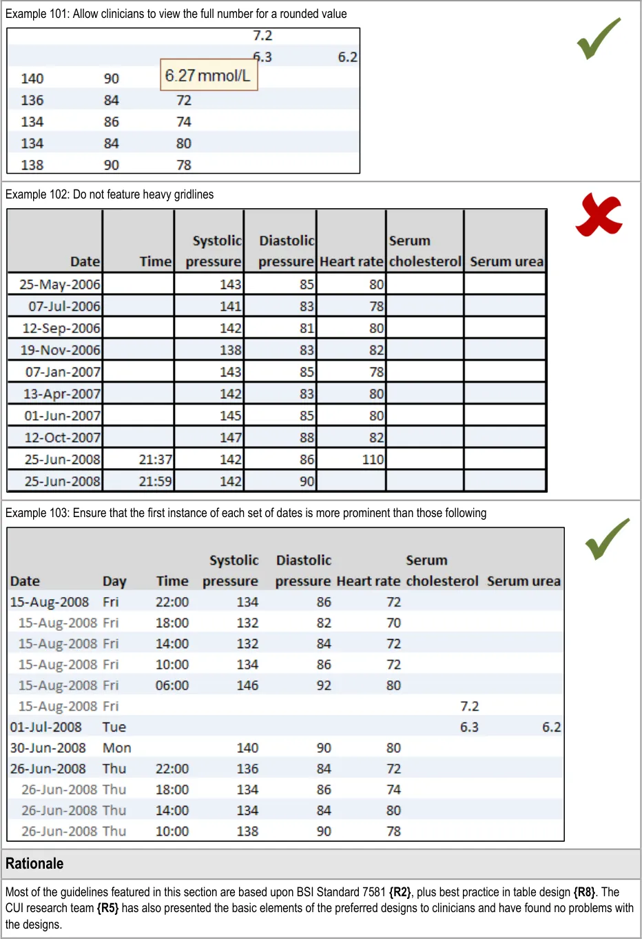
GTAB-192 9.2 Feature light banding along the rows (Example 99)
GTAB-193 9.2 Do not feature heavy gridlines (Example 102)
GTAB-194 9.2 Round data displayed in table cells entries where it is not misleading to do so
GTAB-195 9.2 If numeric cell entries are rounded, the table must communicate that the data is rounded and the extent to which it is rounded
GTAB-196 9.2 If appropriate, allow users to read the full version of any rounded data
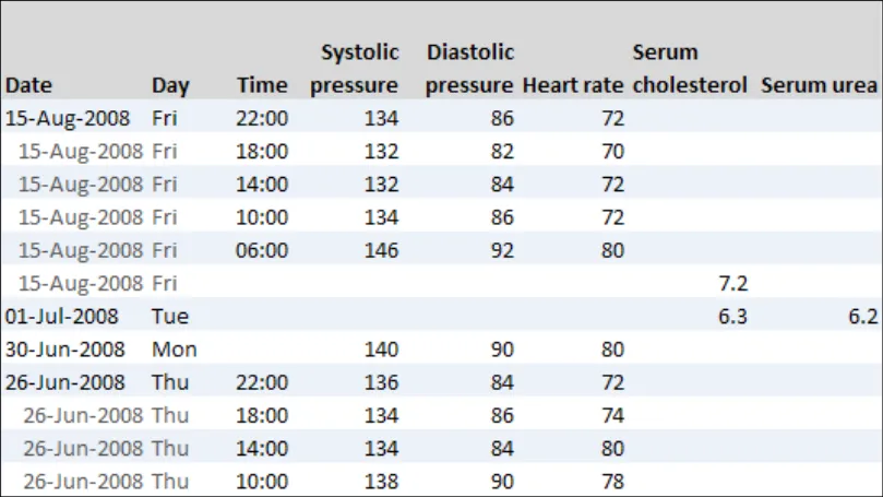
GTAB-197 9.2 Ensure that where there are multiple instance of the same date, or time within a date, the first instance is more visually prominent than the following instances (Example 103)
GTAB-198 9.2 Do not stretch tables to fill available space (this impedes horizontal scanning)
GTAB-199 9.2 Feature extra spacing every fifth row (this assists vertical scanning)
GTAB-200 9.2 Use a constant horizontal spacing for numerals (this ensures vertical alignment)
GTAB-201 9.2 Align the decimal marker for all numerals in a column
GTAB-202 9.2 If some numbers in a column do not feature a decimal place, but others do, do not add an unnecessary decimal place but instead provide padding within cells to allow for decimals (Example 100)
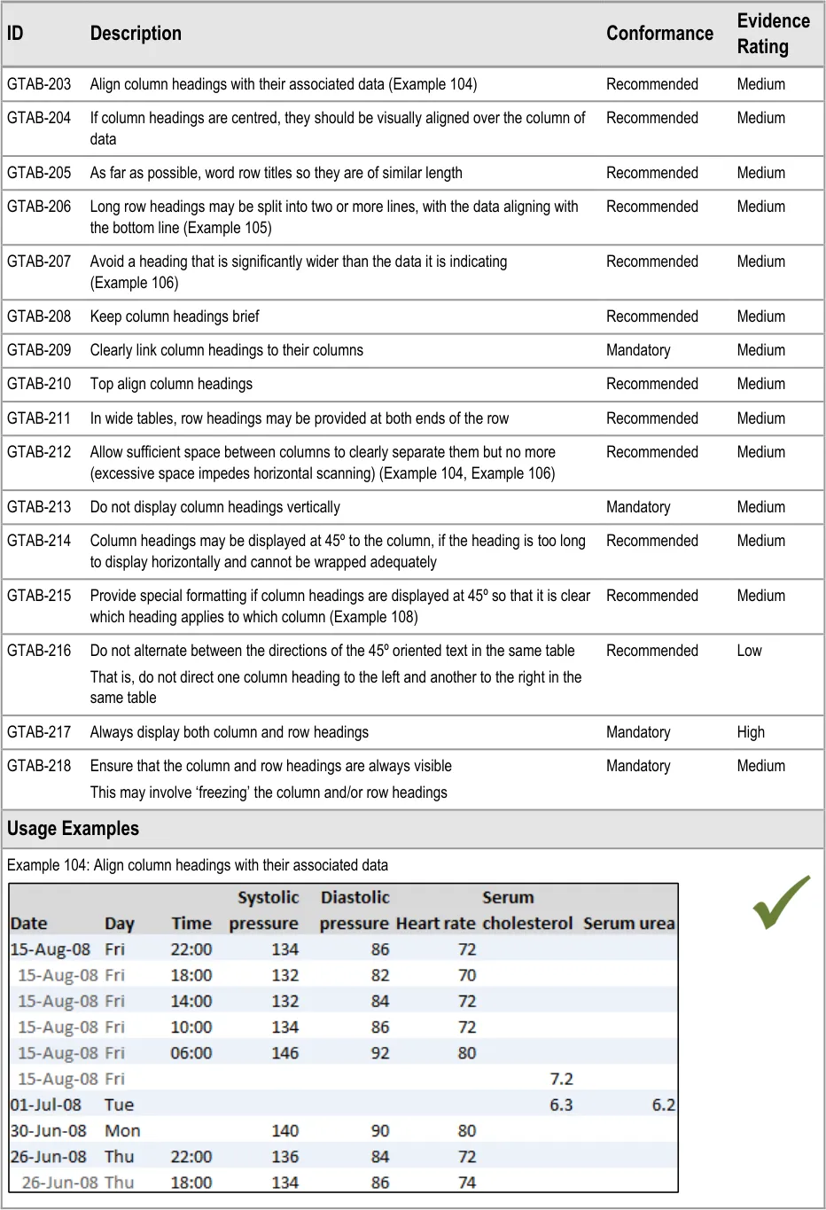
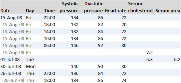
GTAB-203 9.3 Align column headings with their associated data (Example 104)
GTAB-204 9.3 If column headings are centred, they should be visually aligned over the column of data
GTAB-205 9.3 As far as possible, word row titles so they are of similar length
Page 15
Copyright ©2013 Health and Social Care Information Centre
HSCIC Controlled Document
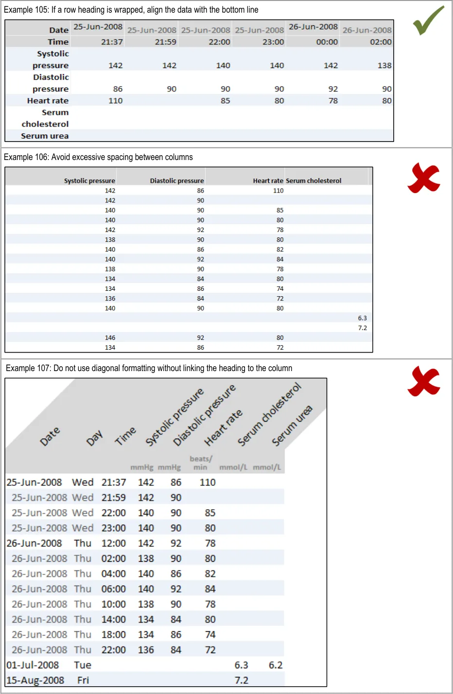
GTAB-206 9.3 Long row headings may be split into two or more lines, with the data aligning with the bottom line (Example 105)
GTAB-207 9.3 Avoid a heading that is significantly wider than the data it is indicating
GTAB-208 9.3 Keep column headings brief
GTAB-209 9.3 Clearly link column headings to their columns
GTAB-210 9.3 Top align column headings
GTAB-211 9.3 In wide tables, row headings may be provided at both ends of the row
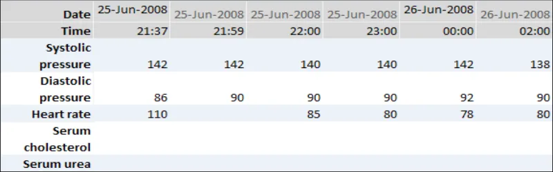
GTAB-212 9.3 Allow sufficient space between columns to clearly separate them but no more (excessive space impedes horizontal scanning) (Example 104, Example 106)
GTAB-213 9.3 Do not display column headings vertically
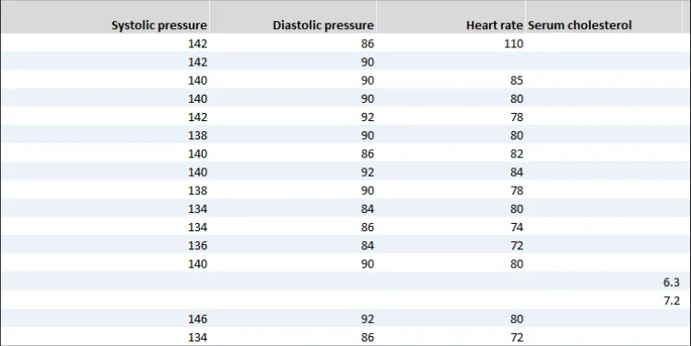
GTAB-214 9.3 Column headings may be displayed at 45º to the column, if the heading is too long to display horizontally and cannot be wrapped adequately
GTAB-215 9.3 Provide special formatting if column headings are displayed at 45º so that it is clear which heading applies to which column (Example 107)
GTAB-216 9.3 Do not alternate between the directions of the 45º oriented text in the same table
GTAB-217 9.3 Always display both column and row headings
GTAB-218 9.3 Ensure that the column and row headings are always visible
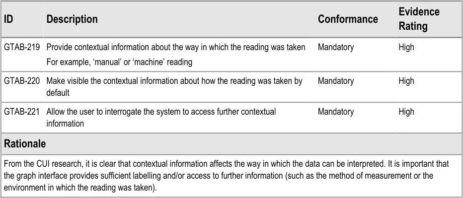
GTAB-219 10.1 Provide contextual information about the way in which the reading was taken
GTAB-220 10.1 Make visible the contextual information about how the reading was taken by default
GTAB-221 10.1 Allow the user to interrogate the system to access further contextual information
Table 13: Summary of Guidance
Page 16
Copyright ©2013 Health and Social Care Information Centre
HSCIC Controlled Document
2 DATA VALUES AND UNITS GUIDANCE DETAILS
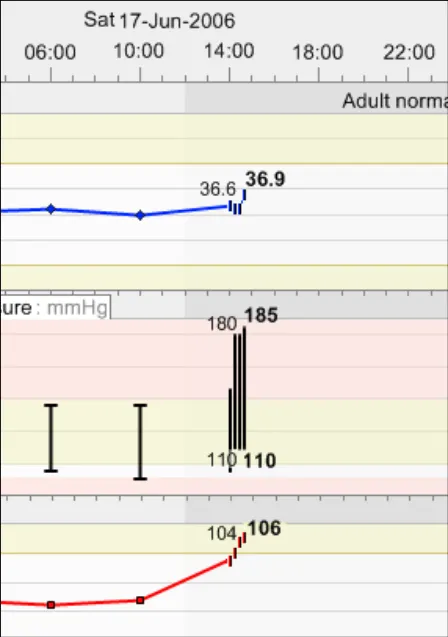
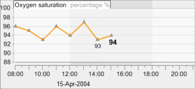
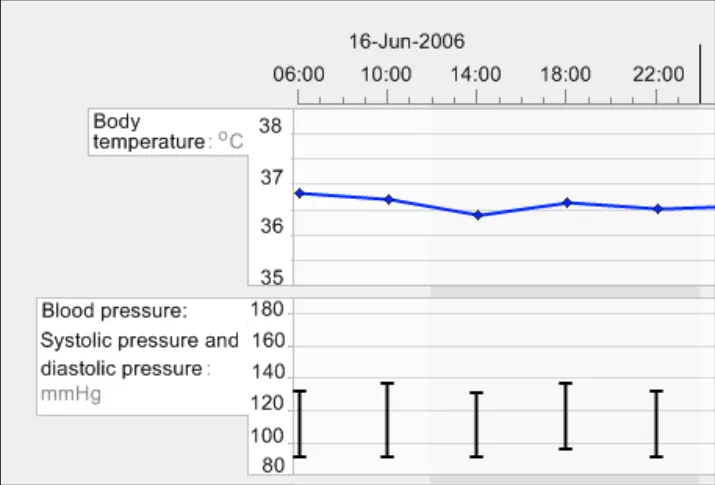
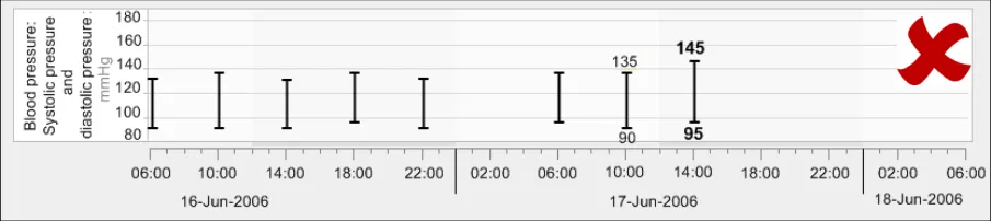
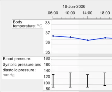
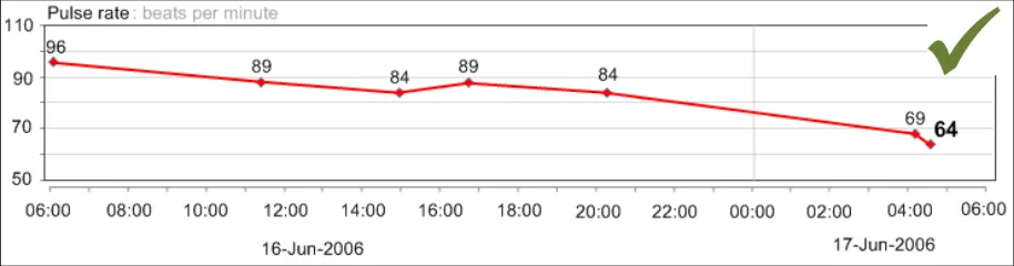
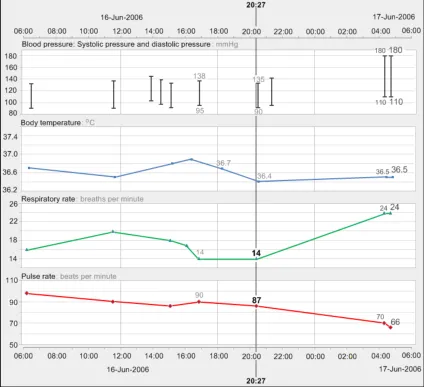
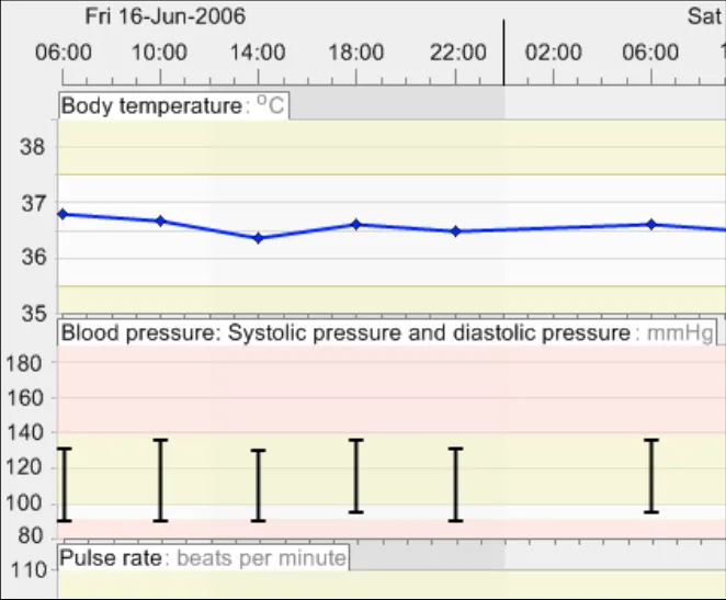
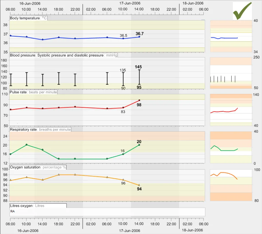
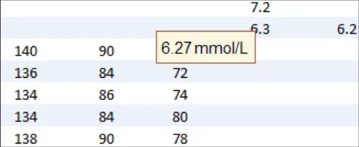
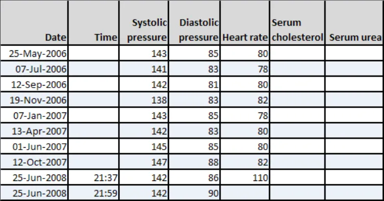
Graphs and tables comprise a number of key components, the foremost of which are the data values and units. An example of a data value and its unit is ‘140 mmHg systolic pressure, taken at 10:30 17-Jun-2006’.
2.1 Guidelines – Creating Symbols for Data Points in Graphs
Page 17
Copyright ©2013 Health and Social Care Information Centre
HSCIC Controlled Document
Page 18
Copyright ©2013 Health and Social Care Information Centre
 HSCIC Controlled Document
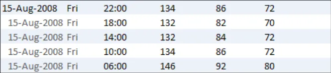
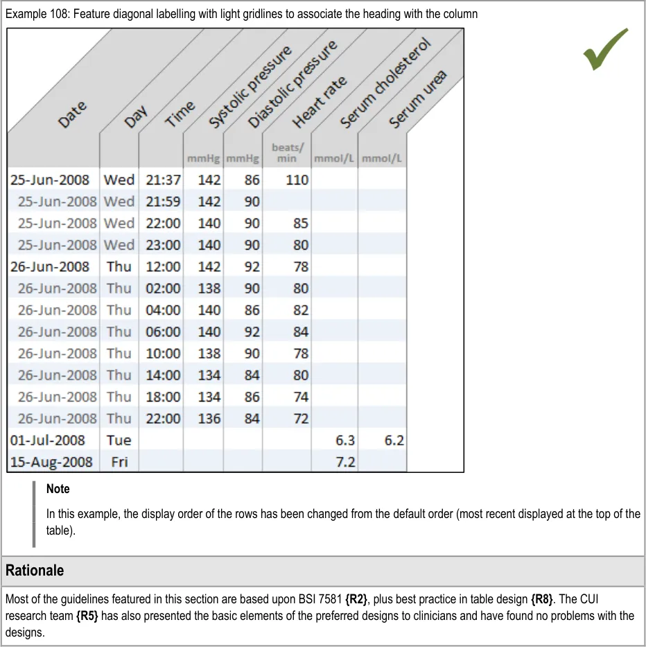
| Col1 | Example 9: Avoid symbol overlap by shrinking the icons to vertical bars when they become close |
|---|---|
| Example 10: Another example of avoiding symbol overlap by shrinking the icons to vertical bars when they become close In the example above, the data symbols have had to shrink so that the readings taken every fifteen minutes can be seen on a 48-hour timescale that shows a range of four-hourly observations leading up the more intensive readings. This is close to the narrowest the symbols can be before they cannot be distinguished. If they reach a size where they cannot be distinguished, display a message to tell users that they must zoom in or change the timescale to view the individual points and their values. | |
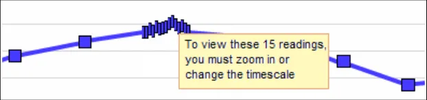
| Example 11: Where possible, avoid overlap If overlap is unavoidable (that is, it still occurs after shrinking the icons), then feature a message on top to advise the user how many data points are contained in the bunching and a recommendation to zoom in or change the timescale to view the points distinctly. Example 12: Force viewers to zoom or change timescale if the data is too tightly packed |
Page 19
Copyright ©2013 Health and Social Care Information Centre
 HSCIC Controlled Document
Page 20
Copyright ©2013 Health and Social Care Information Centre
HSCIC Controlled Document
2.2 Guidelines – Identifying and Labelling Data
Page 21
Copyright ©2013 Health and Social Care Information Centre
HSCIC Controlled Document
Copyright ©2013 Health and Social Care Information Centre
Page 22
 HSCIC Controlled Document
Copyright ©2013 Health and Social Care Information Centre
Page 23
 HSCIC Controlled Document
2 Royal National Institute for Blind People: See it Right guidelines {R16} : http://www.rnib.org.uk/xpedio/groups/public/documents/publicwebsite/public_seeitright.hcsp
Page 24
Copyright ©2013 Health and Social Care Information Centre
HSCIC Controlled Document
2.3 Guidelines – Displaying Data Units
Copyright ©2013 Health and Social Care Information Centre
Page 25
HSCIC Controlled Document
Copyright ©2013 Health and Social Care Information Centre
Page 26
 HSCIC Controlled Document
Page 27
Copyright ©2013 Health and Social Care Information Centre
HSCIC Controlled Document
2.4 Guidelines – Displaying Blood Pressure Composites
Copyright ©2013 Health and Social Care Information Centre
Page 28
 HSCIC Controlled Document
Page 29
Copyright ©2013 Health and Social Care Information Centre
HSCIC Controlled Document
2.5 Guidelines – Displaying Textual-Numerical Values in Graphs
Copyright ©2013 Health and Social Care Information Centre
Page 30
HSCIC Controlled Document
Copyright ©2013 Health and Social Care Information Centre
Page 31
 HSCIC Controlled Document
Page 32
Copyright ©2013 Health and Social Care Information Centre
HSCIC Controlled Document
2.6 Guidelines – Focus of Data Points
Page 33
Copyright ©2013 Health and Social Care Information Centre
HSCIC Controlled Document
Page 34
Copyright ©2013 Health and Social Care Information Centre
 HSCIC Controlled Document
Page 35
Copyright ©2013 Health and Social Care Information Centre
HSCIC Controlled Document
3 SCALING GUIDANCE DETAILS
Scaling refers to the mapping of numeric intervals in the underlying data onto physical distances in the graph area. In other words, a scale provides a means of assigning specific values to the data points on the graph, based upon their location along the scale lines.
For example, an hour may be represented by a distance of 10 mm running from left-to-right along the (horizontal) x-axis while a rise of 0.5º centigrade of body temperature may be represented by 5mm running from bottom-to-top along the (vertical) y-axis.
The current guidance addresses both the x-axis and y-axis scales in combination as this has importance in dictating the ‘shape’ of the pattern formed by the location of the data points, which can influence clinicians’ interpretation of the underlying data.
The guidance assumes a ‘common’, linear scaling rather than a non-linear scaling for the observations data, as the quantitative interval from one axis marking to the next is always the same. Non-linear scaling, such as ‘logarithmic’ scaling, may have uses in clinical graphing, but analysis has not identified reasons for their inclusion when measuring the physiological ‘vital signs’ that are in scope for the current guidance.
3.1 Guidelines – Scaling
Page 36
Copyright ©2013 Health and Social Care Information Centre
HSCIC Controlled Document
Page 37
Copyright ©2013 Health and Social Care Information Centre
HSCIC Controlled Document
Copyright ©2013 Health and Social Care Information Centre
Page 38
HSCIC Controlled Document
Page 39
Copyright ©2013 Health and Social Care Information Centre
 HSCIC Controlled Document
Page 40
Copyright ©2013 Health and Social Care Information Centre
 HSCIC Controlled Document
Page 41
Copyright ©2013 Health and Social Care Information Centre
 HSCIC Controlled Document
Page 42
Copyright ©2013 Health and Social Care Information Centre
HSCIC Controlled Document
4 AXES GUIDANCE DETAILS
4.1 Guidelines – X-Axis and Y-Axis Arrangements
Page 43
Copyright ©2013 Health and Social Care Information Centre
HSCIC Controlled Document
4.2 Guidelines – Time Axis Intervals
Page 44
Copyright ©2013 Health and Social Care Information Centre
 HSCIC Controlled Document
Page 45
Copyright ©2013 Health and Social Care Information Centre
HSCIC Controlled Document
4.3 Guidelines – Clinical Measure Axis Intervals
Page 46
Copyright ©2013 Health and Social Care Information Centre
HSCIC Controlled Document
Page 47
Copyright ©2013 Health and Social Care Information Centre
HSCIC Controlled Document
4.4 Guidelines – Axis Ranges
Copyright ©2013 Health and Social Care Information Centre
Page 48
HSCIC Controlled Document
Page 49
Copyright ©2013 Health and Social Care Information Centre
 HSCIC Controlled Document
Page 50
Copyright ©2013 Health and Social Care Information Centre
HSCIC Controlled Document
4.5 Guidelines – Gridlines
Copyright ©2013 Health and Social Care Information Centre
Page 51
HSCIC Controlled Document
Copyright ©2013 Health and Social Care Information Centre
Page 52
HSCIC Controlled Document
Page 53
Copyright ©2013 Health and Social Care Information Centre
HSCIC Controlled Document
4.6 Guidelines – Axis Labels
Page 54
Copyright ©2013 Health and Social Care Information Centre
 HSCIC Controlled Document
Copyright ©2013 Health and Social Care Information Centre
Page 55
 HSCIC Controlled Document
Page 56
Copyright ©2013 Health and Social Care Information Centre
HSCIC Controlled Document
5 LAYOUT, DENSITY AND FORMATTING GUIDANCE DETAILS
5.1 Guidelines – Colours and Contrasts
Copyright ©2013 Health and Social Care Information Centre
Page 57
 HSCIC Controlled Document
Page 58
Copyright ©2013 Health and Social Care Information Centre

 HSCIC Controlled Document
Page 59
Copyright ©2013 Health and Social Care Information Centre
HSCIC Controlled Document
5.2 Guidelines – Typeface Formatting
Page 60
Copyright ©2013 Health and Social Care Information Centre
HSCIC Controlled Document
Copyright ©2013 Health and Social Care Information Centre
Page 61
 HSCIC Controlled Document
3 World Wide Web Consortium (W3C) Web Accessibility Initiative (WAI) guidelines {R23} :http://www.w3.org/WAI/
Page 62
Copyright ©2013 Health and Social Care Information Centre
HSCIC Controlled Document
5.3 Guidelines – Line Formatting
Page 63
Copyright ©2013 Health and Social Care Information Centre
HSCIC Controlled Document
5.4 Guidelines – Other Formatting Considerations
Page 64
Copyright ©2013 Health and Social Care Information Centre
HSCIC Controlled Document
6 MULTIPLE DATA SERIES GUIDANCE DETAILS
6.1 Guidelines – Viewing Multiple Non-Overlaid Graphs
Page 65
Copyright ©2013 Health and Social Care Information Centre
HSCIC Controlled Document
Copyright ©2013 Health and Social Care Information Centre
Page 66
HSCIC Controlled Document
Page 67
Copyright ©2013 Health and Social Care Information Centre
HSCIC Controlled Document
6.2 Guidelines – Overlaying Multiple Graphs
Page 68
Copyright ©2013 Health and Social Care Information Centre
HSCIC Controlled Document
6.3 Guidelines – Special Considerations for Viewing Multiple Overlaid Graphs
Page 69
Copyright ©2013 Health and Social Care Information Centre
HSCIC Controlled Document
Page 70
Copyright ©2013 Health and Social Care Information Centre
HSCIC Controlled Document
7 INTERPOLATION GUIDANCE DETAILS
7.1 Guidelines – Use of Interpolation
Copyright ©2013 Health and Social Care Information Centre
Page 71
HSCIC Controlled Document
Page 72
Copyright ©2013 Health and Social Care Information Centre
HSCIC Controlled Document
7.2 Guidelines – Formatting of Interpolation
Copyright ©2013 Health and Social Care Information Centre
Page 73
HSCIC Controlled Document
Page 74
Copyright ©2013 Health and Social Care Information Centre
HSCIC Controlled Document
8 INDICATIVE RANGES GUIDANCE DETAILS
8.1 Guidelines – Displaying Indicative Ranges
Page 75
Copyright ©2013 Health and Social Care Information Centre
 HSCIC Controlled Document
Page 76
Copyright ©2013 Health and Social Care Information Centre
 HSCIC Controlled Document
Page 77
Copyright ©2013 Health and Social Care Information Centre
HSCIC Controlled Document
9 TABLES GUIDANCE DETAILS
Tables are an important medium for displaying clinical data. They are not as effective as graphs at revealing trends – and can be off-putting to the reader, especially if large – but tables possess some unique benefits over graphs:
-
They can hold many data cells
-
They can allow numeric data to be extracted easily and accurately
-
They can easily accommodate wide ranges of data
Graphs emphasise the patterns and trends in data, but do not make the extraction of the values as easy as a table and cannot always easily present data with wide discrepancies of scale.
This section outlines the key factors to consider when creating tables that are safe and easy to use.
9.1 Guidelines – Table Orientation
Copyright ©2013 Health and Social Care Information Centre
Page 78
HSCIC Controlled Document
| Col1 | Example 97: Tables with time running vertically should be ordered with the most recent reading at the top by default |
|---|---|
| Example 98: Do not sort time from top-to-bottom in a vertically oriented table by default | |
| Rationale | |
| Following CUI research, this guidance concludes that there is no one way that clinicians must orient their data. Some clinicians expressed a preference for viewing tables that had time running vertically down them, whereas others felt more comfortable with a horizontal time axis**{R5}. Other studies have shown that there are benefits to either orientation, although certain actions are easier to do with one of the orientations. For example, scanning through information for particular values is easier with time vertically oriented{R2, R8}, as is interpreting trends from the data. On the other hand, some clinicians feel that the progression of time is easier to understand when it is oriented horizontally, akin to the graph’s x-axis. As the relevant BSi standard (7581) states, ‘Rows are easier to read than columns, but columns are easier to scan.…The reader’s need to scan tables should influence which information should be in rows and which in columns.’{R2}. Therefore the current guidance is not mandating the use of one or other orientation. However, the default orientation of the table should remain consistent for a given clinical situation or data type. For example, if blood tests in a GP software programme are displayed by default with a vertical time axis on one day, a vertical time axis should be the default on a later day, unless there is a clinical reason to do otherwise. The basic designs shown in this section have been tested by CUI research{R5}**. The research demonstrated that clinicians found the tables to be clear. |
Page 79
Copyright ©2013 Health and Social Care Information Centre
 HSCIC Controlled Document
9.2 Guidelines – Table Formatting
Copyright ©2013 Health and Social Care Information Centre
Page 80
 HSCIC Controlled Document
Page 81
Copyright ©2013 Health and Social Care Information Centre
HSCIC Controlled Document
9.3 Guidelines – Table Labelling
Page 82
Copyright ©2013 Health and Social Care Information Centre
HSCIC Controlled Document
Copyright ©2013 Health and Social Care Information Centre
Page 83
 HSCIC Controlled Document
Page 84
Copyright ©2013 Health and Social Care Information Centre
HSCIC Controlled Document
10 CONTEXTUAL INFORMATION GUIDANCE DETAILS
10.1 Guidelines – Accessing Contextual Data
Page 85
Copyright ©2013 Health and Social Care Information Centre
HSCIC Controlled Document
11 DOCUMENT INFORMATION
11.1 Terms and Abbreviations
A&E Accident and Emergency
BSI British Standards Institution
CUI Common User Interface
ISO International Standards Organization
MEWS Modified Early Warning Score
NHS National Health Service
NHS CFH NHS Connecting for Health
O2 Oxygen
PARS Patient At-Risk Scores
RNIB Royal National Institute of Blind People
SNOMED-CT Systematised Nomenclature of Medicine-Clinical Terms
UI User Interface
WAI Web Availability Initiative
W3C World Wide Web Consortium
Table 14: Terms and Abbreviations
11.2 Definitions
NHS Entity Within this document, defined as a single NHS organisation or group that is operated within a single technical infrastructure environment by a defined group of IT administrators.
The Authority The organisation implementing the NHS National Programme for IT (currently NHS Connecting for Health).
Current best practice Current best practice is used rather than best practice, as over time best practice guidance may change or be revised due to changes to products, changes in technology, or simply the additional field deployment experience that comes over time.
Normal range A clinically relevant range for a data series, defined by an upper and a lower parameter, that expresses the normal values expected for a given healthy population, in isolation to other data series. Values that fall outside of a normal range may potentially indicate a health problem and a cause for concern. Which normal range applies to a given patient may depend upon certain aspects of their individual demography. For example, the age or gender of the patient may determine which normal range applies to them at a given point in time.
Target range or threshold A range, or a point above or below a threshold, associated with a positive health outcome that is formulated by the care giver when planning and delivering the patient’s care. Unlike normal ranges, target ranges and thresholds are patient-specific, rather than population-specific.
Page 86
Copyright ©2013 Health and Social Care Information Centre
HSCIC Controlled Document
Critical range or threshold A range, or a point above or below a threshold, associated with a negative health outcome that is formulated by the care giver when planning and delivering the patient’s care. Typically, if data values fall within such a range (or above or below such a threshold) warnings should be raised, such as a nurse contacting the doctor. This type of range or threshold is patient-specific rather than population-specific.
Reference range A standard range that helps the viewer of a graph understand the absolute values (or at least the significance) of the data points by locating their position in relation to the range. A reference range may comprise a normal range.
Indicative range Same as ‘Reference range’.
Scale The relationship between the physical distances displayed in the graph and the relationships between the underlying data values. For example, an hour may be represented by a distance of 10 mm running from left-to-right along the (horizontal) x-axis plane, while a rise of 10 mmHg of systolic pressure may be represented by 5 mm running from bottom-to-top along the (vertical) y-axis plane.
References to ‘scale’ include both the x-axis and y-axis scales, as it is often the ratio between these two that is important to the clinician’s interpretation of the data.
Axes The orthogonal (perpendicular) planes that represent data continuums, such as ‘pulse rate’. On a two dimensional graph area, there will be a minimum of two axes, the x- and y-axis, one of those being ‘time’. In special cases of overlaid data, there may be three axes in the same graph area.
X-axis The x-axis marks the horizontal scale and is orthogonal to the y-axis.
Y-axis The y-axis marks the vertical scale and is orthogonal to the x-axis.
Axis range The range of potential values shown in the graph along a single axis in a view.
Axis marking Markings of data increments along the axes.
Gridlines Horizontal and/or vertical lines shown on the graph area aligned with regular increments in the data. The purpose of these lines is to help the viewer identify the values of the data points.
Data point A visual representation of a data value.
Data unit The measurement units in which a data series is being expressed, such as ‘beats per minute’.
Data series A set of data of a single measurement type, such as ‘pulse rate’ or ‘body temperature’.
Interpolation Lines added to the graph that sequentially join up the data points. Interpolation assists the perception of the data values and the patterns in which they fall.
Graph area The two-dimensional blank space in which data points may be displayed.
Logarithmic scaling Scaling where a series of numbers are produced by increasing the power of a base number by one for each sequential interval.
Table 15: Definitions
Page 87
Copyright ©2013 Health and Social Care Information Centre
HSCIC Controlled Document
11.3 Nomenclature
This section shows how to interpret the different styles used in this document to denote various types of information.
11.3.1 Body Text
Code Monospace
Script
Other markup languages
Interface dialog names Bold
Field names
Controls
Folder names Title Case
File names
Table 16: Body Text Styles
11.3.2 Cross References
Current document – sections Section number only
Current document – figures/tables Caption number only
Other project documents Italics and possibly a footnote
Publicly available documents Italics with a footnote
External Web-based content Italics and a hyperlinked footnote
Table 17: Cross Reference Styles
11.4 References
R1. National Institute for Health and Clinical Excellence: Acutely ill patients in hospital: Recognition of and response to acute illness in adults in hospital: http://www.nice.org.uk/CG50
R2. British Standards Institute: Guide to Presentation of tables and graphs: British Standard BS 7581: 1992
July 2007
R3. Design Guide Entry – Date Display 3.0.0.0
R4. Design Guide Entry – Time Display 3.0.0.0
R5. NHS CUI Research Study ID 2
R6. NHS CUI Research Study ID 39
R7. Ware, Colin: Information Visualization. Perception for design(2004) Second Edition
R8. Few, Stephen: Show me the numbers. Designing tables and graphs to enlighten(2004) First Edition
R9. Tufte, Edward: The Visual display of quantitative information (2001) Second Edition
Page 88
Copyright ©2013 Health and Social Care Information Centre
HSCIC Controlled Document
R10. Douglas, G, Nicol, F and Robertson, C (editors): Macleod’s clinical examination(2005) Eleventh Edition
R11. Wright, P, Jansen, C and Wyatt, J C: How to limit clinical errors in interpretation of data: Lancet 1998; 352: 1539-43
R12. Wyatt, J and Wright, P: Design should help use of patients’ data: Lancet 1998; 352: 1375-78
R13. Nygren, E, Wyatt, J C and Wright, P: Helping clinicians to find data and avoid delays: Lancet 1998; 352: 1462-66
R14. Cartmill, R S V and Thornton, J G: Effect of presentation of partogram information on obstetric decision-making: Lancet 1992; 339: 1520-22
R15. Chatterjee, M T, Moon, J C, Murphy, R and McCrea, D: The “OBS” chart: an evidence based approach to re-design of the patient observation chart in a district general hospital setting: Postgraduate. Medical Journal. 2005; 81: 662-666
R16. Royal National Institute for Blind People: See it Right guidelines: http://www.rnib.org.uk/xpedio/groups/public/documents/publicwebsite/public_seeitright.hcsp
R17. British Standards Institute: Ergonomic requirements for office work with visual display terminals (VDTs) Part 12: Presentation of information: BS EN ISO 9241-12:1999
R18. Bridger, R S: Introduction to Ergonomics (2003) Second Edition
R19. Healy, C G, Booth, K S, Enns, J T: High-Speed Visual Estimation using Preattentive Processing: ACM Transactions on Computer-Human Interaction (TOCHI), Vol 3, Issue 2 (1996)
R20. Tay, S K, Yong, T T: Visual Effect of Partogram Designs on the Management and Outcome of Labour: Australian and New Zealand Journal of Obstetrics and Gynaecology, Vol 36, Issue 4 (1996)
R21. Chapanis, A: Man-Machine Engineering, London: Tavistock Publications, 1965
R22. Berlin, B, Kay, P: Basic Color Terms, their Universality and Evolution, 1969
R23. World Wide Web Consortium (W3C) Web Accessibility Initiative (WAI) guidelines: http://www.w3.org/WAI/
R24. Tufte, Edward: Beautiful Evidence, (2006)
Table 18: References
Page 89
Copyright ©2013 Health and Social Care Information Centre
HSCIC Controlled Document
APPENDIX A HIGH-LEVEL TASK SCENARIOS
The following scenarios were developed in order to represent how graphs and tables could be used within a clinical setting. They were originally written in collaboration with the CUI clinical specific audience and then validated with a wider set of clinicians. Designs were built around these scenarios and these led, in part, to the creation of the guidance.
PART I Emergency Department Assessment
A nurse is performing an initial assessment on a patient who has been brought in by ambulance into her Accident and Emergency (A&E) ward complaining of chest pains.
The nurse reads the set of observations recorded by paramedics and then records the patient’s vital signs onto their chart.
Comparing the two charts, the nurse notices that the patient’s blood pressure has dropped significantly, the respiratory rate has increased slightly and oxygen, pulse and temperature have remained constant.
High Level Tasks Read the current data values
Check the provenance of the data values
Compare the current data values with past readings
Check for significant interactions between data series
Potential Risks High:
Nurse fails to either view the previous (ambulance) data or fails to recognise when it was taken
Nurse fails to identify the drop in blood pressure as being significant
They fail to see how much it has dropped
They fail to see how quickly it has dropped
Medium:
Nurse fails to see the drop in blood pressure in the context of the oxygen, pulse and temperature
remaining constant
Low:
Nurse fails to see that the respiratory rate has increased slightly
Nurse does not correctly read the absolute values of the blood pressure
Nurse does not correctly read the absolute values of the respiratory rate oxygen, pulse and
temperature.
Nurse does not factor in that the differences in readings may be fully or partially accounted for by
the change in settings in which the readings were taken
Possible consequence of risks: Delayed diagnosis or understanding of problem
Key Feature Areas Most Significant:
Intuitive and appropriate scaling
Viewing trends and interactions, including interpolation
Quite Significant:
Simultaneous views of multiple data series
Clear and appropriate axes
Reasonably Significant:
Access to and display of supporting contextual data
Support for baseline deviation calculations
Basic Practice:
Clear presentation of data values and units
Appropriate layout, density and formatting of graph spaces, values and text
Page 90
Copyright ©2013 Health and Social Care Information Centre
HSCIC Controlled Document
PART II Intensive Care Unit Monitoring
A paediatrics consultant is called to see a baby with meningitis who isn’t passing urine.
On the way to the baby, the consultant reads a summary of the patient’s history.
The consultant then views the chart and sees, among other observations, that the baby’s blood pressure is high while the oxygen saturations are low and the pulse has been rising. The baby’s high temperature also indicates pyrexia.
The consultant suspects that the baby is fluid overloaded.
The consultant puts the baby onto a ventilator and prescribes Forusemide.
The consultant then monitors the baby at regular intervals to check the baby’s progress.
High Level Tasks Read the current data values
Check if the current data values fail to exceed or fall below a threshold
Check for significant patterns over time in a series of data values
Check for significant interactions between data series
Potential Risks High:
Consultant fails to see the current configuration of the vital signs (for example, high, low, rising)
Consultant fails to understand the current configuration of the vital signs in relation to the patient’s
usual levels
Medium:
Consultant fails to identify the rise in blood pressure and pulse as significant:
Fails to see how much they had risen
Fails to see how quickly they had risen
Consultant fails to identify the drop in oxygen saturations as significant:
Fails to see how much they had dropped
Fails to see how quickly they had dropped
Possible consequence of risks: Incorrect treatment
Key Feature Areas Most Significant:
Simultaneous views of multiple data series
Intuitive and appropriate scaling
Viewing data values in relation to normal ranges, targets and thresholds
Quite Significant:
Clear and appropriate axes
Viewing trends and interactions, including interpolation
Support for baseline deviation calculations
Reasonably Significant:
Clear presentation of data values and units
Basic Practice:
Appropriate layout, density and formatting of graph spaces, values and text
Page 91
Copyright ©2013 Health and Social Care Information Centre
HSCIC Controlled Document
PART III Renal Outpatients Unit
A doctor working in a renal outpatients unit is attending a patient with kidney disease who has been taking Irbesartan recently to reduce blood pressure.
The doctor views the patient’s blood pressure graph for the last couple of years, which suggests the patient has not been taking the medicine.
High Level Tasks Read the current data values
Compare the current data values with past readings
Check if the current data values fail to exceed or fall below a threshold
Check for significant patterns over time in a series of data values
Potential Risks High:
Doctor fails to recognise that the data is now showing a new trend:
Fails to see that trend
Doctor fails to recognise the previous trend
Doctor fails to recognise the differences between the two trends
Doctor fails to understand that the change in trend is significant
Medium:
Doctor fails to recognise where the patient’s current blood pressure readings are in relation to the
target range
Low:
Doctor fails to accurately read the patient’s current blood pressure reading
Possible consequence of risks: Incorrect treatment
Key Feature Areas Most Significant:
Viewing trends and interactions, including interpolation
Clear and appropriate axes
Quite Significant:
Viewing data values in relation to normal ranges, targets and thresholds
Intuitive and appropriate scaling
Reasonably Significant:
Support for baseline deviation calculations
Basic Practice:
Clear presentation of data values and units
Appropriate layout, density and formatting of graph spaces, values and text
Page 92
Copyright ©2013 Health and Social Care Information Centre
HSCIC Controlled Document
PART IV Inpatient Monitoring
Variation 1: A nurse has been called to see an elderly inpatient who is very drowsy. The nurse views the patient’s chart and sees that the patient’s blood pressure has increased dramatically since the last set of readings, whereas their oxygen saturations have fallen.
The nurse suspects a possible intracranial bleed.
Variation 2: An inpatient on a ward is complaining of a severe headache and nausea and the nurse increases the observation schedule from 4 hourly to every 15 minutes.
On the second reading the nurse finds the blood pressure is increasing with an increased pulse rate and informs the doctor who then reviews the last day’s observations with the current ones.
High Level Tasks Read the current data values
Compare the current data values with past readings
Check if the current data values fail to exceed or fall below a threshold
Check for significant patterns over time in a series of data values
Check for significant interactions between data series
Potential Risks High:
Nurse fails to see the increase in blood pressure
Nurse fails to see the drop in oxygen saturations
Nurse fails to see the rise in blood pressure and drop in oxygen saturations as significant:
Fails to see how much the readings have risen/dropped
Fails to see how quickly the readings have risen/dropped
Patient fails to understand the new trend in their blood pressure readings
Medium:
Nurse fails to see the changes in blood pressure and oxygen saturations in relation to each other
Possible consequence of risks: Delayed diagnosis/ understanding of problem
Key Feature Areas Most Significant:
Viewing trends and interactions, including interpolation
Simultaneous views of multiple data series
Intuitive and appropriate scaling
Quite Significant:
Clear and appropriate axes
Reasonably Significant:
Support for baseline deviation calculations
Basic Practice:
Clear presentation of data values and units
Appropriate layout, density and formatting of graph spaces, values and text
Page 93
Copyright ©2013 Health and Social Care Information Centre
HSCIC Controlled Document
PART V Hypertension Clinic
A GP is seeing a patient who is being treated for hypertension. The GP checks the patient’s blood pressure and looks at their readings, which have been taken approximately every three months over the past three years.
For the last six months the patient has been taking a new regime of anti-hypertensive drugs.
The GP checks that the patient’s blood pressure is still within the target range, which it is, and that it is stable.
High Level Tasks Read the current data values
Check if the current data values fail to exceed or fall below a threshold
Check for significant patterns over time in a series of data values
Potential Risks High:
GP fails to see that the blood pressure has stabilised
GP fails to see that the patient’s blood pressure readings are in the target range
Medium:
Patient fails to understand the trend in their blood pressure readings
Possible consequence of risks: Incorrect treatment
Key Feature Areas Most Significant:
Viewing trends and interactions, including interpolation
Viewing data values in relation to normal ranges, targets and thresholds
Quite Significant:
Intuitive and appropriate scaling
Clear and appropriate axes
Reasonably Significant:
Clear presentation of data values and units
Basic Practice:
Appropriate layout, density and formatting of graph spaces, values and text
Copyright ©2013 Health and Social Care Information Centre
Page 94
HSCIC Controlled Document
REVISION AND SIGNOFF SHEET
Change Record
15-Jul-2008 Ben Luff 0.0.0.1 Initial draft for review/discussion
15-Jul-2008 Manuela Perr 0.0.1.0 Raised to Working Baseline
18-Jul-2008 Mick Harney 0.0.2.0 First copyedit pass and raise to Working Baseline [#] 2
31-Jul-2008 Ben Luff 0.0.2.1 Major additions and changes
07-Aug-2008 Mick Harney 0.0.2.2 Copyedit on new text and reformatted throughout. Returned for checks.
12-Aug-2008 Andy Payne 0.0.2.3 Reviewed copyedit changes
12-Aug-2008 Mick Harney 0.0.2.4 Cleared down to remaining questions and agreed with Andy Payne
14-Aug-2008 Mick Harney 0.1.0.0 Raised to Baseline Candidate
20-Aug-2008 Ben Luff 0.1.0.1 Completing CRS corrections and replacing wrong date format figures
21-Aug-2008 Mick Harney 0.2.0.0 Raised to Baseline Candidate #2
15-Sep-2008 Niki Nicolaides 1.0.0.0 Raised to Baseline 1.0.0.0
24-Oct-2008 Andy Payne 1.0.1.0 Updated guidance points GTAB-188 and GTAB-189 to mitigate patient safety hazard
28-Oct-2008 Mick Harney 1.1.0.0 Raised to Baseline Candidate
29-Oct-2008 Mick Harney 2.0.0.0 Raised to Baseline 2.0.0.0
Document Status has the following meaning:
- Drafts 0.0.0.X - Draft document reviewed by the Microsoft CUI Project team and the
Authority designate for the appropriate Project. The document is liable to change.
- Working Baseline 0.0.X.0 - The document has reached the end of the review phase and
may only have minor changes. The document will be submitted to the Authority CUI Project team for wider review by stakeholders, ensuring buy-in and to assist in communication.
- Baseline Candidate 0.X.0.0 - The document has reached the end of the review phase and
it is ready to be frozen on formal agreement between the Authority and the Company
- Baseline X.0.0.0 - The document has been formally agreed between the Authority and the
Company
Note that minor updates or corrections to a document may lead to multiple versions at a particular status.
Open Issues Summary
None
Page 95
Copyright ©2013 Health and Social Care Information Centre
HSCIC Controlled Document
Audience
The audience for this document includes:
- Authority CUI Manager / Project Sponsor . Overall project manager and sponsor for the
NHS CUI project within the Authority.
- Authority Clinical Applications and Patient Safety Project Project Manager.
Responsible for ongoing management and administration of the Project.
- The Authority Project Team . This document defines the approach to be taken during this
assessment and therefore must be agreed by the Authority.
- Microsoft NHS CUI Team . This document defines the approach to be taken during this
assessment, including a redefinition of the Clinical Applications and Patient Safety Project strategy.
Reviewers
Mike Carey Workstream Lead
Tim Chearman UX Architect
Peter Johnson Clinical Architect
Kate Verrier-Jones Clinical Advisor
Dee Hackett Clinical Advisor
Naveenta Kumar Clinical Advisor
Distribution
Mike Carey Workstream Lead
Tim Chearman UX Architect
Peter Johnson Clinical Architect
Kate Verrier-Jones Clinical Advisor
Dee Hackett Clinical Advisor
Naveenta Kumar Clinical Advisor
Document Properties
Document Title Displaying Graphs and Tables User Interface Design Guidance
Author Clinical Applications and Patient Safety Project
Restrictions RESTRICTED – COMMERCIAL; MICROSOFT COMMERCIAL; Access restricted to: NHS CUI Project Team, Microsoft NHS Account Team
Creation Date 14 July 2008
Last Updated 23 June 2015
Page 96
Copyright ©2013 Health and Social Care Information Centre
HSCIC Controlled Document
Copyright:
You may re-use this information (excluding logos) free of charge in any format or medium, under the terms of the Open Government Licence. To view this licence, visit nationalarchives.gov.uk/doc/open-government-licence or email psi@nationalarchives.gsi.gov.uk.
Page 97
Copyright ©2013 Health and Social Care Information Centre