Alertsymbdes

 Prepared for
NHS Connecting for Health
Version 0.1.0.0 Baseline Candidate
Prepared by
Carrie Longson, Neil Ashley & Giles Colborne
This document was prepared for NHS Connecting for Health which ceased to exist on 31 March
2013. It may contain references to organisations, projects and other initiatives which also no
longer exist. If you have any questions relating to any such references, or to any other aspect of
the content, please contact cuistakeholder.mailbox@hscic.gov.uk
Copyright:
You may re-use this information (excluding logos) free of charge in any format or medium, under the terms of the Open Government Licence. To view this licence, visit nationalarchives.gov.uk/doc/open-government-licence or email psi@nationalarchives.gsi.gov.uk.
Prepared for
NHS Connecting for Health
Version 0.1.0.0 Baseline Candidate
Prepared by
Carrie Longson, Neil Ashley & Giles Colborne
This document was prepared for NHS Connecting for Health which ceased to exist on 31 March
2013. It may contain references to organisations, projects and other initiatives which also no
longer exist. If you have any questions relating to any such references, or to any other aspect of
the content, please contact cuistakeholder.mailbox@hscic.gov.uk
Copyright:
You may re-use this information (excluding logos) free of charge in any format or medium, under the terms of the Open Government Licence. To view this licence, visit nationalarchives.gov.uk/doc/open-government-licence or email psi@nationalarchives.gsi.gov.uk.
1 EXECUTIVE SUMMARY
- 1 EXECUTIVE SUMMARY
- 2 INTRODUCTION
- 3 CLASSIFICATION
- 4 VISUAL SYNTAX
- 5 WARNING SIGNS IN USE
- 6 RECOMMENDATIONS AND PRINCIPLES
- 7 CURRENT ALERT SYMBOLS RECOMMENDATIONS
- Summary
- Change History
Source PDF: alertsymbdes.pdf
1.1 Scope
This document develops a framework for describing alert symbols, reviews existing symbols and makes initial recommendations on the design of alert symbols.
It has been developed prior to a review of the specific needs of clinical applications and their developers and may change following such an investigation.
1.2 Classification
Alert symbols are classified by:
-
Intensity (whether they must be obeyed or merely offer advice / alerts)
-
Polarity (whether they recommend or deprecate a course of action)
This classification allows us to identify four classes of alert symbol:
-
Prohibitions
-
Mandatory actions
-
Warnings
-
Suggested actions
1.3 Visual Syntax
A study of the structure of signs shows that the graphical element associated with an alert is a ‘container’ surrounding a symbol or icon.
1.4 Warning Signs in use
A review of alert symbols shows a very wide range in use. Some alert symbols are used in contradictory cases. Symbols adhering to International Standards Office (ISO) standards are, however, among the most commonly used.
Analysis of these symbols shows that combinations of their shape and tone determine their meaning. Colour is used to enhance their meaning.
1.5 Principles and Recommendations
From our study of the literature surrounding this field, we have developed a number of principles of good symbol systems:
- Prohibitions and mandatory actions are at the top of the intensity scale. They have equal
intensity – the reader is obliged to obey the message. So intensity should be represented separately to polarity (positive / negative).
- The system should have clear rules for setting the number of levels of intensity below this
maximum.
- The system should be able to incorporate alert signs into a more complex message
structure.
A review of how signs are interpreted by readers (see APPENDIX A), leads to a number of additional rules for good symbol design:
- Signs should rely on codes which are shared by the recipients.
Page 1
Copyright ©2013 Health and Social Care Information Centre
HSCIC Controlled Document
- Signs should be based on codes which are already widely understood and repeated –
rather than seek to create new codes.
-
Sign systems should be as simple as possible to ensure ease of learning.
-
Signs should be easily distinguishable by target users in the media in which they are
displayed.
- Signs should be easily distinguishable without relying on colour alone to convey their
meaning.
Applying these principles to our observations, we recommend the following symbols are used:
Prohibited action Mandatory action Warning
Figure 1: Recommended Symbols
Suggested Action
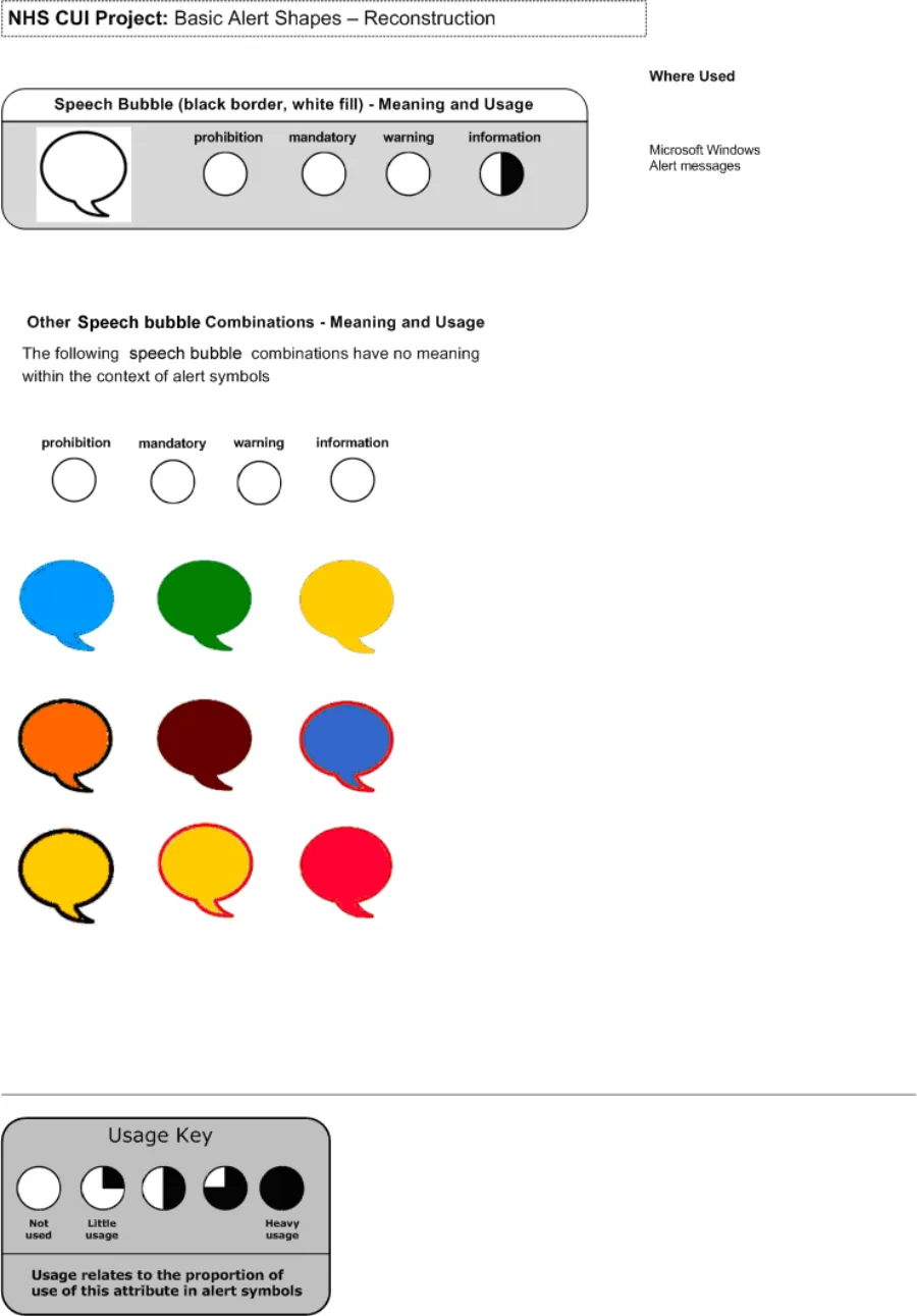
A symbol for suggested action or information for example the speech bubble, does not fit strongly into our framework and therefore we have not included it here as a formal recommendation since further investigation needs to be undertaken to establish its suitability.
1.6 Next steps
- Our research to date has not included a detailed review of symbols in use in clinical
applications. Future rounds of research will cover this area.
-
Effect of clinical environments on interpretation of symbols
-
Effect of end users on the interpretation of symbols
-
Rules for when an item is a ‘critical error’ and when it’s a warning.
Page 2
Copyright ©2013 Health and Social Care Information Centre


 HSCIC Controlled Document
2 INTRODUCTION
2.1 Overview
Within the user interface, alert symbols are used to influence users’ behaviour by indicating where problems (or opportunities) may lie, and what actions should not (or must) be attempted.
Alert symbols are important in providing cues to users for changes in their behaviour. Alert symbols that are misinterpreted by users (for instance, suggestions that are taken to be requirements) may cause users to suspend their better judgement and endanger patient safety.
Alert symbols that are deployed inconsistently may cause users to lose confidence in the system and ignore potentially important information. Again, this could put patient safety at risk.
It is important, therefore, that developers have at their disposal a set of symbols that are unambiguous and can be deployed in a consistent manner.
2.2 Scope of Alert Symbols
Symbology is the study, interpretation and use of symbols. The scope of Alert Symbols through the releases of the Design Guide is to:
- Establish a detailed understanding of both online and offline symbols that may be
encountered by our target audiences.
-
Understand the fundamental language of symbols.
-
Determine the role symbols should play in the overall application framework and
understand how other application elements, such as menus and buttons, are used in conjunction with symbols to provide a comprehensive set of actions, tools, and features that comprise a graphical user interface.
- Develop a set of rules for the design and use of symbols which ensure that their use
enhances the speed and accuracy with which information is conveyed, and does so in a way which end-users find acceptable.
2.3 Current Focus of this Document
The current focus of this work is to:
- Formulate a framework that provides guidance for symbol construction, use and
interpretation
-
Identify trends in alert symbols in various environments, using this framework
-
Propose principles for the design and use of alert symbols
-
Apply these principles to the trends to develop recommendations for alert symbol
construction
- Identify future research requirements for symbols in general and alert symbols in particular
The current research focus does not include:
- Symbols that represent specific items within the clinical environment (such as people,
places, equipment, actions or concepts)
-
Application icons and symbols (representing controls and concepts within software)
-
Understanding how the target audience interprets symbols
Page 3
Copyright ©2013 Health and Social Care Information Centre
HSCIC Controlled Document
- Understanding the unique needs of developers of clinical applications in designing or
deploying alert symbols
-
Understanding how the clinical environment affects the interpretation of symbols
-
User research or research into artefacts within the clinical environment, such as physical
alerts, notices, forms.
- Text accompanying alerts and warnings, and informational text
Note
The authors recognise that their investigation has been unable to cover clinical applications. This will be done in a future release. Therefore, the conclusions of the investigation (and recommendations arising from it) are subject to change.
2.4 Future Releases of this Document
We are following a phased approach to developing the Symbology. Our process is intended to involve users and gain maximum benefit from direct research.
- Quick Wins. Desk research
Review standards, literature, publicly available content, books. Develop a framework for symbol construction. Investigate warning signs, specifically. Identify future areas for research in Phase 1 and 2.
- Phase 1. End user research
Investigate clinical use of signs and symbols, test key areas with users. Expand desk research. Develop a visual catalogue of symbols currently in use which conform with our recommendations.
- Phase 2. Expand the catalogue of symbols
Create rules for adding new items to the catalogue. Expand desk research. Conduct further end user research.
2.5 Considerations and Assumptions
2.5.1 Considerations
Patient Safety
Patient safety is the primary concern of this work. Alerts must be clear, accurate, unambiguous, and timely. Clinicians need to be able to interpret and act upon alerts with the minimum of delay, in an adaptive unconscious manner. Non-verbal communication is at the heart of the principals stated here.
Existing Clinical Applications
More research needs to be done to understand how alerts are currently used in clinical applications. We need to determine contextual use and understand if and when processes should be interrupted using alerts.
2.5.2 Assumptions
- Clinical alerts can be split into the four main classifications of alert (that is, Prohibitive,
Mandatory, Warning, Information)
- The four categories (listed above) broadly cover all clinical alert types
Page 4
Copyright ©2013 Health and Social Care Information Centre
HSCIC Controlled Document
-
Clinical software alert symbols must be internationally relevant
-
Our recommendations do not conflict with current NHS practice
2.6 Methodology
In developing the recommendations within this document, the authors followed these steps:
- Review research into the classification, interpretation and design of symbols in general and
symbols in user interfaces in particular. This involved:
A review of texts on semiotics (the study of signs and symbols and their meanings)
A review of books and papers on the use of signs and symbols within user interfaces
A review of books and papers on warning signs and symbols
A review of standards and guidelines on warning signs and symbols
- From this research, develop a framework for describing alert symbols and identifying their
distinguishing features. This involved:
Determining the scope of alert symbols
Identifying the key characteristics of alert symbols and using these to develop groups and shared dimensions
Developing a system for describing the components of signs and symbols
Identifying the components of signs and symbols that are unique to alerts and the shared characteristics of those components
Identifying rules and guidelines for the design of good signs and symbols
- Review of existing symbols:
Identifying alert symbols used in a variety of environments and deconstructing these into their component parts
Identifying patterns and inconsistencies within the available signs
Apply our rules to these observations to make recommendations on the design of alert signs
Page 5
Copyright ©2013 Health and Social Care Information Centre
HSCIC Controlled Document
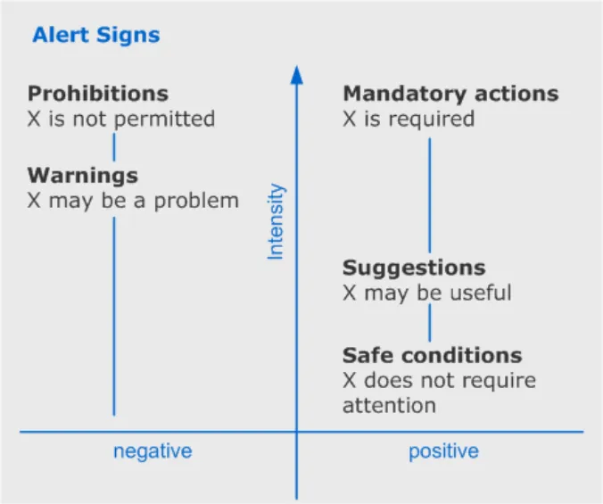
3 CLASSIFICATION
3.1 Alert Signs
Alert signs can be classified according to two criteria:
- What is the polarity of the alert sign? Is the alert sign a ‘negative’ (trying to prevent the
reader from doing something) or a ‘positive’ (trying to encourage the reader to do something)?
- What is the intensity of the alert sign (from low intensity to high intensity)?
The zones within this framework are:
-
Prohibitions (negative, maximum intensity)
-
Mandatory actions (positive, maximum intensity)
-
Warnings (negative, mid intensity)
-
Suggestions (positive, mid intensity)
-
Safe conditions (positive, minimum intensity)
Figure 2: Framework for Classification of Alert Signs
In Figure 2 above, ‘X’ is any item, data or action. ‘X’ may equally refer to something from the clinical domain (for example, a drug) or the system domain (for example, a disk drive).
The scale of increasing intensity, from zero to maximum, describes the importance of the alert sign within the context of the thing to which it is referring. As intensity increases, so does the likelihood that the interface will limit the users’ freedom of action.
The power of this framework is its simplicity – it helps us avoid unnecessary categories of alert, and it helps us to determine what is and is not an alert.
Page 6
Copyright ©2013 Health and Social Care Information Centre
 HSCIC Controlled Document
3.1.1 Examples of Messages within the Scope of the Framework
It’s helpful, when considering this framework, to have some examples that illustrate how alerts can be classified.
- ‘Requests for information’ are a form of positive alert. ‘Omitted’ information alerts are a form
of negative alert. So this framework could be used to identify fields in a form where a user is required to fill in information (mandatory action). If the user attempts to submit the form without completing these fields, their status would change to ‘warning’ (meaning ‘these fields may be causing you a problem’).
- The framework covers conditional alerts. These are instructions about what readers should
do under specified circumstances (for example,‘If patient develops headaches then administer aspirin.’). Conditional statements are multi-part: a condition and a response. There are two types of alert here: a warning and a mandatory/prohibited/suggested response. The trigger here is the warning (‘if X…’ or ‘X may require your attention’) – and it is the warning that should be displayed.
- The framework includes ‘limits’. These are a form of prohibition (for example,‘Do not
exceed specified dose’).
- The lowest level of alert (‘positive, zero intensity’) is simply a display of the state of a
system. Examples of system state include ‘whether or not an action has been initiated’, ‘preferences’ and ‘to what level a thermostat has been set’.
The lowest level of alert – display of the state of a system, is not included in this study. This is because it is not considered to be an alert, merely ‘direct information’. Achieving a specific system state, or attempting to change the system state may trigger a higher level of alert (for instance ‘are you sure you want to empty the wastebasket?’) – but the system state (‘wastebasket contains some items [but you don’t need to do anything about them for the system to continue to operate properly]’) and the alert (‘you will lose data by emptying the wastebasket’) are not the same thing.
3.1.2 Messages Outside of the Scope of the Framework
- There is no alert sign for ‘negative, minimum intensity’ – this would imply a problem that did
not require attention. It is possible to imagine such conditions (for example, a piece of unused equipment is broken). However, it is impossible to distinguish these examples from warnings in any practical circumstance (for example, if the reader is interested in the status of the unused equipment, he should be warned that it is broken – so a warning is required here).
3.2 Requirements for Systems of Alert Signs
The framework shows us some important requirements that must be addressed by an alert sign system:
-
Intensity should be represented separately to polarity (positive / negative)
-
Prohibitions and mandatory actions are at the top of the intensity scale. They have equal
intensity – the reader is obliged to obey the message
- The system should have clear rules for setting the number of levels of intensity below this
maximum
- The system should be able to incorporate alert signs into a more complex message
structure
Page 7
Copyright ©2013 Health and Social Care Information Centre
HSCIC Controlled Document
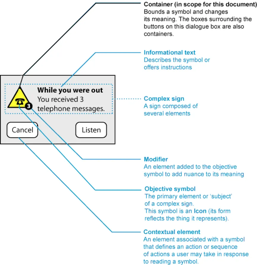
4 VISUAL SYNTAX
Alert signs are composed of a number of elements. However, many of these elements are supplementary to the alert symbol – they provide context or add detail.
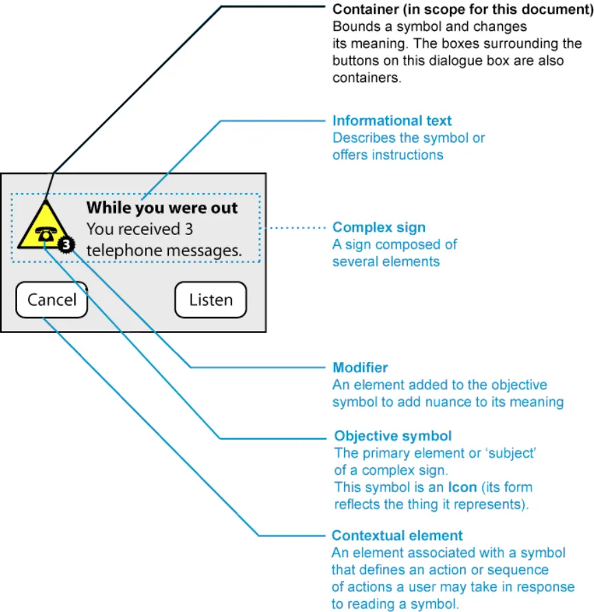
The dialogue box in Figure IAA002 shows how the sign can be broken down into component parts. Detailed definitions are available in APPENDIX A.
Figure 3: Elements of an Alert Sign
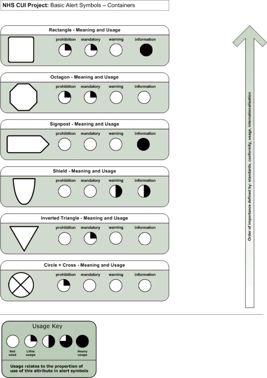
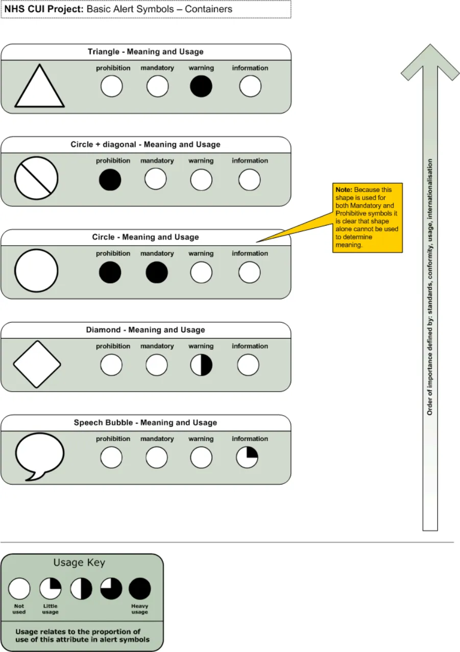
From this break-down, we can see that the primary elements of an alert symbol are the container, which is a combination of shape, tones and colours. Different alert symbols use unique combinations of shapes, and colours to express their meaning.
Therefore there is a syntax of shapes and colours which can be used to express an alert.
Page 8
Copyright ©2013 Health and Social Care Information Centre
 HSCIC Controlled Document
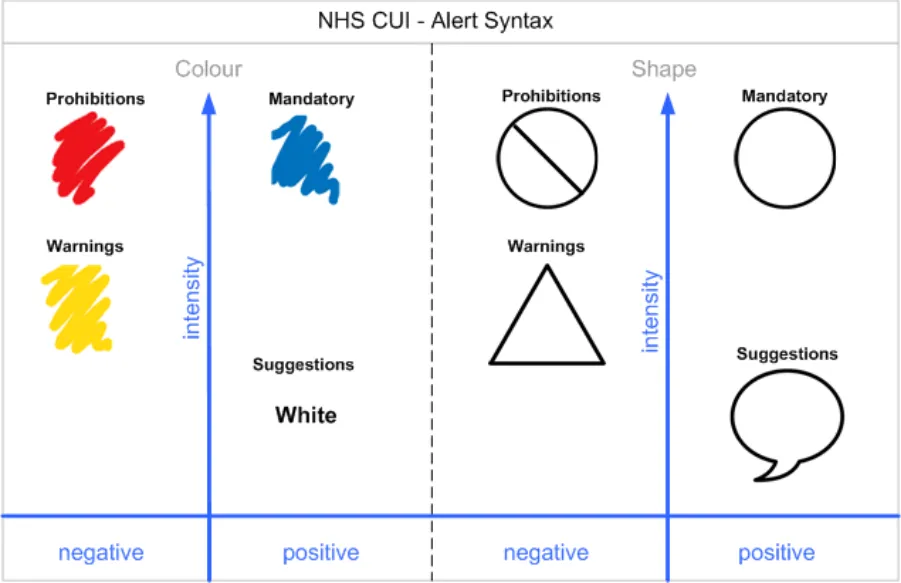
5 WARNING SIGNS IN USE
5.1 Observations
[see attached spreadsheet – alert symbol observations.xls]
5.1.1 Syntax
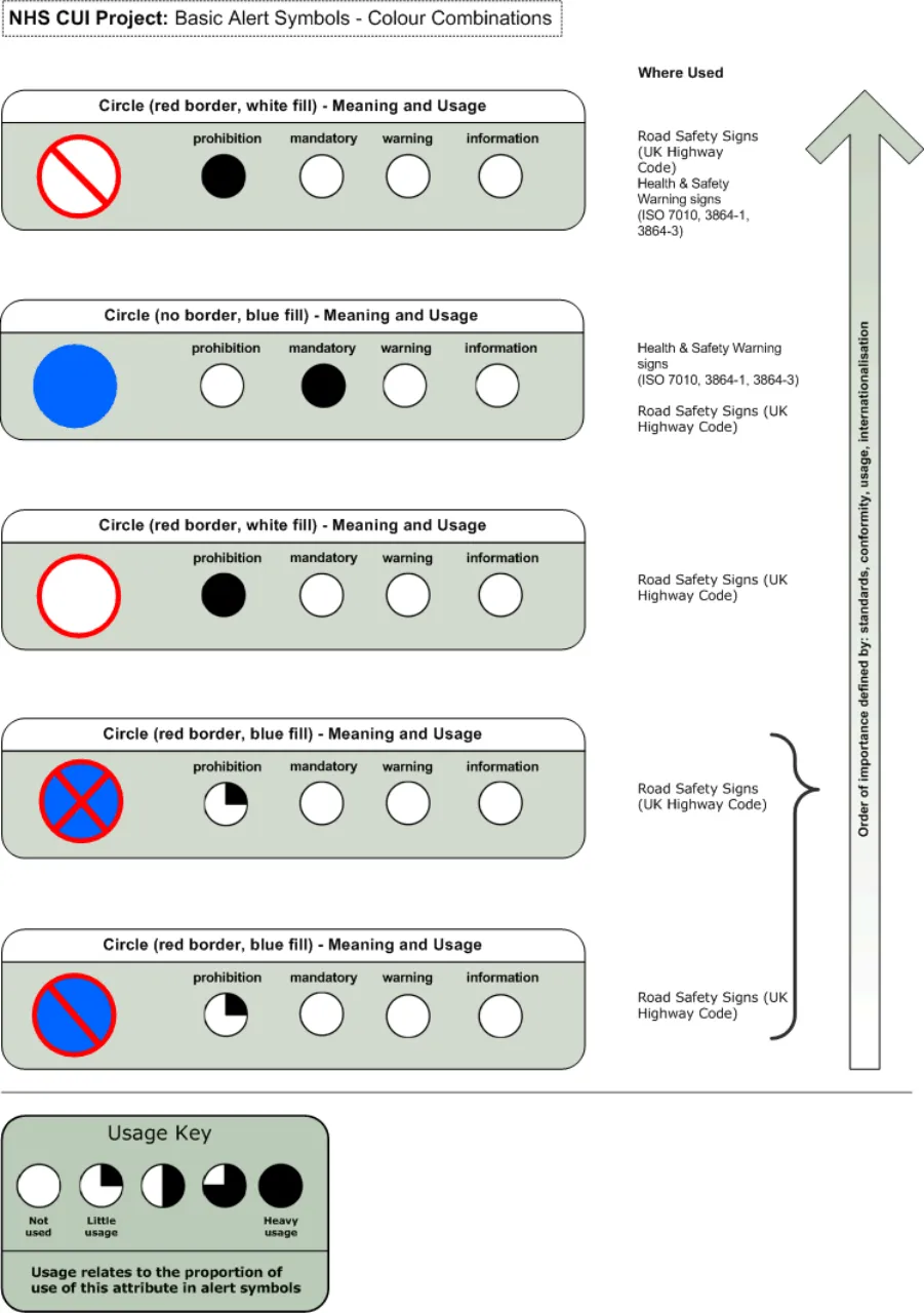
- Circle is used in prohibitions and mandatory signs – it represents the ‘most intense’ level of
sign.
-
Intensely negative signs are light circles (with a thick dark border).
-
Intensely positive signs are dark circles (sometimes a thin light border is applied to make
the sign stand out from its background).
- Colour is used to emphasise the difference between positive and negative signs, often by
using a red border for prohibition and a blue fill for mandatory.
- The strike-through on the prohibition sign is additional emphasis. The cross usually falls
from left to right – but can fall from right to left if this helps make the sign clearer. A double strike-through is not necessary.
- Limits are a special case of prohibition. They are very rare in the signs we studied – though
they did occur in road signs (speed limits and rights of way). Here the prohibition sign, without a strikethrough was used.
- Warnings most frequently represented by triangles. Often different colours are used to
distinguish these from prohibitions.
- Suggestions don’t occur very frequently – except in interactive environments. The speech
bubble is sometimes used, although sometimes no container is used at all.
-
The safe condition is expressed primarily by an absence of containers.
-
Colours are chosen to be accessible - circumstance (red – prohibition, blue – mandatory,
yellow – warning, white – suggested action/information).
Page 9
Copyright ©2013 Health and Social Care Information Centre
HSCIC Controlled Document
Figure 4: Alert Syntax
Page 10
Copyright ©2013 Health and Social Care Information Centre
HSCIC Controlled Document
6 RECOMMENDATIONS AND PRINCIPLES
6.1 Rules for Symbol Design
Our framework provides rules for good symbol design:
-
Intensity should be represented separately to polarity (positive / negative)
-
Prohibitions and mandatory actions are at the top of the intensity scale. They have equal
intensity – the reader is obliged to obey the message
- The system should have clear rules for setting the number of levels of intensity below this
maximum
- The system should be able to incorporate alert signs into a more complex message
structure
A review of how signs are interpreted by readers (see APPENDIX C), leads to a number of additional rules for good symbol design:
-
Signs should rely on codes which are shared by the recipients
-
Signs should be based on codes which are already widely understood and repeated, rather
than seek to create new codes
-
Sign systems should be as simple as possible to ensure ease of learning
-
Signs should be easily distinguishable by target users in the media in which they are
displayed
- Signs should be easily distinguishable without relying on colour alone to convey their
meaning
6.1.1 When to use Symbols
APPENDIX C also discusses when symbols should be used:
If the target audience is familiar with the symbols employed, then symbols can be used to:
-
Represent items in the interface that would otherwise take many words to describe
-
Draw attention to information (for instance in warnings)
-
Communicate to people who may not be able to communicate in written language
-
Speed the communication of frequently repeated or important information
Page 11
Copyright ©2013 Health and Social Care Information Centre
HSCIC Controlled Document
7 CURRENT ALERT SYMBOLS RECOMMENDATIONS
This section recommends the standard for displaying alert and warning symbols within the NHS CUI. In line with our earlier finding that alert symbols in safety critical environments should be based on internationally understood standards, we do not recommend the development of a unique set of alert symbols for the CUI.
In the software world there is poor conformance to guidelines and, where these exist, they borrow heavily from real world standards. In the real world there is a strong stream of conformance to robust, internationally accepted standards for alert symbols within safety critical environments (Ref: European Union Directive 92/58/EEC, ANSI (American National Standards Institute) Z535).
7.1 Symbol Construction Recommendations
When making recommendations for alert symbols we considered all valid shape, colour and modifier combinations. For each of these valid symbols we compared attributes against meaning, usage, international recognition and supporting standards. Our recommendations were made based on the strongest combination of these factors present for any given symbol.
Three symbol configuration recommendations based on research undertaken and the prevalence of certain symbol compositions are made:
-
Mandatory actions
-
Prohibitive actions
-
Warnings
The symbol for suggested action or information (speech bubble) does not fit strongly into our framework and, therefore we have not included it here as a formal recommendation since further investigation needs to be undertaken to establish its suitability.
7.2 Mandatory Action Symbol
7.2.1 Format
NHS clinical applications should display mandatory actions as:
-
Symbol Shape is a circle
-
Symbol Colour is Blue (RGB value to be specified)
-
Symbol Size is (To be specified)
-
Icon Colour is (To be specified)
-
Icon Size is (To be specified)
Page 12
Copyright ©2013 Health and Social Care Information Centre
 HSCIC Controlled Document
7.2.2 Recommendation Rationale
- This mandatory symbol configuration is used in international safety signage to indicate a
mandatory instruction. It has the strongest combination of meaning, usage, international recognition and supporting standards.
- The shape, a circle, signifies the most intense level of alert sign. The colour, blue,
determines the polarity of the sign, signifying the sign as positive, mandatory action.
- As shown in the observations diagram this shape and colour combination is consistently
used (by 10 out of the 17 references) to denote a mandatory action.
- This shape and colour combination is sighted in the European Union Directive 92/58/EEC
as the mandatory action symbol which must be used by all twenty five member states.
- The harmonisation of the ISO 38643 standard and ANSI (American National Standards
Institute) Z535 standard states mandatory action symbols be displayed as a blue circle.
-
The sign is visually distinct from the other signs due to colour (no conflicts for colour blindness).
-
The sign is visually distinct from the other signs due to tone (works on black and white
monitors / print-outs and mono-chromatic colour blindness).
- The sign does not rely on colour alone to convey its meaning.
7.2.3 Key References
-
European Union Directive 92/58/EEC
-
ANSI (American National Standards Institute) Z535
-
Health and Safety Executive (HSE) Regulations 1996
-
British Standards Institute (BSI) Regulation BS 5378
-
ISO standards for Health and Safety signs (7010)
-
ISO standards for Design principles for safety signs in workplaces and public areas (38641)
-
ISO standards for Design criteria for graphical symbols used in safety signs (38643)
-
ISO standards for Shipboard plans for fire protection, life-saving appliances and means of
escape (17631)
-
UK Highway Code
-
Traffic Signs Regulations – 3113 (2002)
7.3 Prohibited Action Symbol
Page 13
Copyright ©2013 Health and Social Care Information Centre
 HSCIC Controlled Document
7.3.1 Format
NHS clinical applications should display mandatory actions as:
-
Symbol Shape is a circle
-
Symbol Colour is white
-
Symbol Border and Diagonal line is red (RGB value to be specified)
-
Symbol Size is (To be specified)
-
Icon Colour is (To be specified)
-
Icon Size is (To be specified)
7.3.2 Recommendation Rationale
- This prohibition symbol configuration is used in international safety signage to indicate a
prohibitive instruction. It has the strongest combination of meaning, usage, international recognition and supporting standards.
- The shape, a circle, signifies the most intense level of alert sign. The colour, red,
determines the polarity of the sign, signifying the sign as negative, prohibited action.
- As shown in the observations diagram this shape and colour combination is consistently
used (by 10 out of the 17 references) to denote a prohibited action.
- This shape and colour combination is sighted in the European Union Directive 92/58/EEC
as the prohibited action symbol which must be used by all twenty five member states.
- The harmonisation of the ISO 38643 standard and ANSI (American National Standards
Institute) Z535 standard states prohibited action symbols be displayed as a white circle with a red border and diagonal line running from the top left to the bottom right of the circle.
- The sign is visually distinct from the other signs due to the border and diagonal line colour
(no conflicts for colour-blindness).
- The sign is visually distinct from the other signs due to tone (works on black and white
monitors / print-outs and mono-chromatic colour blindness).
- The sign does not rely on colour alone to convey its meaning.
7.3.3 Key References
-
European Union Directive 92/58/EEC
-
ANSI (American National Standards Institute) Z535
-
Health and Safety Executive (HSE) Regulations 1996
-
British Standards Institute (BSI) Regulation BS 5378
-
ISO standards for Health and Safety signs (7010)
-
ISO standards for Design principles for safety signs in workplaces and public areas (38641)
-
ISO standards for Design criteria for graphical symbols used in safety signs (38643)
-
ISO standards for Shipboard plans for fire protection, life-saving appliances a means of
escape (17631)
-
UK Highway Code
-
Traffic Signs Regulations – 3113 (2002)
Page 14
Copyright ©2013 Health and Social Care Information Centre
HSCIC Controlled Document
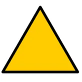
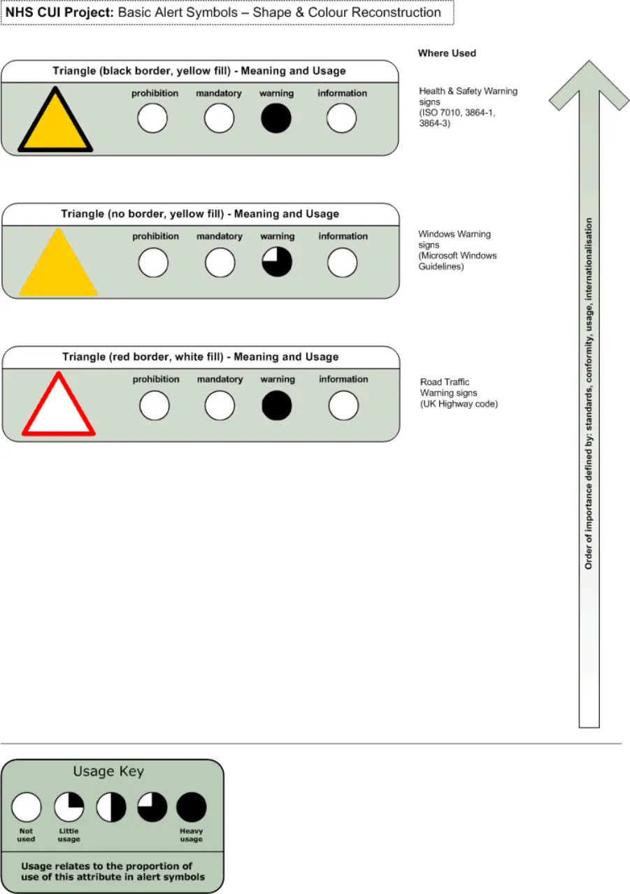
7.4 Warning Symbol
7.4.1 Format
NHS clinical applications should display warnings as:
-
Symbol Shape is a triangle
-
Symbol Colour is Yellow (RGB value to be specified)
-
Border Colour is black (RGB value 0,0,0)
-
Symbol Size is (To be specified)
-
Icon Colour is (To be specified)
-
Icon Size is (To be specified)
7.4.2 Recommendation Rationale
- This symbol configuration is used in international safety signage to indicate a warning. It
has the strongest combination of meaning, usage, international recognition and supporting standards.
- The shape, a triangle, signifies a medium intensity level of alert sign. The colour, yellow,
determines the polarity of the sign, signifying the sign as negative warning.
- As shown in the observations diagram this shape and colour combination is consistently
used (by 10 out of the 17 references) to denote a mandatory action.
- This shape and colour combination is sighted in the European Union Directive 92/58/EEC
as the warning symbol which must be used by all twenty five member states.
- The harmonisation of the ISO 38643 standard and ANSI (American National Standards
Institute) Z535 standard states warning symbols be displayed as a yellow triangle.
- The sign is visually distinct from the other signs in this set due to colour (no conflicts for
colour-blindness).
- Does not rely on colour alone to convey its meaning.
7.4.3 Key References
-
European Union Directive 92/58/EEC
-
Health and Safety Executive (HSE) Regulations 1996
-
British Standards Institute (BSI) Regulation BS 5378
-
ISO standards for Health and Safety signs (7010)
Page 15
Copyright ©2013 Health and Social Care Information Centre
 HSCIC Controlled Document
-
ISO standards for Design principles for safety signs in workplaces and public areas (38641)
-
ISO standards for Design criteria for graphical symbols used in safety signs (38643)
-
ISO standards for Shipboard plans for fire protection, life-saving appliances a means of
escape (17631)
-
UK Highway Code
-
Traffic Signs Regulations – 3113 (2002)
-
Microsoft Windows Guidelines
Page 16
Copyright ©2013 Health and Social Care Information Centre
HSCIC Controlled Document
Other Candidates Considered
Warning
Mandatory Action
Prohibitive Action
Information
Table 1: Alert Symbol Candidates
Summary
This symbol is used in international road signs to denote warning, however it has no other context of use. Although its shape is similar to Chemical Hazard Warning signs it is not used to present the same complex meaning.
Although the octagonal STOP sign is unique it represents only one specific meaning. If used at low resolution or small size it might be mistaken for a circular shape. This sign could also be considered a prohibitive symbol in terms of classification. This symbol is only sighted in Road Traffic regulations.
Although this symbol configuration is very similar to the one recommended, without the crucial diagonal line modifier its meaning is somewhat diluted and may even make it ambiguous in some cases. This symbol is only sighted in Road Traffic regulations.
Although the octagonal STOP sign is unique it represents only one specific meaning. If used at low resolution or small size it might be mistaken for a circular shape. This sign could also be considered a mandatory symbol in terms of classification. This symbol is only sighted in Road Traffic regulations.
Real world information is presented in a rectangular container. This shape is problematic in the real world as it is used to contain the information icon (as a logogram), directional information, explanatory text and modifier text, mandatory signs, and prohibitive signs. This shape is problematic in the software world as it is used to contain application icons in toolbars and it bounds alert messages.
- The three categories of alerts symbols were split by the intensity of their meaning and the
polarity between their positive and negative message.
- Alert symbols used in the non-clinical, off-line world have strong supporting international
standards and are used extensively across industries.
- Alert symbols in the software world borrow heavily from real world examples, however there
is little adherence to the few guidelines that exist for software alerts.
- Combinations of colour and shape have significant meaning for alert symbols in safety
critical environments and are supported by international standards.
- Our recommendations for key alert symbol classifications are based on the framework that
we developed from research and analysis.
- The context of alert symbols is derived from additional elements in an alert, such as icons,
text and other modifiers.
- Our research to date has not included a detailed review of symbols in use in clinical
applications. Future rounds of research will cover this area.
Page 17
Copyright ©2013 Health and Social Care Information Centre
HSCIC Controlled Document
8 ACCESSIBILITY CONSIDERATIONS
The following considerations for accessibility should be applied to any implementation of alerts and icons:
- Appropriate text equivalents for all images must be provided, for example by the use of ‘alt
text’ in web applications. The text should be functional and not a literal description of the design of the image. For icons the text should provide the function of the icon (for example, ‘save’ not ‘disk’). For alerts the text should describe the detail of the alert (for example, ‘warning: above recommended dosage’ not ‘red…’).
-
Colour must not be the only way of differentiating between symbols
-
Flashing in the 2-59Hz range must be avoided
-
Alerts and icons (and their equivalent text) should be used consistently across the whole
application
Page 18
Copyright ©2013 Health and Social Care Information Centre
HSCIC Controlled Document
9 NEXT STEPS
9.1 Key Activities
-
Understand the effect of clinical environments on interpretation of alert symbols
-
Understand how end users interpret alert symbols
-
Establish rules for when an item is a critical alert and when it is a warning.
-
Begin research on Application icons
-
Begin research on Buttons
-
Begin research on clinical icons within alert symbols
-
Research standards and guidelines for application icons
-
Review icons currently used in clinical applications
-
Build detailed clinical scenarios for hypothesis testing
-
Explore clinical environment (detailed in the User Research section below)
9.2 User Research
Although we have conducted some broad secondary research, providing cultural observations, ISO standards and software platform guidelines; it is when we come to the latter that we find the greatest degree of confusion and non-conformity in the implementation of alerts and the use of icons. For this reason it is necessary to conduct more extensive user research, especially within the clinical environment, to establish how users interpret icons and how alerts might best be constructed to support their working practices and ensure safety without being over intrusive or cumbersome.
9.2.1 Primary Research
-
Observational Research
-
Research within clinical environments
-
How clinicians currently use notes to attract attention or denote importance
-
Research within other non-clinical environments where safety is an important factor, for
example, the power industry, airlines, armed forces, car manufacturers (designing safety warning features in vehicles)
-
Interview-based Research
-
Interview people who train for safety
-
Interview clinicians in a safety critical environment or process
-
Interview people who teach clinicians
9.2.2 Cultural Research
- Studying alerts and icons in different software environments, for example,games (high
element of danger and instructional information delivery)
- Warnings, icons and information architecture on packaging and labels (for example, non prescription drug packaging, online health sites for special groups like diabetics)
Page 19
Copyright ©2013 Health and Social Care Information Centre
HSCIC Controlled Document
9.2.3 Confirmation Research
- Survey-based research directed at specific clinician groups (helps to support primary
research findings)
-
Survey questionnaire for symbols and icons
-
Building journals of daily interaction with warnings in clinical environment
-
Informal usability testing on early paper prototypes
Copyright ©2013 Health and Social Care Information Centre
Page 20
HSCIC Controlled Document
APPENDIX A DEFINITIONS
In common parlance, words such as ‘sign’, ‘symbol’ and ‘icon’ are used interchangeably. For clarity, user interface designers must adhere to careful definitions of these terms. Our framework relies on clear definitions of the components of signs within the CUI.
This document uses the following definitions from the field of semiotics (Ref: CCMS (Communication, Cultural and Media Studies).
Sign
A ‘sign’ is a meaningful unit which is interpreted as ‘standing for’ something other than itself. Examples of signs are written words, images, sounds, acts or objects.
Symbol
A symbol is a sign whose meaning comes from an agreement between the people using it.
For example:
-
A red traffic light means ‘stop’
-
A circle with a vertical line at the top means ‘on/off’
Symbols are purely arbitrary - to be correctly interpreted by users, symbols must follow conventions and rules that are accepted and understood by the reader. This is an important point crucial to understanding how to develop signs (see ‘How signs are read’, below).
Code
A code is a convention for communication. For instance, the Roman alphabet is a code.
Icon
An icon is a sign whose form reflects the thing that it signifies.
For example:
-
An image of a CD on a computer screen (representing a real CD in the computer’s CD ROM drive)
-
An image of a person in a wheelchair (representing disabled people in general)
-
The word ‘splash’ (which sounds like the thing it describes)
By definition, icons represent things that have a form.
Page 21
Copyright ©2013 Health and Social Care Information Centre
HSCIC Controlled Document
Complex Signs
Complex signs are signs which are comprised of other signs.
For example:
Complex sign Symbol Icon
Figure 5: Components of a Complex Sign
For further information, see http://www.cultsock.ndirect.co.uk/MUHome/cshtml/semiomean/semio1.html
CUI Definitions
The NHS and Independent Software Vendors (ISV) developers need to describe specific types of signs, namely alert signs within clinical applications. This document proposes new definitions of elements of complex signs.
These are:
-
The objective symbol
-
The container
-
The modifier
-
Informational text
-
Contextual elements
These definitions are specific to this document. Should our future research identify a classification scheme that is in common use, we will review these definitions.
Page 22
Copyright ©2013 Health and Social Care Information Centre


 HSCIC Controlled Document
Figure 6: Illustration of a Complex Sign Components
Objective Symbol
The objective symbol is the primary element of the sign. It is usually placed at the centre of the sign. It is the ‘subject’ of the sign.
In Figure 6, the telephone icon is the objective symbol.
Container
A container is a shape that bounds or overlays the objective symbol. You use a container to change its meaning.
For example:
-
A circle with a line through it, overlaying an icon of a cigarette (‘no smoking’)
-
An image of a ‘button’ surrounding a magnifying glass icon (a ‘zoom’ control in a software
interface)
In Figure 6 above, the yellow triangle is a container. The button outlines around the words ‘Cancel’ and ‘Listen’ are also containers.
Page 23
Copyright ©2013 Health and Social Care Information Centre
 HSCIC Controlled Document
Modifiers
A modifier is a minor element (icon, number or text) which you combine with a major icon. You use the minor element to modify or nuance the icon’s meaning.
For example:
-
A list of times underneath a ‘No Parking’ sign which describe when it is illegal to park.
-
An icon of a folder with an icon of a picture frame within it, used to represent ‘folder for
pictures’.
In Figure 6 above, the ‘3’ symbol is a modifier.
Informational Text
Informational text is a message you place next to the symbol that you use to describe the symbol’s meaning, offer instructions or explain the purpose of the symbol.
Informational text is different from modifying text. For instance a ‘No Parking’ symbol may be accompanied by a list of times (which modify its meaning) and the words ‘no parking’ (which repeat the symbol’s meaning). In this instance, the times are modifiers and the words ‘no parking’ are informational text.
In Figure 6 above, the message ‘While you were out you received 3 telephone messages,’ is the informational text.
Contextual Elements
Contextual elements are the surrounding and context in which a symbol will be displayed. These determine the actions the user may perform in response to interpreting the icon.
For instance, a symbol may be displayed in the context of (next to) a checkbox. The context modifies the users’ interpretation of the symbol (as an option).
In Figure 6 above, the dialogue box and buttons are contextual elements in relation to the telephone icon.
Page 24
Copyright ©2013 Health and Social Care Information Centre
HSCIC Controlled Document
APPENDIX B ALERTS AND INTERACTIONS
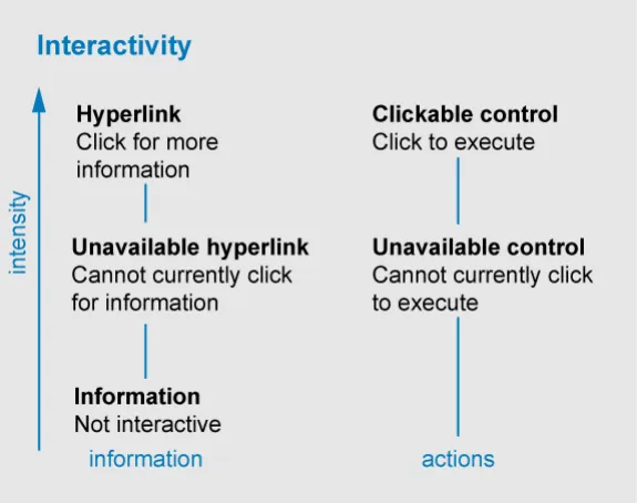
The classification of alert signs (Figure 2) can be used as a template for other interface elements – for instance, interactions.
A short discussion of inactivity cues is included because, although it is out of the scope of this document, interactivity cues are also containers and are, in this sense, related to alert cues.
Interactivity Cues
Interactive elements can be classified according to two criteria:
-
Is the element ‘information’ (‘click to find out more detail’) or an action (‘click to execute’)?
-
What is the state or intensity of the interactivity cue?
Figure 7: Classification of Interactive Elements
Again, this simple framework allows us to classify many items.
For instance, checkboxes are interface elements that are always ‘clickable’. Hyperlinks may be disabled or enabled. Buttons may be clickable or currently unavailable.
What is interesting is that alert signs are a form of information. They may be clickable or not. So a ‘safe condition’ symbol may also be a non-interactive piece of information (for example,an indicator of temperature) or an interactive piece of information (an ‘all clear’ summary icon leading to a page detailing a patient’s vital signs).
Page 25
Copyright ©2013 Health and Social Care Information Centre
 HSCIC Controlled Document
APPENDIX C RULES FOR SYMBOL DESIGN
In the language of semiotics, signs are written by a ‘sender’ in order to convey information to a ‘receiver’.
Rule 1: Understanding a Sign
To be easily and accurately understood, signs should rely on codes that are shared by the recipients.
The first principle of semiotics is the ‘arbitrariness of the sign’ – the idea that there is no inherent reason for a sign to mean something.
For instance, there is no particular reason why the word ‘sister’ should mean a female sibling, other than convention. A sender may choose another word (such as ‘egg’ or ‘brother’) to carry the meaning ‘a female sibling’. The only reason that ‘sister’ is a good choice, is because English speakers tend to agree that ‘sister’ means ‘a female sibling’.
So it is for all signs – the arrows, shapes and diagrams we see around us only mean something because we have learned a ‘code’ that is shared with the people who wrote the signs.
-
The value of a sign depends on the ease and accuracy with which the recipient decodes it.
-
The author of a sign has no control over how it is interpreted.
Rule 2 and 3: Learning the Meaning of a Sign
Signs should be based on codes which are already widely understood and repeated – rather than seek to create new codes.
Sign systems should be as simple as possible to ensure ease of learning.
Learned behaviour has a tendency to break down during the early stages of learning and under stressful conditions. We need to take this into account when designing signs for a safety critical environment.
It is clear that signs that are entirely new will have to be learned by all readers.
Furthermore, it is axiomatic that simple subject matter (subject matter with few elements, few rules and few exceptions) is easier to learn than complex subject matter.
Rule 4 and 5: Legibility and Accessibility
Signs should be easily distinguishable by target users in the media in which they are displayed.
Further releases will attempt to determine specific values to accompany Rule 4.
Signs may also be seen by readers with defective colour vision or by readers using equipment with defective colour reproduction.
Signs should be easily distinguishable without relying on colour alone to convey their meaning.
Signs within the CUI will be read on computer / television screens as well as other media. This will constrain the legibility of the signs – for instance, due to low resolution of the computer screens.
It is clear from Rule 4 and Rule 5 that safety-critical signs will have to rely on a combination of colours, shapes and words to accurately convey their meaning.
Page 26
Copyright ©2013 Health and Social Care Information Centre
HSCIC Controlled Document
When to use Symbols
If the target audience is familiar with the symbols employed, then symbols can be used to:
-
Represent items in the interface that would otherwise take many words to describe
-
Draw attention to information (for instance in warnings)
-
Communicate to people who may not be able to communicate in written language
-
Speed the communication of frequently repeated or important information
Copyright ©2013 Health and Social Care Information Centre
Page 27
HSCIC Controlled Document
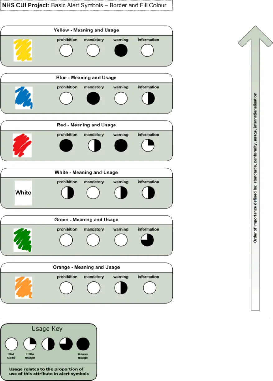
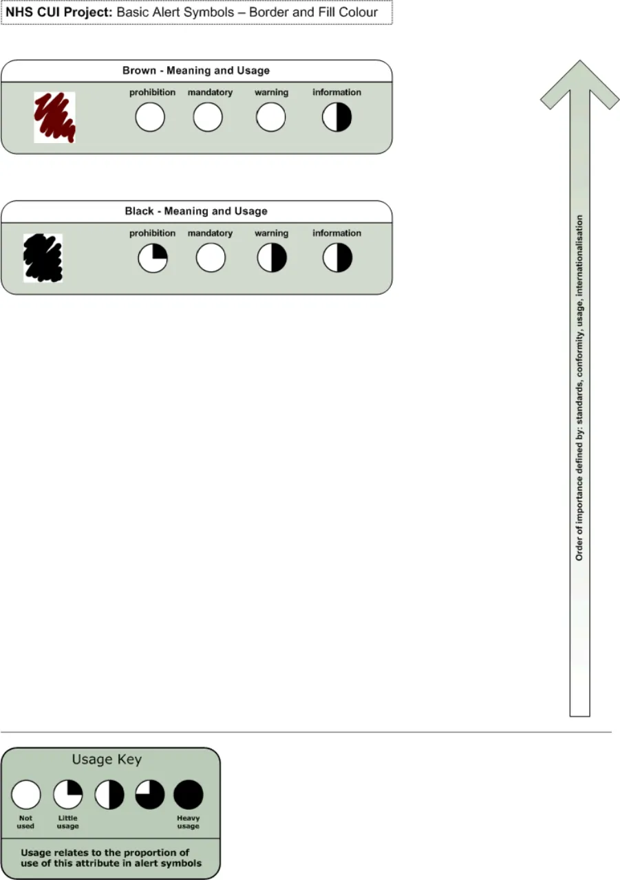
Features of Alert Symbols
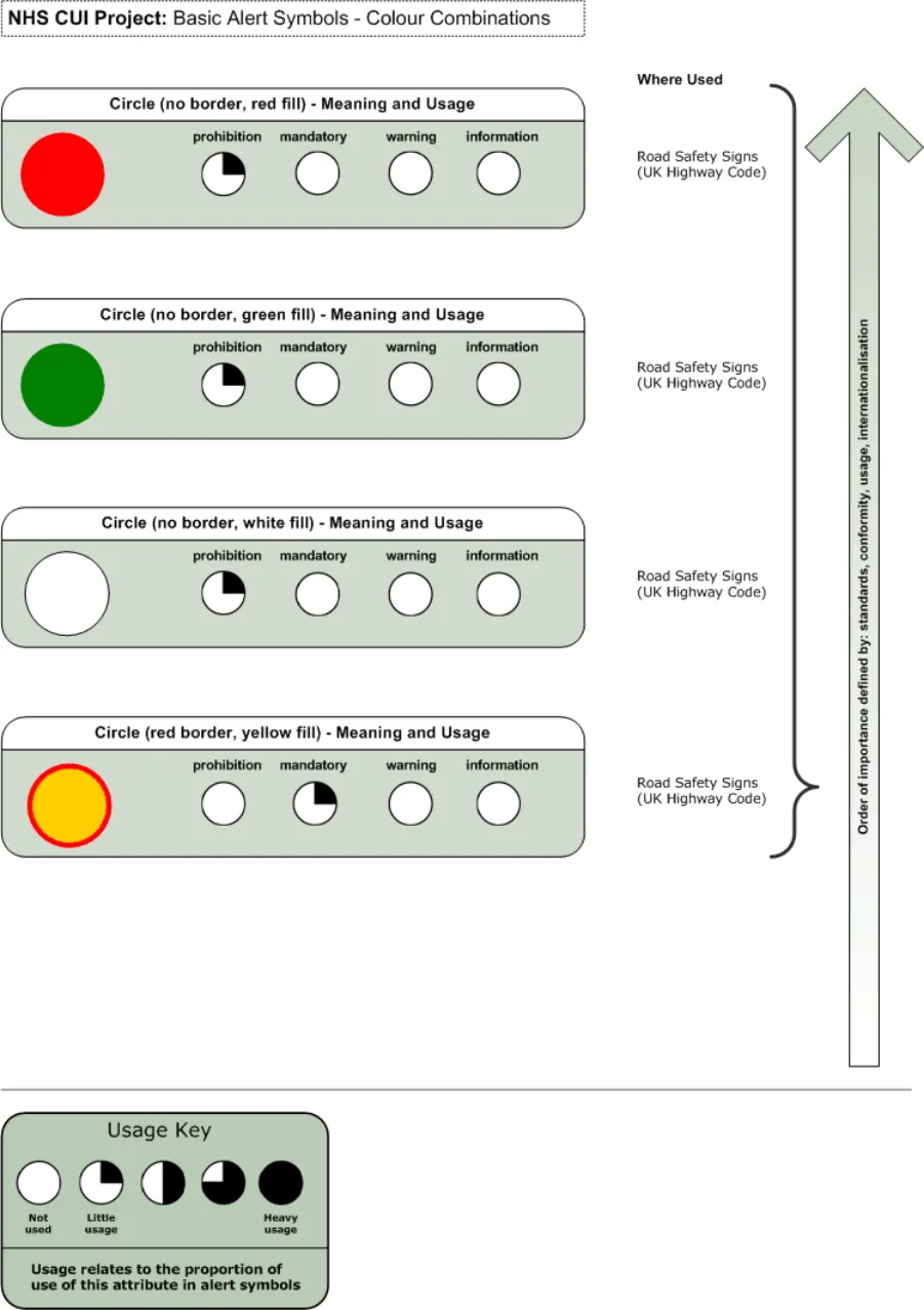
Figure 8: Basic Alert Symbols - Border and Fill Colour (Image 1 of 2)
Copyright ©2013 Health and Social Care Information Centre
Page 28
HSCIC Controlled Document
Figure 9: Basic Alert Symbols - Border and Fill Colour (Image 2 of 2)
Copyright ©2013 Health and Social Care Information Centre
Page 29
HSCIC Controlled Document
Figure 10: Basic Alert Symbols - Containers (Image 1 of 2)
Copyright ©2013 Health and Social Care Information Centre
Page 30
HSCIC Controlled Document
Figure 11: Basic Alert Symbols - Containers (Image 2 of 2)
Copyright ©2013 Health and Social Care Information Centre
Page 31
HSCIC Controlled Document
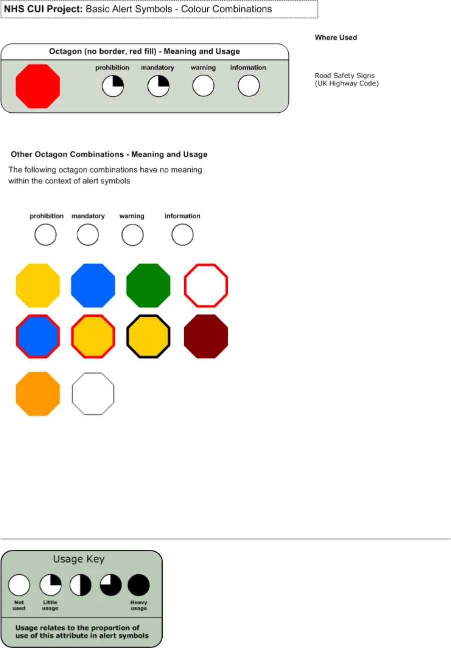
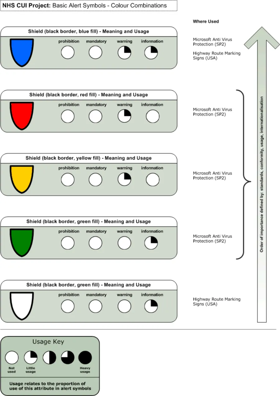
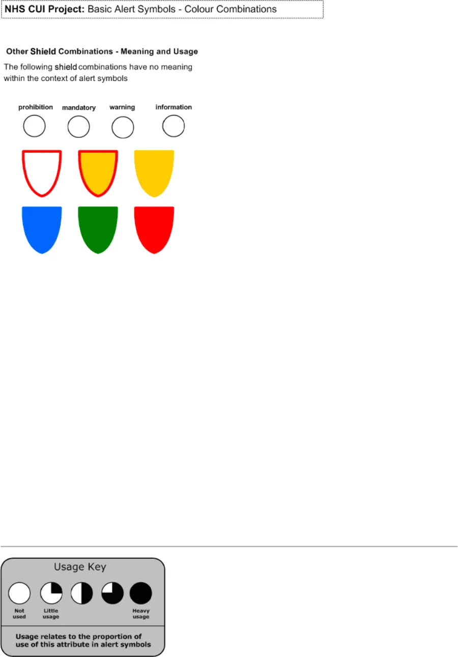
Figure 12: Basic Alert Symbols - Colour Combinations (Image 1 of 3)
Copyright ©2013 Health and Social Care Information Centre
Page 32
HSCIC Controlled Document
Figure 13: Basic Alert Symbols - Colour Combinations (Image 2 of 3)
Copyright ©2013 Health and Social Care Information Centre
Page 33
HSCIC Controlled Document
Figure 14: Basic Alert Symbols - Colour Combinations (Image.3 of 3
Copyright ©2013 Health and Social Care Information Centre
Page 34
HSCIC Controlled Document
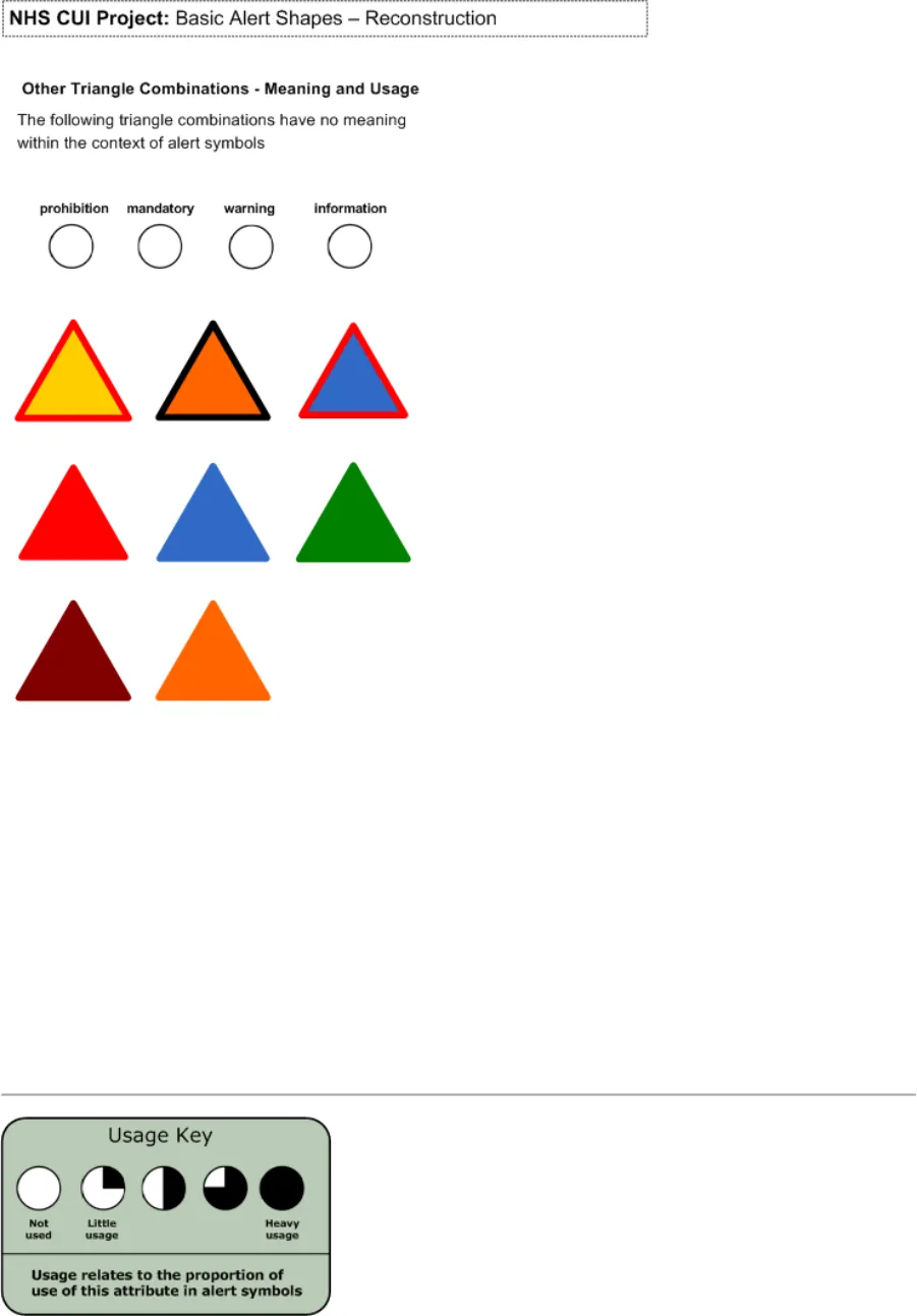
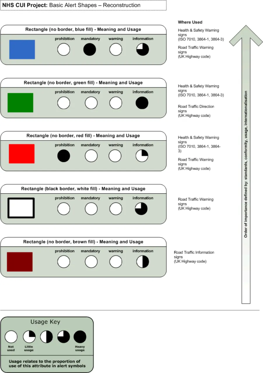
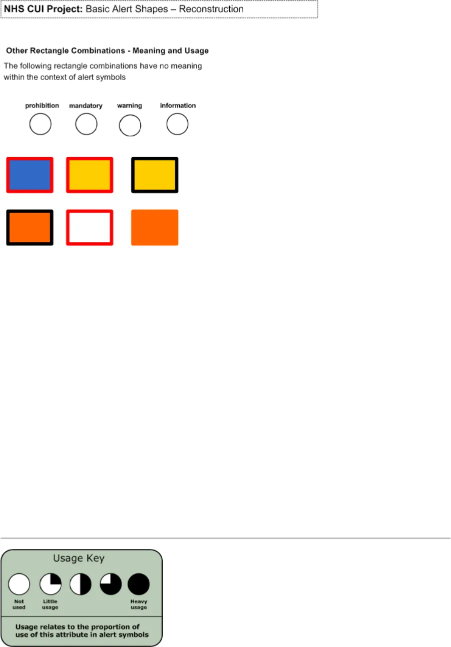
Figure 15: Basic Alert Shapes - Reconstruction
Copyright ©2013 Health and Social Care Information Centre
Page 35
HSCIC Controlled Document
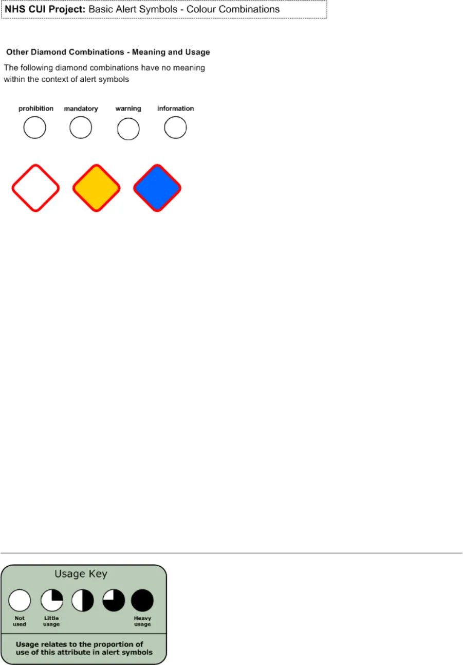
Figure 16: Basic Alert Symbols - Shape and Colour Reconstruction
Copyright ©2013 Health and Social Care Information Centre
Page 36
HSCIC Controlled Document
Figure 17: Basic Alert Shapes - Reconstruction (Image 1 of 3)
Copyright ©2013 Health and Social Care Information Centre
Page 37
HSCIC Controlled Document
Figure 18: Basic Alert Shapes - Reconstruction (Image 2 of 3)
Copyright ©2013 Health and Social Care Information Centre
Page 38
HSCIC Controlled Document
Figure 19: Basic Alert Shapes - Reconstruction (Image 3 of 3)
Copyright ©2013 Health and Social Care Information Centre
Page 39
HSCIC Controlled Document
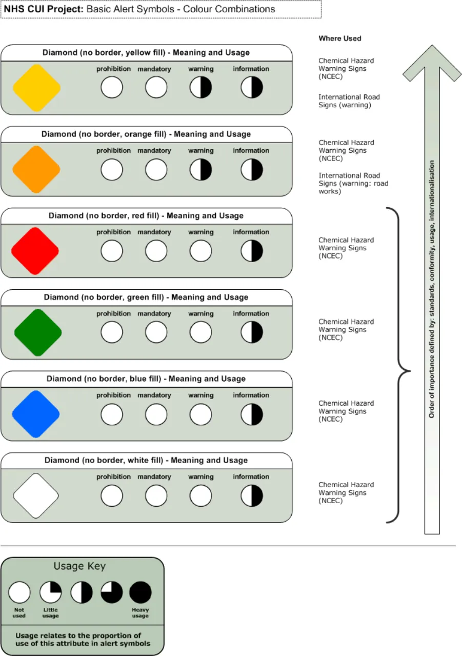
Figure 20: Basic Alert Symbols - Colour Combinations (Image 1 of 5)
Copyright ©2013 Health and Social Care Information Centre
Page 40
HSCIC Controlled Document
Figure 21: Basic Alert Symbols - Colour Combinations (Image 2 of 5)
Copyright ©2013 Health and Social Care Information Centre
Page 41
HSCIC Controlled Document
Figure 22: Basic Alert Symbols - Colour Combinations (Image 3 of 5)
Copyright ©2013 Health and Social Care Information Centre
Page 42
HSCIC Controlled Document
Figure 23: Basic Alert Symbols - Colour Combinations (Image 4 of 5)
Copyright ©2013 Health and Social Care Information Centre
Page 43
HSCIC Controlled Document
Figure 24: Basic Alert Symbols - Colour Combinations (Image 5 of 5)
Copyright ©2013 Health and Social Care Information Centre
Page 44
HSCIC Controlled Document
EXTENDED REFERENCES
-
European Union Directive 92/58/EEC
-
Health and Safety Executive (HSE) Regulations 1996
-
British Standards Institute (BSI) Regulation BS 5378
-
ISO standards for Health and Safety signs (7010)
-
ISO standards for Design principles for safety signs in workplaces and public areas (38641)
-
ISO standards for Design criteria for graphical symbols used in safety signs (38643)
-
ISO standards for Shipboard plans for fire protection, life-saving appliances a means of
escape (17631)
-
UK Highway Code
-
Traffic Signs Regulations – 3113 (2002)
-
Microsoft Windows user interface guidelines
-
World Wide Web Consortium (W3C)
-
Judith Edworthy Research – (Research library)
-
Accessible Information Solutions Colour Contrast Analyser
-
Interfaces for Message Notification – (Research Library)
-
Impacts of User Interface Complexity on User Acceptance and Performance in Safety Critical Systems – (Homeland Security)
-
Oil and Gas Journal Safety Systems
-
Information Graphics – Peter Wildbur and Michael Burke (Thames and Hudson 2001)
-
Envisioning Information – Edward R. Tufte (Graphics Press 1999)
-
Why Warnings Fail – Mark Green
-
British Medical Journal
-
National Science Foundation (IBN0217403)
-
NPSA-SCHIN critical drug alerts – (Research library)
-
HCI in Safety Critical Systems
-
Alarms in Process Control link
-
Clear Rx Prescription packaging system
-
Signs and Symbols – Pepin Van Roojen (The Pepin Press 2003)
-
Lingua Grafica – Johannes Plass (Mutabor 2001)
-
Lingua Universalis - Johannes Plass (Mutabor 2004)
-
National Institute of Mental Health (R01-59970)
-
National Alliance for Research on Schizophrenia and Depression (NARSAD)
Page 45
Copyright ©2013 Health and Social Care Information Centre
HSCIC Controlled Document
Change History
Page 46
Copyright ©2013 Health and Social Care Information Centre